UB Theme Helper
Introduction
UB Theme Helper is a handy and practical customisation panel built-in as a core feature in all Magento 2 themes at Ubertheme. It allows to easily customize almost anything (Font, Color, Background, Button, Product Labels, etc.,) with ease via user-friendly interface.
More info
Below are our first Magento 2 themes packed with UB Theme Helper:
- UB MegaMall: Demo | More info
- UB Bookshop: Demo | More info
- UB Mago: Demo | More info
- Crafts 2.0: Demo | More info
- (work in progress) UB SportsGear: Demo | More info
- (work in progress) UB Kidsland: Demo | More info
This documentation will guide you step by step to customize our Magento 2 themes with UB Theme Helper.
How to customize themes
Stage 1. Set Scope of Configuration & Activate Theme
The scope determines which website, store, or view is affected by a configuration setting. You can select to customize the entire page or any store view separately.
Navigate to Content | (Theme Configuration) UB Theme Helper. In the upper-left corner of the Admin, set the scope of your choice. If no scope is defined, Default Config will be applied.
Then click Activate button to apply specific theme you select.

Stage 2. (Optional) Configure Themes
Navigate to Content | (Theme Configuration) UB Theme Helper | navigate to the active theme and click SETTING. You will be directed to theme setting panel that helps modify the theme:
1.Theme
1.1. Theme Overview:
A brief introduction of the theme you’re using, including a few helpful links that you might need, like changelog, technical support forum etc.

1.2. Theme Typography Settings:

After you edit your active theme’s Typography settings, you must run deploy command to apply the changes. Go to your root and run the command:
- rm -R var/*
- rm -R pub/static/*
- php -f bin/magento setup:static-content:deploy --theme Ubertheme/[theme_name]
Depending on which active theme you are using, you fill in with the correct [theme_name] as follows:
- UB MEGAMALL: theme_name is “default”
- UB MEGAMALL GREEN: theme_name is “blue”
- UB MEGAMALL PINK: theme_name is “pink”
- UB MEGAMALL RED: theme_name is “red”
- UB MEGAMALL VIOLET: theme_name is “violet”
1.2.1 Base font size:
Base font size: The font size of most of other elements (eg. heading elements ) will be automatically calculated relative to this value.
1.2.2 General font size:

General font Library: Determine the font library for regular text. You can select either default font or Google font.
a. Default Font: supports general font families including:

- Serif
- Sans-serif
- Cursive
- Fantasy
- Monospace
Beside those 5 font families, UB ThemeHelper also support two other values:
- Inherit: If ‘Inherit’ selected, default font family will be used.
- Other: If ‘Other’ selected, default Helvetica font will be used
b. Google Font:: If you wish to use Google font family -- a robust directory of open source designer web fonts, simply browse the font of your choice:

General font weight: set the font weight you need (Eg: Thin, Extra Light, Light, Regular, Medium, Semi bold, Bold, Black).

Note: Make sure you specified correct font weight for the selected font. A specific font might not available in all weights.
1.2.3. Heading Font
Heading font library: Determine the font library for heading text elements. You can choose one of the two options: Default font or Google font. Heading Element: refers to all H1, H2, H3, H4, H5, H6 and other elements which use the same font with the heading elements. Default value will be used if heading elements have invalid value or empty.
Similar to section 1.2.2. General font library, you can select either default font or Google font.
a. Default font

Heading font family: the Heading supports 5 common font families: Serif, Sans-serif, Monospace, Cursive and Fantasy. Besides, UB ThemeHelper also supports two other values:
- Inherit: If ‘Inherit’ selected, default font family will be used.
- Other: If ‘Other’ selected, default HelveticaBold font will be used
Heading font weight: Simply set the font weight you need (Eg: thin, extra light, light, regular, medium, semi bold, bold, black). Make sure you specified correct font weight for the selected font. A specific font might not available in all weights.
b. Google font

The Google font setting is similar to the section 1.2.2. General font library.
c. Menu base font

- Menu base font size: Define global font size for regular text of the menu. Default value is 12px.
- Parent Menu font size: refers to the font size of parent menu items. Default value is 12 px.
- Submenu title font size: refers to the font size of Submenu items. Default value is 16px.
- Submenu link font size: refers to the font size of Submenu link items. Default value is 12px.
1.3 Element Settings
1.3.1 Logo Settings

- Logo image: Allowed file types: png, gif, ipg, jpeg, svg. The Logo image is uploaded to the folder: pub/media/ubertheme/ubthemehelper/logo/logo-red.png. To delete a logo image, simply uncheck ‘Use system value’ and check the “Delete image’ checkbox, and click Save Config.
- Logo width: Specify your specific value in pixels. Default value is 270 px.
- Logo height: Specify your specific value in pixels. Default value is 82 px.
- Logo Alt: (Optional) add your branding text here.
Front-end Appearance:
Note: To apply the changes you made, make sure you run deploy command, as per this note
1.3.2 General Settings

- Menu sticky: If set ‘Yes’, sticky menu allows to make your store pages ‘sticky’ as soon as it hits the top of the page when your users scroll down.
- Enable Alternative Product Image: Setting “Yes” if you want to show another thumbnail image upon mouse hover on a product rather than default thumbnail image.
- Rating: Set “Yes” to show rating on all pages.
- Price: Set “Yes” to show price on all pages
- Add to cart: Set “Yes” to show “Add to cart” button on all pages
- Add to compare: Set “Yes” to show “Compare” button on all pages
- Shop by Toggle: Select “Yes” to enable Shop by toggle in the Category page.
1.3.3 Product Labels

Show Label Hot: Choose either Text Label or Image Label. Set Hide to disable the Hot label.
a. Image Label

- Label Hot Width: Default width of Label Hot: 40px. If empty, default value will be used
- Label Hot Height: Default height of Label Hot: 40px. If empty, default value will be used.
- Label Hot Image: Upload your custom icon image here
a. Text Label

Default wdith and height of Text label is similar to the Image label, as noted above.
- Label Hot Background Color: Default background color of the label is inherited from the primary color. If empty, default value will be used.
- Label Hot Color: Default color of Hot label is #fff. If empty, default value will be used.
- Label Hot Font size: Default font size of Hot label is 14px. If empty, default value will be used.
Front-end Appearance:

Note:
- Follow the same steps to configure the settings of New Label and Sale Label.
- To apply the changes you made, make sure you run deploy command, as per this link note
1.4 Color Setting
1.4.1. Pages Color


- Text color: Default color is #646464. If empty, default value will be used.
- Link Color: Default color is inherited from the primary color. If empty, default value will be used.
- Button text color: Default color: #f04e46. If empty, default value will be used.
- Button Text Hover Color: Default color: #646464. If empty, default value will be used.
- Button Background Color: Default color is inherited from the primary color. If empty, default value will be used.
- Button Background Hover Color: Default color is inherited from the text color. If empty, default value will be used.
- Product Price Color: Default color: #009bcb. If empty, default value will be used.
- Body Border color: Default color: #e1e1e1. If empty, default value will be used.
- Body background: You can choose of one three types: Background color; Background image; or Background image, color.
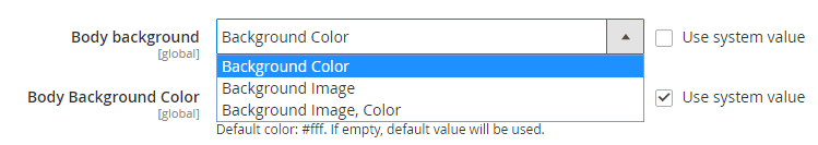
Background Color:
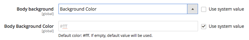
Simply fill in the color of your choice using the Color picker.
Background Image:
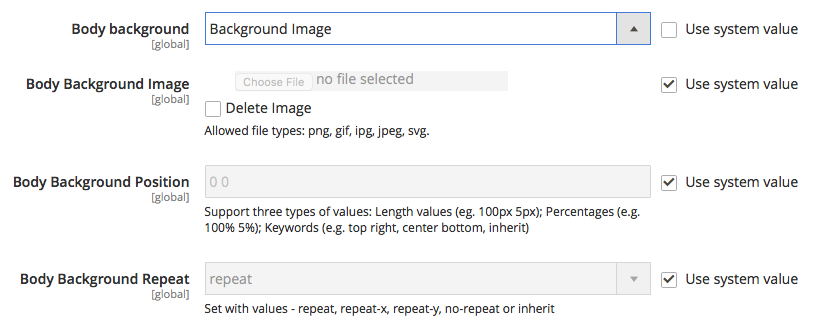
- Body Background Image: Upload the image from your computer. To delete a selected image by check delete box. Allowed file types: png, gif, ipg, jpeg, svg.
- Body background: Support three types of values: Length values (eg. 100px 5px); Percentages (e.g. 100% 5%); Keywords (e.g. top right, center bottom, inherit)
- Body background Repeat:
- Repeat: The background image will be repeated both vertically and horizontally. This is default
- Repeat-x: The background image will be repeated only horizontally
- Repeat-y: The background image will be repeated only vertically
- No-repeat: The background-image will not be repeated
- Inherit: Inherits this property from its parent element
Background Image, Color:
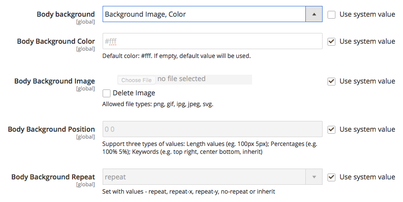
This setting simply combines both options mentioned above -- Background Image and Background Color.


1.4.2. Menu color

- Parent Menu Link Color: Default color: #fff. If empty, default value will be used.
- Parent Menu Link Hover Color: Default color: #fff. If empty, default value will be used.
- Parent Menu Background Color: Default color: #009bcb. If empty, default value will be used.
- Parent Menu Active Background Color: Default color: #0086af. If empty, default value will be used.
- Submenu Text Color: Default color is inherited from the text color. If empty, default value will be used.
- Submenu Link Color: Default color is inherited from the text color. If empty, default value will be used.
- Submenu Link Hover Color: Default color is inherited from the primary color. If empty, default value will be used.
- Submenu Button Text Color: Default color: #fff. If empty, default value will be used.
- Submenu Button Text Hover Color: Default color: #fff. If empty, default value will be used.
- Submenu Button Background Color: Default color is inherited from the primary color. If empty, default value will be used.
- Submenu Button Background Hover Color: Default color is inherited from the text color. If empty, default value will be used
- Submenu Border Color: Default color: #e1e1e1. If empty, default value will be used.
- Submenu background: similar setting as per afore-mentioned section 1.4.1 Page Color | Body background
- Submenu Background Color: similar setting as per afore-mentioned section 1.4.1 Page Color | Body background
Front-end Appearance:

1.4.3. Header color

- Header Text Color: Default color is inherited from the text color. If empty, default value will be used.
- Header Border Color: Default color: #ebebeb. If empty, default value will be used.
- Header Link Color: Default color: #8d8d8d. If empty, default value will be used.
- Header Link Hover Color: Default color is inherited from the primary color. If empty, default value will be used.
- Header Button Text Color: Default color: #fff. If empty, default value will be used.
- Header Button Text Hover Color: Default color: #fff. If empty, default value will be used.
- Header Button Background Color: Default color is inherited from the primary color. If empty, default value will be used.
- Header Button Background Hover Color: Default color is inherited from the text color. If empty, default value will be used.
- Header Background: similar setting as per afore-mentioned section 1.4.1 Page Color | Body background
- Header Background Color: similar setting as per afore-mentioned section 1.4.1 Page Color | Body background Color
Front-end Appearance:

1.4.4. Main content color configuration
Main Content Background: You can select one of three options: Background Color, Background Image, or Background Image, Color.

- Main Content Background: similar setting as per afore-mentioned section 1.4.1 Page Color | Body background
- Main Content Background Color: Default color: #fff. If empty, default value will be used.
1.4.5. Footer color

- Footer Text Color: Default color is inherited from the text color. If empty, default value will be used.
- Footer Border Color: Default color: #3c3c3c. If empty, default value will be used.
- Footer Link Color: Default color: #979797. If empty, default value will be used.
- Footer Link Hover Color: Default color: #fff. If empty, default value will be used.
- Footer Button Text Color: Default color: #fff. If empty, default value will be used
- Footer Button Text Hover Color: Default color: #fff. If empty, default value will be used.
- Footer Button Background Color: Default color is inherited from the primary color. If empty, default value will be used.
- Footer Button Background Hover Color: Default color is inherited from the text color. If empty, default value will be used.
- Footer background: similar setting as per afore-mentioned section 1.4.1 Page Color | Body background
- Footer Background Color:similar setting as per afore-mentioned section 1.4.1 Page Color | Body background
Note: To apply the changes you made, make sure you run deploy command, as per this note
2. Page configuration
2.1. Catalog(Grid)
2.1.1. Product Columns (Desktop)

The section allows to specify the number of product columns, if the browser viewport width >= 1024px.
- Product Colunms -- One column Layout: this setting applies for One column layout. Simply set the number of product columns you want.
- Product columns -- Two colums Layout: this setting applies for Two column layout. Simply set the number of product columns you want.
- Product colums -- Three colums layout: this setting applies for Three column layout. Simply set the number of product columns you want.
2.1.2. Product Columns (Tablet)
Specify the number of product columns displayed, if the browser viewport width is between 768px and 1023px. Simply input your desired values or leave it as default.

2.1.3. Product Columns (Mobile Horizontal)
Specify the number of product columns displayed, if the browser viewport width is between 481px and 767px.

2.1.4. Product Columns (Mobile Vertical)
Specify the number of product columns displayed, if the browser viewport width < 481px

2.1.5. Product Grid Image Settings
Set your own image width and height values. Default is 175px for both Width and Height value. If empty, default value will be used.

Note: To apply the changes you made, make sure you run deploy command, as per this note
2.2. Catalog (List)

- Image width: Specify product image width in the List mode. Default value: 22px
- Image height: Default height value is 222px
- Show product description: Set ‘No’, to hide the product description
- Maximum description length: Determine the maximum characters for the product description
Note: To apply the changes you made, make sure you run deploy command, as per this note
2.3. Product view

a. Media Images
- Image width: Set the width of the main product image in Product detail page. Default value: 370px. If empty, default value will be used.
- Image Height: Set the height of the main product image in Product detail page. Default value: 370px. If empty, default value will be used.
- Thumbnail Image Width / Height: Set the width / height of the product thumbnail images in Product detail page. Default width and height values: 50px. If empty, default value will be used.
b. Related Products
- Show Related: Set to ‘No’ if you wish to hide Related products on the product page.
- Image Width: Default width for Related product image: 170px. If empty, default value will be used.
- Image Height: Default height for Related product image: 170px. If empty, default value will be used.
- Related Product Limit: Set a default limit on the number of related products displayed on the product page
Frontend Appearance:

c. Upsell Products
- Show Upsell: Set to ‘No’ if you wish to hide Upsell products on the product page.
- Image Width: Default width for Upsell product image: 170px. If empty, default value will be used.
- Image Height: Default height for Upsell product image: 170px. If empty, default value will be used.
- Related Product Limit: Set a default limit on the number of upsell products displayed on the product page
Frontend Appearance:

d. Custom Tab

UB Theme Helper allows you to add custom tab into the product detail page. Please note the following two important fields:
- Content: You first need to assign a static block to this custom tab. You can add a new static block, or select from your existing static blocks.
- Assign Custom Tab to: configure to show the custom tab to one of the following pages:
- All Product IDs: your custom tab will be displayed on all product detail pages
- Product IDs: your custom tab will be displayed on specific product detail pages of your choice. Simply enter the product id that you wish to show Custom tab. Multiple product ids should be separated by a comma.
- Category: select one or multiple categories to show custom tab
Note: To apply the changes you made, make sure you run deploy command, as per this note
2.4. Contact us

Front-end Appearance:

Note: To apply the changes you made, make sure you run deploy command, as per this note
2.5. Shopping cart

Below are the configuration option to control the cross sell product on the Shopping cart page:
- Cross Sell Image Width: Default value is 170px. If empty, default value will be used.
- Cross Sell image height: Default value: 170px. If empty, default value will be used.
- Cross Sell product limit: Default value: 10. Enter the maximum number of Cross-sell Product to be displayed.
Front-end Appearance:

Note: To apply the changes you made, make sure you run deploy command, as per this link note
Extra configuration
Custom CSS

In order to add custom CSS, you should follow one of the following options:
- Upload your custom CSS file to the server which you can override the default styling of the theme. In the Additional CSS field, enter the CSS file name needed for custom style. Multiple files should be separated by a comma. Or,
- Add your custom CSS directly to the Custom CSS field.
You can add your own CSS styles directly here, which allows you to override the default styles of your Theme.
Note: To apply the changes you made, make sure you run deploy command, as per this note