Ahh! The cart page! This is basically the page that rocks your items straight to check-out. But just as the saying goes, do not count the chickens before the eggs have hatched. Think of this: your cart-page is the incubator where premature sales are waiting for approval. So how can you make sure that your eggs, I mean, your items, rather, can come out of the checkout process successfully? Just like an incubator, make sure your cart page is irresistibly hot that your visitors cannot say “no” to purchase! Here’s a list of pointers for you to consider:
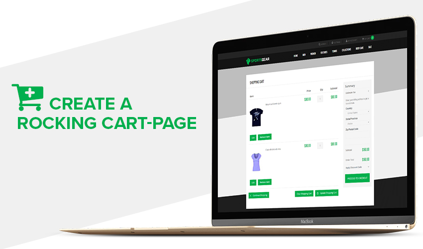
Create a Rocking Cart-page that Secures Your Conversion!
1. Provide mini shopping carts
A mini shopping cart, mini cart for short, is typically presented as a sidebar that appears once your customers add their first item to their cart. It shows the latest products they have added and gives them the option to either remove or change basic order descriptions such as the quantity. It lets your shoppers stay on the same page for a smooth shopping experience while confirming that their item has already been added to their list. But why is this important?
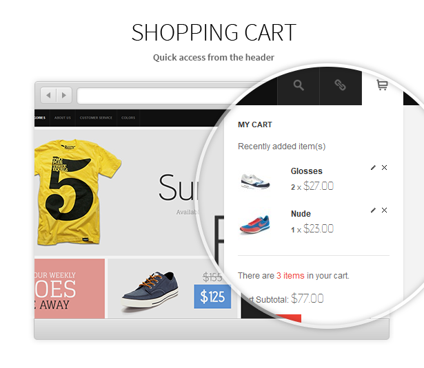
Handy Magento minicart -- A sample from JM Wall theme
Remember: the essence of online shopping is basically to promote ease of access for busy shoppers wherever they are in the globe. Your magento store must therefore be designed in line with this principle. Most shoppers, though, face the hassle of having two different pages -- one for browsing items, and another for their shopping cart page. This is basically the opposite of “ease of access.” If anything, it only creates a perfect online shopping hassle. Imagine yourself as a shopper caught in either one of these scenarios:
- You click the “add to cart” option and you are automatically brought to a whole new page with all your saved products. This then forces you to navigate back to where you were to continue your shopping experience. This happens every time you add a product to your cart.
- After clicking the “add to cart” option, you stay in the same page. However, you are not entirely sure if you have already added the item to your cart yet. To confirm, you open another tab for your shopping cart page to see whether your item is already saved. Not such a hassle? Imagine going on a traditional shopping in a grocery store but instead of being able to bring your cart as you go, your cart is stationed in one place and you’d have to keep running back to it every time you add an item.
Do not let your visitors go through any of these hassles because (1) you risk losing your chance of maximizing your conversions as your shoppers are likely to add only the necessary items to their cart, and (2) your competing online stores have most likely optimized their mini carts and they are bound to steal your loyal shoppers in no time.
TIP: Provide a link that easily directs your visitors from mini carts to full carts and vice-versa. Mini carts may be easy and convenient but they provide limited information. Hence, they are not designed to replace your full cart page.
2. Create scarcity and urgency prompt
Another good way to keep your customers from procrastinating in checking the product out is by promoting urgency. Whether a certain product is a need or simply a want of your customer, giving them the idea that the item may soon be beyond their purchasing capacity creates the feeling of urgency for purchase. CXL Institute revealed that their sales went up to a shocking 332% by simply using this technique. The logic behind it is the basic economic principle of supply and demand. The value of a product is amplified when your shoppers know it will not be forever available and that it could not wait on them until they make up their minds next century. Do not be afraid to provide a “low-stock indicator” and see the wonders as your conversion inflates.
3. Provide a progress bar
Among the major problems in the shopping cart page is the increasing amount of abandonment rates. These are the items that have already been picked by shoppers but did not make it past the checkout page. While we cannot totally control the decision of our customers, there may be specific steps to increase the probability of them converting. Making your progress update visible is one the most effective solutions.
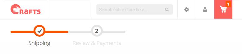
Magento 2 Standard Checkout
Do not wait for the checkout process to add a progress bar. Begin from your cart-page. Here are the two reasons to take on this strategy:
You create a goal
By showing their progress on the outset of their cart page, you create an implicit goal to your shoppers to finish the process until the checkout stage. This is backed by the psychological fact that when you lay out the definite steps before anyone, a part of our brain is impelled to finish the task as it promotes a sense of achievement at the end of the process.
Assurance
By letting your customers know where they are in the process, they feel assured that shopping in your Magento store won’t take much of their time. Remember that the reason for your adding a progress sheet is to give them the goal to purchase. Studies show that tracking their progress promotes a sense of commitment to the process.
TIP: Make sure your progress indicator has as few steps as possible. Limit this up to 3-4 steps. 5 is tolerable. 6? Don’t. Otherwise, you end up (1) scaring your shoppers with a long and complicated shopping experience (2) defeating the purpose of adding a progress bar and (3) you sabotage your conversions by escorting your abandoning shoppers out of your Magento store!
4. Create a design layout that slays!
Remember the three-second rule which is also known as the “blink test.” You have to design your shopping cart page in a way that would attract your shoppers instantly. Given the tight competition in the ecommerce industry, your visitors have seen enough of the cliche pages and have therefore drastically developed a short attention span for online stores. Your Magento store is not an exception. Hence, stand out by making your shopping cart page simple, striking, and effectively irresistible. Here is your checklist to consider:
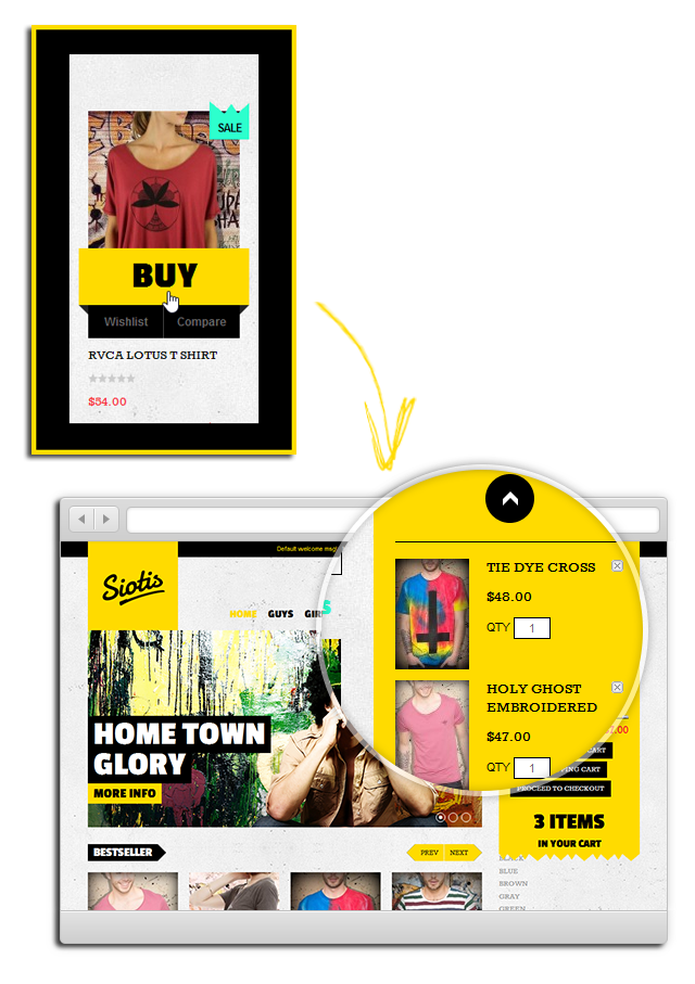
Auto-update shopping cart without reloading the page -- Magento QuickBuy in Siotis theme
Readable and easy to understand layout
Start with a prominent display of “check-out” or “add cart” button near your image. Limit the distraction in your page. Make sure your comments and product reviews do clutter in the same page as they deviate your customers’ attention. Use as less columns as possible, 3 or less to be precise.
Use high-quality images
This one should come as a no-brainer. However, high-quality image does not only mean a good colored, high definition photo of your product. As much as possible, you image must provide a visible description of your item. But how can you do so? What really constitutes a “high-quality” product image for an ecommerce store?
Blow up option
Providing an option to zoom in your products gives your visitors a more accurate expectation of what they are going to get which results to better chances of purchase.
Show supplementary items
Clothings worn by models are more likely to be sold online than the same items that hang on a rack. Whatever product you sell, accentuate your product images with supplementary items. This gives your shoppers a more realistic feel of the item they are getting which increases their likelihood of checking it out.
360-degree spin for product images
Putting more emphasis to detail and advanced use of technology pays your dividends. This is proven true by duematernity.com as they have reported a 27% increase of conversions by adding the 360-degree spin feature to their product images.
Click and drag cart
Enhance your website usability and shopping experience with click and drag cart interface. But what exactly does it do? It allows your customers the option to drag your items straight to their cart. They can also simply remove the item by dragging it out of the cart. So what’s something special about this feature compared to the traditional clicking option? Depending on your target demographic, having a drag and drop to cart option may provide a fun user experience to your playful shoppers. It adds more interaction and is obviously a lot more entertaining as they drag a product icon straight to their mini cart. By maximizing your use of graphics, you foster a better customer-client interaction.
TIP: Provide both the one-click and drag-and-drop options for your shoppers. It is also not a safe bet to completely eradicate the one-click option as a sizable number of shoppers would still prefer its simplicity.
5. Make a abandonment-proof cart page
Okay. So this may sound way over the top unrealistic. There is no such thing as abandonment-proof cart-page strategy. Your shoppers (not you) has the last say on their purchasing decisions, after all. But while we admit that there will always be reports of abandonment on your page, you still have the last say about the overall game. By using highly effective strategies, you can turn the 69.23% of your abandoning visitors into valued customers. Here are some quick tips:
Create a mobile-friendly cart page
Not just your cart page. In fact, it pays to make your entire Magento website smartphone and tablet compatible. Note that in United States alone, media time is as its peak on mobile phones at 51%. Unfortunately, 88% of these smartphone users admits to have had a negative shopping experience. By taking steps to optimize your mobile cart page, you create strong Magento game that secures your mobile conversions.
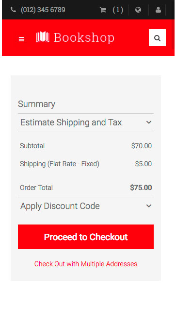
Mobile friendly cart -- UB Bookshop Magento 2 theme
Accept a plethora of payment options
And this goes rather personal to me. A few weeks ago, one of my cousins phoned me up asking for my credit card details just because the kicks he’s been eyeing for so long is finally on 70% off. The problem? He could not get past the checkout process because he does not have a mastercard or visa. As much as I trust my dear cousin, he phoned me up in the middle of my dinner with some friends in a pub and there’s no way I’m going to risk providing my details over the phone in a public area. He ended up not buying the kicks after all. While my heart bled out for him as soon as I realized that I could have just texted him the details instead, it got me thinking about the importance of providing a large list of payment options. Enough said. Just be creative with your payment methods: paypal, bank outlets, bitcoin. Show them all in your cart page!
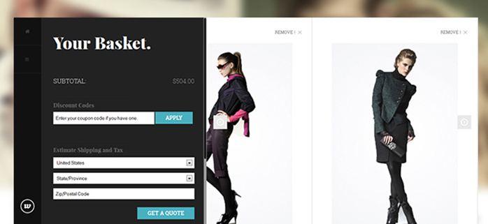
Provide a box for coupons and other deals
With the rise of websites dedicated to selling coupons and deals, your Magento store must learn to accommodate this trend. If you are able to process discounts and codes and maybe even provide for your own promotions, you give your customers the feeling of an economical shopping experience. Not only will they purchase your items now; they are also more likely to come back for their next online shopping transactions.
A custom Magento shopping cart
Make trust signals visible
Again, this should come as a no-brainer. The world wide web is infiltrated with countless fraudulent transaction lurking from corner to corner. This makes it a lot harder for less known ecommerce stores to advance in the game as they can easily be dismissed as among the many fraudulent websites. Hence, promote confidence in your visitor’s shopping experience as you lay your trust signals from the cart-page straight to your checkout page. Make them feel protected by making that padlock sign visible throughout the entire process.
Conclusion
Here’s a quick not so fun fact all online entrepreneurs have to consider: there is an average of 67.91% abandonment rate for typical shopping carts. This should give you a good reason to not set aside the optimization of your cart page if you haven’t done it already. True, just as the incubator metaphor at the outset, not all your shoppers will convert. But by following these steps to create a rocking Magento cart-page, you pave a larger way to accommodate more conversions!