Flexbox and CSS Grid are the most popular responsive layout models which are widely supported across platforms and browsers. Our upcoming UB Atoms theme will support by both Flexbox and CSS Grid by default. If Flexbox is disabled, the CSS Grid will be used.
In this post, we’ll take a closer at the Flexbox that UB Atoms does support and learn how it helps distribute and align content in ways that Magento pages need.
A brief introduction about Flexbox
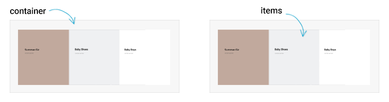
Flexbox -- a shorter term for CSS3 Flexible Box Layout -- is a new layout mode in CSS3. It describes ways to align and size elements including the parent element (the flex container) and the child elements (the flex items).
Flexbox layout lacks some of the properties (such as floats, columns) that are available in a 2-dimensional grid layout like CSS Grid. However, in return, flexbox gains simple and powerful tools that help you align elements horizontally and vertically (to the left, center, and right), size them according to their parent, and tell them how to fill a row.
Flexbox Grid options
UB Atoms theme takes advantage of flex display property to support a grid system that works across multiple devices. The flexbox in UB Atoms defines five pixel-based breakpoints for grid columns, which are shown in the following table:
| Extra-small (<480px) |
Small (<768px) |
Medium (>=768px) |
Large (>=1024px) |
Extra Large (>=1440px) |
|
|---|---|---|---|---|---|
| Suitable for | Phones | Phones | Tablets | Small Laptops | Laptops & Desktops |
| Max Container Width | None (auto) | None (auto) | 768px | 1024px | 1440px |
| Grid Behavior | Horizontal at all times | Horizontal at all times | Collapsed to start, horizontal above breakpoints | ||
| Class prefix | .col-xs- |
.col-s- |
.col-m- |
.col-l- |
.col-xl- |
| # of Columns | 12 | ||||
| Gutter Width (*) | 8px (4px on each side of a column) | 16px (8px on each side of a column) | 32px (16px on each side of a column) | ||
| Netstable | Yes | ||||
| Offsets | Yes | ||||
| Column Ordering | Yes | ||||
(*) Gutter widths are default values defined in UB Atoms. You can easily change these default values via UB Theme Helper.
Example: A flexible banner grid layout
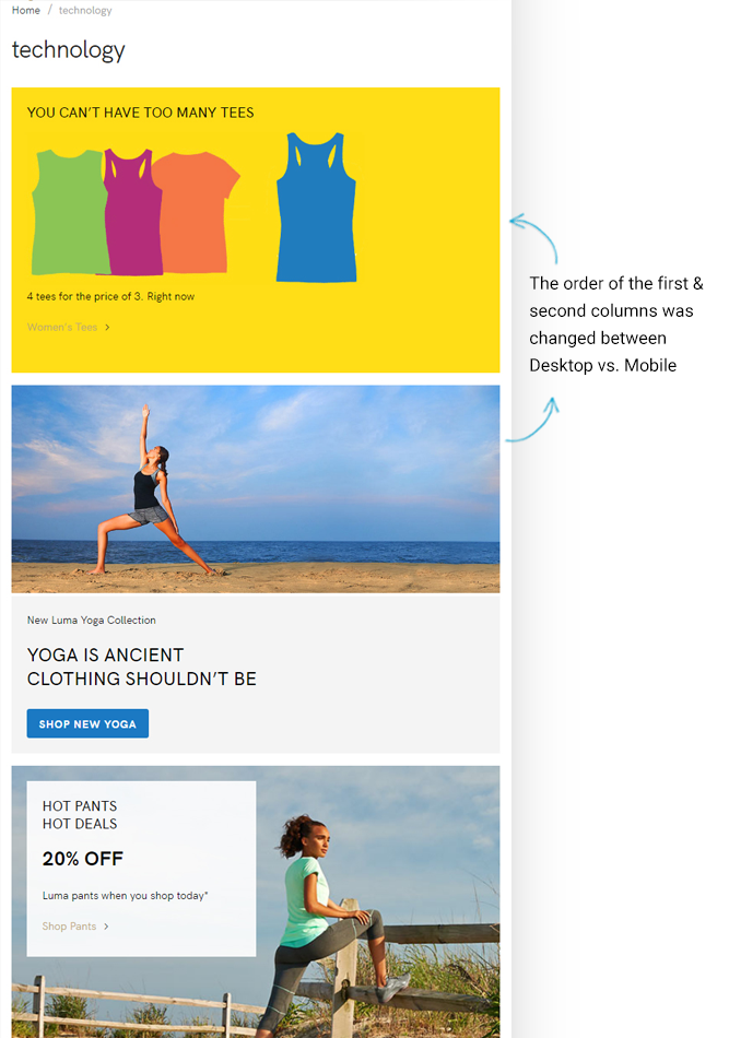
For demo purposes, our team re-created Magento’s default category page using Flexbox layout. Here’s the result we captured from our work-in-progress UB Atoms theme:
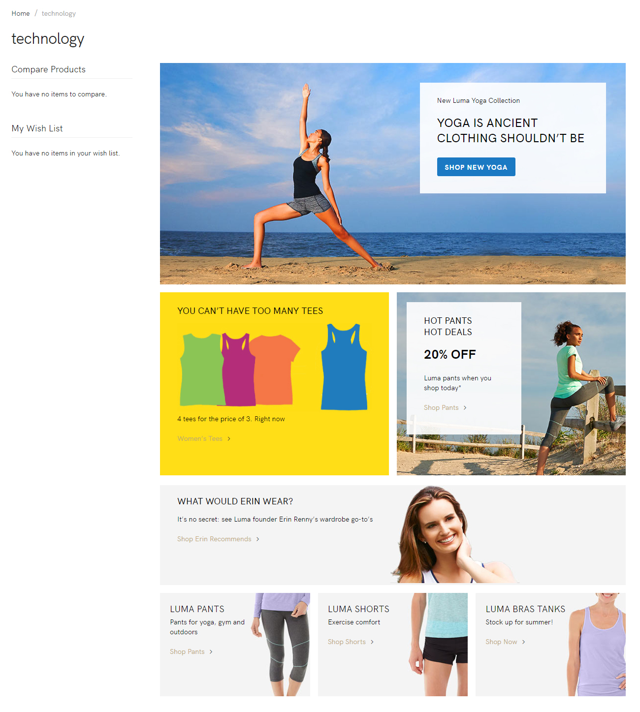
Sample category page using Flexbox
Here’s our HTML markup for the page above:
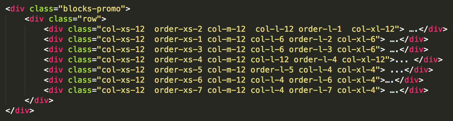
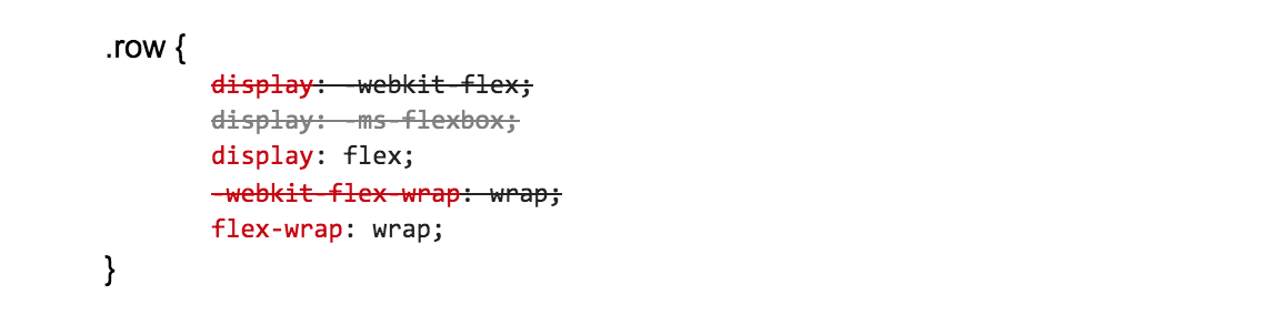
Notice that we’ve used the .row element which is by default a flex container. Here’s the associated CSS:
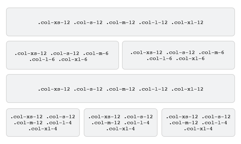
As can be seen, the above-mentioned Flexbox layout combined three tiers: Full width, single column; two equal columns; and three equal columns.
In this example, we even manipulated the order of the first and second columns depending on the viewport width. Here’s an example of the same layout on the mobile viewport:
More Flexbox use cases
The Flexbox grid system in UB Atoms supports five tiers of classes: xs and s (phones), m (tablets), l (desktops), and xl (larger desktops). You can use nearly any combination of these classes to create more dynamic and flexible layouts.
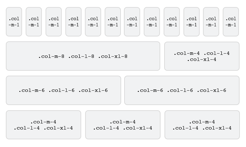
Stacked-to-horizontal with equal and un-equal columns
With Flexbox Grid in UB Atoms, you can create a basic grid system with dynamic column layouts using a combination of different classes for each tier. In the example below, your columns with .col-m-1 will simply stack on mobile devices while other columns go with three equal-width column layouts (with .col-m-4) or three unequal-width column layouts (with .col-m-8).
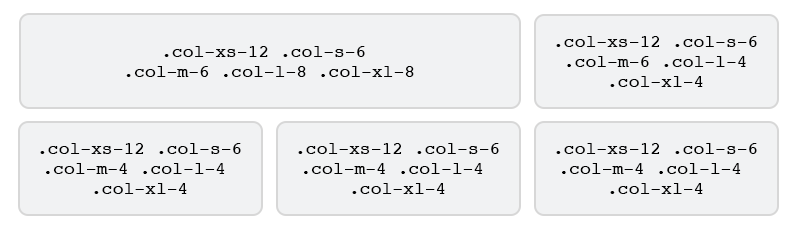
Combined: mobile, tablet, and desktop
Similar to the previous example, if you don’t want your columns to simply stack on mobile devices, you can use a set of .col-xs-* and .col-s-* classes as follows:
Column wrapping
Since Flexbox grid in UB Atoms uses a 12 column grid, it breaks after 12. So, if more than 12 columns are placed within a single row, each group of extra columns will, as one unit, wrap onto a new line.
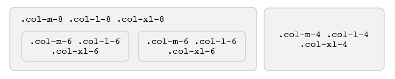
Nesting columns
You can nest columns once you have a flex container. To nest your content with the default grid, add a new .row and set of .col-m-* columns within an existing .col-m-* column. Nested rows should include a set of columns that add up to 12 or fewer.
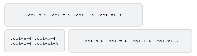
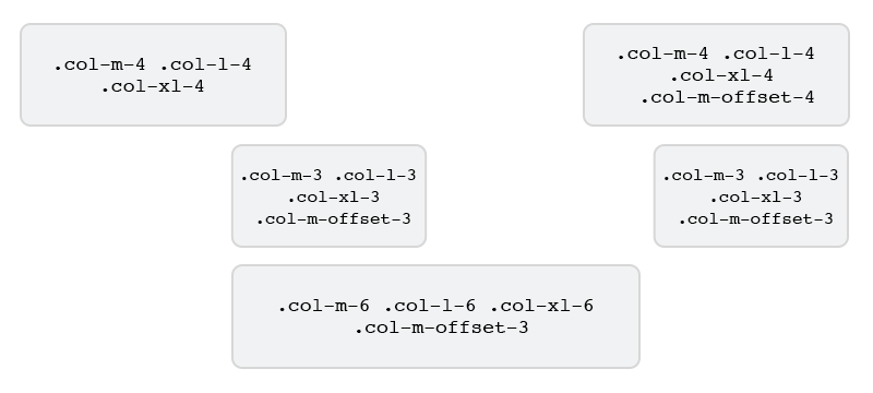
Offset
You can easily move columns to the right using .col-*-offset-* classes to create even more dynamic layouts. See the example below for a better idea of how it works.
Those are typical use cases of Flexbox Grid in UB Atoms.
If you disable Flexbox, CSS Grid will be used. In this case, you can use the features in CSS Grid like Column Ordering (with .col-*-push-, .col-*-pull-), Column Clearing…
Conclusion
In this overview article, we covered a few examples that take advantage of responsive flexbox utilities in our upcoming UB Atoms theme. I hope you enjoyed what we are building here.
If you have any questions, let me know in the comments below.
Useful links: