Generally speaking, an e-commerce site has a clear purpose: it needs to sell. Although there is no end-all be-all answer to this optimizing conversion, improving the navigation of your online stores can lead directly to increased sales.
After looking at several hundred Magento 2 sites, we realized that the best way to learn how you can improve your own store navigation in both looks and functionality is to see the real-life examples of how Magento 2 websites figure out a way to create a frictionless navigation experience.
That’s why we put together a collection of online stores built exclusively with Magento 2 and our UB Mega Menu module. It covers verticals such as sporting & recreation goods, luxury goods & jewelry, sports nutrition, and more.
Before exploring the showcase, let’s take a look at universal guidelines that provide a clear direction for what should be implemented for the main navigation.
A few basic rules of thumb when designing your main navigation
There are a number of user experience guidelines for an e-commerce website based on in-depth analytical research and user-testing. The universal rule applies: the simpler, the better. Having too many navigational options may easily intimidate customers.
Below we are sharing a few basic rules of thumb to use when designing your main navigation (also known as mega menus).
- Consolidate your categories as much as possible: Decide what is most important and which comes in the main navigation.
- Order initial main product categories by traffic volume. Order subcategories (if using) alphabetically.
- Be mindful of products that do not gain so much traffic or may need sales boost and put them together in one category instead of listing down all products, along with the category of high-selling ones.
- Keep menu options on a single page, use a dynamic menu or expanders that allow for better visual hierarchy.
- Always present the main navigation page in an orderly and systematic manner. The menu list is either short (e.g. up to 7) or is longer and has clear sections that help the target users understand quickly.
- Consolidated menu with hamburger and cart
- Post-sales actions like ‘Register’ and ‘Sign-in’ should be included above the fold in menu.
- Easy to move back or out of the menu.
- Include post-sales activities in the menu like customer service. If you have a physical store, include the store locator icon in the menu (or header). If calls are important, include click-to-call at the top of every page.
- Take advantage of a sticky menu: The sticky navigation gives the customer more confidence as they explore since the menu or bar itself is always visible, even when scrolling down.
Each Magento 2 site is built for a unique use-case, target audience, and has unique navigation needs that work best. These recommendations may work on one site and not on the other. For certainty though, these recommendations will go a long way to help improve site navigation.
UB Mega Menu showcase
1 -- Halfhitch
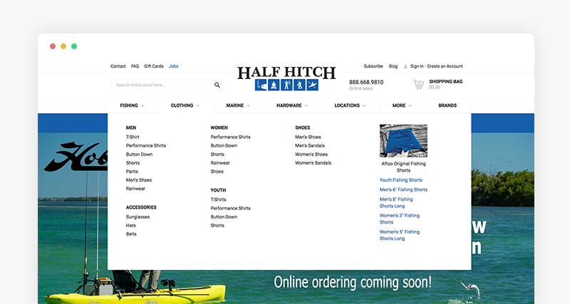
Halfhitch’s responsive accordion menu (learn more about how to set up Accordion menus here):
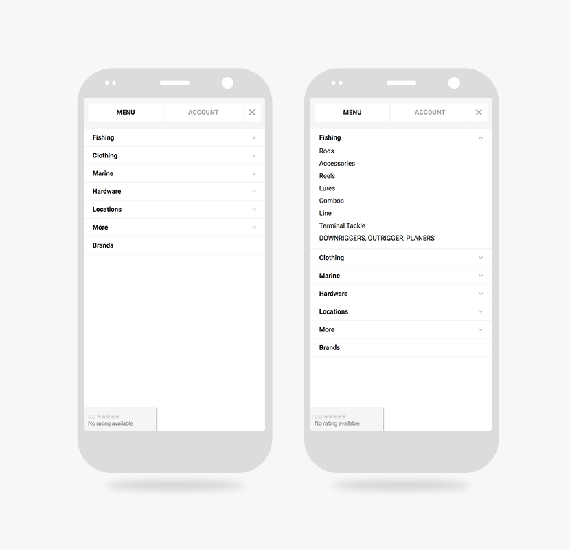
Halfhitch responsive accordion menu
2 -- Haardjesland (Agency: Gerrits e-commerce)
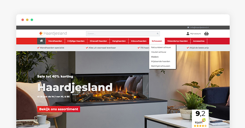
Haardjesland’s drilldown menu (learn more about how to set up Drilldown menus here):
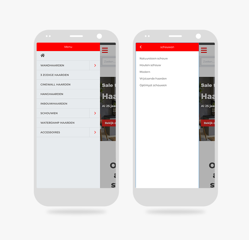
Haardjesland responsive accordion menu
3 -- Klundertmuziek (Agency: Gerrits e-commerce)
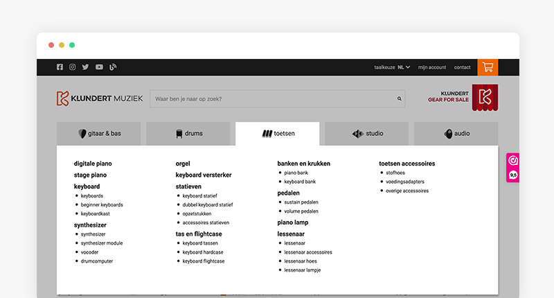
Klundertmuziek’s responsive drilldown menu (learn more about how to set up Drilldown menus here):
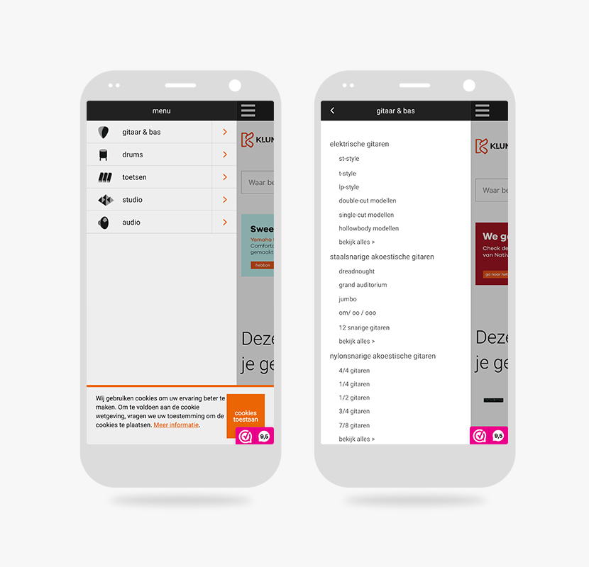
Klundertmuziek responsive accordion menu
4 -- Hamiltonjewelers
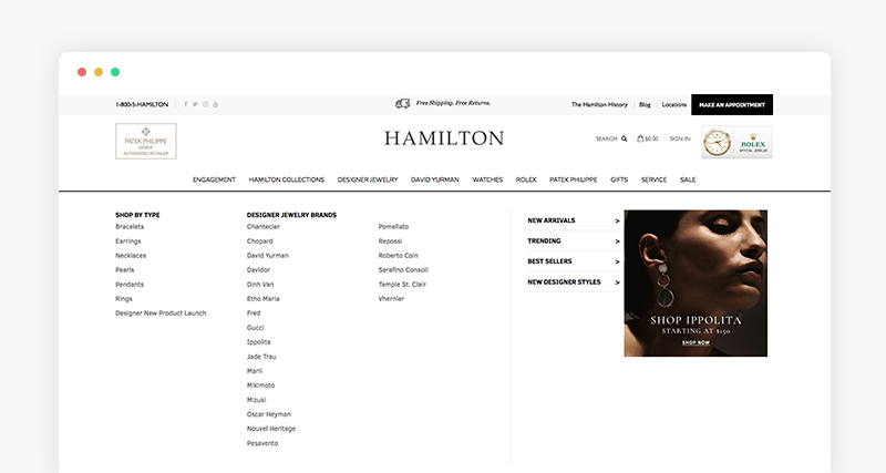
Hamiltonjewelers’s responsive accordion menu (learn more about how to set up Accordion menus here):
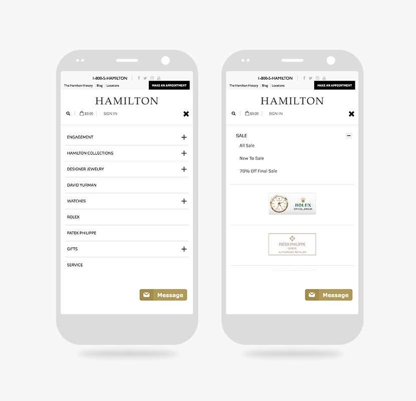
Hamiltonjewelers responsive accordion menu
https://www.hamiltonjewelers.com
5 -- Electromarket
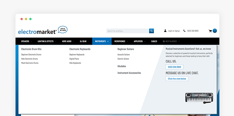
Electromarket’s responsive accordion menu (learn more about how to set up Accordion menus here):
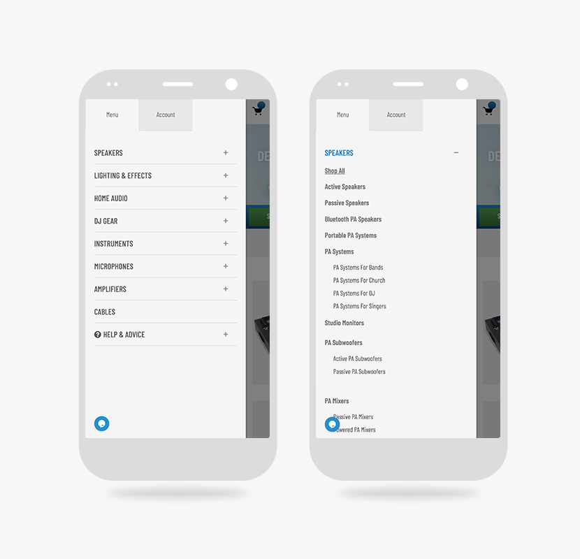
Electromarket’s responsive accordion menu
6- Eafit
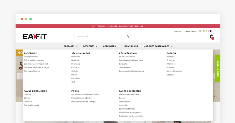
Eafit’s accordion menu (learn more about how to set up Accordion menus here):
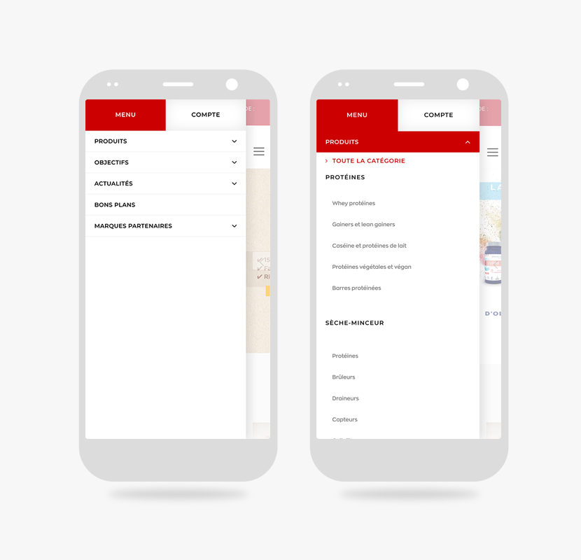
Eafit’s responsive accordion menu
Think your UB Mega Menu-based website or landing page should be featured in our showcase? Give it a shot!
