When it comes to the PWA Studio project, should we stick with the classic Hamburger Menus or switch to Tab Bars on mobile?
Even though there are a few alternatives for navigation on mobile, we’re going to lay out all the pros and cons of the hamburger menus and tab bars (bottom navigation) only. We hope it gives you evaluation criteria to find which one is right for your Magento PWA project.
Hamburger menu
The hamburger menus are often listed as #1 choice and become the go-to icon for traditional responsive eCommerce websites. The hamburger menu is the ‘3-bars’ icon on mobile that typically opens up into a side menu or navigation drawer.
However, from an app perspective, during a talk at the Worldwide Developers Conference in 2014, Mike Stern -- designer and Apple UX Evangelist -- was against using the hamburger menu for their apps, saying:
“Remember, the [two] key things about an intuitive navigation system is that they tell you where you are, and they show you where else you can go.”.
So, is the hamburger menu really effective and the best way to display your Magento PWA Studio project’s navigation? To answer this question, first, we need to dive into the effectiveness and usability of this UI element in mobile navigation.
Does it tell you where you are?
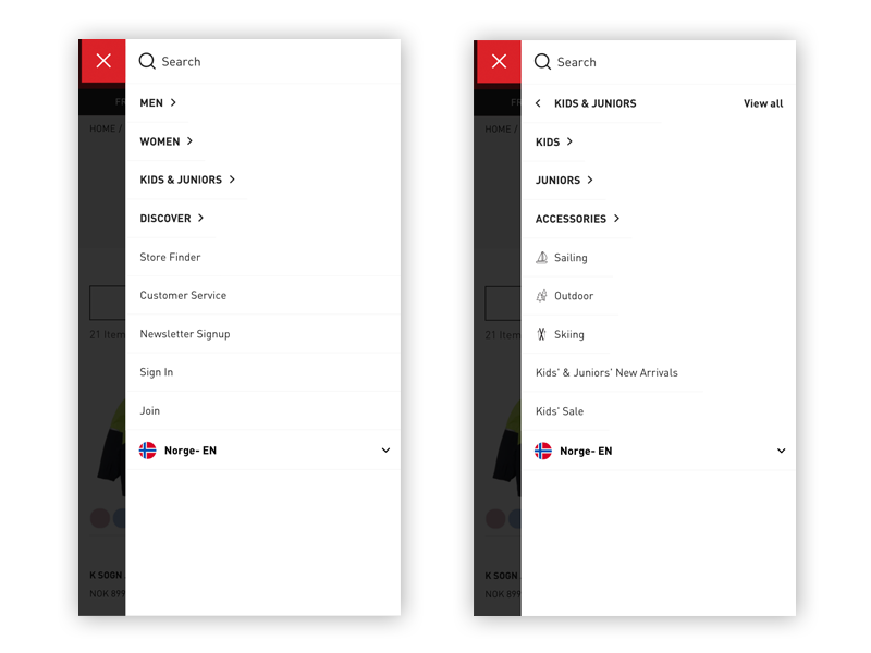
Let’s take a look at two Magento 2 sites www.omegawatches.com and www.hellyhansen.com on mobile:
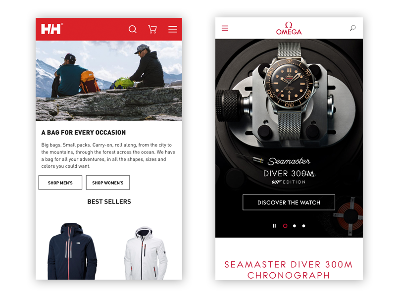
Samples of two Magento 2 sites https://www.omegawatches.com and https://www.hellyhansen.com on mobile
For both sites, it’s true that the whole menu is hidden on the screen, only the hamburger icon to display the menu is visible. Is it bad UX? It’s not all that bad if it’s done right.
From our experience with many Magento projects so far, we found that because the screen is smaller on mobile, people may be more familiar with the hamburger menu and more likely to notice it and use it despite a few usability downsides.
In addition, due to the small screen size, less content on mobile pages is visible above the fold, so people may tend to use a menu instead of scrolling through and exploring whether there is any content that matches their interest. That’s one of the good reasons that so many eCommerce websites out there are using the hamburger menu, especially ones with many levels of subcategories. Let’s take a closer look at how Made.com -- an online store for designer furniture and homeware -- organizes its consolidated hamburger menu:
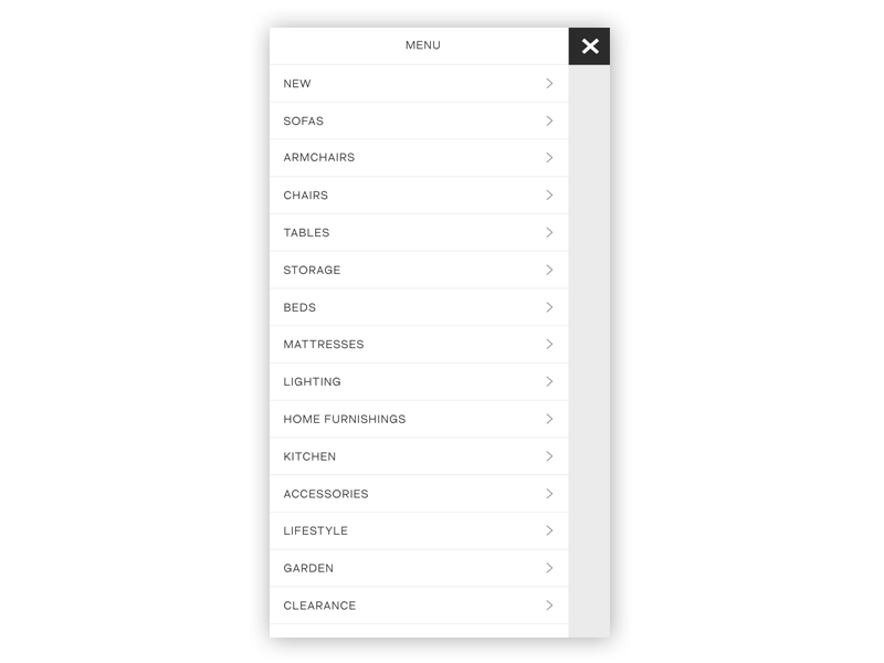
The clean hamburger menu helps Made.com get everything tucked away neatly
Takeaway: That said, hiding navigation under an expandable menu can be a necessity on small mobile devices.
Does it show you where else you can go?
In the first section of this article, we found that mobile users were significantly more likely to use the hamburger menu. After opening the menu, mobile users easily have a better preview of the content of the page and can be able to find the sub-navigation quickly, using a dynamic menu or expanders. For example, the Magento 2 site www.hellyhansen.com effectively showcases a consolidated menu option:
Menu level 1 & Menu level 2 of Hellyhansen.com on mobile
Even though it takes at least twice as many taps to change sections, the hamburger menu is a space-saving mechanism especially when screen space is a precious commodity on mobile.
Takeaway: Not clicking a menu on a mobile device can simply reflect that users perceived something else to be a better choice, and not necessarily that they did not notice or recognize the hamburger menu.
Any downsides should you notice?
Like other mobile navigation patterns, the hamburger menu is not 100% perfect. While taking advantage of this menu pattern for a new Magento PWA project, we cannot ignore a few downsides:
- Poor display of sections (Content discoverability): For many eCommerce websites that have fairly complex information architectures, with many levels of categories, presenting these subcategories on mobile devices is not always straightforward. In turn, it affects content discoverability.
- Navigational buttons at the top of the screen (not the best touch zone): they are hard to reach on one-handed use which might lead to the low click rates (You can learn more about this downside here)
How the Thumb Zones change when you shift your grip? (By Scott Hurff)
Takeaway: Menu navigation is an integral part of any eCommerce websites and it’s important to create well-thought-out solutions based on your clients’ needs. Here are a few notes to take away for your next Magento PWA Studio project:
- Create a consolidated menu with a hamburger and cart (with recognizable icons).
- Keep the menu on one page, use a dynamic menu or expanders that allows for better visual hierarchy.
- Include key CTAs (Search, Store Locator, Phone icons… depending on your specific context) above the fold on the menu. Also include post-sales actions like ‘Register’ and ‘Signin’ in the menu.
- Organize the main product categories sorted by traffic volume. For subcategories, organize alphabetically.
Tab Bars (Bottom Navigation)
Another strong contender for mobile navigation of a Magento PWA project is tab bars which are common on iOS apps (also known as Bottom navigation on Android apps).
For native mobile apps, the tab bar has become a go-to-solution for long that seems to be the best solution of intuitive mobile navigation. The tab bar typically shows a user three things:
- Where am I? (active tab highlighting)
- Where else can I go? (other tabs)
- What will I find when I get there? (icons and descriptive labels)

Tab bar of https://charmingchick.com
Actually, we see many e-commerce stores started adopting the tab bars (bottom navigation menus) due to one of its biggest advantage -- the bottom navigation provides an incredibly simple way to instantly see the main site sections from any page. The website does not overload your users with choices.
The mobile version of the Charmingchick.com website above provides a good example of a tabbed menu that can appear and disappear dynamically upon scrolling. This case tells us a few things:
- Such bottom navigation makes all key menu items visible and available with one tap. Thus, navigation is obvious and much cleaner.
- Navigational buttons at the bottom of the screen -- the best touch zone on one-handed use.
- The fact that the tab bar can be hidden upon scrolling helps to overcome a known problem of tab bars in the old days -- a user doesn’t know his / her current location as soon as he/she navigates to a child-view (because the child-view overlays the entire screen including the tab bar).
As you can see, when implemented correctly the tab bar (bottom navigation) is a powerful navigation element indeed.
So, are the tab bars the new hamburger menus for Magento PWA projects on mobile design?
We know every store is different, so the answer might vary. Like the hamburger menus, the tab bar is simple and clear but is not suitable for all projects.
Takeaway: Tab bar works well if you have a limited number of destinations in the bottom navigation (usually three to five top-level destinations at most). Putting too many tabs in a tab bar can make it physically difficult for people to tap the one they want.
Conclusion notes
The use of the hamburger menu or tab bars (bottom navigation) on mobile is a powerful metaphor that contributes towards improving usability when done right. While they share similar plus points, it is often challenging due to the limited screen real estate and very easy to get them wrong.
Great navigation of a Magento PWA project project on mobile is one that helps users know where they are and show where else you can explore further in the most efficient way possible. The easier your navigation is for them to use, the more likely they’ll be to use it.