When selecting a category when on a Iphone 4 for example, the page is overwhelmed with a single extra large product image.
Is there anywhere in the code I can go in and make this image a little smaller?
8 answers
Hi Tswec,
I am sorry for not getting your points. It would be awesome if you can possibly include URL of your site and a screenshot with detailed explanation. I am happy to help you out.
Best Regards,
Ziven.
Hello,
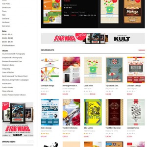
I am sorry. When you select a category when say on a iphone 4 or 5 for example the products appear in a single row and are extra large. I have attached a screenshot . I would like to decrease the image size a little.
http://media.benedictpress.com/images/screenshot_Mobile.jpg
Thank you
Hi Sir,
Please stay FTP in here. i will help you resolve,
Best Regards,
Ziven.
Hi Tswec,
Please go to the file: skin\frontend\default\jm_book\css\layout-mobile.css end the file add below the code:
.category-products .product-image img,
.products-grid .product-image img {
 width: auto;
}

.products-grid li.item .product-image a {
 display: inline-block;
}
Best Regards,
Ziven.
Hello,
I would like the category view to display in mobile like our new releases show on the home page. Is that possible, because the category view image is just too large on mobile devices and the above code doesn’t work.
Thank you!
Hi Tswec,
Now it working fine. I’m changed it for you. i’m changed the file: /public_html/skin/frontend/default/jm_book/css/layout-mobile.css
Best Regards,
Ziven.
Thank you so much for the fix! That worked!
This question is now closed

