Mago
NOTE: We’ve developed a native UB Mago theme for Magento 2. Check out the userguide for UB Mago here.
I. Installation
Mago is fully responsive and supports Off-canvas menu for collapsed screen devices.There are two ways to install a UberTheme Magento theme like Mago:
- General Installation: Applicable if you have installed a Magento base on your server before.
- Quickstart Installation: Applicable if you want to get a whole new site as per Demo.
Decide which way to follow. Once downloaded, unzip the package of Mago to get the following folders:
- mage_ext: contains all built-in extensions of the theme.
- mage_tpl: contains the theme files only.
- quickstart: a full Magento CMS version with Mago already integrated to match the demo.
- source: contains all source files of the theme.
Provided that you have installed the Magento base already, General Installation will help you adapt Mago and its extensions with your current site.
Note: Your store must be ready before the installation. If not, get it done quickly by following the Magento Installation Guide. See also the following docs for general installations and configurations.
Extension basetheme is required to be installed before installing the other extensions and theme.
For more details, please check the documentation of the specific extension here.
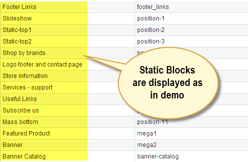
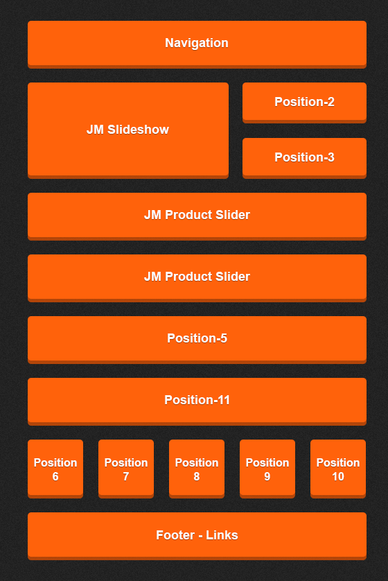
II. Static Blocks
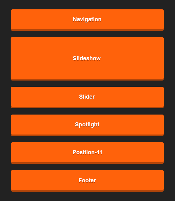
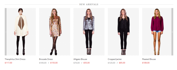
The Mago front-page uses 14 static blocks on Theme:
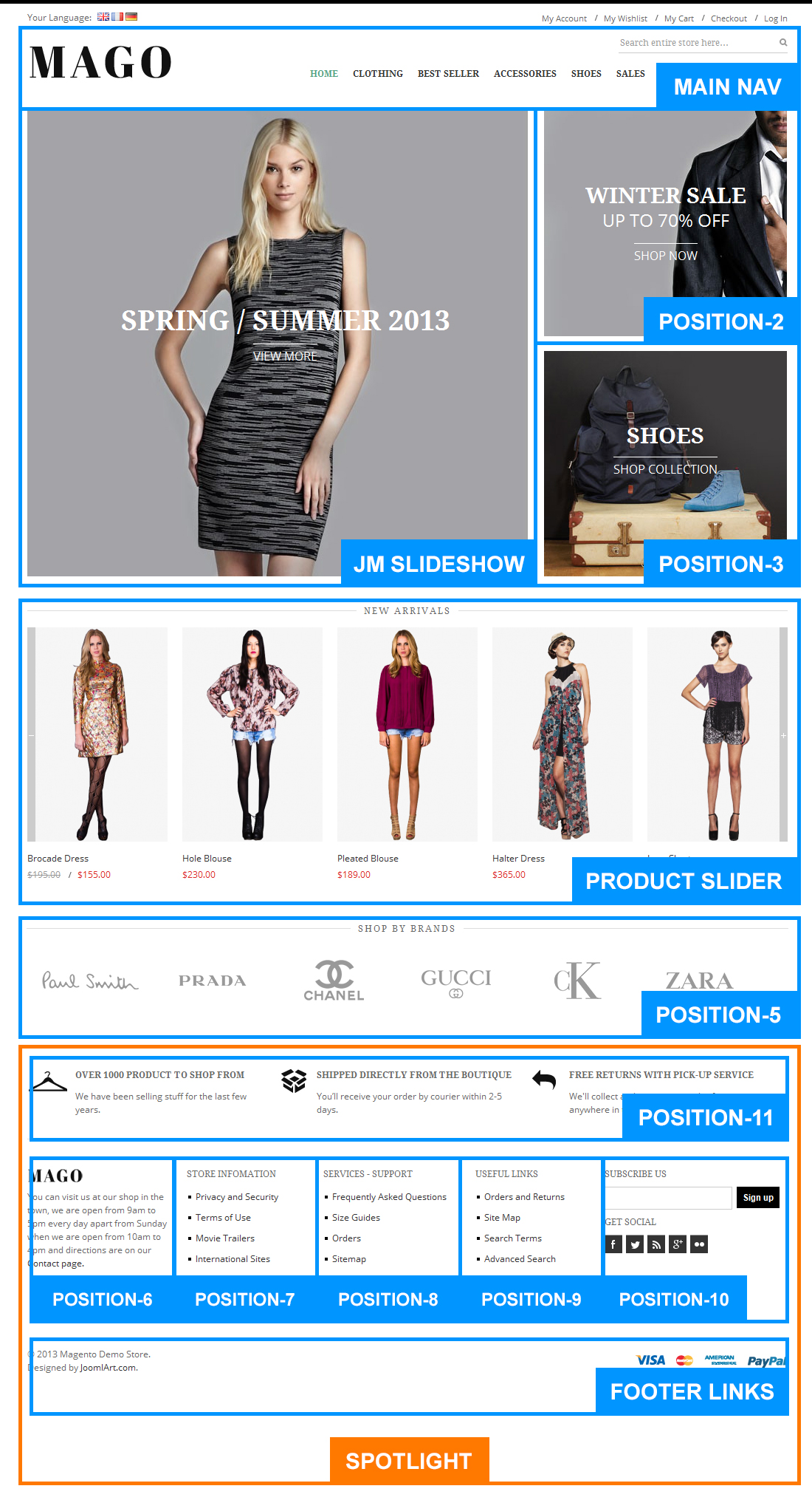
Static Blocks list
To create these blocks, go to CMS >> Static Block >> and select page that you want to display this block on (e.g: Home page):
You can add a new block by click on Add New Block button to create new block and input the content of this block as you need. Please see
>How to create New Static Block.
Position-2:
<div class=" static-top bg-static-1"><a href="#"> <span class="text-title"> Winter SALE </span> <span class="sub-text-title"> up to 70% OFF </span> {{widget type="cms/widget_page_link" anchor_text="Shop Now" title="Shop Now" template="cms/widget/link/link_block.phtml" page_id="9"}} </a></div>

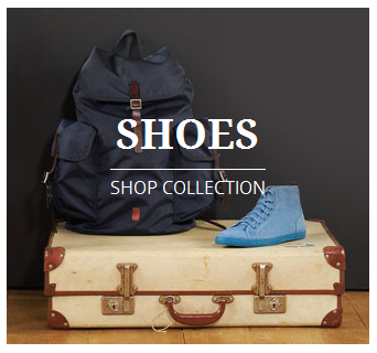
Position-3:
<div class=" static-top bg-static-2"><a href="#"> <span class="text-title"> SHOES </span> {{widget type="cms/widget_page_link" anchor_text="Shop Now" title="Shop Now" template="cms/widget/link/link_block.phtml" page_id="9"}} </a></div>
Position-5:
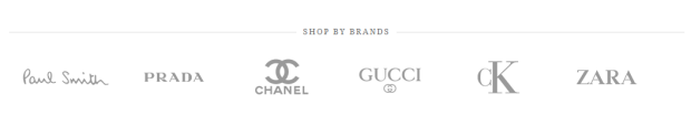
<div class="block">
<div class="block-title"><strong> <span> SHOP BY BRANDS </span> </strong></div>
<div class="block-content"><a class="shop-paulsmith" href="#"> <span> Paul Smith </span> </a> <a class="shop-prada" href="#"> <span> Prada </span> </a> <a class="shop-channel" href="#"> <span> Channel </span> </a> <a class="shop-gucci" href="#"> <span> Gucci</span> </a> <a class="shop-ck" href="#"> <span> CK </span> </a> <a class="shop-zara" href="#"> <span> Zara </span> </a></div>
</div>
Postion-6:
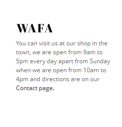
<div class=" col-1"> <div class="block block-list"> <div class="block-title"><strong> <span>   </span> </strong></div> <div class="block-content">You can visit us at our shop in the town, we are open from 9am to 5pm every day apart from Sunday when we are open from 10am to 4pm and directions are on our <a href="#">Contact page.</a></div> </div> </div>
Postion-7:
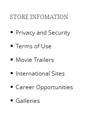
<div class=" col-2">
<div class="block block-list">
<div class="block-title"><strong> <span>Store infomation</span> </strong></div>
<div class="block-content"><ol>
<li><a title="Privacy and Security" href="#">Privacy and Security</a></li>
<li><a title="Terms of Use" href="#">Terms of Use</a></li>
<li><a title="Movie Trailers" href="#">Movie Trailers</a></li>
<li><a title="International Sites" href="#">International Sites</a></li>
<li><a title="Career Opportunities" href="#">Career Opportunities</a></li>
<li><a title="Galleries" href="#">Galleries</a></li>
</ol></div>
</div>
</div>
Postion-8:
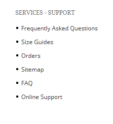
<div class=" col-3">
<div class="block block-list">
<div class="block-title"><strong> <span>Services - support</span> </strong></div>
<div class="block-content"><ol>
<li><a title="Frequently Asked Questions" href="#">Frequently Asked Questions</a></li>
<li><a title="Size Guides" href="#">Size Guides</a></li>
<li><a title="Orders" href="#">Orders</a></li>
<li><a title="Sitemap" href="#">Sitemap</a></li>
<li><a title="FAQ" href="#">FAQ</a></li>
<li><a title="Online Support" href="#">Online Support</a></li>
</ol></div>
</div>
</div>
Postion-9:
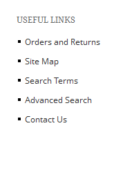
<div class=" col-4">
<div class="block block-list">
<div class="block-title"><strong> <span>Useful Links</span> </strong></div>
<div class="block-content"><ol>
<li><a title="Orders and Returns" href="{{config path='web/unsecure/base_url'}}sales/guest/form/">Orders and Returns</a></li>
<li><a title="Site Map" href="{{config path='web/unsecure/base_url'}}catalog/seo_sitemap/category/">Site Map</a></li>
<li><a title="Search Terms" href="{{config path='web/unsecure/base_url'}}catalogsearch/term/popular/">Search Terms</a></li>
<li><a title="Advanced Search" href="{{config path='web/unsecure/base_url'}}catalogsearch/advanced/">Advanced Search</a></li>
<li><a title="Contact" href="{{config path='web/unsecure/base_url'}}contacts/">Contact Us</a></li>
</ol></div>
</div>
</div>
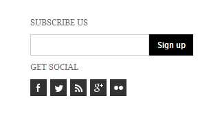
Postion-10:
<div class=" col-5">{{block type="newsletter/subscribe" name="left.newsletter" template="newsletter/subscribe.phtml" }}
<div class="block block-list">
<div class="block-title"><strong> <span>Get social </span> </strong></div>
<div class="block-content">
<ul>
<li><a class="facebook"> <span> Facebook </span> </a></li>
<li><a class="tiwter"> <span> Tiwter </span> </a></li>
<li><a class="rss"> <span>Rss </span> </a></li>
<li><a class="google"> <span> Google </span> </a></li>
<li><a class="flickr"> <span> Flickr </span> </a></li>
</ul>
</div>
</div>
</div>
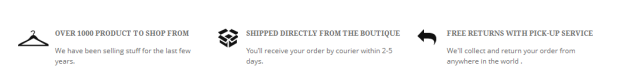
Postion-11:
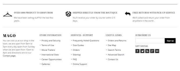
<div class="col-wide">
<div class="block ">
<div class="block-content">
<ul>
<li>
<div class="mass-block bg-s1"><span class="text-title"> <strong> OVER 1000 product TO SHOP FROM </strong></span> <span class="sub-text-title">We have been selling stuff for the last few years. </span></div>
</li>
<li>
<div class="mass-block bg-s2"><span class="text-title"><strong>SHIPPED DIRECTLY FROM THE BOUTIQUE</strong> </span> <span class="sub-text-title">You’ll receive your order by courier within 2-5 days.</span></div>
</li>
<li>
<div class="mass-block bg-s3"><span class="text-title"><strong>FREE RETURNS WITH PICK-UP SERVICE</strong></span> <span class="sub-text-title"> We'll collect and return your order from anywhere in the world .</span></div>
</li>
</ul>
</div>
</div>
</div>
Footer_links:
<p><a class="visa" title="Visa" href="#"> <span> Visa </span> </a> <a class="masstercart" title="masstercart" href="#"><span> Masster Cart </span> </a> <a class="express" title="express" href="#"><span> American Express </span> </a> <a class="paypal" title="paypal" href="#"><span> Paypal </span> </a></p>

Mega2: Banner:
<div class="block"><a title="" href="#"><img src="{{media url="wysiwyg/banner1.jpg"}}" alt="" /></a></div>

III. Extensions Configuration
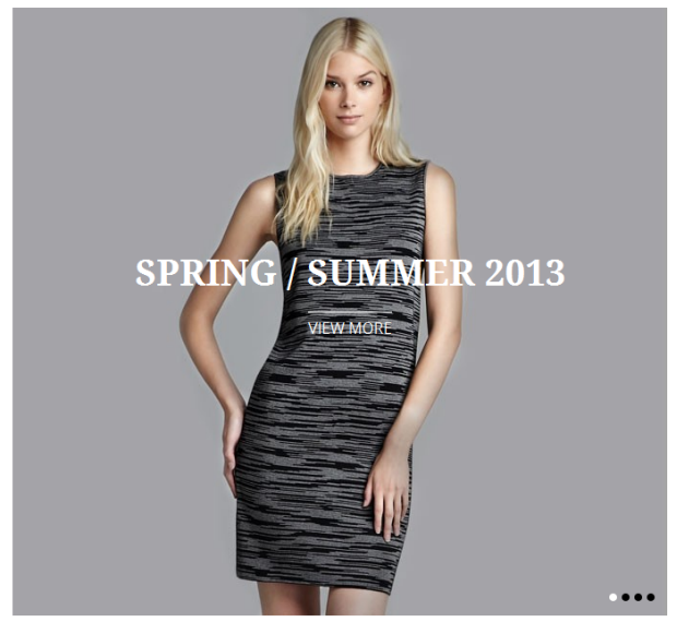
Slideshow Module
Navigate to System>JoomlArt>SlideShow and configure the default criteria as Backend Settings as is on Demo
Description for each item
[desc img="1.jpg" url="#"]
<h3>SPRING / summer 2013</h3>
[/desc]

[desc img="2.jpg" url="#"]
<h3>SPRING / summer 2013</h3>
[/desc]

[desc img="3.jpg" url="#"]
<h3>SPRING / summer 2013</h3>
[/desc]

[desc img="4.jpg" url="#"]
<h3>SPRING / summer 2013</h3>
[/desc]
Now you need to create a static block named Position-1. Backend Settings as is on Demo.
In the content of block Position-1, put this code:
<div class=" ja-topsl_left">{{block type="joomlart_jmslideshow/list" name="jmslideshow" template="joomlart/jmslideshow
To push this extension onto front page on top, go to CMS > Pages >> Homepage >> In Design tab, please fill in Layout Update XML parameter as below :
<reference name="topsl">
                    <block type="cms/block" name="position-1">
                        <action method="setBlockId"><block_id>position-1</block_id></action>
                    </block>


                </reference>
For more detail, please check the documentation of the module.
Product Slider Module
Navigate to System>JoomlArt>Products Slider to enable extension
Backend Settings as is on Demo
To push this module onto front page on top, you need to create a block named mega1, please fill in parameter as below :
{{block type="joomlart_jmproductsslider/list" name="home.jmproductsslider" template="joomlart/jmproductsslider/list.phtml" }}
For more detail, please check the documentation of the module.
Product Module
Navigate to System>JoomlArt>Products to enable extension
Backend Settings as is on Demo
To push this module onto front page on top, you need to create a block named mega1, please fill in parameter as below :
{{block type="joomlart_jmproducts/list" name="home.jmproducts.list" template="joomlart/jmproducts/oneproduct.phtml" quanlity="1" title="" catsid="10" max="0" }}
For more detail, please check the documentation of the module.
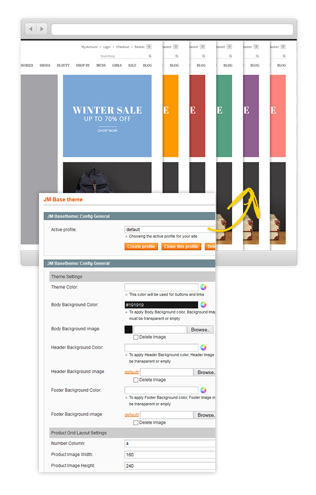
Base Theme Module
Navigate to System>JoomlArt>Base Theme Backend Settings as is on Demo
Base theme Admin settings allow user to customized unlimited color
Mega Menu Module
Navigate to System>JoomlArt>Mega Menu Backend Settings as is on Demo
For more detail, please check the documentation of the module.
Spotlight Module
Navigate to System>Configuration>Spotlight Backend Settings as is on Demo
IV. Menu Configuration
Mago site uses Mega Menu. Follow the guide below to create menu.
To add menu items, please navigate backend >> Mega Menu >> Manage Menu Item
4.1 Home Menu
Front-end appreance

Backend-settings:
- Item: Home Backend settings
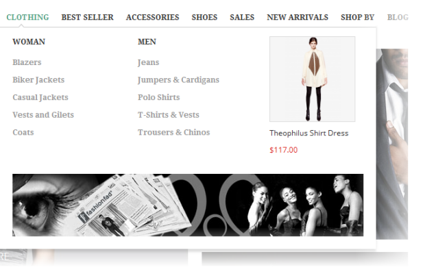
4.2 Clothing Menu
Front-end appreance
Backend-settings:
- Item 1: Clothing Backend settings
- Item 2: Women Backend settings
- Item 3: Blazers Backend settings
- Item 4: Men Backend settings
- Item 5: Jeans Backend settings
- Item 6: Mega Module Backend settings
- Item 7: Banner Backend settings
4.3 Best Seller Menu
Front-end appreance

Backend-settings:
- Item: Best Seller Backend settings
Other menu items have similar settings with items above.
V. Manage Page
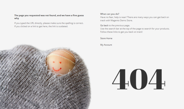
404 Not Found page
To config this page, please navigate to CMS >> Pages, then select 404 Not Found 1 page to update the settings as below:
Paste the code below on Content field:
<div id="jm-error">
<div class="left">
<div class="page-head-alt">
<h3>The page you requested was not found, and we have a fine guess why</h3>
</div>
<ul class="disc">
<li>If you typed the URL directly, please make sure the spelling is correct.</li>
<li>If you clicked on a link to get here, the link is outdated.</li>
</ul>
</div>
<div class="right"><dl><dt>What can you do?</dt><dd>Have no fear, help is near! There are many ways you can get back on track with Magento Demo Store.</dd><dd>
<ul class="disc">
<li><a onclick="history.go(-1);" href="#">Go back</a> to the previous page.</li>
<li>Use the search bar at the top of the page to search for your products.</li>
<li>Follow these links to get you back on track!<a style="margin-right: 20px;" href="{{store url=""}}">Store Home</a> <a href="{{store url="customer/account"}}">My Account</a></li>
</ul>
</dd></dl></div>
</div>
Front-end Appearance
VI. Responsive Design
Mago Magento theme is a Responsive design Magento theme, which allows Mago displayed beautifully on various screen sizes and devices (mobiles and tablets)
1. Supported Layouts
All the style files supported layouts are located in the folder: skin/frontend/default/jm_mago/css
In this particular theme, we support 3 styles: layout in desktop, tablet & mobile (for the Magento default theme only. Will be upgraded in the next version) .
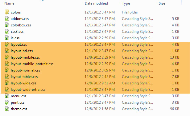
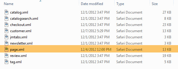
Have the style files in hand, modification for the files will need to be defined in the page.xml file located in: app/design/frontend/default/jm_mago/layout
Open file layout.xml
At the tag in this file, add this code:
<action method="addCss"><stylesheet>css/layout-mobile.css</stylesheet><params>media="only screen and (max-width:719px)"</params></action>
                <action method="addCss"><stylesheet>css/layout-mobile-portrait.css</stylesheet><params>media="only screen and (max-width:479px)"</params></action>
                <action method="addCss"><stylesheet>css/layout-tablet.css</stylesheet><params>media="only screen and (min-width:720px) and (max-width: 985px)"</params></action>
                <action method="addCss"><stylesheet>css/layout-normal.css</stylesheet><params>media="only screen and (min-width:986px) and (max-width: 1235px)"</params></action>
                <action method="addCss"><stylesheet>css/layout-wide.css</stylesheet><params>media="only screen and (min-width:1236px) and (max-width: 1585px)"</params></action>
                <action method="addCss"><stylesheet>css/layout-wide-extra.css</stylesheet><params>media="only screen and (min-width:1586px) and (max-width: 1890px)"</params></action>
                <action method="addCss"><stylesheet>css/layout-hd.css</stylesheet><params>media="only screen and (min-width:1891px)"</params></action>
- When the screen width is somewhere between 479 and 1891 pixel, the themes will load the layout-tablet.css file to display as the default style file.
- When the screen width is smaller than 479 pixel, the theme will loads the layout-mobile.css file to display as the default style file.
- Otherwise, the theme will load the layout.css file to display as its default style file. The layout.css file is the style file for desktop.
2. How to define Responsive
In summary, the base of responsive is column.
- The layout on desktop uses 1 column, the width size of layout is 100% --> width size of each column = 50%. Hence, whenever the screen width in pixel is changed, the width of each column in pixel will also get changed accordingly.
- Tablet Layout uses 1 column, each column width is 50%.
- Mobile Layout uses 1 columns, each column width is 100%.
2.1 Layout in demo
Desktop and Tablet Layout
Mobile Layout