Wall
I. Installation
Wall is fully responsive and supports Off-canvas menu for collapsed screen devices. There are two ways to install a UberTheme Magento theme like Wall:
- General Installation: Applicable if you have installed a Magento base on your server before.
- Quickstart Installation: Applicable if you want to get a whole new site as per Demo.
Decide which way to follow. Once downloaded, unzip the package of Wall to get the following folders:
- mage_ext: contains all built-in extensions of the theme.
- mage_tpl: contains the theme files only.
- quickstart: a full Magento CMS version with Wall already integrated to match the demo.
- source: contains all source files of the theme.
Provided that you have installed the Magento base already, General Installation will help you adapt Wall and its extensions with your current site.
Note: Your store must be ready before the installation. If not, get it done quickly by following the Magento Installation Guide. See also the following docs for general installations and configurations.
For more details, please check the documentation of the specific extension here.
II. Static Blocks
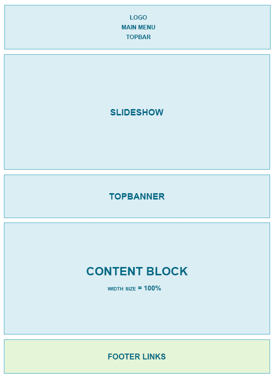
The Wall front-page uses 4 static blocks on Theme:
Static Blocks list
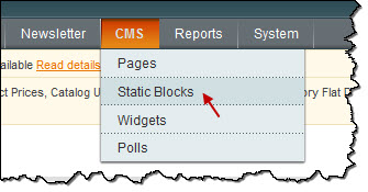
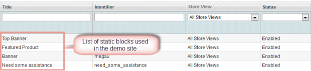
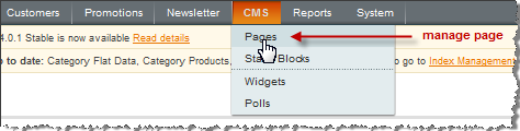
To create these blocks, go to CMS >> Static Block >> and select page that you want to display this block on (e.g: Home page):
List of static blocks
To add a new block, see the guide here.
Topbanner:
<div class="block block-banner">
<div class="block-content">
<ul class="clearfix">
<li class="banner first"><a href="#"><img src="{{media url="wysiwyg/banner4.jpg"}}" alt="" /></a></li>
<li class="banner"><a href="#"><img src="{{media url="wysiwyg/banner2.jpg"}}" alt="" /></a></li>
<li class="banner last"><a href="#"><img src="{{media url="wysiwyg/banner3.jpg"}}" alt="" /></a></li>
</ul>
</div>
</div>

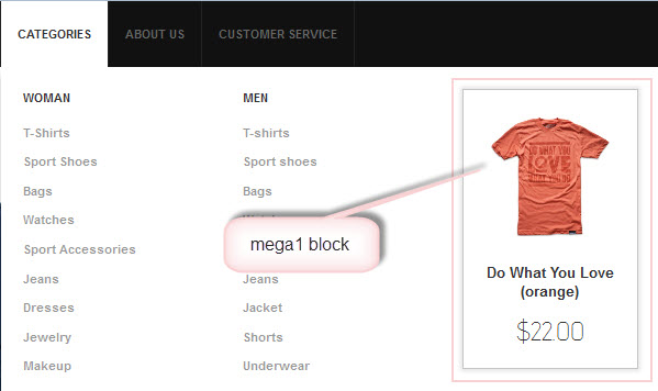
Mega1 -- Feature Product:
This block is displayed at the Mega Menu Extension of Wall
<p>{{block type="joomlart_jmproducts/list" name="home.jmproducts.list" template="joomlart/jmproducts/oneproduct.phtml" quanlity="1" title="" catsid="23" max="0" }}</p>
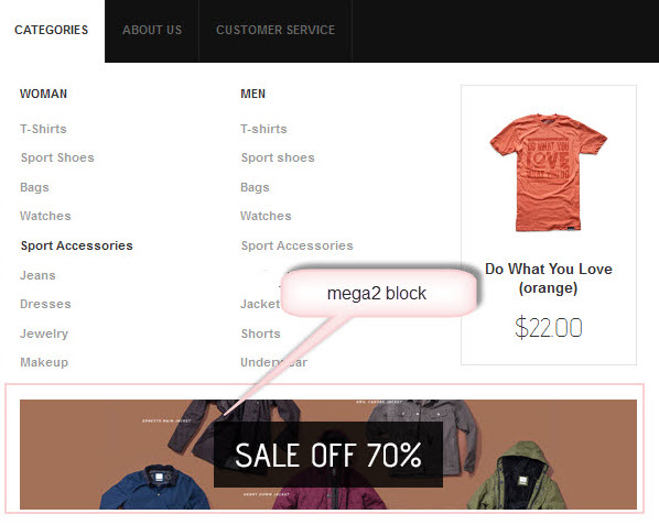
Mega2- Banner:
<div class="block"><a title="" href="#"><img src="{{media url="wysiwyg/banner1.jpg"}}" alt="" /></a></div>
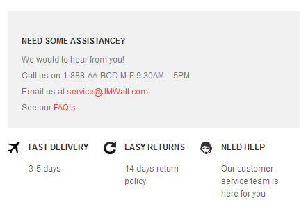
Need_some_assistance -- Need some assistance:
<div class="need_some_assistance">
<div class="inner clearfix">
<h2>Need some assistance?</h2>
<p>We would to hear from you!</p>
<p>Call us on 1-888-AA-BCD M-F 9:30AM – 5PM</p>
<p>Email us at <a title="" href="#">[email protected]</a></p>
<p>See our <a title="" href="#">FAQ’s</a></p>
</div>
<ul class="clearfix">
<li class="fast-delivery">
<h2>Fast Delivery</h2>
<p>3-5 days</p>
</li>
<li class="easy-returns">
<h2>Easy returns</h2>
<p>14 days return policy</p>
</li>
<li class="need-help">
<h2>Need Help</h2>
<p>Our customer service team is here for you</p>
</li>
</ul>
</div>
III. Extensions Configuration
Product Module
To push this extension into front page like our demo site, go to CMS >> Pages:
Then click on Homepage >> Design Tab and fill parameter with syntax below:
<reference name="content">
   <block  type="joomlart_jmproducts/list"  name="home.jmproducts.list"  template="joomlart/jmproducts/list.phtml"  >
               <block type="catalog/product_list_toolbar" name="product_list_toolbar" template="catalog/product/list/toolbar.phtml">
                  <block type="page/html_pager" name="product_list_toolbar_pager"/>
               </block>
        <action method="setToolbarBlockName"><name>product_list_toolbar</name></action>
   </block>
</reference>
Navigate to System >> Configuration >> Products and configure default criteria as per screen-short below for Product List:
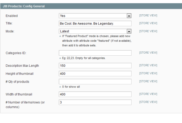
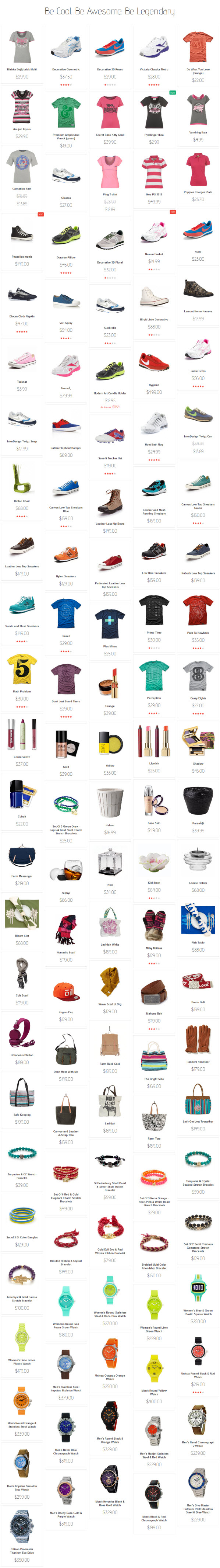
Front-end Appearance
Front-end Appearance
For more detail, please check the documentation of the module.
Slideshow Module
Navigate to System>Configuration>SlideShow and configure default criteria as per screen-short below:
Extension Settings:
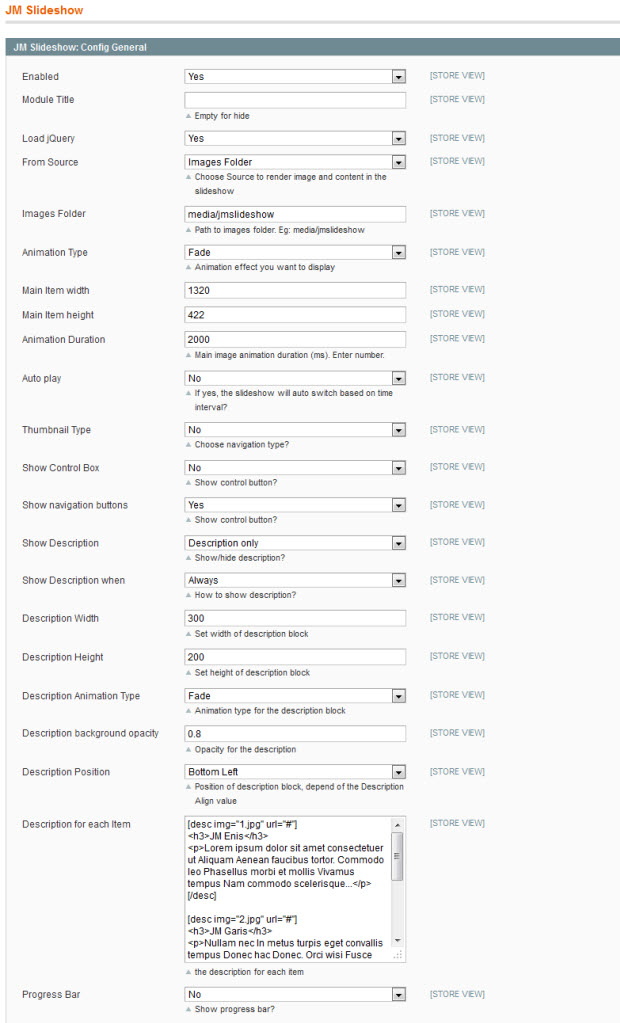 Slideshow Back-end

Description for each item
[desc img="1.jpg" url="#"]
<h3>Enis</h3>
<p>Lorem ipsum dolor sit amet consectetuer ut Aliquam Aenean faucibus tortor. Commodo leo Phasellus morbi et mollis Vivamus tempus Nam commodo scelerisque...</p>
[/desc]

[desc img="2.jpg" url="#"]
<h3>Garis</h3>
<p>Nullam nec In metus turpis eget convallis tempus Donec hac Donec. Orci wisi Fusce consectetuer quis sem et est dui...</p>
[/desc]

[desc img="3.jpg" url="#"]
<h3>Bistro</h3>
<p>At et id justo accumsan Donec a odio nibh id et. Quisque nunc nibh sit pretium turpis eget sed non Proin non. Justo id pede Vestibulum ornare Phasellus egestas.</p>
[/desc]
To push this extension onto front page on top, go to CMS > Pages >> Homepage >> In Design tab, please fill in Layout Update XML parameter as below :
<reference name="mass-top">
    <block type="joomlart_jmslideshow/list" name="jmslideshow" template="joomlart/jmslideshow/list.phtml" />
</reference>

For more detail, please check the documentation of the module.
Mega Menu Module
Wall site uses Mega Menu. Follow the guide below to create menu.
To add menu items, please navigate backend >> Mega Menu >> Manage Menu Item
1. Categories Menu
Front-end appreance
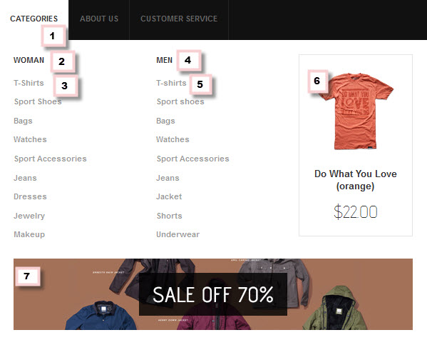
Backend-settings:
Main Menu Items (parent & child)
- Item 1: Categories
- Item 2: Woman
- Item 3: T-Shirts
- Item 4: Men
- Item 5: T-Shirts
- Item 6: Mega Extension
- Item 7: Banner
2. About Us Menu
Front-end appreance

3. Customer Service Menu
Front-end appreance

IV. Manage Page
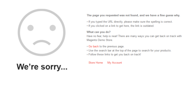
1. 404 Not Found page
To config this page, please navigate to CMS >> Pages, then select 404 Not Found 1 page to update the settings as below:
Paste the code below on Content field:
<div id="jm-error"><dl><dt>The page you requested was not found, and we have a fine guess why.</dt><dd>
<ul class="disc">
<li>If you typed the URL directly, please make sure the spelling is correct.</li>
<li>If you clicked on a link to get here, the link is outdated.</li>
</ul>
</dd></dl><dl><dt>What can you do?</dt><dd>Have no fear, help is near! There are many ways you can get back on track with Magento Demo Store.</dd><dd>
<ul class="disc">
<li><a onclick="history.go(-1);" href="#">Go back</a> to the previous page.</li>
<li>Use the search bar at the top of the page to search for your products.</li>
<li>Follow these links to get you back on track!<a style="margin-right: 20px;" href="{{store url=""}}">Store Home</a><a href="{{store url="customer/account"}}">My Account</a></li>
</ul>
</dd></dl></div>
Front-end Appearance
V. Responsive Design
We are proud to tell that Wall theme for Magento supports Responsive design. Meanwhile, this theme will fit screens of various devices (mobiles and tablets)
1. Supported Layouts
To config this page, please navigate to CMS >> Pages, then select 404 Not Found 1 page to update the settings as below:
All the style files supported layouts are located in the folder: skin/frontend/default/jm_wall/css
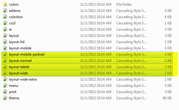
When you have style files, we need to define it in the page.xml file located in: app/design/frontend/default/jm_wall/layout
Open file layout.xml
At the tag in this file, add this code:
<action method="addCss"><stylesheet>css/layout-mobile.css</stylesheet><params>media="only screen and (max-width:719px)"</params></action>
                <action method="addCss"><stylesheet>css/layout-mobile-portrait.css</stylesheet><params>media="only screen and (max-width:479px)"</params></action>
                <action method="addCss"><stylesheet>css/layout-tablet.css</stylesheet><params>media="only screen and (min-width:720px) and (max-width: 985px)"</params></action>
                <action method="addCss"><stylesheet>css/layout-normal.css</stylesheet><params>media="only screen and (min-width:986px) and (max-width: 1235px)"</params></action>
                <action method="addCss"><stylesheet>css/layout-wide.css</stylesheet><params>media="only screen and (min-width:1236px) and (max-width: 1585px)"</params></action>
                <action method="addCss"><stylesheet>css/layout-wide-extra.css</stylesheet><params>media="only screen and (min-width:1586px) and (max-width: 1890px)"</params></action>
                <action method="addCss"><stylesheet>css/layout-hd.css</stylesheet><params>media="only screen and (min-width:1891px)"</params></action>
- As can be seen, when the screen width is between 479 and 1891 pixel, the themes loads file layout-tablet.css to display as the default style file.
- When the screen width is smaller than 479 pixel, the theme loads file layout-mobile.css to display as the default style file.
- Otherwise, the theme will load the file layout.css to display as its default style file. The layout.css file is the style file for PC.
2. How to define Responsive
In summary, the base of responsive is column.
- The layout in PC uses 1 columns, the width size of layout is 100% --> width size of each column = 50%. Then every time screen width in pixel changes, the width of each column in pixel is also changes.
- Tablet Layout uses 1columns, each column width is 50%.
- Mobile Layout uses 1 columns, each column width is 100%.
2.1 Layout in demo
Layout in demo