Siotis
I. Installation
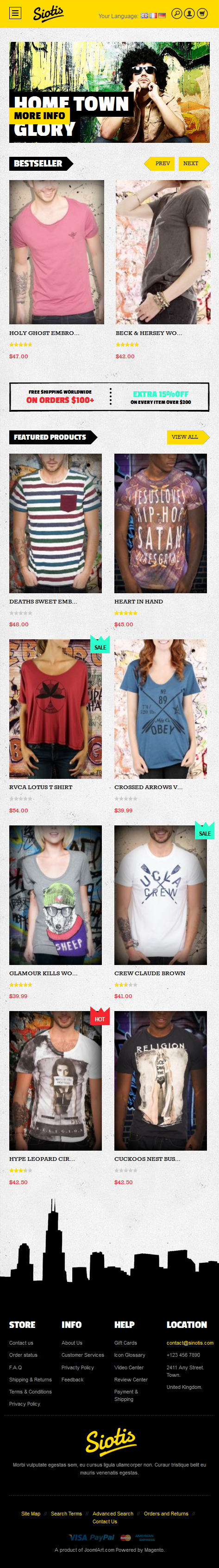
So you are about to install our responsive Magento theme Siotis -- the professional Magento fashion theme for eCommerce Magento stores. The theme is packed up with 7 complementary Magento extensions including Product, Slideshow, Mega Menu, BaseTheme, Product Slider, Masshead and Ajax Cart. Siotis is fully responsive and supports Off-canvas menu for collapsed screen devices.
There are two ways to install a UberTheme Magento theme like Siotis:
- General Installation: Applicable if you have installed a Magento base on your server before.
- Quickstart Installation: Applicable if you want to get a whole new site as per Demo.
Decide which way to follow. Once downloaded, unzip the package of Siotis to get the following folders:
- mage_ext: contains all built-in extensions of the theme.
- mage_tpl: contains the theme files only.
- quickstart: a full Magento CMS version with Siotis already integrated to match the demo.
- source: contains all source files of the theme.
Provided that you have installed the Magento base already, General Installation will help you adapt Siotis and its extensions with your current site.
Note: Your store must be ready before the installation. If not, get it done quickly by following the Magento Installation Guide. See also the following docs for general installations and configurations.
Extension basetheme is required to be installed before installing the other extensions and theme.
For more details, please check the documentation of the specific extension here.
II. Static Blocks
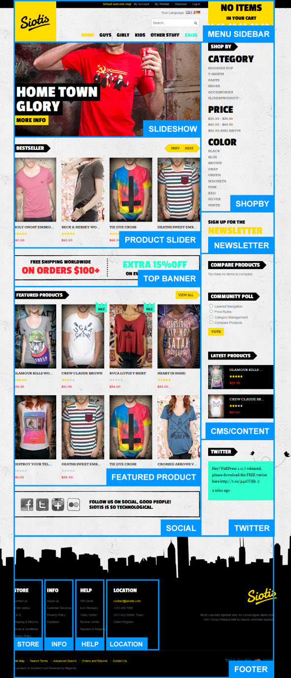
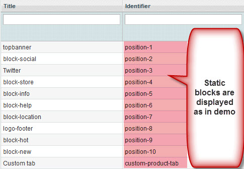
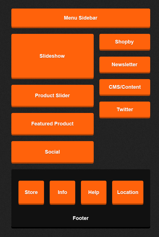
The Siotis front-page uses 11 static blocks on Theme:
To create these blocks, go to CMS >> Static Block >> select page that you want to display this block on e.g. Homepage.
To add a new block, click on Add New Block button and input the content for it.
Position-1: topbanner
<div class="block top-banner">
<ul>
<li class="left-text"><span class="text1">Free shipping worldwide </span>  <span class="text2">on orders $100+ </span></li>
<li class="right-text"><span class="text3"> Extra 15%0ff</span> <span class="text1"> On every item over $200</span></li>
</ul>
</div>

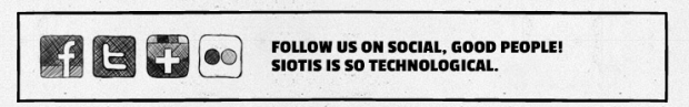
Position-2:block-social
<div class=" block-social">
<div class="left-icon">
<ul>
<li><a class="facebook"> <span> Facebook </span> </a></li>
<li><a class="tiwter"> <span> Tiwter </span> </a></li>
<li><a class="google"> <span> Google </span> </a></li>
<li><a class="flickr"> <span> Flickr </span> </a></li>
</ul>
</div>
<div class="right-text">Follow us on social, good people!  Siotis is so technological.</div>
</div>
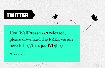
Position-3: Twitter
<div class="block block-twitter">
<div class="block-title"><strong> <span>twitter</span> </strong></div>
<div class="block-content">
<div class="bg-image"> </div>
<div class="div-nd">
<p>Hey! WallPress 1.0.7 released, please download the FREE verion here //t.co/p4zIYDjh :)</p>
<p><a href="#"> 2 mins ago </a></p>
</div>
</div>
</div>
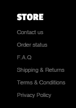
Postion-4: store
<div class=" col-1"> <div class="block block-list"> <div class="block-title"><strong> <span>store</span> </strong></div> <div class="block-content"><ol> <li><a title="Contact us" href="#">Contact us</a></li> <li><a title="Order status" href="#">Order status</a></li> <li><a title="F.A.Q" href="#">F.A.Q</a></li> <li><a title="Shipping & Returns" href="#">Shipping & Returns</a></li> <li><a title="Terms & Conditions" href="#">Terms & Conditions</a></li> <li><a title="Privacy Policy" href="#">Privacy Policy</a></li> </ol></div> </div> </div>
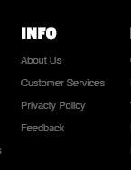
Position-5: info
<div class=" col-2">
<div class="block block-list">
<div class="block-title"><strong> <span>info</span> </strong></div>
<div class="block-content"><ol>
<li><a title="About Us" href="#">About Us</a></li>
<li><a title="Customer Services" href="#">Customer Services</a></li>
<li><a title="Privacty Policy" href="#">Privacty Policy</a></li>
<li><a title="Feedback" href="#">Feedback</a></li>
</ol></div>
</div>
</div>
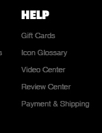
Position-6: help
<div class=" col-3"> <div class="block block-list"> <div class="block-title"><strong> <span>help</span> </strong></div> <div class="block-content"><ol> <li><a title="Gift Cards" href="#">Gift Cards</a></li> <li><a title="Icon Glossary" href="#">Icon Glossary</a></li> <li><a title="Video Center" href="#">Video Center</a></li> <li><a title="Review Center" href="#">Review Center</a></li> <li><a title="Payment & Shipping" href="#">Payment & Shipping</a></li> </ol></div> </div> </div>
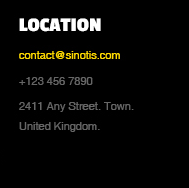
Position-7: location
<div class=" col-4">
<div class="block block-list">
<div class="block-title"><strong> <span>location</span> </strong></div>
<div class="block-content"><ol>
<li><a href="#"> [email protected] </a></li>
<li>+123 456 7890</li>
<li>2411 Any Street. Town.</li>
<li>United Kingdom.</li>
</ol></div>
</div>
</div>
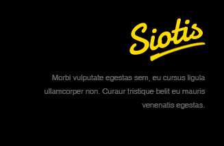
Position-8: logo-footer
<div class="col-wide">
<div class="block">
<div class="block-content">Morbi vulputate egestas sem, eu cursus ligula ullamcorper non. Curaur tristique belit eu mauris venenatis egestas.</div>
</div>
</div>
Position-9: block-new
<div>{{block type="joomlart_jmproducts/list" name="mega.jmproducts.list" template="joomlart/jmproducts/oneproduct.phtml" quanlity="1" title="" productsid="179,186" max="0" height="240" width="160" }}</div>
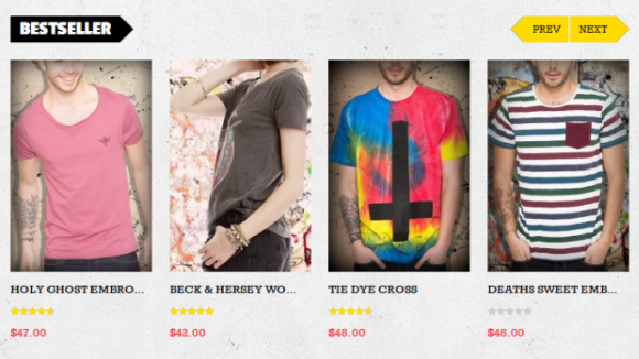
Position-10: block-hot
<div>{{block type="joomlart_jmproducts/list" name="mega.jmproducts.list" template="joomlart/jmproducts/oneproduct.phtml" quanlity="1" title="" productsid="175" max="0" height="240" width="160" }}</div>
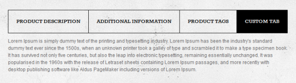
Custom-product-tab:
<p>Lorem Ipsum is simply dummy text of the printing and typesetting industry. Lorem Ipsum has been the industry's standard dummy text ever since the 1500s, when an unknown printer took a galley of type and scrambled it to make a type specimen book. It has survived not only five centuries, but also the leap into electronic typesetting, remaining essentially unchanged. It was popularised in the 1960s with the release of Letraset sheets containing Lorem Ipsum passages, and more recently with desktop publishing software like Aldus PageMaker including versions of Lorem Ipsum.</p>
To this custom tab display in frontend, go to Manage Products. There’s a {Custom tab} at {General} tab.
Back-end Settings to add custom tab as is on Demo.
Enter identifier of{Custom Tab Product} block to call it at product details page.
III. Extensions Configuration
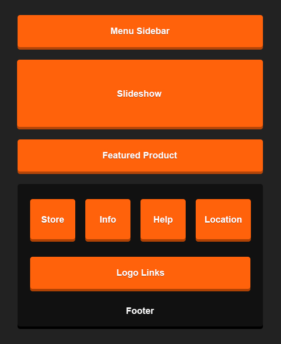
Slideshow Module
Navigate to JoomlArt >> SlideShow and configure the default criteria as Backend Settings as is on Demo.
Description for each item:
[desc img="1.jpg" url="#"]
<h3><strong> Home Town Glory </strong></h3>
[/desc]

[desc img="2.jpg" url="#"]
<h3><strong> Home Town Glory </strong></h3>
[/desc]

[desc img="3.jpg" url="#"]
<h3><strong> Home Town Glory </strong></h3>
[/desc]
To get this extension to show onto the front page at the up top position, go to CMS >> Pages >> Homepage >> In Design tab, please fill in Layout Update XML parameter as below :
<reference name="mass-top">
<block type="joomlart_jmslideshow/list" name="jmslideshow" template="joomlart/jmslideshow/list.phtml" />
</reference>

For more detail, please check the documentation of the module.
Product Slider Module
Navigate to JoomlArt >> Product Slider. Backend Settings as is on Demo.
To call this extension onto the front page at the up top position, go to CMS >> Pages >> Homepage >> In Content tab, please fill in Layout Update XML parameter -between tag as below:
<block type="joomlart_jmproductsslider/list" name="jmproductsslider" template="joomlart/jmproductsslider/list.phtml" />
For more detail, please check the documentation of the module.
Product Module
Navigate to JoomlArt >> Product to enable extension. Configure the Backend Settings as Demo.
To call this module onto front page on top, create a block named mega1, please fill in parameter as below.
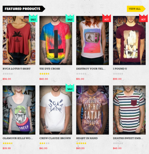
Products Extension will be called at Homepage as Featured Products, at Product Listing page and Latest Products List page.
For more detail, please check the documentation of the module.
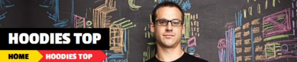
Masshead Module
Navigate to JoomlArt >> Masshead to enable extension. Configure the Backend Settings as on Demo.
This extension can be used at any position of a page. In this theme, it’s being used at the header of the categories page. To add this extension, go to CMS >> Static Block >> then select the page that you would like to display it on. Configure the Backend Settings as on Demo.
To call this module onto front page on top, at Custom Design tab please fill in Layout Update XML parameter as below.
<reference name="mass-top1">
<block type="joomlart_jmmasshead/core" name="jmmasshead"  >
<action method="setData"><name>title</name><value>Hoodies Top</value></action>
<action method="setData"><name>background</name><value>images/media/banner-catalog.jpg</value></action>
</block>
For more detail, please check the documentation of the module.
For more detail, please check the documentation of the module.
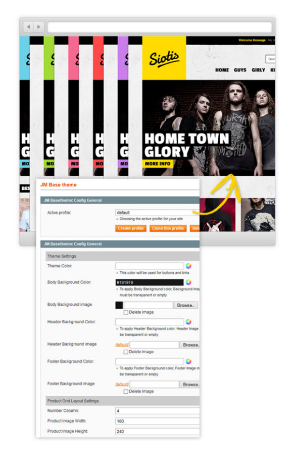
BaseTheme Module
Navigate to JoomlArt >> BaseTheme. Configure the Backend Settings as on Demo.
For more detail, please check the documentation of the module.
For more detail, please check the documentation of the module.
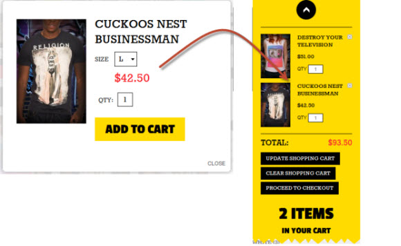
Ajax Cart Module
Navigate to System >> Configuration >> Ajax Cart. Configure the Backend Settings as on Demo.
Mega Menu Module
Navigate to System >> Configuration >> Mega Menu. Configure theBackend Settings as on Demo.
Label Configuration
To label any products, follow these steps.
Step 1: At Theme Settings, select “Yes” value to enable Labelling function.
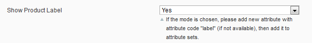
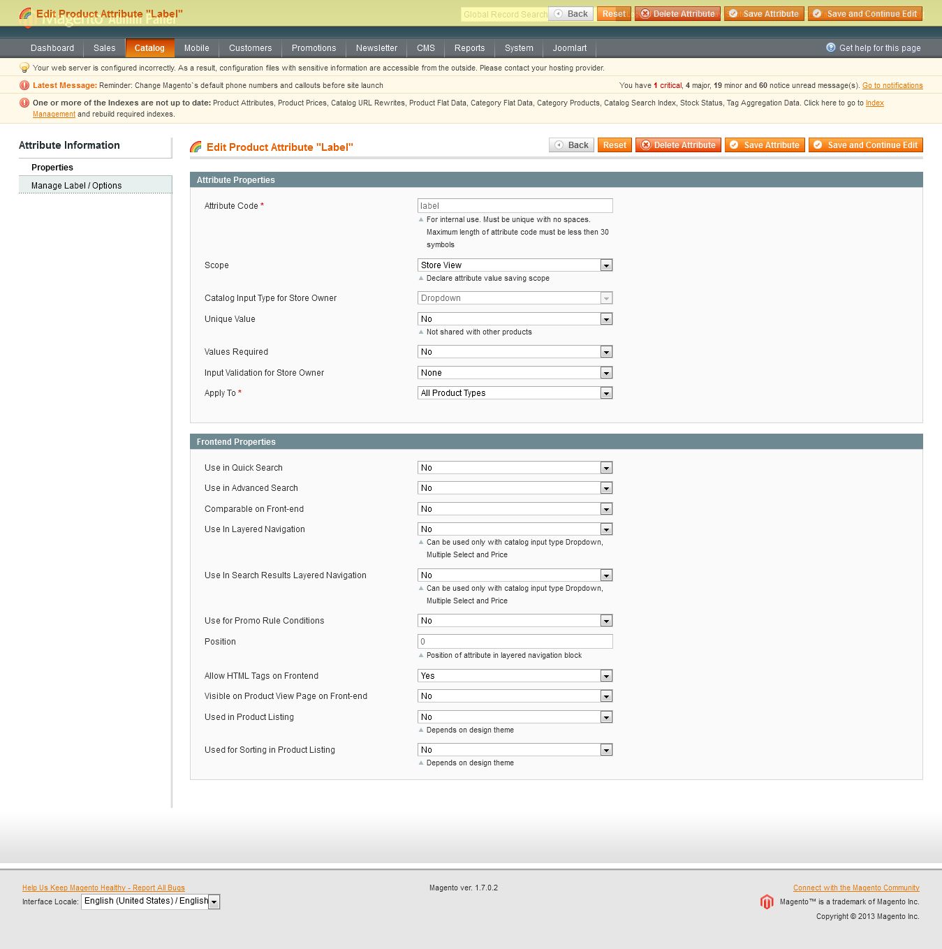
Step 2: Navigate to Catalog >> Attributes >> Manage Attributes and create a new attribute named Label.
- Properties -- Back-end Settings
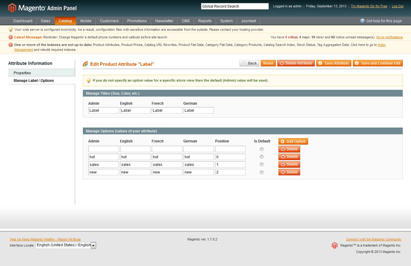
- Manage Label/ Options -- Back-end Settings
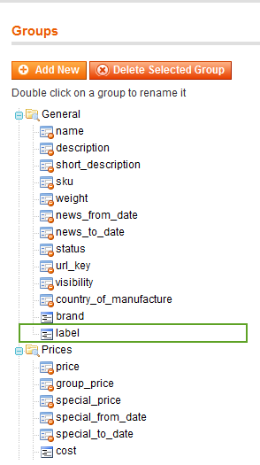
Step 3: Navigate to Catalog >> Attributes >> Manage Attribute Sets to add the “Label” attribute into “Default Attribute Set”.
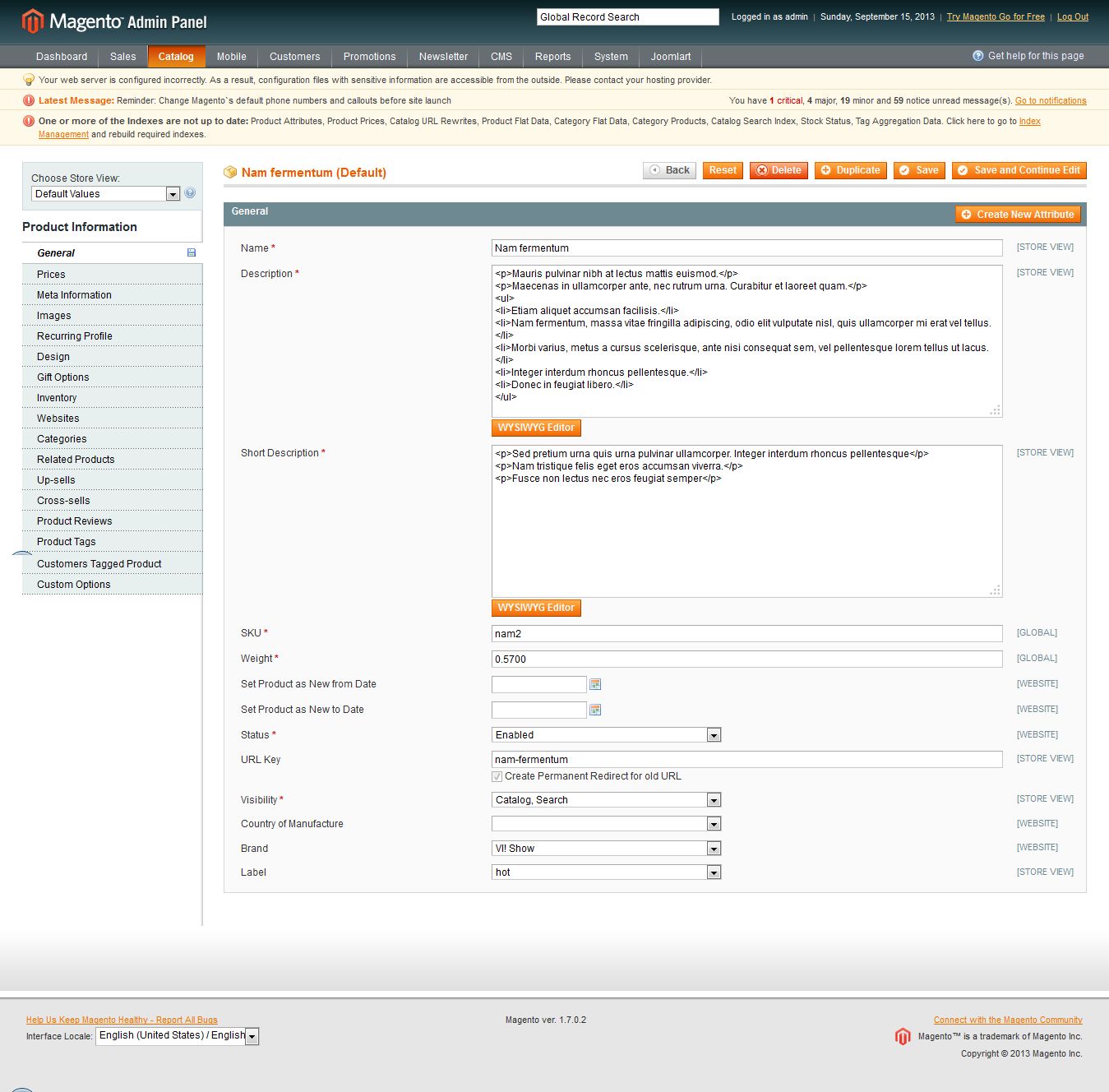
Step 4: Simply choose the label you want for each product as Back-end Settings.
IV. Menu Configuration
Siotis supports Magento extenstion Mega Menu. Follow the guide below to get it configured properly.
In the Magento Admin Panel, navigate back-end >> Mega Menu >> Manage Menu Groups.
You need to create a Menu group first, each for one store language view. Once done, select the store language view that you want to create a menu and click “Add Menu Item” button to define the menu items. The default settings belong to English group. Other language groups have similar settings for menu items.
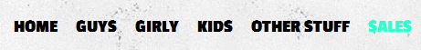
4.1 Home Menu
Front-end appreance

Backend-settings:
- Item: Home Backend settings
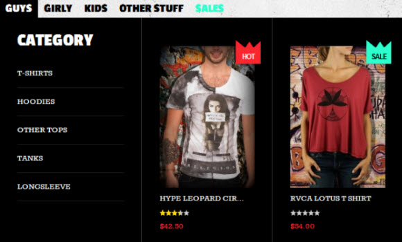
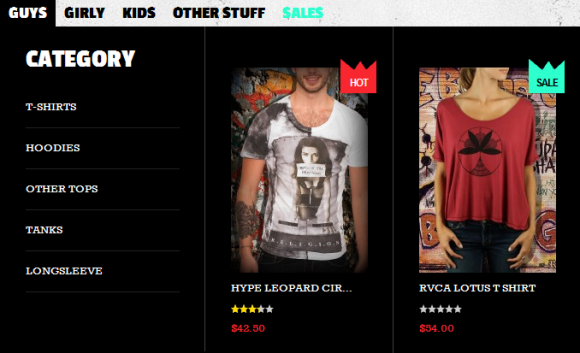
4.2 Guys Menu
Front-end appreance
Backend-settings:
- Item 1: Guys Backend settings
- Item 2: Category Backend settings
- Item 3: T-shirt Backend settings
- Item 4: Hoodies Backend settings
- Item 5: Other Tops Backend settings
- Item 6: Tanks Backend settings
- Item 7: Longsleeve Backend settings
- Item 8: HOT Backend settings
- Item 9: SALE Backend settings
4.3 Girly Menu
Front-end appreance
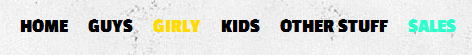
Backend-settings:
- Item: Camcorders Backend settings
4.4 Kids Menu
Front-end appreance
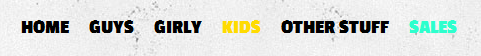
Backend-settings:
- Item: Kids Backend settings
4.5 Other Stuff Menu
Front-end appreance
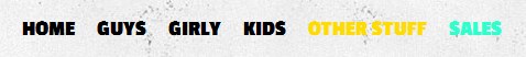
Backend-settings:
- Item: Other Stuff Backend settings
4.6 Sales Menu
Front-end appreance
Backend-settings:
- Item: Sales Backend settings
V. Manage Page
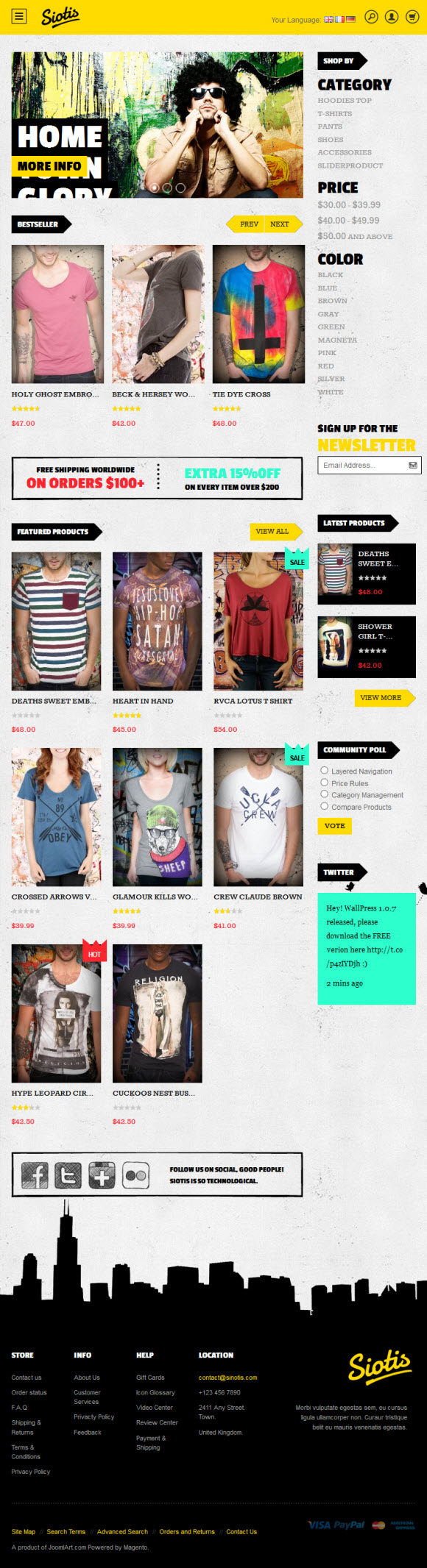
Home page
To config this page, please navigate to CMS >> Pages, create Homepage, navigate to tab Design and update with the following settings:
- Layout : select 2 columns with right bar on drop down list
- Layout Update XML: Paste the code below
PHP Code:
<reference name="mass-top">
        <block type="joomlart_jmslideshow/list" name="jmslideshow" template="joomlart/jmslideshow/list.phtml" />
</reference>

<reference name="content">
<block type="joomlart_jmproductsslider/list" name="jmproductsslider" template="joomlart/jmproductsslider/list.phtml" />
<block type="cms/block" name="topbanner">
           <action method="setBlockId"><block_id>position-1</block_id></action>
</block>
<block  type="joomlart_jmproducts/list"  name="home.jmproducts.list"    template="joomlart/jmproducts/list.phtml" >
                    <action method="setData"><name>title</name><value>Featured Products</value></action>
                     <action method="setData"><name>mode</name><value>featured</value></action>
 </block>
<block type="cms/block" name="block-social">
           <action method="setBlockId"><block_id>position-2</block_id></action>
</block>
</reference>

<reference name="right">
   <remove name="catalog.compare.sidebar"></remove>
    <block  type="joomlart_jmproducts/list"  name="right.jmproducts.list"  after="right.newsletter"   template="joomlart/jmproducts/column.phtml">
            <action method="setData"><name>title</name><value>Latest Products</value></action>
            <action method="setData"><name>mode</name><value>latest</value></action>
            <action method="setData"><name>perrow</name><value>1</value></action>
            <action method="setData"><name>quanlity</name><value>2</value></action>
    </block>
</reference>
Home page -- Design tab : Backend Settings
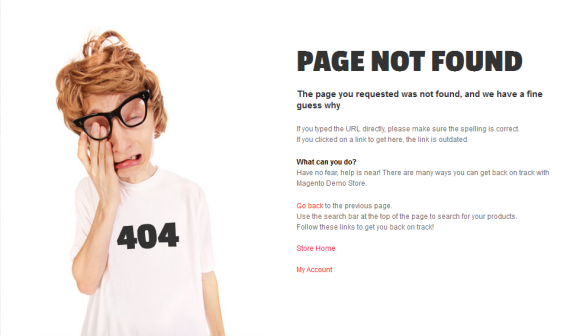
404 Not Found page
To config this page, navigate to CMS >> Pages, then select 404 Not Found 1 page to update the settings as below:
Paste the code below on Content field:
<div id="jm-error">
<div class="page-head-alt">
<h2>Page not found</h2>
<h3>The page you requested was not found, and we have a fine guess why</h3>
</div>
<ul class="disc">
<li>If you typed the URL directly, please make sure the spelling is correct.</li>
<li>If you clicked on a link to get here, the link is outdated.</li>
</ul>
<dl><dt style="color: [URL=//www.joomlart.com/forums/usertag.php?do=list&action=hash&hash=000]#000[/URL]">What can you do?</dt><dd>Have no fear, help is near! There are many ways you can get back on track with Magento Demo Store.</dd><dd>
<ul class="disc">
<li><a onclick="history.go(-1);" href="#">Go back</a> to the previous page.</li>
<li>Use the search bar at the top of the page to search for your products.</li>
<li>Follow these links to get you back on track!<a style="margin-right: 20px;" href="{{store url=""}}">Store Home</a> <a href="{{store url="customer/account"}}">My Account</a></li>
</ul>
</dd></dl></div>
Front-end Appearance
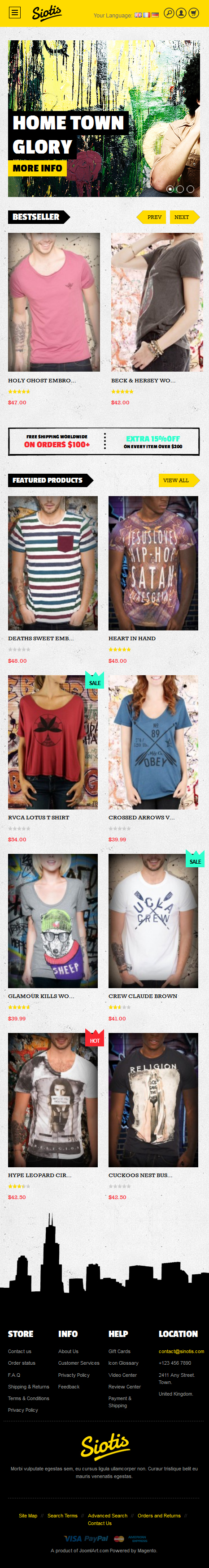
VI. Responsive Design
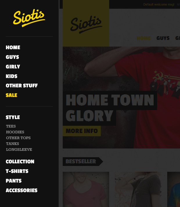
Siotis Magento theme is a Responsive design Magento theme, which allows Siotis displayed beautifully on various screen sizes and devices (mobiles and tablets). This theme has Off Canvas layouts. You can see how define it below.
1. Supported Layouts
All the style files supported layouts are located in the folder: skin/frontend/default/jm_siotis/css
In this particular theme, we support 3 styles: layout in desktop, tablet & mobile
Have the style files in hand, modification for the files will need to be defined in the page.xml file located in: app/design/frontend/default/jm_siotis/layout
Open file layout.xml
At the tag in this file, add this code:
<block type="page/js_cookie" name="js_cookies" template="page/js/cookie.phtml"/>

                <action method="addCss"><stylesheet>css/addons.css</stylesheet></action>
                 <action method="addCss"><stylesheet>css/colorbox.css</stylesheet></action>
                <action method="addCss"><stylesheet>css/layout.css</stylesheet></action>
                <action method="addCss"><stylesheet>css/styles.css</stylesheet></action>
                 <action method="addCss"><stylesheet>css/off-canvas.css</stylesheet></action>
                <action method="addCss"><stylesheet>css/layout-mobile.css</stylesheet><params>media="only screen and (max-width:719px)"</params></action>
                <action method="addCss"><stylesheet>css/layout-mobile-portrait.css</stylesheet><params>media="only screen and (max-width:479px)"</params></action>
                <action method="addCss"><stylesheet>css/layout-tablet.css</stylesheet><params>media="only screen and (min-width:720px) and (max-width: 985px)"</params></action>
                <action method="addCss"><stylesheet>css/layout-normal.css</stylesheet><params>media="only screen and (min-width:986px) and (max-width: 1235px)"</params></action>
                <action method="addCss"><stylesheet>css/layout-wide.css</stylesheet><params>media="only screen and (min-width:1236px) and (max-width: 1585px)"</params></action>
                <action method="addCss"><stylesheet>css/layout-wide-extra.css</stylesheet><params>media="only screen and (min-width:1586px) and (max-width: 1890px)"</params></action>
                <action method="addCss"><stylesheet>css/layout-hd.css</stylesheet><params>media="only screen and (min-width:1891px)"</params></action>
                <action method="addItem"><type>skin_css</type><name>css/styles-ie.css</name><params/><if>lt IE 8</if></action>
                <action method="addCss"><stylesheet>css/widgets.css</stylesheet></action>
                <action method="addCss"><stylesheet>css/print.css</stylesheet><params>media="print"</params></action>

                <action method="addItem"><type>js</type><name>lib/ds-sleight.js</name><params/><if>lt IE 7</if></action>
                <action method="addItem"><type>skin_js</type><name>js/ie6.js</name><params/><if>lt IE 7</if></action>
            </block>
- When the screen width is somewhere between 479 and 1891 pixel, the themes will load the layout-tablet.css file to display as the default style file.
- When the screen width is smaller than 479 pixel, the theme will loads the layout-mobile.css file to display as the default style file.
- Otherwise, the theme will load the layout.css file to display as its default style file. The layout.css file is the style file for desktop.
2. How to define Offcanvas
In the folder: skin/frontend/default/jm_siotis/js, the theme defined a js file named off-canvas
It will be called in the file head.phtml at the folder app/design/frontend/default/jm_siotis/template/page/html
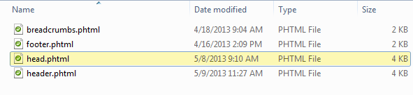
Open file head.phtml, add this code:
<script type="text/javascript" src="<?php echo $this->getSkinUrl('js/off-canvas.js') ?>"></script>
3. How to define Responsive
In summary, the base of responsive is column.
- The layout on desktop uses 1 column, the width size of layout is 100% --> width size of each column = 50%. Hence, whenever the screen width in pixel is changed, the width of each column in pixel will also get changed accordingly.
- Tablet Layout uses 1 column, each column width is 50%.
- Mobile Layout uses 1 columns, each column width is 100%.
2.1 Layout in demo
Desktop and Tablet Layout
Mobile Portrait
Mobile Landscape
2.2 Frontend in demo
Tablet Portrait
Tablet Landscape
Mobile Portrait

Mobile Landscape
Off Canvas