Slideshow
NOTE: We’ve developed a native UB Content Slider extension for Magento 2. Check out the userguide for UB Content Slider here.
I. Overview
So you are about to grab Magento extension Slideshow for your eCommerce Magento store. Slideshow is a practical Magento extension that allows you to show off your promotional messages and graphics with a smooth and vivid slideshow at ease.
This documentation will guide you step by step to install and configure Slideshow. Let’s get started.
II. Installation
Download Slideshow and then extract the downloaded package. To install, especially if you are new to Magento, kindly follow the Magento extension user guide to install the Magento extension Slideshow.
Kindly note that Slideshow uses jQuery. Thus, you need to update Javascript library script.aculo.us built in default Magento to help the Slideshow works properly. Steps to update:
- Get the latest version of the script.aculo.us (1.8.2 right now): //script.aculo.us/.
- Upload the file to [Magento]/js/scriptaculous.
III. Configuration
Provided that Slideshow module is installed properly, you can follow these steps to configure this Magento extension for your eCommerce website.
1. Log in to your Admin Panel on the stage localhost: //localhost/magento/index.php/admin/.
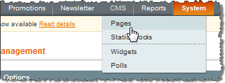
2. Navigate to JoomlArt >> Slideshow.

3. Add value for these following parameters as per screenshot:

- Enabled : select to publish/unpublish the slideshow.
- Module Title : fill in the title of slideshow.
- Load jQuery : select to enable/disable jQuery loading for slideshow.
- Data From Source : choose source to render image and content in the slideshow.
- Image Folder : define the location of image folder displayed.
Note : When Data From Source: Image Folder. Description of image can configure on settings Slide Show Images below

- Animation Type : choose type of animation for slideshow
- Main Item Width : defined width of main item.
- Main Item Height : defined height of main item.
- Main Item Width (tablet) : defined width of main item on tablet landscape view.
- Main Item Height (tablet portrait) : defined height of main item on tablet portrait view.
- Main Item Width (mobilde) : defined width of main item on mobile landscape view.
- Main Item Height (mobile portrait) : defined height of main item on mobile portrait view.
- Animation Duration : choose source to render image and content in the slideshow.
- Auto Play : select Yes or No to set Auto play or not. If Yes, the slideshow will auto switch according to the added interval.
- Repeat : select to replay slideshow or not.
- Interval : set duration (in seconds) between two slides.

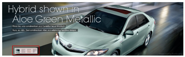
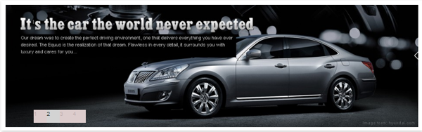
- Thumbnail Type : select the type of thumnails displayed as “Thumbnail” or “Number”. See the illustration as follows.
- Front-end appearance with Thumbnail type:
- Front-end appearance with Number type:
- Number of thumbnails : define quantity of thumbnail items displayed (with thumbnail type for Navigation).
- Width of a navigation item : define the width of an item listed (with the “From Source” = “Product List”).
- Height of a navigation item : define the height of an item listed (with the “From Source” = “Product List”).
- Thumbnail Spacing : define the space between each item and the border in format top : right : bottom : left.
- Thumbnail Direction : select navigation direction: vertical or horizontal.
- Thumbnail Position : set position for thumbnail block dock on the slideshow.
- Event to trigger a thumbnail : select which event (click or hover, etc.) to the thumbnail for interaction on the slideshow.
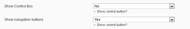
- Show Control Box : choose to show or hide the control button.
- Show Navigation Buttons : choose to show or hide the navigation button.

- Show Description : choose to show or hide the description, options included: Description only/Description with Readmore.
- Show Description when : choose how to show description, options included: Always show description/Show when mouse over image/show when image animated.
- Description Width : define the width of the description field.
- Description Height : define the width of the description field.
- Description Animation Type : select type of animation for the description.
- Description Background Opacity : set opacity for the description background.
- Description Position : set position of description displayed.
- Progress Bar : choose to show or hide the progress bar of slideshow.
You need to copy your image folder into your_site_path/media and fill path into Image folder param. For other parameters, set as you wish.
To push the module onto the front page, go to CMS > Manage page >> select the page that you want to display this module on E.g. Homepage.
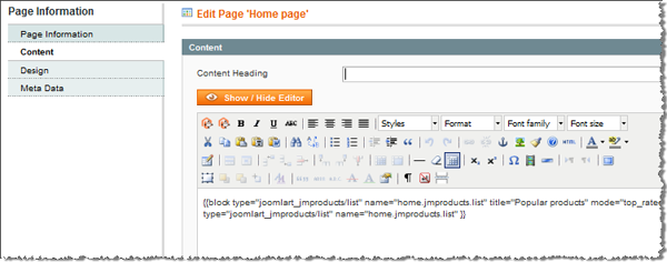
Fill in Content parameter with syntax as below:
{{block type="joomlart_jmslideshow/list" name="home.jmproducts.list" title="Popular products" mode="top_rated" quanlity="1" perrow="1" width="180" height="180" max="300" catsid="13" }}
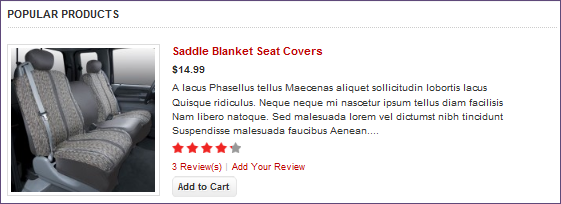
Front-end appearance then:
Tip : You can also declare directly parameters of Slideshow in Content parameter. E.g. to get image from an URL (e.g. media/extraslideshow), you can declare folder parameters as follows:
{{block type="joomlart_jmslideshow/list" name="home.jmslideshow.list" folder="media/extraslidesho}}
The parameters that are declared directly here will overwrite those pre-defined in the module configuration panel in your admin.
Direct declaration will be helpful in case you want to create multi slideshows.
For instance, in order display two slideshowes: Slideshow and Extra Slideshow, you can declare as below:
{{block type="joomlart_jmslideshow/list" name="home.jmslideshow.list" }}
{{block type="joomlart_jmslideshow/list" name="home.jmslideshow.list" folder="media/extra_slideshow"}}
For your reference, the table below records parameters you can use for direct declaration (as demonstrated above) instead of conducting configuration via admin panel.