Magento 2 UB Content Slider
I. Overview
[Magento 2] UB Content Slider is a handy extension that allows you to create and manage unlimited responsive banner slideshows, product carousels (eg. Latest Products, Hot Products, etc.), video sliders, (NEW) product image hotspot & lookbook and place them anywhere on your Magento 2 store. The user guide below will walk you through the installation and configuration process to set up the UB Content Slider module. Let’s get started.
II. Installation
- Step 1. (Required) Install PHP Mobile Detect Resource APIs
NOTE: This step is required for UB Content Slider v1.1.5 and later.
You have to install the PHP Mobile Detect Resource APIs using Composer by requiring the mobiledetect/mobiledetectlib in your project. You can check out How to install PHP Mobile Detect Resource APIs here.
- Step 2. Unzip the download packager
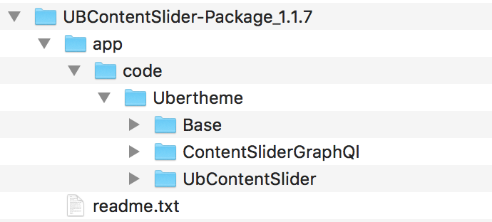
- Step 3. Copy and merge the folder app of the package to your Magento root folder.
- Step 4. Open the SSH terminal, then go to webroot folder and run the commands below:
- php -f bin/magento module:enable -c Ubertheme_Base
- php -f bin/magento module:enable Ubertheme_UbContentSlider
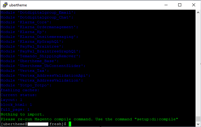
- php -f bin/magento setup:upgrade
- php -f bin/magento setup:di:compile
- Step 5. Run the deploy command to regenerate static files:
- If your M2 is in a production mode: php -f bin/magento setup:static-content:deploy
- If your M2 is in a developer mode: php -f bin/magento setup:static-content:deploy -f
You can refer to Magento guideline for the static file deployment here.
Now your extension has been installed on your web.
III. Get Started
3.1 Types of Sliders
UB Content Slider extension enables to create multiple types of content and place them anywhere on your Magento 2 store (on any CMS pages and any CMS static block), including:
- Banner Slider
- Video Slider
- Product Carousel
- Latest Product Slider
- New Product Slider
- Hot Products
- Random Product Slider
- Best Sell Slider
- Product Image Hotspot (available in UB Content Slider v1.1.4)
- Lookbook (available in UB Content Slider v1.1.4)
Before you start creating a carousel, here you can see some examples of the Slick carousel shortcode that we created for demo purpose:
js_lib="owl1" with js_lib="slick" to create a carousel with OWL carousel.a. Banner Slider
a1. Banner Slider with Outside Thumbnail Navigation
The shortcode to display the Banner Slider with Outside Thumbnail Navigation on a CMS Page or in a CMS static block (Please replace YOUR_SLIDER_KEY with the Slider Key of your carousel in your store):
{{widget type="Ubertheme\UbContentSlider\Block\Widget\MediaWidget" content_type="slider" js_lib="slick" slider_key="YOUR_SLIDER_KEY" show_title="0" single_item="1" vertical="0" item_width="1240" item_height="600" auto_height="1" show_item_title="1" show_item_desc="1" show_navigation="1" infinite="1" show_paging="2" thumb_width="0" thumb_height="0" auto_run="1" slide_speed="3000" stop_on_hover="1" pause_on_focus="1" start_pos="1"}}
a2. Banner Slider with Inside Thumbnail Navigation
If you do not want to go with the default Outside Thumbnail Navigation, you can switch to the Inside Thumbnail Navigation using the additional class thumbs-inside as follows.
The shortcode to display the Banner Slider with Inside Thumbnail Navigation on a CMS Page or in a CMS static block (Please replace YOUR_SLIDER_KEY with the Slider Key of your carousel in your store):
{{widget type="Ubertheme\UbContentSlider\Block\Widget\MediaWidget" content_type="slider" js_lib="slick" slider_key="YOUR_SLIDER_KEY" show_title="0" single_item="1" vertical="0" item_width="1240" item_height="600" auto_height="1" show_item_title="1" show_item_desc="1" show_navigation="1" infinite="1" show_paging="2" thumb_width="0" thumb_height="0" auto_run="1" slide_speed="3000" stop_on_hover="1" pause_on_focus="1" start_pos="1" addition_class="thumbs-inside"}}
a3. Banner Slider with Dot Navigation

The shortcode to display the Banner Slider on a CMS Page or in a CMS static block (Please replace YOUR_SLIDER_KEY with the Slider Key of your carousel in your store):
{{widget type="Ubertheme\UbContentSlider\Block\Widget\MediaWidget" content_type="slider" js_lib="slick" slider_key="YOUR_SLIDER_KEY" show_title="0" single_item="1" item_width="1240" item_height="600" auto_height="1" show_item_title="1" show_item_desc="1" show_navigation="1" infinite="1" show_paging="1" paging_numbers="0" auto_run="1" slide_speed="3000" stop_on_hover="1" pause_on_focus="1" pause_on_dots_hover="1" start_pos="1"}}
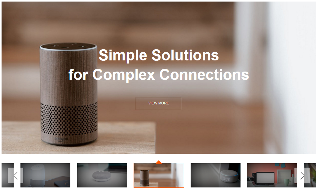
If you want to set your banner slider as full-width, you can do so by adding the addition_class=”fullwidth” as follows (Please refer to section 4. How-to for more information)
{{widget type="Ubertheme\UbContentSlider\Block\Widget\MediaWidget" content_type="slider" js_lib="slick" slider_key="YOUR_SLIDER_KEY" show_title="0" single_item="1" vertical="1" item_width="1920" item_height="800" auto_height="1" show_item_title="1" show_item_desc="1" show_navigation="1" infinite="1" show_paging="1" paging_numbers="0" auto_run="1" slide_speed="3000" stop_on_hover="1" pause_on_focus="1" pause_on_dots_hover="1" start_pos="1" addition_class="fullwidth"}}
b. Product Slider
You can easily create different product carousels using Slick carousel, for example, the Latest Products, Random Products carousels (system automation), or the Best Seller, Hot Products, New Products carousels across specific date range (via admin setting). Besides, in version 1.1.7, you can take advantage of a brand new vertical Bestseller Product carousel. You can use this to feature products for different promotions.
Below are examples of the Latest Product, Bestseller Product, New Product (Sidebar), Big Deal, and Vertical Bestseller Product carousels.
b1. Bestseller Product
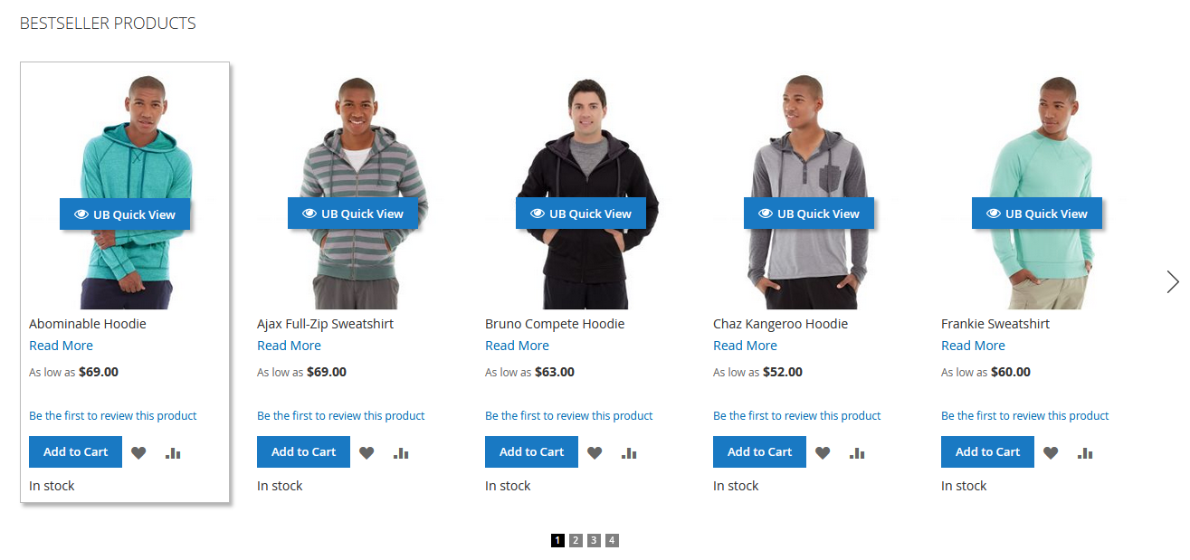
The shortcode to display the Best Seller carousel on a CMS Page or in a CMS static block:
{{widget type="Ubertheme\UbContentSlider\Block\Widget\ProductWidget" js_lib="slick" content_type="bestseller_products" show_title="1" title="Bestseller Products" single_item="0" variable_width="0" vertical="0" number_items="5" number_items_desktop="5" number_items_desktop_small="4" number_items_tablet="3" number_items_tablet_small="2" number_items_mobile="1" rows="1" sort_by="name" sort_dir="ASC" qty="8" show_name="1" show_price="1" show_desc="1" desc_length="100" show_readmore="1" show_review="1" show_wishlist="1" show_compare="1" show_add_cart="1" auto_height="1" show_navigation="1" infinite="0" show_paging="1" paging_numbers="1" auto_run="1" slide_speed="3000" stop_on_hover="1" pause_on_focus="1" pause_on_dots_hover="1" center_mode="0" items_to_scroll="1" start_pos="1" enable_rtl="0"}}
b2. Latest Product carousel
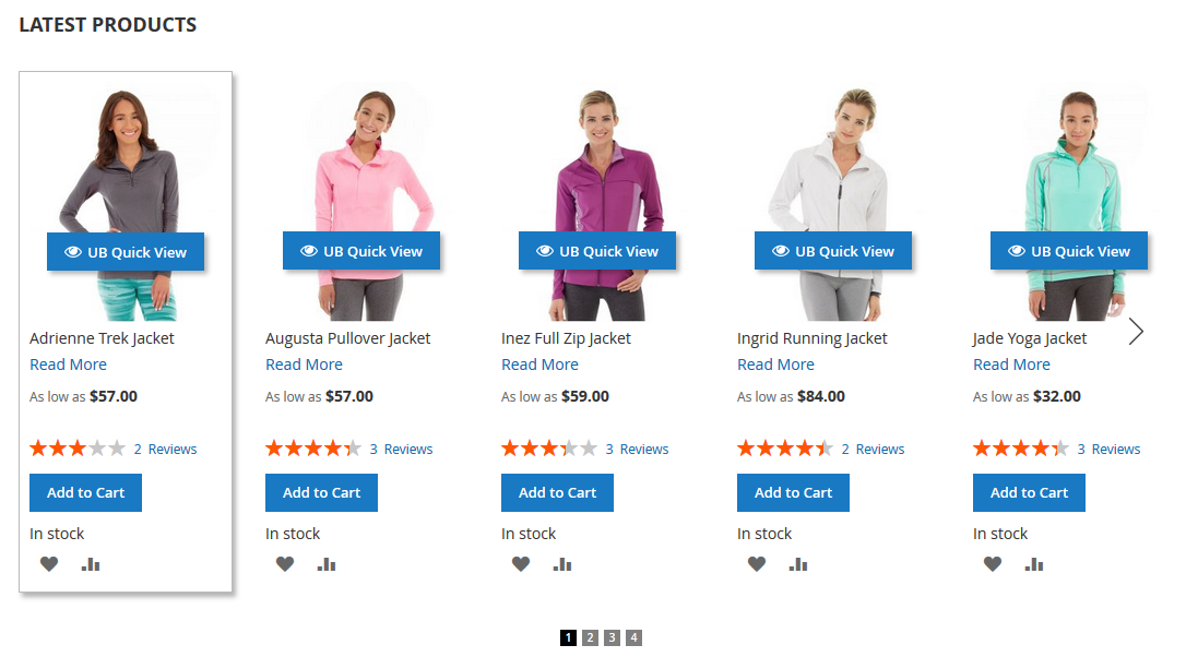
The shortcode to display the Latest Product carousel on a CMS Page or in a CMS static block:
{{widget type="Ubertheme\UbContentSlider\Block\Widget\ProductWidget" js_lib="slick" content_type="latest_products" show_title="1" title="Latest Products" single_item="0" variable_width="0" vertical="0" number_items="5" number_items_desktop="5" number_items_desktop_small="4" number_items_tablet="3" number_items_tablet_small="2" number_items_mobile="1" rows="1" sort_by="name" sort_dir="ASC" qty="8" show_name="1" show_price="1" show_desc="1" desc_length="100" show_readmore="1" show_review="1" show_wishlist="1" show_compare="1" show_add_cart="1" auto_height="1" show_navigation="1" infinite="0" show_paging="1" paging_numbers="1" auto_run="1" slide_speed="3000" stop_on_hover="1" pause_on_focus="1" pause_on_dots_hover="1" center_mode="0" items_to_scroll="1" start_pos="1" enable_rtl="0"}}
b3. Big Deal carousel
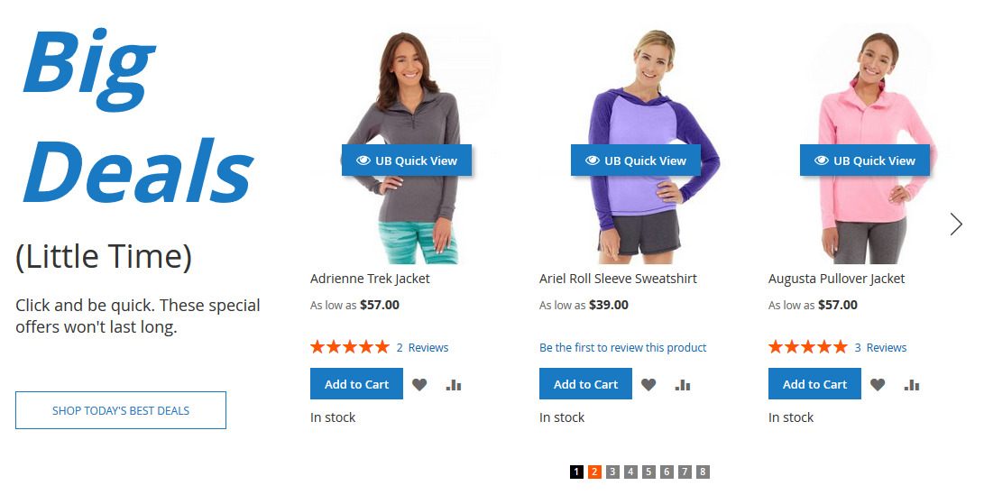
The shortcode to display Big Deals carousel on a CMS Page or in a CMS static block:
<div class="ub-blocks-slider">
<div class="big-deal">
<div class="title">Big<br>Deals</div>
<div class="tagline">(Little Time)</div>
<div class="desc">Click and be quick. These special offers won't last long.</div>
<a class="more-deal" href="#">Shop today's best deals</a></div>
<div class="slider-contents">{{widget type="Ubertheme\UbContentSlider\Block\Widget\ProductWidget"  js_lib="slick"  infinite="0" content_type="latest_products" show_title="0" title="Big Deal" sort_by="name" sort_dir="ASC" qty="10" show_name="1" show_price="1" show_desc="0" desc_length="100" show_readmore="0" show_review="1" show_wishlist="1" show_compare="1" show_add_cart="1" single_item="0" show_navigation="1" show_paging="1" paging_numbers="1" auto_run="1" auto_height="1" slide_speed="2000" stop_on_hover="1" number_items_mobile="1" number_items_tablet_small="1" number_items_tablet="2" number_items_desktop_small="2" number_items_desktop="3" number_items="3"}}</div>
</div>
b4. New Product (Sidebar)
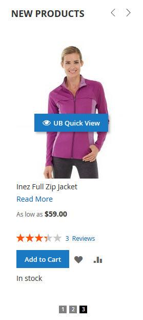
The shortcode to display the New Product carousel (Sidebar) on a CMS Page or in a CMS static block:
{{widget type="Ubertheme\UbContentSlider\Block\Widget\ProductWidget" js_lib="slick" content_type="latest_products" show_title="1" title="New Products" single_item="0" variable_width="0" vertical="0" number_items="1" number_items_desktop="1" number_items_desktop_small="1" number_items_tablet="1" number_items_tablet_small="1" number_items_mobile="1" rows="1" sort_by="name" sort_dir="ASC" qty="3" show_name="1" show_price="1" show_desc="1" desc_length="100" show_readmore="1" show_review="1" show_wishlist="1" show_compare="1" show_add_cart="1" auto_height="1" show_navigation="1" infinite="1" show_paging="1" paging_numbers="1" auto_run="1" slide_speed="3000" stop_on_hover="1" pause_on_focus="1" pause_on_dots_hover="1" center_mode="0" items_to_scroll="1" start_pos="1" enable_rtl="0"}}
b5. Bestseller Product (Vertical)
Vertical Bestseller Product carousel is a new special option added in version 1.1.7 and available for Slick Carousel only. It is handy to showcase promotional products on your category pages. Here is an example.
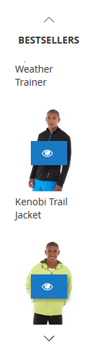
The shortcode to display the Bestseller Product carousel (Vertical) on a CMS Page or in a CMS static block:
{{widget type="Ubertheme\UbContentSlider\Block\Widget\ProductWidget" js_lib="slick" content_type="latest_products" show_title="1" title="Bestsellers" single_item="0" variable_width="0" vertical="1" number_items="2" number_items_desktop="2" number_items_desktop_small="2" number_items_tablet="2" number_items_tablet_small="2" number_items_mobile="2" rows="1" sort_by="name" sort_dir="ASC" qty="4" show_name="1" show_price="1" show_desc="0" show_readmore="0" show_review="0" show_wishlist="0" show_compare="0" show_add_cart="1" auto_height="1" show_navigation="1" infinite="1" show_paging="0" auto_run="0" center_mode="0" items_to_scroll="1" start_pos="1" addition_class="vertical-slider-sticky"}}
b6. Product Carousel with Right-to-Left enabled
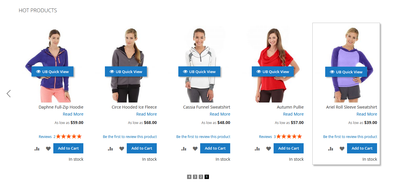
The shortcode to display Product Carousel Right to Left = Yes on a CMS Page or in a CMS static block:
{{widget type="Ubertheme\UbContentSlider\Block\Widget\ProductWidget" js_lib="slick" content_type="hot_products" show_title="1" title="Hot Products" single_item="0" variable_width="0" vertical="0" number_items="5" number_items_desktop="5" number_items_desktop_small="4" number_items_tablet="3" number_items_tablet_small="2" number_items_mobile="1" rows="1" sort_by="name" sort_dir="ASC" qty="8" show_name="1" show_price="1" show_desc="1" desc_length="100" show_readmore="1" show_review="1" show_wishlist="1" show_compare="1" show_add_cart="1" auto_height="1" show_navigation="1" infinite="0" show_paging="1" paging_numbers="1" auto_run="1" slide_speed="3000" stop_on_hover="1" pause_on_focus="1" pause_on_dots_hover="1" center_mode="0" items_to_scroll="1" start_pos="1" enable_rtl="1"}}
b7. Product Carousel with Center Mode enabled
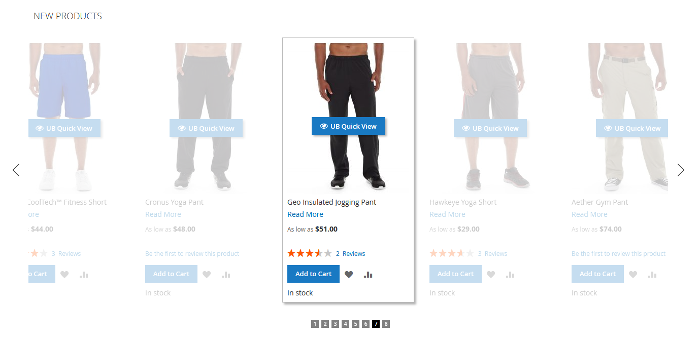
The shortcode to display Product Slider Center Mode = Yes and Varibale Width = Yes on a CMS Page or in a CMS static block:
{{widget type="Ubertheme\UbContentSlider\Block\Widget\ProductWidget" js_lib="slick" content_type="new_products" show_title="1" title="New Products" single_item="0" variable_width="1" rows="1" sort_by="name" sort_dir="ASC" qty="8" show_name="1" show_price="1" show_desc="1" desc_length="100" show_readmore="1" show_review="1" show_wishlist="1" show_compare="1" show_add_cart="1" auto_height="1" show_navigation="1" infinite="1" show_paging="1" paging_numbers="1" auto_run="1" slide_speed="3000" stop_on_hover="1" pause_on_focus="1" pause_on_dots_hover="1" center_mode="1" start_pos="1"}}
c. Video Slider
The shortcode to display Video Slider on a CMS Page or in a CMS static block (Please replace YOUR_SLIDER_KEY with the Slider Key of your carousel in your store):
{{widget type="Ubertheme\UbContentSlider\Block\Widget\MediaWidget" content_type="slider" js_lib="slick" slider_key="YOUR_SLIDER_KEY" show_title="0" single_item="0" variable_width="0" vertical="0" number_items="3" number_items_desktop="3" number_items_desktop_small="3" number_items_tablet="2" number_items_tablet_small="1" number_items_mobile="1" rows="1" item_width="400" item_height="300" auto_height="1" show_item_title="1" show_item_desc="1" show_navigation="1" infinite="1" show_paging="1" paging_numbers="1" auto_run="1" slide_speed="3000" stop_on_hover="1" pause_on_focus="1" pause_on_dots_hover="1" center_mode="0" items_to_scroll="1" start_pos="1" enable_rtl="0"}}
d. Product Image Hotspot and Lookbook
These two new features was first introduced in UB Content Slider ver 1.1.4 and remains available for Slick carousel. You can check out the demo of both Product Image Hotspot and Lookbook here.
3.2. How to display a slider on a page
UB Content Slider extension supports several ways to insert a content slider in your page as follows:
3.2.1. Using the shortcode / widgets to insert a slider to a CMS page or CMS static block
Option 1: To display a slideshow in a selected place, use the following shortcode (Please replace YOUR_SLIDER_KEY with the Slider Key of your carousel in your store):
{{block class="Ubertheme\UbContentSlider\Block\Slider" name="ub.content.slider.video" title="Video Slider" content_type="slider" slider_key="YOUR_SLIDER_KEY_HERE" number_items="2" item_width="480" item_height="270"}}
To insert the shortcode above, go to your Magento 2 admin | Content | click (Elements) Pages or (Elements) Blocks depending on where you want to insert the shortcode | click Select | Edit the page or block you need | Tap Show / Hide Editor to work in WYSIWYG mode. From here, you simply enter the shortcode.
Option 2: Alternatively, you can insert multiple sliders in your pages using widgets:
- Step 1. Navigate to your M2 admin | Content | Widgets | Add Widget. Then select UB Content Slider type at your choice.
- Step 2. In the Storefront Properties tab, fill in the widget configuration.
- Step 3. In the Widget Options, define your own settings.
NOTE: Make sure that you create a slider in advance so that you can assign that slider in the Widget Options of this widget.
3.2.2. Adding XML code
A slider can be also defined directly in the XML layout file (of your theme or extension) as follows:
(Please note this option requires an understanding of XML)
- Open the layout file at app\design\frontend\THEME_VENDOR\THEME_NAME\Magento_Theme\layout\default.xml, add the following code block (you can add right above the line: <referenceContainer name=”footer”>):
<referenceContainer name="content">
    <block class="Ubertheme\UbContentSlider\Block\Slider" name="ub.content.slideshow" as="ub-content-slideshow">
        <arguments>
            <argument name="content_type" xsi:type="string">slider</argument>
            <argument name="slider_key" xsi:type="string">main-slideshow</argument>
            <argument name="single_item" xsi:type="string">1</argument>
        </arguments>
    </block>
</referenceContainer>
NOTE: The sample code above inserts the slider in position ‘content’: <referenceContainer name=”content”>. You can change the ‘content‘ to ‘content.top‘, ‘content.aside‘ or ‘content.bottom‘, according to the layout of your page.
Make sure you update the ‘slider_key‘ and ‘addition_class‘ of the slider you want to show. Learn more about these parameters here.
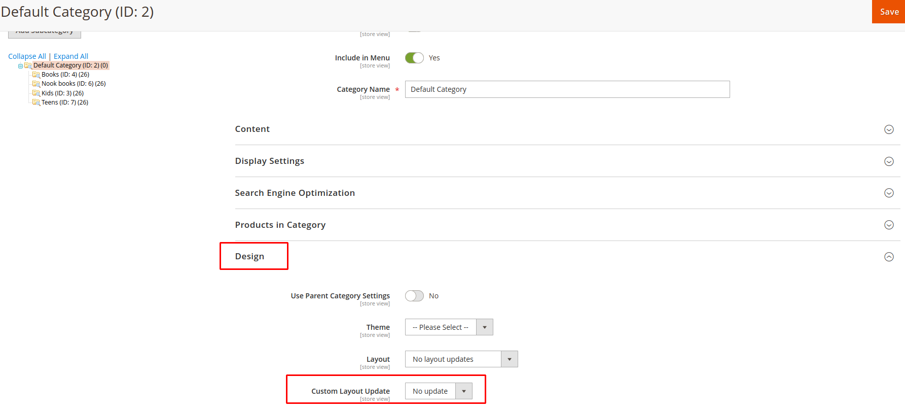
Besides, you can also specify XML instruction in a Custom Layout Update file directly in your theme. Then simply open the page that you want to display the slider (which can be either a product, category, or CMS page) in edit mode and choose the Design tab to load the Custom Layout Update that applies to the slider. Below are some examples of the Custom Layout Update field in a few different pages:
- Category page:
- CMS page:
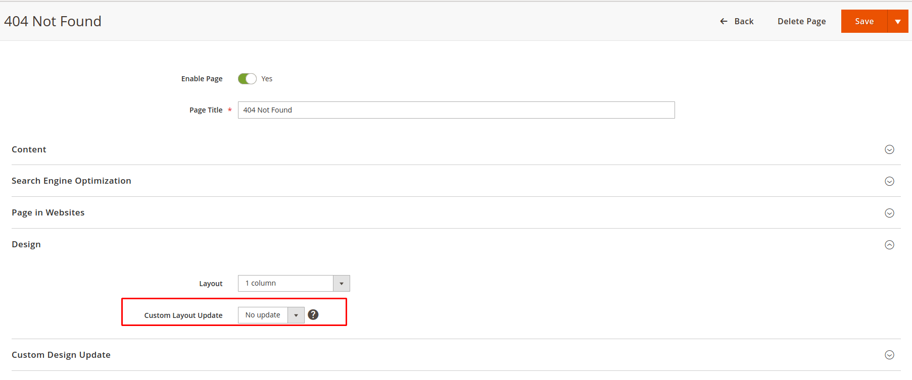
- Product page:
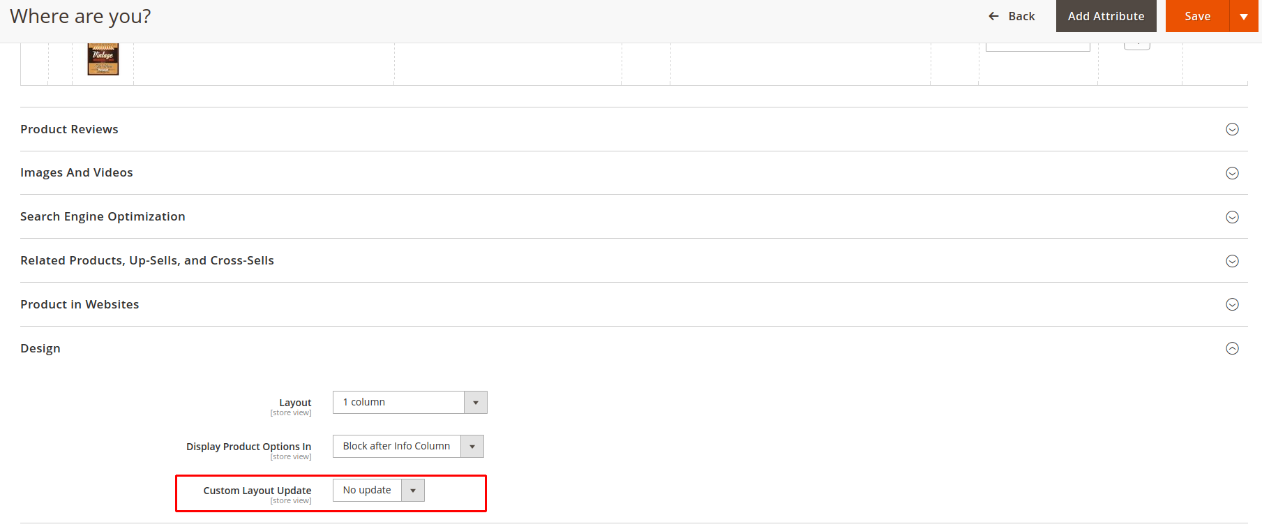
- Category page:
3.3. List of Parameters
While working on CMS pages or CMS static block, you can use the shortcode to display a slider in a selected place. You can learn more about specific parameters of our UB Content Slider module to configure the sliders your way.
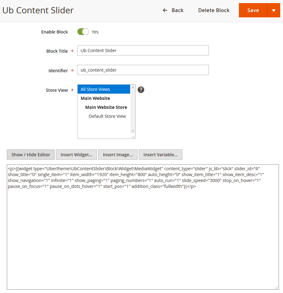
The screenshot below represents the way to create a CMS static block and call slider parameters (Your Magento 2 Admin | Content | Blocks | Add New Block, click Show / Hide Editor button to insert the slider shortcode):
UB Content Slider Params:
| enable | to enable/disable the block. Value 0 to disable and 1 to enable |
| title | allows to set the module’s title. Valid value: text |
| content_type | allows to enable the products carousel with the following types:
|
| js_lib | Select the carousel jQuery library used for creating slideshows and carousels: OWL carousel or Slick Carousel (Slick carousel is available in UB Content Slider v1.1.7 and newer).
|
| single_item | if enabled, the slider will show with one item. Valid value: 1/ 0. Default is 0. |
| variable_width | allows to disable automatic width calculation of images in the slider. Valid value: 1/ 0. Default is 0 (only applicable to Slick carousel and available in UB Content Slider v1.1.7 and newer). |
| vertical | allows to enable vertical slide direction. Valid value: 1/ 0. Default is 0 (only applicable to Slick carousel and available in UB Content Slider v1.1.7 and newer). |
| category_ids | allows to set Category ID. The Category ID must exist under the Categories of your store. Example: category_ids = “9, 10, 15” |
| sort_by | select field to sort (By Name, Price, Created Date, Updated Date, Position). This is applied to all Slider content types, except for Best Seller Product |
| sort_dir | select sort direction (Ascending/Descending). This is applied to all Slider content types, except for Best Seller Product |
| qty | allows to specify the number of products to be displayed in the list. Valid value: number. Default is 10 |
| slider_key | the key of Slider is a required field. Make sure you enter a valid XML identifier (eg. block5, id-4, slide_1). Only apply to content_type = ‘slider’. |
| item_width | allows to set the extension block width. Valid value: number. Only apply to content_type = ‘slider’ |
| item_height | allows to set the extension block height. Valid value: number. Only apply to content_type = ‘slider’ |
| show_item_title | allows to show or hide the Item’s title. Valid value: 1/ 0. Default is 1. Only apply to content_type = ‘slider’ |
| show_item_desc | allows to show or hide the Item’s description. Valid value: 1/ 0. Default is 1. Only apply to content_type = ‘slider’ |
| thumb_width | the width of the thumbnail in px. Only apply to content_type = ‘slider’ and single_item = 1 and show_thumbnail = 1. |
| thumb_height | the height of the thumbnail in px. Only apply to content_type = ‘slider’ and single_item = 1 and show_thumbnail = 1. |
| show_name | allows to show or hide the product name. Valid value: 1/ 0. Default is 1 |
| show_price | allows to show or hide the product price. Valid value: 1/ 0. Default is 1+ |
| show_add_cart | allows to show or hide “Add to cart” button of the product. Valid value : 1/ 0. Default is 1 |
| show_desc | allows to show or hide the product description. Valid value: 1/ 0. Default is 1 |
| desc_length | allows to set the Max Length of the Product Description. Default is 100 |
| show_review | allows to show or hide the Review button. Valid value: 1/ 0. Default is 1 |
| show_wishlist | allows to show or hide the Wishlist button. Valid value: 1/ 0. Default is 1 |
| show_compare | allows to show or hide the Compare button. Valid value: 1/ 0. Default is 1 |
| show_readmore | allows to show or hide the Read More button. Valid value: 1/ 0. Default is 1 |
| auto_run | allows to enable autoplay for slider items. Valid value: 1/ 0. Default is 1 |
| auto_height | if enabled, the slider will automatically adapt to the height of the content. Valid value: 1/ 0. Default is 1 |
| slide_speed | set the slider autoplay speed (Applicable when Autorun is enabled). Default is 200 milliseconds. |
| stop_on_hover | the slider autoplay will stop on mouse hover over the slide. Valid value: 1/ 0. Default is 1 |
| pause_on_dots_hover | the slider autoplay will stop on mouse hover over a navigation dot. Valid value: 1/ 0. Default is 1 (only applicable to Slick carousel and available in UB Content Slider v1.1.7 and newer). |
| pause_on_focus | the slider autoplay will stop when a slide item is selected (click). Valid value: 1/ 0. Default is 1 (only applicable to Slick carousel and available in UB Content Slider v1.1.7 and newer). |
| center_mode | allows to enable centered view with partial prev/next slides. Default is 0 (only applicable to Slick carousel and available in UB Content Slider v1.1.7 and newer). |
| items_to_scroll | specify the number of slides to scroll at a time. Note: This setting is only applicable when the ‘Center Mode’ and ‘Varible Width’ are disabled. Leave blank to use the default System configuration value. Default is 1 (only applicable to Slick carousel and available in UB Content Slider v1.1.7 and newer). |
| start_pos | specify the slide item to start on. Valid value: integer. Default is 1 (only applicable to Slick carousel and available in UB Content Slider v1.1.7 and newer). |
| show_navigation | allows to show navigation button or not. Valid value : 1/ 0. Default is 1 |
| infinite | If enabled, the infinity loop is applied to the carousel (instead of stopping at the end or rewinding back to the beginning). Valid value: 1/ 0. Default is 1 (available in UB Content Slider v1.1.7 and newer). |
| show_paging | Show the little dots or thumbnails at the bottom of each slide. Thumbnail is applicable only when Single Item is enabled. Valid value: 1/ 0. Default is 1 |
| paging_numbers | Allows to show slide paging number. Valid value : 1/ 0. Default is 1 |
| show_thumbnail | allows to show thumbnails at the bottom of each slide. Only applicable when single_item = 1. Valid value : 1/ 0. Default is 1 |
| enable_rtl | allows to set the slider’s direction as right-to-left. Valid value: 1/ 0. Default is 0 (only applicable to Slick carousel and available in UB Content Slider v1.1.7 and newer). |
| enable_lazyload | allows to enable/disable lazy load. Images outside of the viewport won’t be loaded before user scrolls to them. Valid value: 1/ 0. Default is 1 |
| show_processbar | allows to show progress bar. Valid value: 1/ 0. Default is 1 |
| slide_transition | selects slide transition: fade, backSlide, goDown, fadeUp. Default is ‘fade’ |
| number_items |
Allows you to specify the number of slides visible with a particular browser width.
visible Items (width >= 1440), default is 5. Only applicable when
visible Items (width > 1199), default is 5. Only applicable when
visible Items (width > 1199), default is 6. Only applicable when |
| number_items_desktop |
visible Items on Desktop (1024 <= width < 1440), default is 5. Only applicable when
visible Items on Desktop (980 <= width <= 1199), default is 5. Only applicable when |
| number_items_desktop_small |
visible Items on Desktop small (768 <= width < 1024) default is 4. Only applicable when
visible Items on Desktop small (768 <= width <= 979) default is 4. Only applicable when |
| number_items_tablet |
visible Items on Tablet (640 <= width < 768) default is 3. Only applicable when
visible Items on Tablet (480 <= width <= 768) default is 3. Only applicable when |
| number_items_tablet_small |
visible Items on Tablet small (480 <= width < 640) default is 1. Only applicable when
visible Items on Tablet small (480 <= width <= 767) default is 2. Only applicable when |
| number_items_mobile |
visible Items on Mobile (320 <= width < 480) default is 1. Only applicable when
visible Items on Mobile (width <= 479) default is 1. Only applicable when |
| rows | set this to more than 1 for making a grid layout. Leave blank to use the default System configuration value (only applicable to Slick carousel and available in UB Content Slider v1.1.7 and newer). |
| addition_class | UB Content Slider extension supports some predefined CSS classes where you can start with.
|
NOTE: You can add multiple classes to the Extra CSS Class field by separating each class with space.
If you wish to add custom CSS styles for a slider, you can do it by adding desired CSS classes and declarations.
3.4. System Configuration
This section refers to the configuration of UB Content Slider admin panel: Ubertheme’s Extensions | [Content Slider] Settings, including:
- General Configuration
- Slider Configuration
The parameters specified in section ‘System Configuration’ are used as a fallback. If a parameter is not specified in a shortcode or via a widget, then UB Content Slider will simply use the value defined in the ‘System Configuration’.
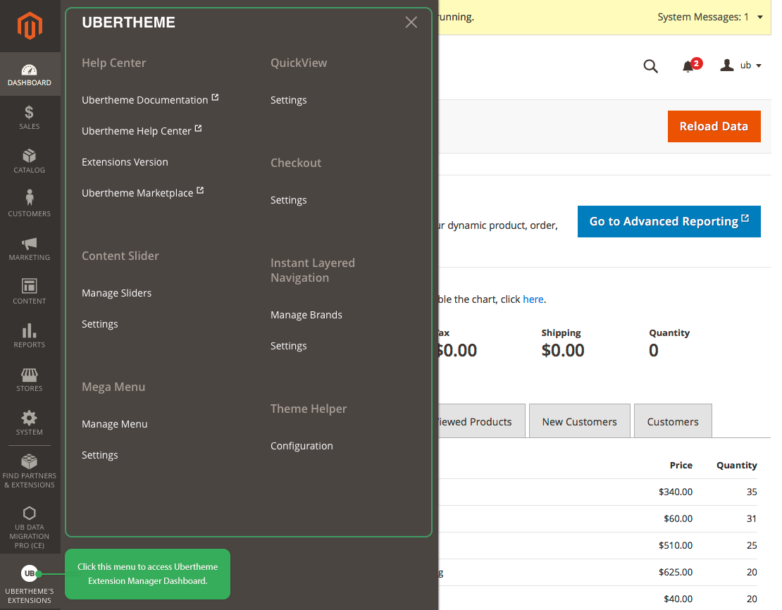
NOTE: Since UB Content Slider version 1.1.3 and above for Magento 2.3.1+, we implement a new Ubertheme Extension Manager Dashboard as shown in the screenshot below:
3.4.1. General Configuration
Log in to your Admin Panel | Ubertheme’s Extensions | [Content Slider] Settings, you should see the parameters shown on the following screenshot:
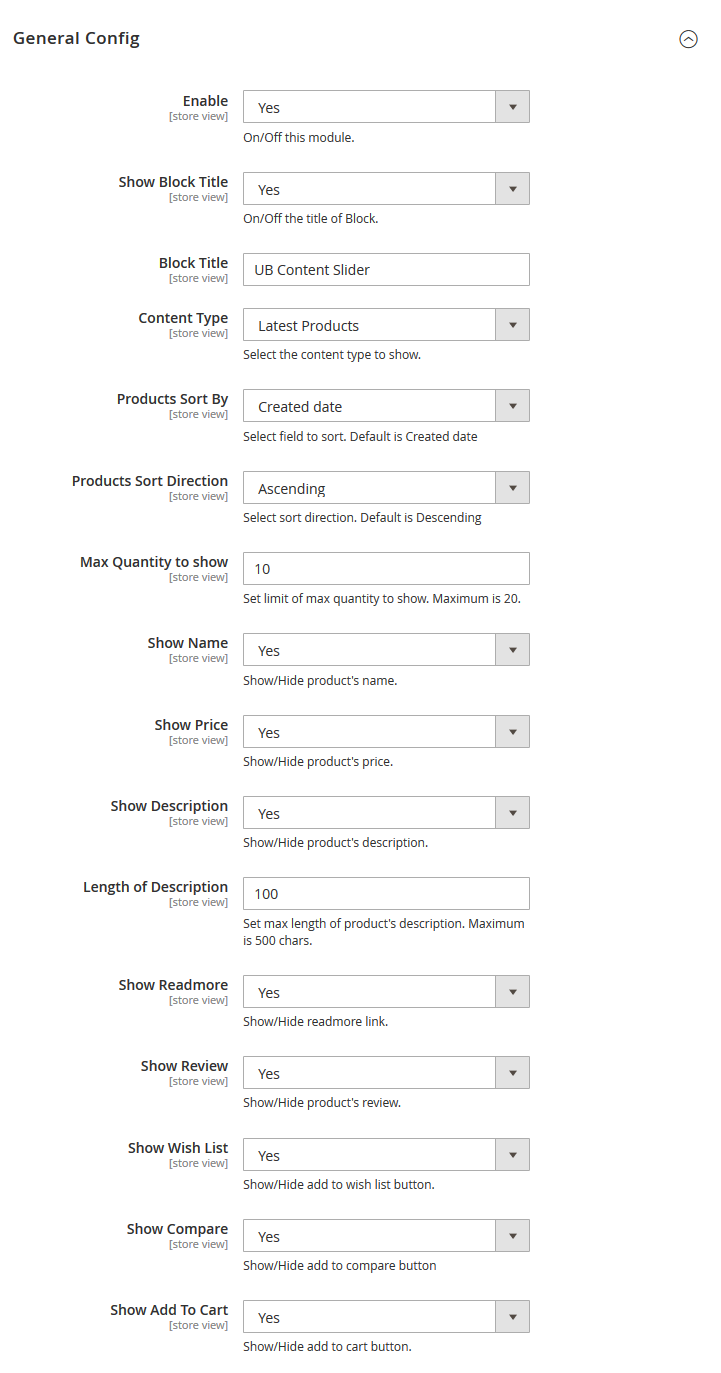
Parameters explanation:
-
- Enabled: Enable or disable UB Content Slider module.
- Block Title: fill in the title of the slider.
- Content Type: choose the type of product displayed, including: Best Seller / Latest Products / New Product (From … to … date) / Hot Products / Random Products / Uploaded Images, Videos.
- Max Quantity to Show: The maximum number of products shown on the product slider. The maximum is 20.
- Show Name: Display the product name.
- Show Price: Display the product price.
- Show Description: Display product description
- Length of Description: Set the maximum length of the product description.
- Show Read more: Show Read more button.
- Show Review: Show product review.
- Show Wishlist: Display Wishlist button.
- Show Compare: Display the Compare button.
- Show Add to cart: Show the Add to cart button.
3.4.2. Slider Configuration
Log in to your Admin Panel | Ubertheme’s Extensions | [Content Slider] Settings, tab the Slider Config section, you should see the parameters like
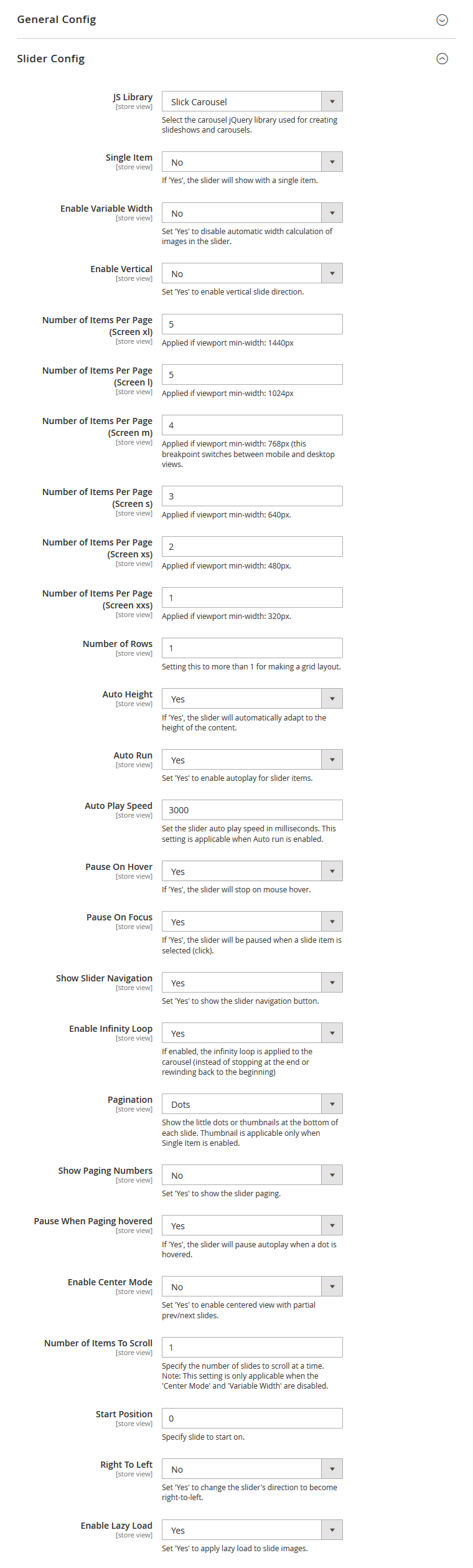
Parameters explanation:
- JS Library: In version 1.1.7, the UB Content Slider module also supports Slick Carousel by default. So you can select either OWL Carousel or Slick Carousel.
- Single Item: Set No to display more than one item on a slider. Set Yes if you want to show a banner carousel that cycling through a series of images. If Single Item is set to No, you need to configure the following related parameters:
- Enable Variable Width: Set ‘Yes’ to disable automatic width calculation of images in the slider.
- Number of Items Per Page (Screen xl): The number of products shown on one page for the viewport min-width 1440px.
- Number of Items Per Page (Screen l): The number of products shown for the viewport width 1024px to 1439px.
- Number of Items Per Page (Screen m): The number of products shown for the viewport width 768px to 1023.
- Number of Items Per Page (Screen s): The number of products shown for the viewport width 640px to 767px.
- Number of Items Per Page (Screen xs): The number of products shown for the viewport width 480px to 639px.
- Number of Items Per Page (Screen xxs): The number of products shown for the viewport width 320px to 479px.
- Number of Rows: Setting this to more than 1 for making a grid layout.
- Enable Vertical: Set to Yes to enable vertical slide direction.
- Auto Height: If set to Yes, the slider will automatically adapt to the height of the content.
- Auto Run: Enable autoplay for slider items.
- Auto Play Speed: Set the slider speed in milliseconds.
- Pause On Hover: Stop autoplay on mouse hover.
- Pause On Focus: Stop autoplay when a slide item is selected (click).
- Show Slider Navigation: Show slider navigation buttons.
- Show Slider Paging: Show slider pagination.
- Enable Infinity Loop: If enabled, the infinity loop is applied to the carousel (instead of stopping at the end or rewinding back to the beginning)
- Pagination: Show the little dots or thumbnails at the bottom of each slide. Thumbnail is applicable only when Single Item is enabled. If enabled thumbnail, you need to configure the following related parameters:
- Width of Thumbnail: Set the width (px) of the thumbnail of slide item (image/video). Enter ‘0’ for auto width.
- Height of Thumbnail: Set the height (px) of the thumbnail of slide item (image/video). Enter ‘0’ for auto height.
- Show Paging Numbers: Show numbers inside the pagination buttons.
- Pause When Paging hovered: If ‘Yes’, the slider will pause autoplay when a dot is hovered.
- Enable Center Mode: Set ‘Yes’ to enable centered view with partial prev/next slides.
- Number of Items To Scroll: Specify the number of slides to scroll at a time. Note: This setting is only applicable when the ‘Center Mode’ and ‘Variable Width’ are disabled.
- Start Position: Specify the slide to start on.
- Right To Left: Set ‘Yes’ to change the slider’s direction to become right-to-left.
- Enable Lazy Load: Delays loading of images. Images outside of viewport won’t be loaded before user scrolls to them.
Note: The lazy load feature is available for product content types only (Bestseller Products, Latest Products, New Products, Hot Products, etc.).
- Slider Transition: Add CSS3 transition style (works only in modern browsers that support CSS3 translated methods). Slider Transition is available only when the ‘Single Item’ is enabled.
- Enable Process Bar: Display the progress bar (Available when the Slider With Single Item is enabled).
IV. How to create banner sliders, product image hotspots, and lookbook page
In this section, you will learn about all steps to create a specific type of slider, including:
- How to create a banner slider
- How to create a video slider
- How to create a product carousel
- How to create Product Image Hotspots
- How to create a Lookbook page
4.1. How to create a banner slider
-
- Step 1: Go to your Magento 2 admin | Ubertheme’s Extensions | [Content Slider] Manage Sliders | click Add New Slider -- see the screenshot below:
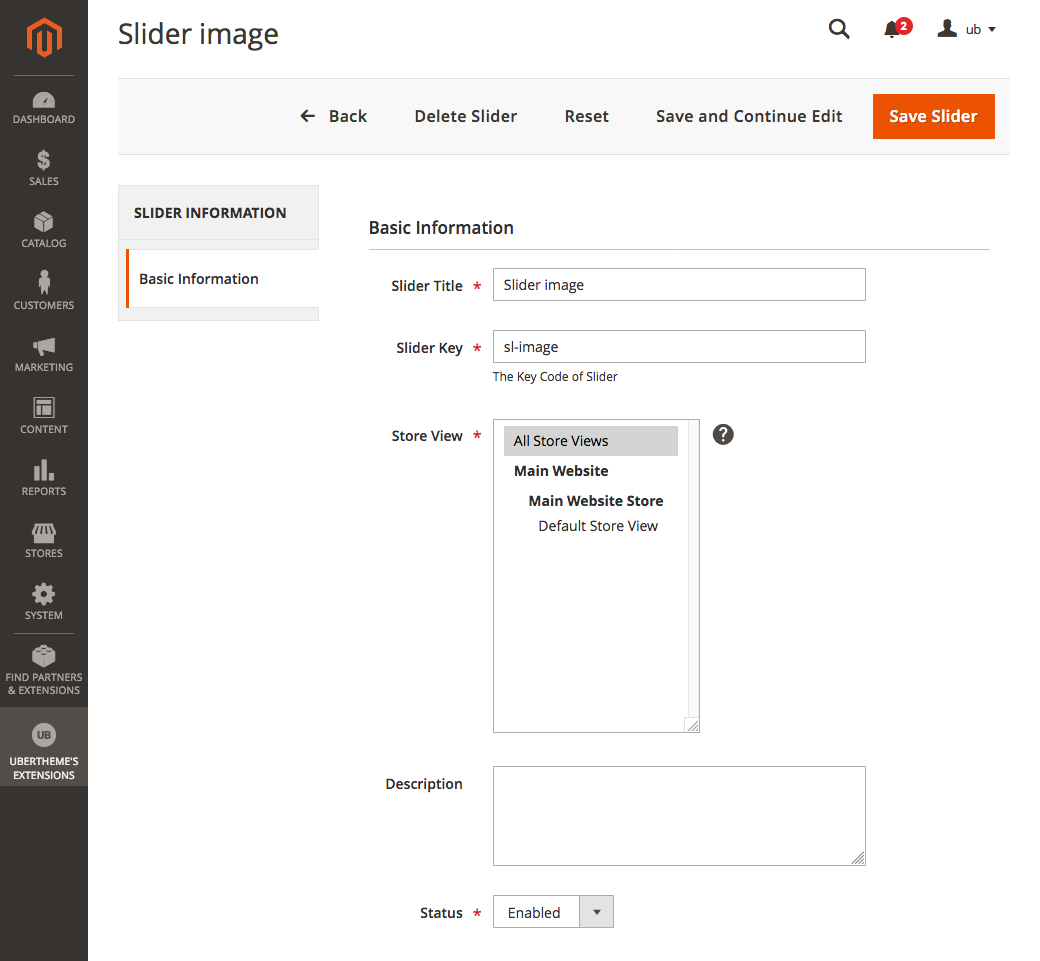
- Slide Title: Enter the slide title.
- Slide Key: Enter Slide Key. This key is [slider_key] parameter that will be used in the shortcode to show a slider with images/videos content type when creating a CMS static block.
- Store View: Select Store to display the slider.
- Description: Enter the description of the slider.
- Status: To enable/disable slider.
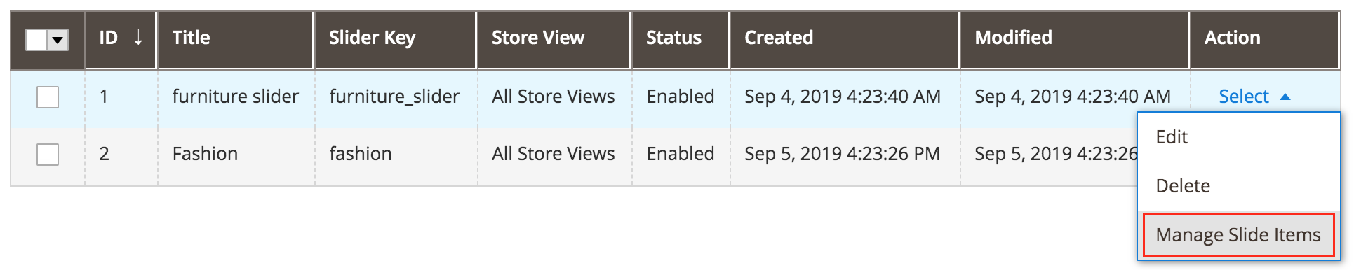
- Step 2: Create Slider Item for Image/Video SliderGo to your Magento 2 admin | Ubertheme’s Extensions | [Content Slider] Manage Sliders | navigate to the Slider you have just created in the previous step and click Select | Manage Slider Items:
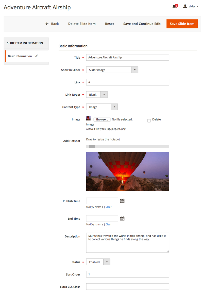
Then, click Add New Slide Item, you should see the configuration form as follows:
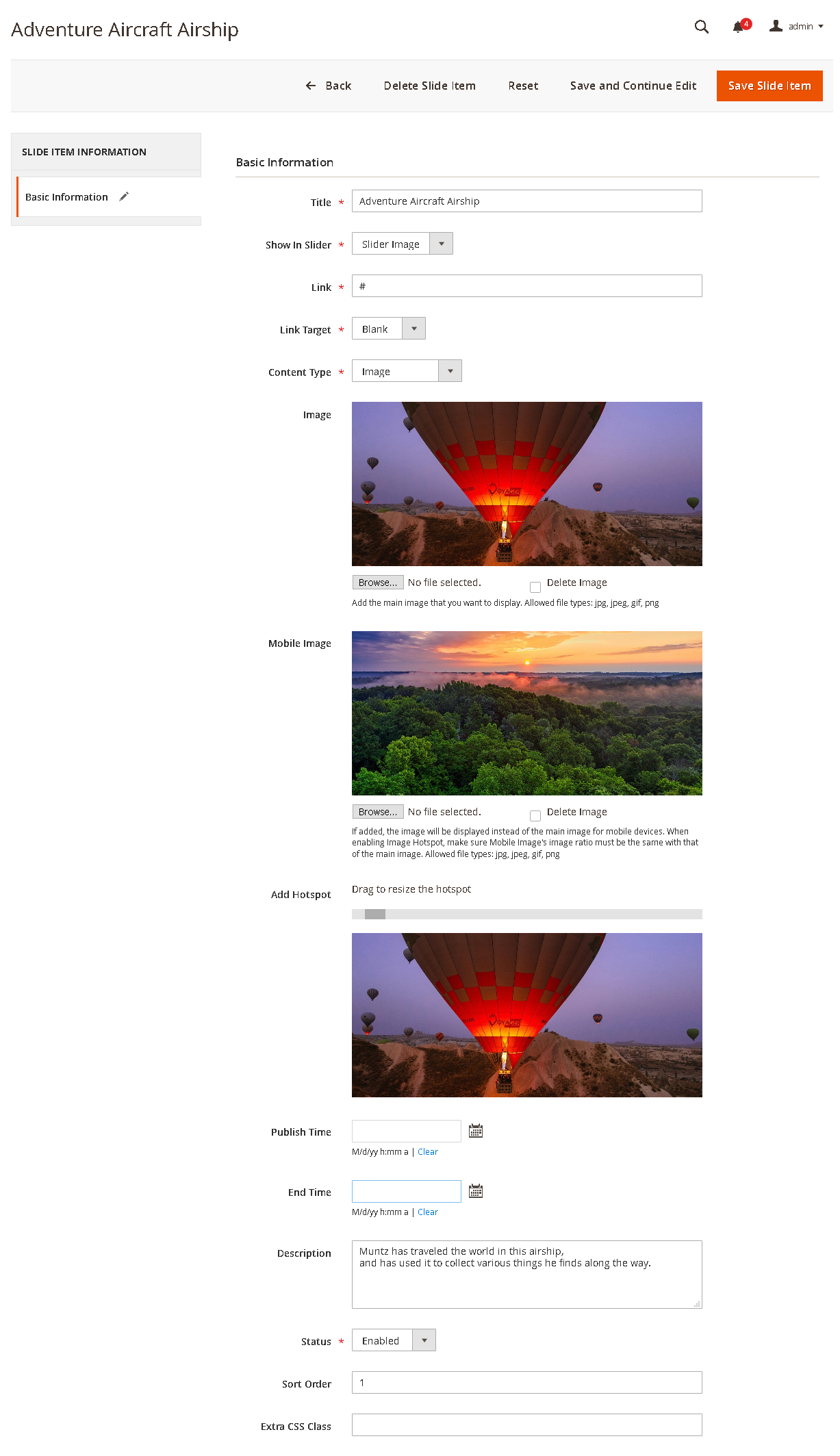
- Show In Slider: Assign the slider item to the slider that you want to display in your slider.
- Link: Enter one of the following:
- The URL of a page in your store. Example: gear.html
- The full URL of an external page to be linked
- Link Target: The target attribute specifies the default target for the link on the page.
- Content Type: Select content type for slider item, either Image, Youtube video, or Vimeo video. If video type enabled, you need to enter the video ID accordingly.
- Image: Upload the image for the slider.
- Mobile Image: Upload the image for the slider on Mobile (available in UB Content Slider v1.1.5 and newer). If added, the image will be displayed instead of the main image for mobile devices. When enabling Image Hotspot, make sure Mobile Image’s image ratio must be the same as that of the main image.
- Add Hotspot: Add product hotspot to this banner slider. See 4.3. How to create a product image hotspot for more details.
- Publish time: Set a future date and time for the slider to publish.
- End time: Set a future date and time for the slider to be disabled.
- Description: Enter the description of the slider.
- Status: To enable/disable the slider item.
- Sort order: Specify the order of the slider item, starting with the position ‘0’.
- Extra CSS Class: Additional styles for the slider. See 3.3. List of Parameters for more details.
- Step 3: Assign the slider to your storefront.
NOTE: UB Content Slider supports a few ways to insert a slider to a CMS page or CMS static block. Check 3.2. How to display a slider on a page for more details.
You can place the slider anywhere on your Magento 2 store. In this section, we walk you through an example about how to place a carousel image slider in a block and then position the block on the home page.
- Go to your Magento 2 admin | Content | (Elements) Blocks | open Home Page Block (You can select any block you want) | and click Select | Edit
- Tap Show / Hide Editor to work in WYSIWYG mode. Then, position the cursor in the text where you want the slider widget to appear. Next, tap Insert Widget on the editor toolbar.
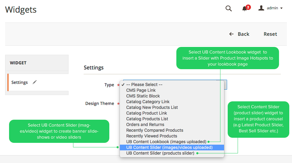
- When prompted, choose the UB Content Slider (images/videos uploaded) widget type. The screenshot below shows the widget configuration form after you choose the Widget type:
Complete the configuration as needed:
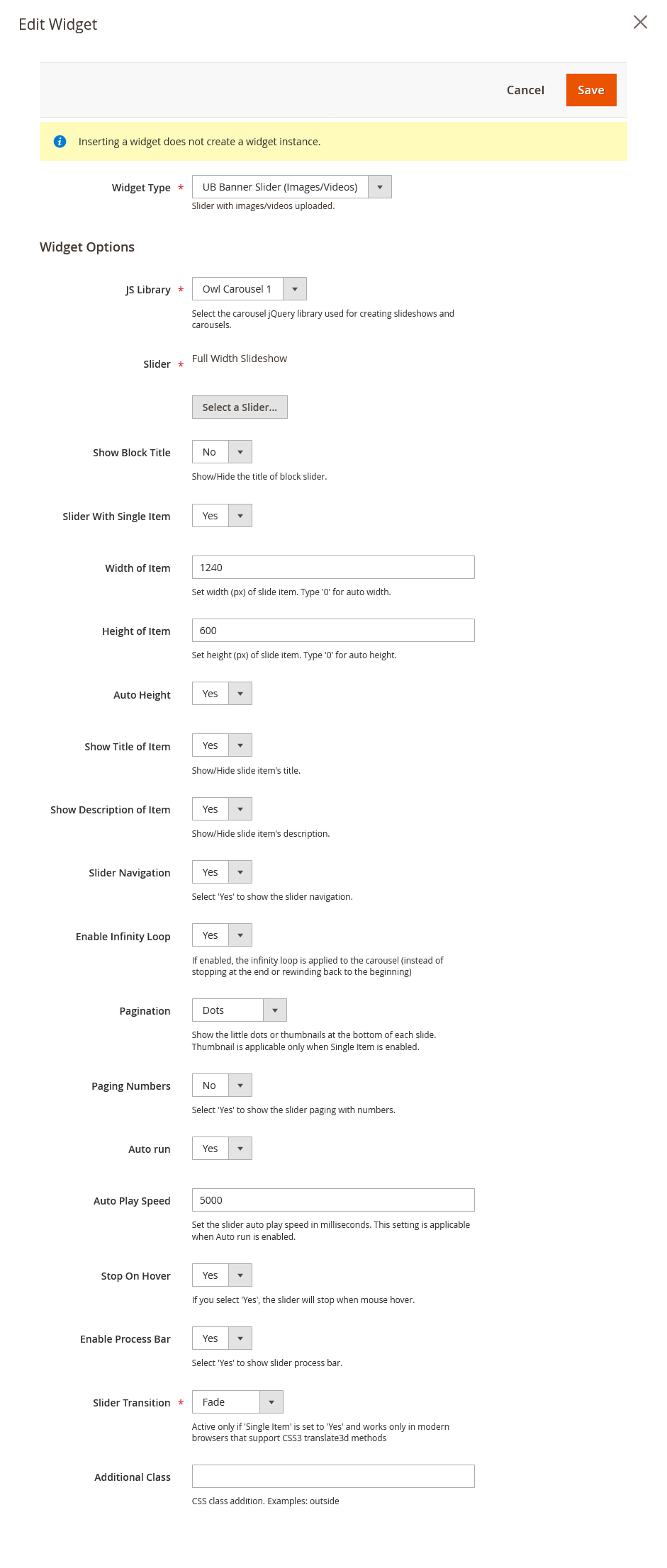 NOTE: Global settings related to slider configuration can be found in 3.4.1. General Configuration. Global settings can be overridden per slider with the following parameters:Below are the sample values used on our demo. You can replace them with your own values.
- JS Library: Select the carousel jQuery library used for creating slideshows and carousels -- Slick or OWL carousel (Slick carousel is available in UB Content Slider v1.1.7 and newer)
- Slider: Choose the slider you want to display
- Show Block Title: Set to No
- Slider With Single Item: Set to Yes (Enabling Single Item allows to show a banner carousel that cycling through a series of images)
- Width of Item: 1240 (in px)
- Height of Item: 600 (in px)
- Auto Height: Yes (This sets the auto height of the slider items in the slider)
- Show Title of Item: Yes
- Show Description of Item: Yes
- Slider Navigation: Set to Yes
- With UB Content Slider v1.1.6 and older:
- Slider Thumbnail: No
- Slider Paging: Yes
- Slider Speed: 200 (in milliseconds)
- Enable Lazy Load: Yes
- With UB Content Slider v1.1.7 and newer:
- Enable Infinity Loop: Set to Yes
- Pagination: Dots. (Select pagination style for slider)
- Auto Play Speed: 5000
- Paging Numbers: No (This shows the numbers inside the pagination buttons)
- Auto Run: Yes (This enables autoplay for the slider)
- Stop On Hover: Yes (stop autoplay on mouse hover)
- Enable Process Bar: Yes
- Slider Transition: Fade
- Additional Class: If empty, the default value will be used. In UB Content Slider v.1.1.5 and newer, it supports 2 predefined CSS: inside (default), outside (The old ub-style-1, ub-style-2 have been deprecated and was only used in UB Content Slider v1.1.4 and older). See List of parameters for more details)
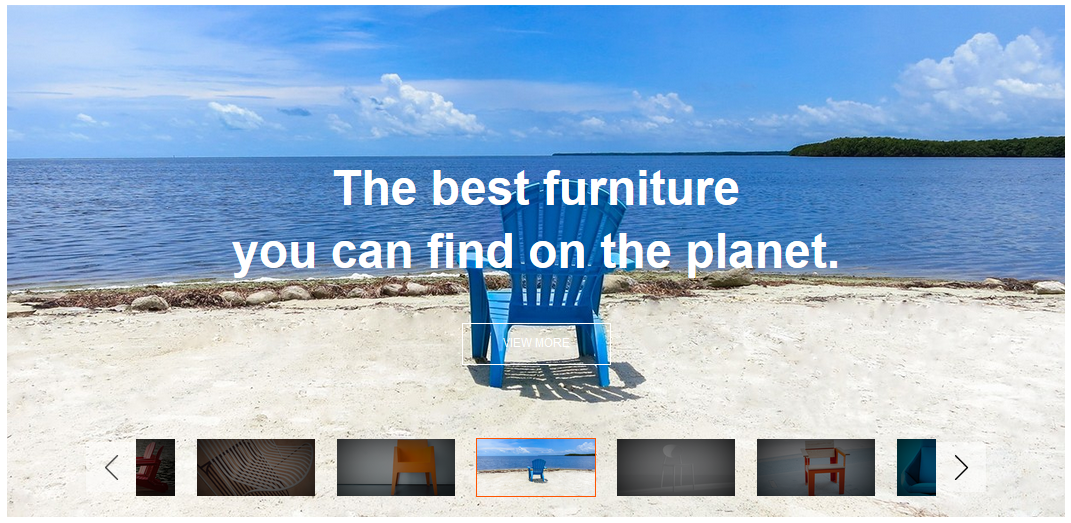
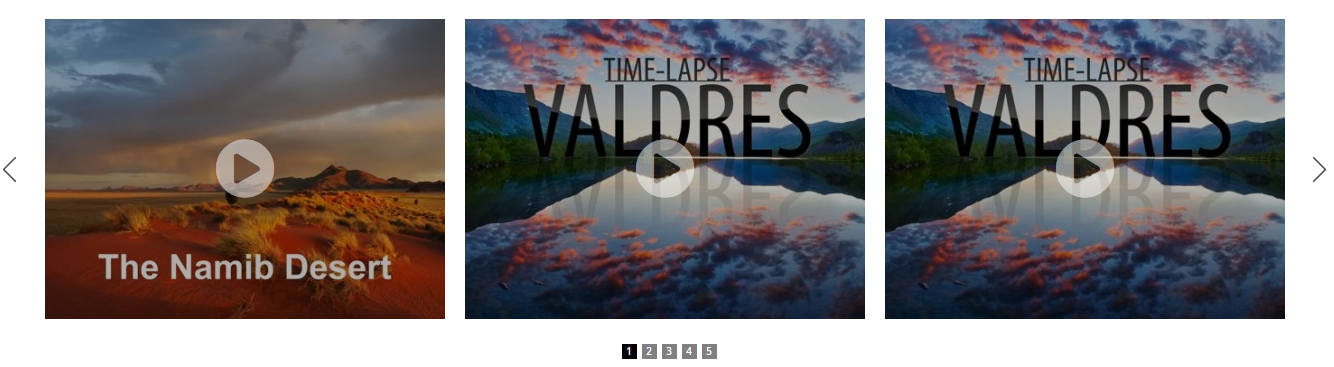
Once you specify your own configuration, clean Magento 2 cache, you should see the slider on your storefront like our demo:

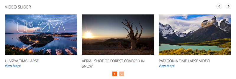
4.2. How to create a video slider
To create a video slider, you simply follow the same steps and configuration as 4.1. How to create a banner slider. Please note a few specific parameters in the video slider as follows:
- Step 1: Add New Slider -- refer to 4.1. How to create a banner slider for more details.
NOTE: Enter the Slide Key of your video slider. This [slider_key] parameter that will be used in the shortcode to show your video slider when creating a CMS static block.
- Step 2: Create video slider items -- refer to 4.1. How to create a banner slider for more details. If you want to create a video slider like our demo, here is a sample configuration of a video slide item on our demo: sample config
- Step 3: Assign the video slider to your storefront -- refer to 4.1. How to create a banner slider for more details. When inserting your video slider to a CMS static block, you can configure the parameters that your project requires. In case you want to place the video slider in a CMS static block like our demo, here is a sample widget configuration: sample config.
- Width of Item: 393 (px)
- Height of Item: 221 (px)
- Slider With Single Item: Set to No
- Number Items Per Page (on a large screen): Set to 3 (The number of products shown on one page for the viewport width above 1200px)
- Number Items Per Page (on desktop): Set to 3 (The number of products shown for the viewport width below 1200px)
- Number Items Per Page (on desktop small): Set to 2 (The number of products shown for the viewport width below 980px.
- Number Items Per Page (on Tablet): Set to 2 (The number of products shown for the viewport width 768px and up.
- Number Items Per Page (on Mobile): Set to 1 (The number of products shown for the viewport width below 480px.
- Additional Class: If empty, the default value will be used. UB Content Slider v1.1.5 and newer supports 3 predefined CSS classes for Slider: inside (default), outside, click-to-play. (The old ub-style-1, ub-style-2 have been deprecated and was only used in UB Content Slider v1.1.4 and older). See List of parameters for more details)
Once done, clean Magento 2 cache, you should see the sample video slider like our demo:
4.3. How to create a product carousel
You can create multiple product carousels and place them anywhere in your store. This option is handy to feature your bestseller, latest, or hot products, etc, with ease.
NOTE: UB Content Slider supports a few ways to insert a slider to a CMS page or CMS static block. Check 3.2. How to display a slider on a page for more details.You can place the slider anywhere on your Magento 2 store. In this section, we walk you through an example about how to place a product carousel in a block and then position the block on the home page.
- Step 1: Select the type of product carousel you want to display:
- Go to your Magento 2 admin | Content | (Elements) Blocks | open Home Page Block (You can select any block you want) | and click Select | Edit
- Tap Show / Hide Editor to work in WYSIWYG mode. Then, position the cursor in the text where you want the slider widget to appear. Next, tap Insert Widget on the editor toolbar.
- When prompted, choose the UB Content Slider (product slider) widget type as shown in this screenshot (You can select between the content types: Latest Products, New Products, Hot Products, Best Seller Products, Random Products):
Complete the configuration as needed:
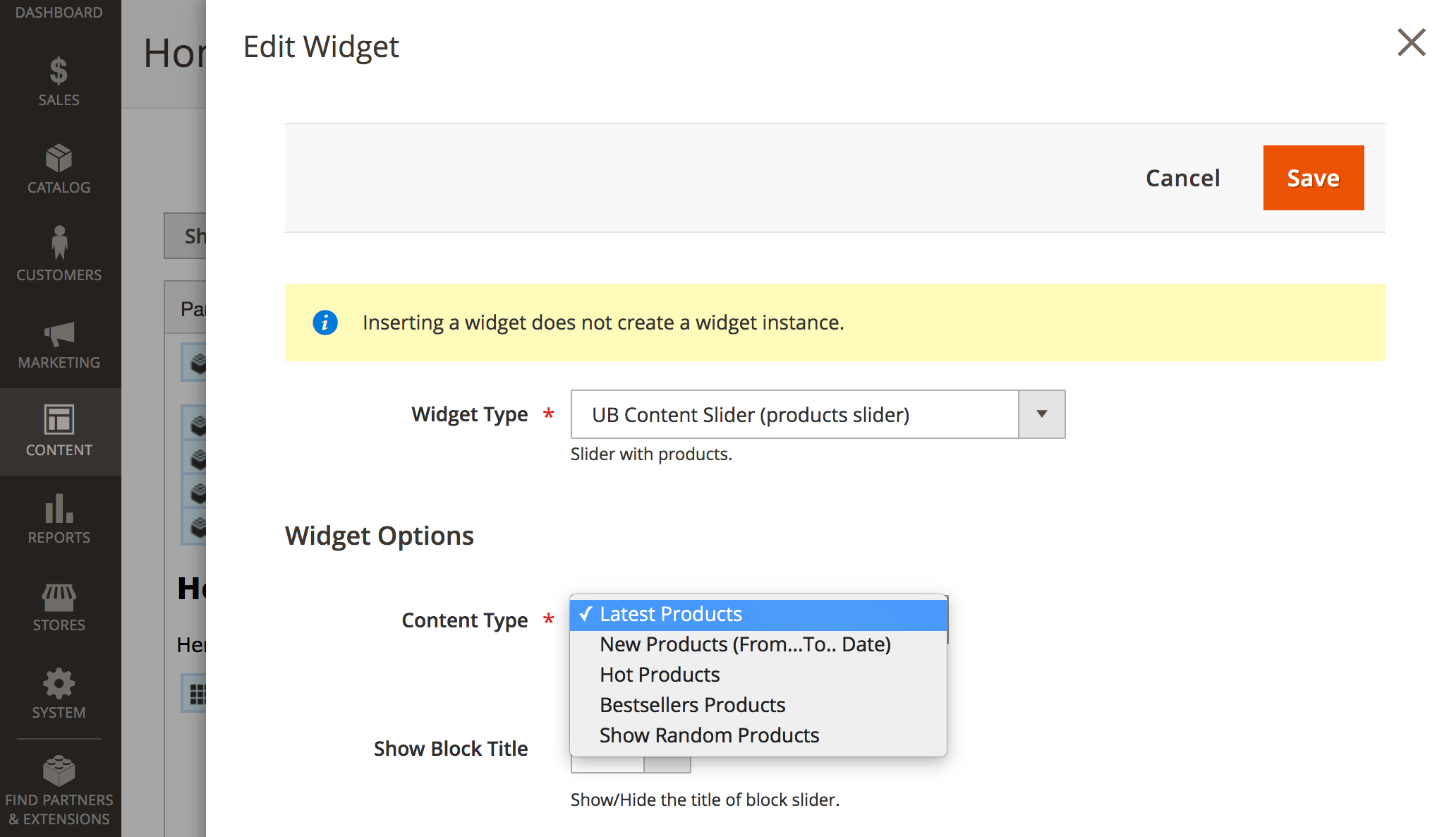
NOTE: Additional info about the types of product carousels:
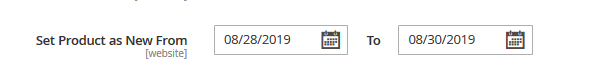
a. New Products Carousel: displays products that are marked as new in your store. To define the products as ‘New’, go to your Magento 2 admin | Catalog | (Catalog) Products | select a product you want to mark as new in your store, click Edit | navigate to the Set Product as New From field, enter the data range in which the product will be promoted as a new product:
b. Hot Product Carousel: to define the products as ‘Hot’, you open a product configuration panel (like the ‘New’ product above), set the Is Hot field to Yes:

c. Best Seller Product Carousel: this shows the best selling products based on your Magento admin statistics during an interval of time or date range.
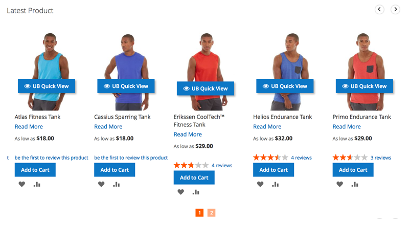
- Step 2: Configure the product carousel. The parameters are self-explanatory and almost similar to Section 4.1. How to create a banner slider. Once you complete the configuration, clean Magento 2 cache, you should have your product carousel on your storefront. Here’s an example of the Latest Product block on our demo:
- Step 1: Go to your Magento 2 admin | Ubertheme’s Extensions | [Content Slider] Manage Sliders | click Add New Slider -- see the screenshot below:


4.4. How to create Product image hotspots
To add a banner slideshow with product image hotspots, you follow these steps:
-
-
- Step 1: Create a new slider
- Step 2: Create slider items
- Step 3: Add product image hotspots to each slider items
- Step 4: Assign the slider with product hotspots to your storefront
-
All steps 1, 2, and 4 above are exactly the same as 4.1. How to create a banner slider. Simply follow Step 3 -- Adding product image hotspots to a slider item as follows:
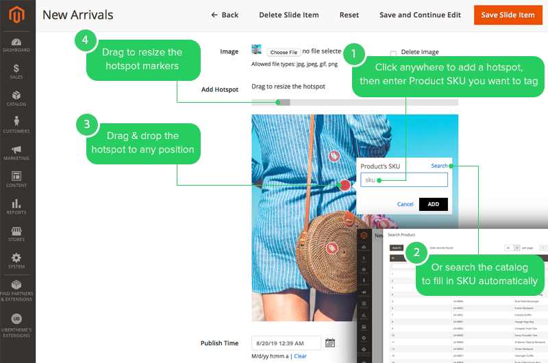
Once you already create a slider item, upload a banner image and hit Save and Continue Edit button, you should see slider item configuration form below:
You can start adding product images right from the Add Hotspot field:
-
-
- Click anywhere on the banner image to add a hotspot
- Enter specific Product’s SKU you want or click Search to search your catalog (On the catalog prompted, find the product you wish to tag and click to automatically create a product hotspot).
- Then, drag and drop the hotspot to any position you want.
- In case you need to adjust the hotspot marker’s size, drag the size bar on top of the banner image.
-
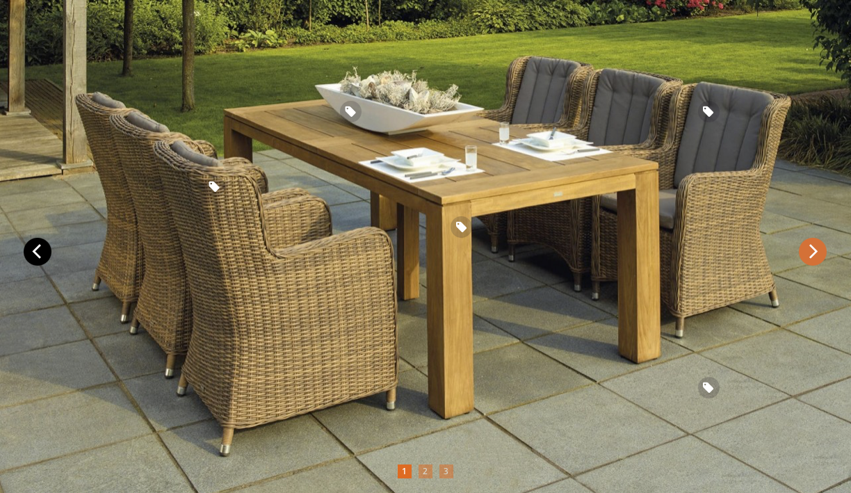
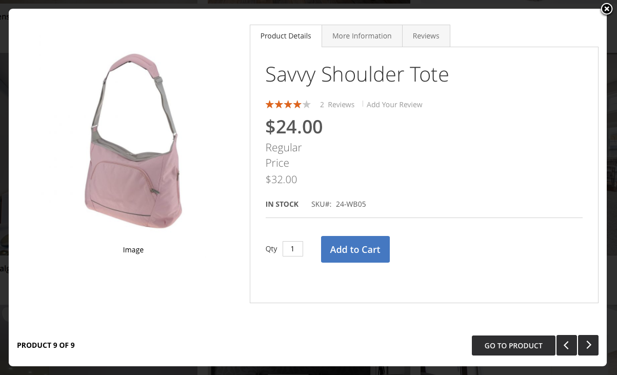
Once you complete Step 3 -- Adding product image hotspot and Step 4 -- Assigning the slider with product hotspots to your storefront, clean your Magento 2 cache, you should see your slideshow with product hotspots on your storefront. Here’s an example:
(Optional) Configure Quickview modal
When a user hovers over a product hotspot and clicks on the product title or product thumbnail, a quick view modal is prompted where he can add the item to the cart. You can configure to enable centered quick view modal or right quick view modal:
Navigate to your Magento 2 admin | Ubertheme’s Extensions | (Quickview) Settings | in the Modal Settings, set the Type field to the style you want (Popup, Right To Left, or Left to Right, etc.).
Here’s the sample of Right to Left modal:
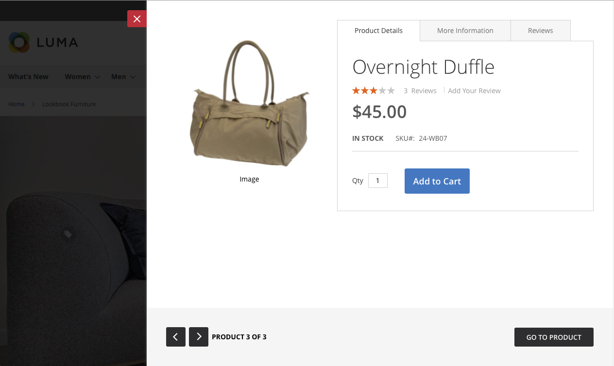
Here’s the sample of Popup (centered) modal:
4.5. How to create a Lookbook page
To create a lookbook page, you can follow these steps:
- Step 1: Create a new page which is used as Lookbook page
- Step 2: Insert UB Content Lookbook (images uploaded) widgets in the Lookbook page
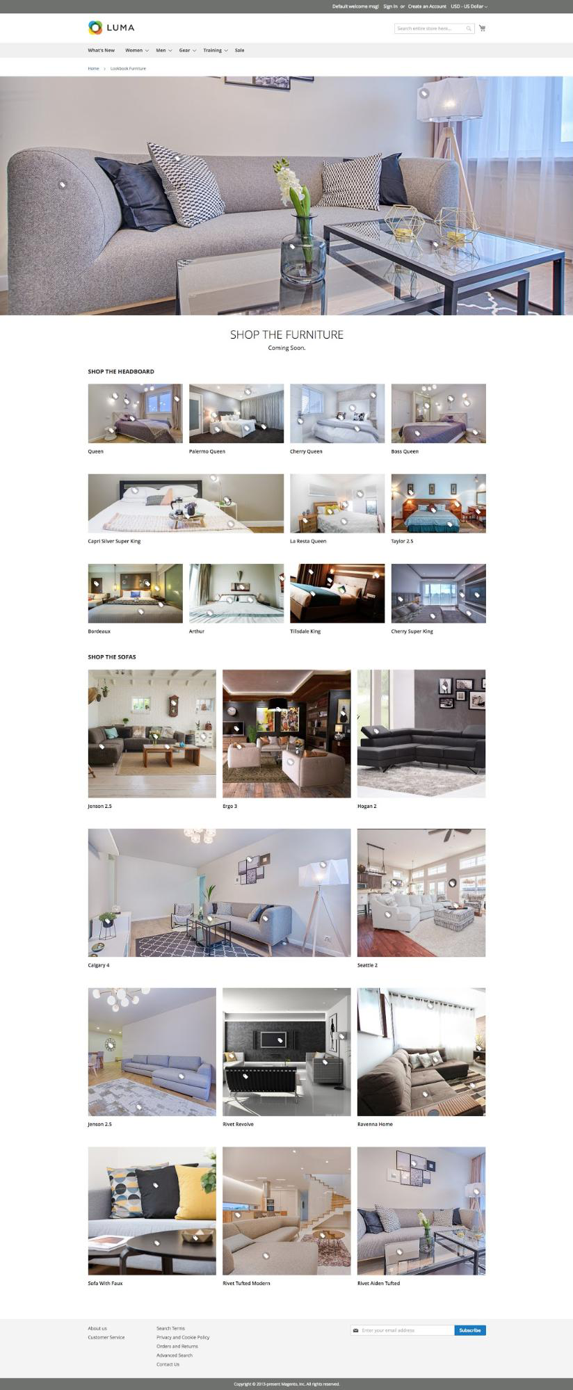
For the purpose of this guide, we will take the Furniture Lookbook page on our demo as an example. We will create a lookbook page like this screenshot:
- Step 1: In the Admin Panel, navigate to Content | (Elements) Pages | Add New Page | complete the configurations with some basic settings for now:
- Page Tile: Enter the Lookbook page title
- Content: You add the code below first. Once you create sliders, you will get back here to insert sliders to this section.
<div class="lookbook-page-title"> <h1 class="header-text">Shop The Furniture</h1> <p class="subheader-text">Coming Soon.</p> </div> - Search Engine Optimization: complete the SEO configuration as needed. Make sure you specify the URL key with lowercase characters with hyphens to separate words.
- Page in Websites: in the Store View list, select the view where the lookbook page is to be available.
- Design: select the layout you want. At present, the predesigned layout packed with UB Content Slider supports 1 column layout only.
- Step 2: Insert UB Content Lookbook (images uploaded) widgets in the Lookbook page.
- First, you need to create 3 Sliders that will be inserted into the lookbook page (Please refer to 4.1. How to create a banner slider for more details about how to create a banner slider and it’s associated slider items):
- Lookbook Furniture Masthead: presents the hero block like this screenshot:
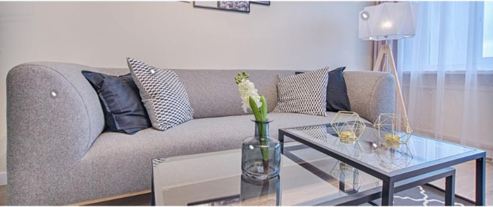
Configuration steps: (1) slider’s configuration -- (2) slider item’s configuration
- Shop the Headboard: presents the product block with 4 items per row like this screenshot:
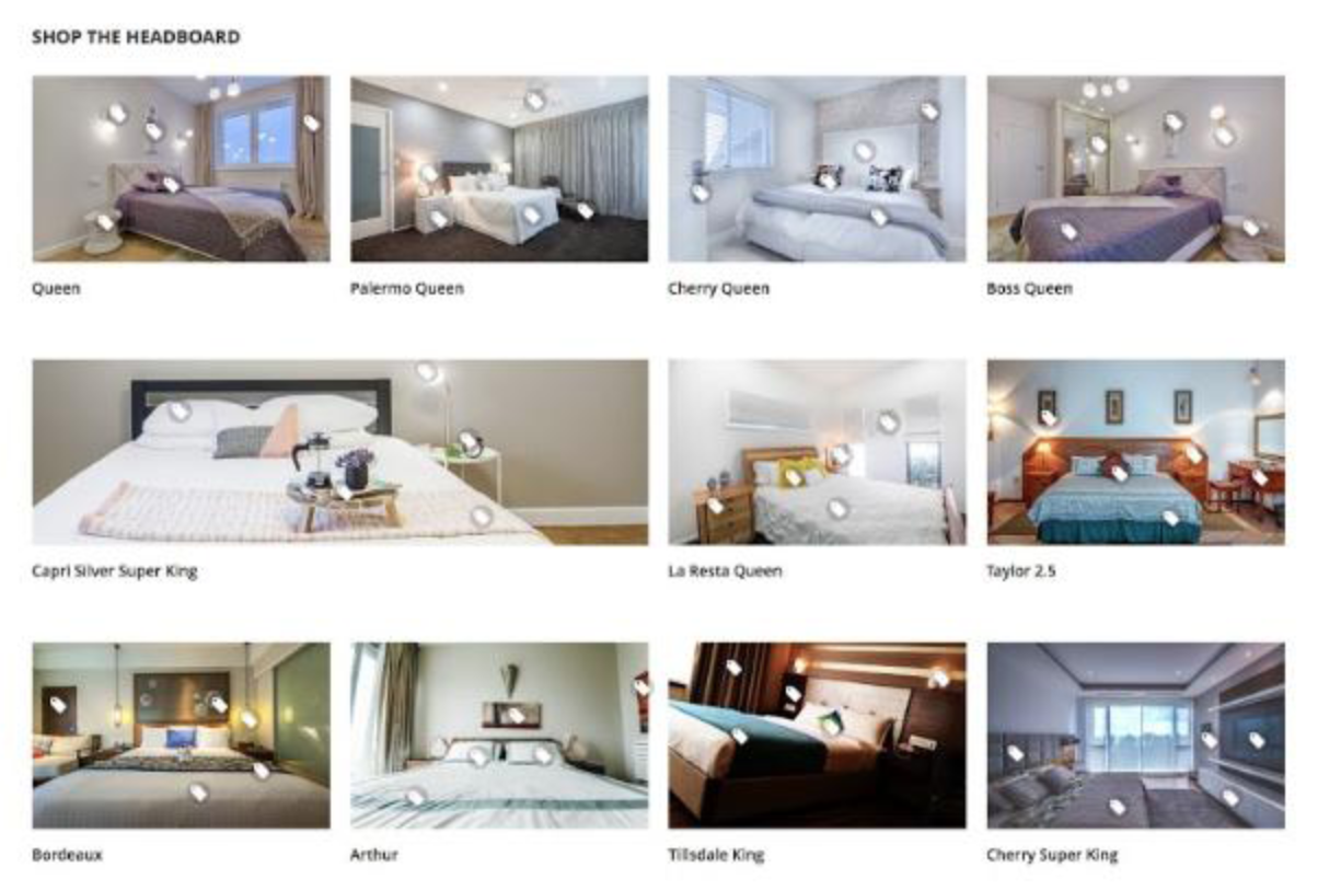
Configuration steps: (1) slider’s configuration -- (2) slider items’ configuration (You can create as many slider items as you want)
NOTE: In the configuration of slider item, if you want to merge 2 items per row into 1, make sure you enter thecol-lgin the Extra CSS Class field. Otherwise, simply leave this field blank. - Shop the Sofas: presents the product block with 3 items per row like this screenshot:
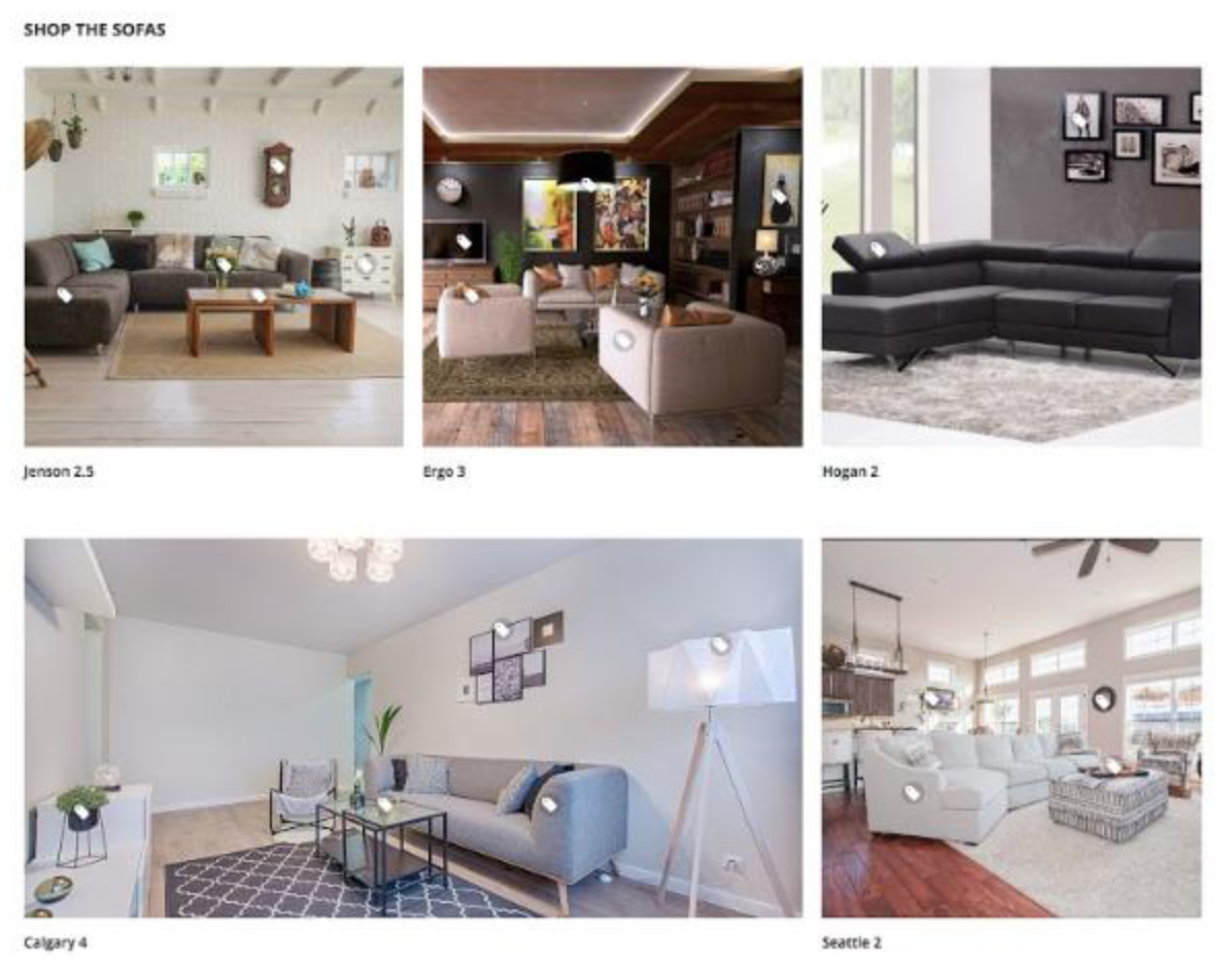
Configuration steps: similar to the Shop the Headboard above.
NOTE: In the configuration of slider item, if you want to merge 2 items per row into 1, make sure you enter thecol-lgin the Extra CSS Class field. Otherwise, simply leave this field blank.
- Lookbook Furniture Masthead: presents the hero block like this screenshot:
- Second, Insert UB Content Lookbook (images uploaded) widgets in the Lookbook page
- Navigate back to the Lookbook page created in Step 1 (Content | (Elements) Pages), under the Content tab,
- Tap Show / Hide Editor to work in WYSIWYG mode. Then, position the cursor in the text where you want the slider widget to appear. Next, tap Insert Widget on the editor toolbar.
- When prompted, choose the UB Content Slider (product slider) widget type. Then select the Slider we created above. Repeat this step to insert each widget in the lookbook page:
- Inserting Lookbook Furniture Masthead widget: see the configuration
Make sure you set the Template field with ‘Masthead‘. - Inserting Shop the Headboard widget: see the configuration
Make sure you enter the Additional Class field withgrid-4-per-row. - Inserting Shop the Sofas widget: see the configuration
Make sure you enter the Additional Class field withgrid-3-per-row.NOTE: UB Content Slider supports a few predefined CSS classes for sliders: grid-2-per-row, grid-3-per-row, grid-4-per-row. The default is fullwidth one column.
Apart from those CSS classes, you can define your own CSS classes to define the grid of columns. Refer to 3.3. List of Parameters to learn more about additional CSS classes.
- Once you complete the configuration, clean Magento 2 cache and check your storefront.
- Inserting Lookbook Furniture Masthead widget: see the configuration
- First, you need to create 3 Sliders that will be inserted into the lookbook page (Please refer to 4.1. How to create a banner slider for more details about how to create a banner slider and it’s associated slider items):


VII. Manual Un-Installation
If you want to have UB Content Slider extension uninstalled, please follow steps below:
- Step 1:[Important] Remove related widgets if they were created.
Go to your Backend | Content | Widget, delete all created widgets with Widget Type ‘UB Content Slider (products slider)’ OR ‘UB Content Slider (images/videos uploaded)’.
- Step 2: Disable UB Content Slider module and clean associated database tables.
-- Open your terminal, go to your Magento 2 folder <your magento installation path> and run the following CLI commands:
php -f bin/magento maintenance:enable

php -f bin/magento deploy:mode:set developer

php -f bin/magento module:disable -c Ubertheme_UbContentSlider

rm -rf app/code/Ubertheme/UbContentSlider
-- Open your Mysql cpanel (eg. PHPMyAdmin), and run the following SQL syntax:
NOTE: Make sure you replace with your own <table_prefix>:
DELETE FROM '<table_prefix>setup_module` WHERE `module`= 'Ubertheme_UbContentSlider';

DROP TABLE '<table_prefix>ubcontentslider_slide_item`;

DROP TABLE '<table_prefix>ubcontentslider_slide_store`;

DROP TABLE '<table_prefix>ubcontentslider_slide`;

DELETE FROM '<table_prefix>eav_attribute` WHERE `attribute_code` = 'is_hot';
Step 3:
- Once done, run the following commands:
NOTE: You can still keep the developer mode if you continue development process. Otherwise, run the following commands to switch to production mode:
php bin/magento deploy:mode:set production

php bin/magento maintenance:disable