Flannel
I. Installation
- If you are new to Uber Magento templates, it is helpful to look at general guideline for basic understanding before you start with installation.
- If you do use our Quickstart installation, the guideline below is not applicable. Learn how to install Quickstart HERE
What you need to do first?
- You will need your Magento store comes ready before you integrate our themes. If your store has not been available yet, get it quickly following Magento Installation Guide
Extension basetheme is required to be installed before installing the other extensions and theme.
- Install Flannel template: Theme installation guide?
- Install extensions built in Flannel: Extension installation guide?
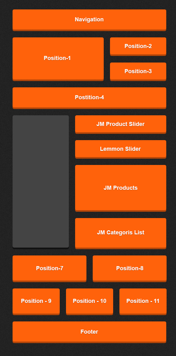
- Block Position: Layout
Included Extensions
In Wall, following extensions are included:
- Products Extension
- Slideshow Extension
- Mega Menu Extension
- Masshead Extension
- Slider Extension
- Categories List Extension
- Quickview Extension
- Deals Extension
- Base Theme Extension
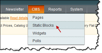
II. Static Blocks
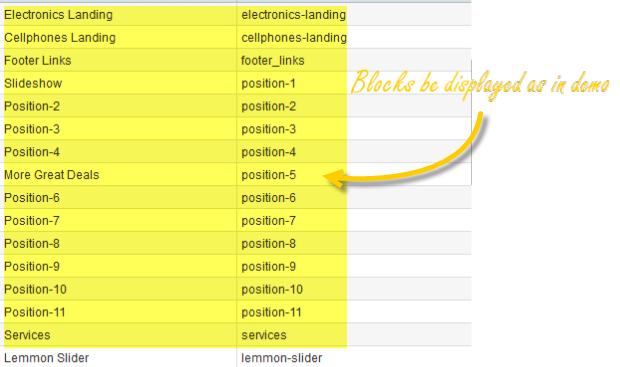
The Flannel front-page uses 12 static blocks on Theme:
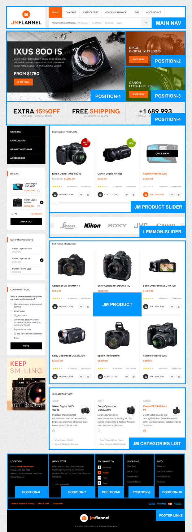 Static Blocks list

To create these blocks, go to CMS >> Static Block >> and select page that you want to display this block on (e.g: Home page):
List of static blocks
You can add a new block by click on Add New Block button to create new block and input the content of this block as you need. Please see
> How to create New Static Block.
Position-2:
<div class=" static-top1">
<div class=" bg-color">
<div class="inner1"><a class="text-title"> Nikon  Digital IXUS 800 IS </a>  {{widget type="cms/widget_page_link" anchor_text="Shop Now!" title="Shop Now!" template="cms/widget/link/link_block.phtml" page_id="9"}}</div>
</div>
</div>

Position-3:
<div class="static-top2">
<div class=" bg-color">
<div class="inner1"><a class="text-title"> Canon  Legria HF-R38 </a>  {{widget type="cms/widget_page_link" anchor_text="Shop Now!" title="Shop Now!" template="cms/widget/link/link_block.phtml" page_id="10"}}</div>
</div>
</div>

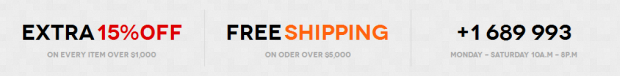
Position-4:
<div class=" ja-topsl_bottom">
<ul>
<li><span class="color-text1"> Extra</span> <span class="color-text2">15%0ff </span>  <span class="color-text4"> On every item over $1,000</span></li>
<li><span class="color-text1"> Free</span> <span class="color-text3">Shipping</span>  <span class="color-text4"> On oder over $5,000</span></li>
<li class="last"><span class="color-text1">+1 689 993</span>  <span class="color-text4"> Monday - Saturday 10A.M - 8P.M</span></li>
</ul>
</div>
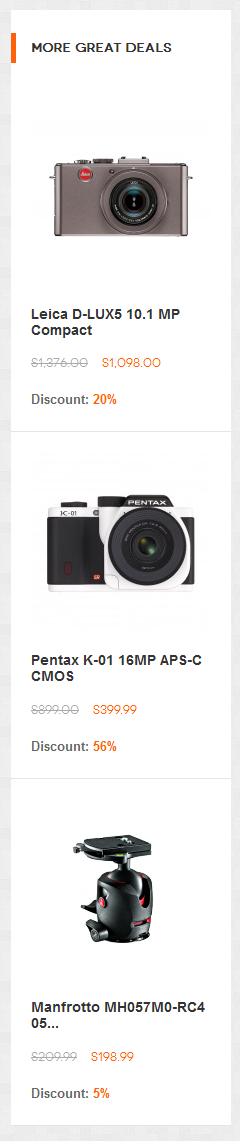
Postion-5: More Great Deals :
<div>{{block type="joomlart_jmproductsdeal/list" name="home.jmproductsdeal.list.right" template="joomlart/jmproductsdeal/right_col.phtml" mode="grid" quanlity="3" perrow="1" width=180 height=180 max="" showproductleft=0 showitemsold=0 showsaleenddate=0 showsaveamount=0 title="More great Deals" }}</div>
Position-6:
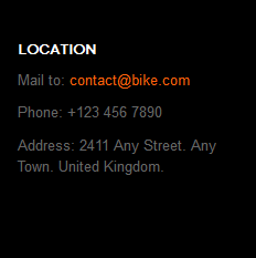
<div class=" col-1">
<div class="block block-list">
<div class="block-title"><strong> <span>Location</span> </strong></div>
<div class="block-content">
<p>Mail to: <a>[email protected] </a></p>
<p>Phone: +123 456 7890</p>
<p>Address: 2411 Any Street. Any Town. United Kingdom.</p>
</div>
</div>
</div>
Position-7:
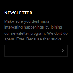
<div class=" col-2">{{block type="newsletter/subscribe" name="left.newsletter" template="newsletter/subscribe.phtml" }}</div>
Position-8:
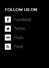
<div class=" col-3">
<div class="block block-list">
<div class="block-title"><strong> <span>Follow us on</span> </strong></div>
<div class="block-content">
<div class="socail-footer"><a class="facebook" title="facebook" href="#"><span>Facebook</span></a> <a class="twitter" title="Twitter" href="#"><span>Twitter</span></a> <a class="flickr" title="flickr" href="#"><span>Flickr</span></a> <a class="feed" title="Feed" href="#"><span>Feed</span></a></div>
</div>
</div>
</div>
Position-9:
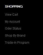
<div class=" col-4">
<div class="block block-list">
<div class="block-title"><strong> <span>Shopping</span> </strong></div>
<div class="block-content"><ol>
<li><a title="View Cart" href="#">View Cart</a></li>
<li><a title="My Account " href="#">My Account </a></li>
<li><a title="Oder Status" href="#">Oder Status</a></li>
<li><a title="Shop By Brand" href="#">Shop By Brand</a></li>
<li><a title="Trade-in Program" href="#">Trade-in Program</a></li>
</ol></div>
</div>
</div>
Position-10:
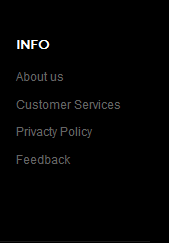
<div class=" col-5">
<div class="block block-list">
<div class="block-title"><strong><span> Info </span> </strong></div>
<div class="block-content"><ol>
<li><a title="About us" href="#">About us</a></li>
<li><a title="Customer Services " href="#">Customer Services </a></li>
<li><a title="Privacty Policy" href="#">Privacty Policy</a></li>
<li><a title="Feedback" href="#">Feedback</a></li>
</ol></div>
</div>
</div>
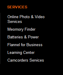
services:
<ul class="megamenu level2">
<li class="mega first"><a class="mega first" href="#"> <span class="menu-title"> Online Photo & Video Services </span> </a></li>
<li class="mega"><a class="mega" href="#"> <span class="menu-title"> Meomory Finder </span> </a></li>
<li class="mega"><a class="mega" href="#"> <span class="menu-title"> Batteries & Power </span> </a></li>
<li class="mega"><a class="mega" href="#"> <span class="menu-title"> Flannel for Business </span> </a></li>
<li class="mega"><a class="mega" href="#"> <span class="menu-title"> Learning Center </span> </a></li>
<li class="mega last"><a class="mega last" href="#"> <span class="menu-title"> Camcorders Services </span> </a></li>
</ul>
lemmon-slider:
<!-- Necessary HTML -->
<div class="jm-lemmon-slider">
<div id="jm-slider-main" class="slider">
<ul>
<li><a title="sample logo" href="#"><img src="{{media url="wysiwyg/logo/logo1.png"}}" alt="" /></a></li>
<li><a title="sample logo" href="#"><img src="{{media url="wysiwyg/logo/logo2.png"}}" alt="" /></a></li>
<li><a title="sample logo" href="#"><img src="{{media url="wysiwyg/logo/logo3.png"}}" alt="" /></a></li>
<li><a title="sample logo" href="#"><img src="{{media url="wysiwyg/logo/logo4.png"}}" alt="" /></a></li>
<li><a title="sample logo" href="#"><img src="{{media url="wysiwyg/logo/logo5.png"}}" alt="" /></a></li>
</ul>
</div>
<div class="controls"><a class="prev-slide" href="#">Prev Slide</a> <a class="next-slide" href="#">Next Slide</a></div>
</div>
<script type="text/javascript">// <![CDATA[
       jQuery(window).load(function(){
      jQuery( '#jm-slider-main' ).lemmonSlider({'infinite' : true});
    });
// ]]></script>

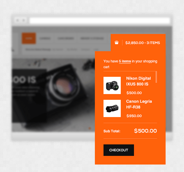
Sidebar shopping cart:
This theme is enabled sidebar shopping cart. Its style is so nice.
To enable it, go to Configuration >> Checkout >> Shopping Cart Sidebar
III. Extensions Configuration
Slideshow Module
Navigate to JoomlArt >> Slideshow and configure the default criteria
Update this code at Description value:
[desc img="1.jpg" url="camera/canon-eos-rebel-t4i-650d-18-0-mp-digital-slr.html"]
<h3>EOS Rebel</h3>
<p>Lorem ipsum dolor sit amet conse ctetur adipisicing elit, sed do eiusmod tempor incididunt ut labore et dolore magna aliqua. Ut enim ad minim veniam...</p>
<p class="price">from $572.99</p>
[/desc]

[desc img="2.jpg" url="camera/pentax-k-01-16mp-aps-c-cmos.html"]
<h3>Pentax K1</h3>
<p>Lorem ipsum dolor sit amet conse ctetur adipisicing elit, sed do eiusmod tempor incididunt ut labore et dolore magna aliqua. Ut enim ad minim veniam...</p>
<p class="price">from $399.99</p>
[/desc]

[desc img="3.jpg" url="camera/leica-m9-p-18mp-full-frame.html"]
<h3>Leica M9P</h3>
<p>Lorem ipsum dolor sit amet conse ctetur adipisicing elit, sed do eiusmod tempor incididunt ut labore et dolore magna aliqua. Ut enim ad minim veniam...</p>
<p class="price">from $6,499.00</p>
[/desc]
To get this extension to show onto the front page at the up top position, go to CMS > Pages >> Homepage >> In Design tab, please fill in Layout Update XML parameter -between tag as below :
<block type="cms/block" name="position-1">
<action method="setBlockId"><block_id>position-1</block_id></action>
</block>
Front-end Appearance

For more detail, please check the documentation of the module.
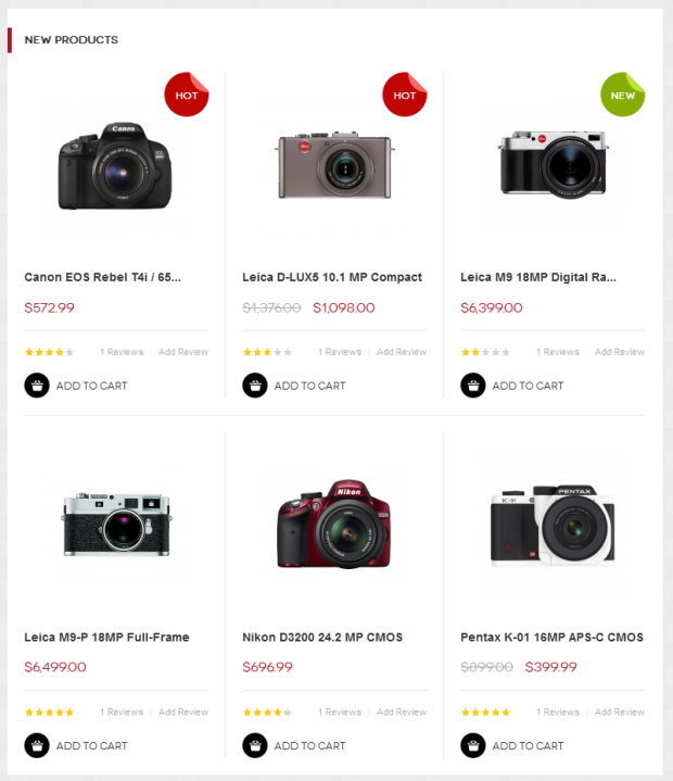
Products Slider Module
Navigate to JoomlArt >> Products Slider
PHP
{{block type="joomlart_jmproductsslider/list" name="home.jmproductsslider" template="joomlart/jmproductsslider/list.phtml" }}
Front-end Appearance
For more detail, please check the documentation of the module.
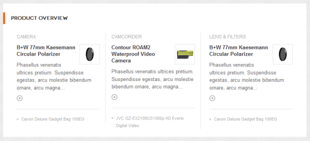
Categories List Module
Navigate to JoomlArt >> Categories List
Content Config:
PHP Code:
<reference name="content">
             <block type="joomlart_jmcategorylist/list" name="jmcategorylist" template="joomlart/jmcategorylist/list.phtml" />
</reference>
Front-end appreance
For more detail, please check the documentation of the module.
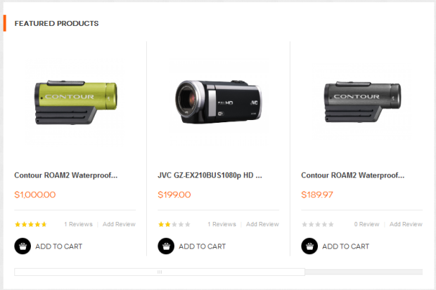
Product Module
Navigate to JoomlArt >> Product to enable extension
To push this module onto front page on top, go to CMS > Pages >> Homepage >> In Design tab, please fill in Layout Update XML parameter as below :
<reference name="content">
   <block  type="joomlart_jmproducts/list"  name="home.jmproducts.list"  template="joomlart/jmproducts/list.phtml"  >
               <block type="catalog/product_list_toolbar" name="product_list_toolbar" template="catalog/product/list/toolbar.phtml">
                  <block type="page/html_pager" name="product_list_toolbar_pager"/>
               </block>
        <action method="setToolbarBlockName"><name>product_list_toolbar</name></action>
   </block>
</reference>
Front-end appreance
For more detail, please check the documentation of the module.
Masshead Module
Navigate to JoomlArt >> Masshead to enable extension
This extension can be used at any position of a page. In this theme, it’s being used at the header of the categories page.
To add this extension, go to CMS > Static Block >then select the page that you would like to display it on
To push this module onto front page on top, at Custom Design tab please fill in Layout Update XML parameter as below :
<reference name="mass-top">
            <block type="joomlart_jmmasshead/core" name="jmmasshead">
                <action method="setData"><name>background</name><value>images/media/masshead-1.jpg</value></action>
                                <action method="setData"><name>title</name><value>Camera</value></action>
            </block>
Front-end appreance

For more detail, please check the documentation of the module.
Quickview Module
Navigate to JoomlArt >> Quickview
Front-end appreance
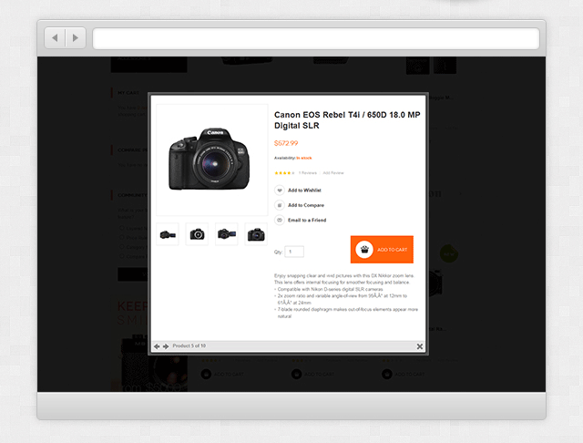
For more detail, please check the documentation of the module.
Deals Module
Navigate to JoomlArt >> Deals
To use this extension, go to CMS >> Pages and create a new page.
This extension has two page type, grid page and list page.
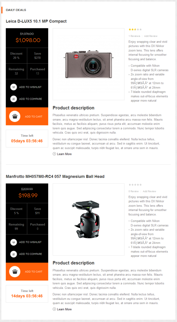
Grid Deals page:
At Design tab, please fill in Layout Update XML parameter as below :
{{block type="joomlart_jmproductsdeal/list" name="home.jmproductsdeal.list" template="joomlart/jmproductsdeal/list.phtml" width=297 height=297 }}
Front-end appreance
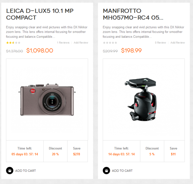
List Deals page:
At Design tab, please fill in Layout Update XML parameter as below :
{{block type="joomlart_jmproductsdeal/list" name="home.jmproductsdeal.list" template="joomlart/jmproductsdeal/list.phtml" mode="list" title="Daily Deals" perrow=1 quanlity=2 showproductleft=1 showitemsold=1 width=280 height=280 max=600 }}
Front-end appreance
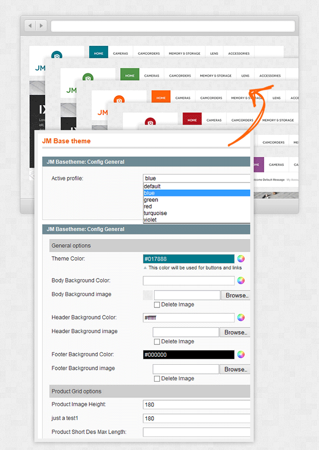
Base Theme Module:
Navigate to System >> Configuration >> Base Theme
Base theme Admin settings allow user to customized unlimited color
Front-end appreance
Megamenu Module:
Navigate to System >> Configuration >> Mega Menu
Front-end appreance
IV. Mega Menu Configuration
Flannel uses Mega Menu. Follow the below guide below to get it configured properly.
To add menu items, please navigate backend >> Mega Menu >> Manage Menu Item
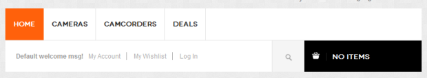
Home Menu
Front-end appreance
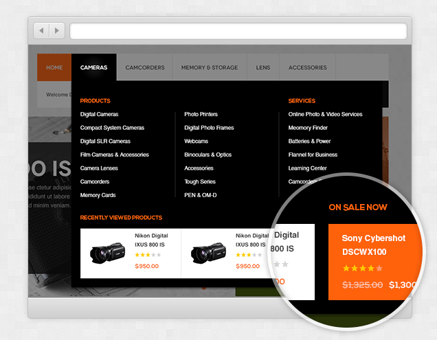
Camera Menu
Front-end appreance
- Item 1: Camera
- Item 2: Products
- Item 3:Services
- Item 4: Recently Viewed Products. Add the following code into Custom block filed
{{block type="reports/product_viewed" name="menu.reports.list.top" template="reports/product_viewed_top.phtml" quanlity="2" height="115" width="225" perrow="2"}}
- Item 5:On Sales Now Add the following code into Custom block filed
{{block type="joomlart_jmproductsdeal/list" name="home.jmproductsdeal.list" template="joomlart/jmproductsdeal/simplelist.phtml" quanlity="1" perrow="1" }}
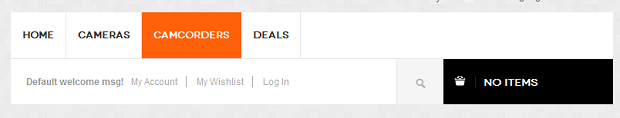
Camcorders Menu
Front-end appreance
IV. Page Configuration
1. Home page
To config this page, please navigate to CMS >> Pages, then select Home page to update the settings as below:
On Content tab, paste the code below on Content field:
<div>{{block type="joomlart_jmproductsslider/list" name="home.jmproductsslider" template="joomlart/jmproductsslider/list.phtml" }} {{widget type="cms/widget_block" template="cms/widget/static_block/default.phtml" block_id="18"}} {{block type="joomlart_jmproducts/list" name="home.jmproducts.list" template="joomlart/jmproducts/list.phtml" }}</div>
On Desigh tab, update the folloing setting
- Set Layout = 2 columns with left bar
- Layout XML : paste code
     <!-- Bottom Spotlight - topsl -->
<reference name="topsl">
<block type="cms/block" name="position-1">
<action method="setBlockId"><block_id>position-1</block_id></action>
</block>

<block type="cms/block" name="position-2">
<action method="setBlockId"><block_id>position-2</block_id></action>
</block>
<block type="cms/block" name="position-3">
<action method="setBlockId"><block_id>position-3</block_id></action>
</block>
<block type="cms/block" name="position-4">
<action method="setBlockId"><block_id>position-4</block_id></action>
</block>
</reference>
<!-- Bottom Spotlight - topsl -->
<reference name="left">
<block type="catalog/navigation" name="catalog.leftnav" before="-" template="catalog/navigation/left.phtml"/>
</reference>
<reference name="content">
<block type="joomlart_jmcategorylist/list" name="jmcategorylist" template="joomlart/jmcategorylist/list.phtml" />
</reference>
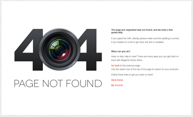
2. 404 Not Found page
To config this page, please navigate to CMS >> Pages, then select 404 Not Found 1 page to update the settings as below:
Paste the code below on Content field:
<ul class="disc">
<li>If you typed the URL directly, please make sure the spelling is correct.</li>
<li>If you clicked on a link to get here, the link is outdated.</li>
</ul>
</dd></dl>
<p> </p>
<dl><dt>What can you do?</dt><dd>Have no fear, help is near! There are many ways you can get back on track with Magento Demo Store.</dd><dd>
<ul class="disc">
<li><a onclick="history.go(-1);" href="#">Go back</a> to the previous page.</li>
<li>Use the search bar at the top of the page to search for your products.</li>
<li>Follow these links to get you back on track!<a href="{{store url=""}}">Store Home</a><a href="{{store url="customer/account"}}">My Account</a></li>
</ul>
</dd></dl>
<p> </p>
<p><img style="margin-right: 15px;" src="{{skin url='images/media/404_callout1.jpg'}}" alt="" /><img src="{{skin url='images/media/404_callout2.jpg'}}" alt="" /></p>
Front-end Appearance
V. Responsive Design
Flannel Magento theme is a Responsive design Magento theme, which allows Flannel displayed beautifully on various screen sizes and devices (mobiles and tablets)
1. Supported Layouts
All the style files supported layouts are located in the folder: skin/frontend/default/jm_flannel/css
In this particular theme, we support 3 styles: layout in desktop, tablet and mobile (for the Magento default theme only. Will be upgraded in the next version).
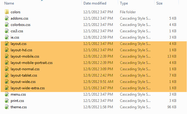
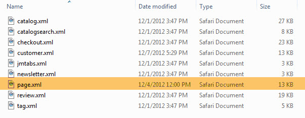
Have the style files in hand, modification for the files will need to be defined in the page.xml file located in: app/design/frontend/default/jm_flannel/layout
Open file layout.xml
At the tag in this file, add this code:
<action method="addCss"><stylesheet>css/layout-mobile.css</stylesheet><params>media="only screen and (max-width:719px)"</params></action>
                <action method="addCss"><stylesheet>css/layout-mobile-portrait.css</stylesheet><params>media="only screen and (max-width:479px)"</params></action>
                <action method="addCss"><stylesheet>css/layout-tablet.css</stylesheet><params>media="only screen and (min-width:720px) and (max-width: 985px)"</params></action>
                <action method="addCss"><stylesheet>css/layout-normal.css</stylesheet><params>media="only screen and (min-width:986px) and (max-width: 1235px)"</params></action>
                <action method="addCss"><stylesheet>css/layout-wide.css</stylesheet><params>media="only screen and (min-width:1236px) and (max-width: 1585px)"</params></action>
                <action method="addCss"><stylesheet>css/layout-wide-extra.css</stylesheet><params>media="only screen and (min-width:1586px) and (max-width: 1890px)"</params></action>
                <action method="addCss"><stylesheet>css/layout-hd.css</stylesheet><params>media="only screen and (min-width:1891px)"</params></action>
- When the screen width is somewhere between 479 and 1891 pixel, the themes will load the layout-tablet.css file to display as the default style file.
- When the screen width is smaller than 479 pixel, the theme will loads the layout-mobile.css file to display as the default style file.
- Otherwise, the theme will load the layout.css file to display as its default style file. The layout.css file is the style file for desktop.
2. How to define Responsive
In summary, the base of responsive is column.
- The layout in PC uses 1 columns, the width size of layout is 100% --> width size of each column = 50%. Then every time screen width in pixel changes, the width of each column in pixel is also changes.
- Tablet Layout uses 1columns, each column width is 50%.
- Mobile Layout uses 1 columns, each column width is 100%.
2.1 Layout in demo
1. Desktop and Tablet Layout:
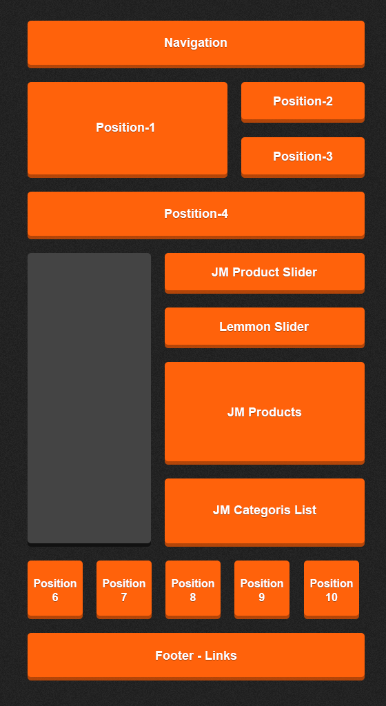 Layout in demo

2. Mobile Landscape
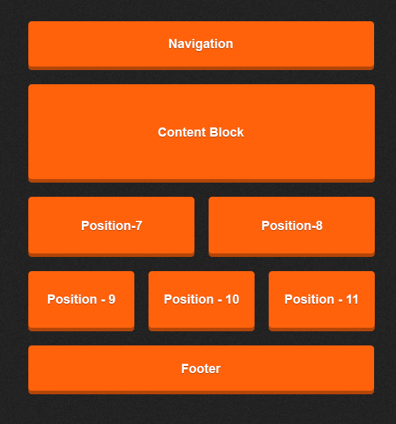 Layout in demo

3. Mobile Portrait
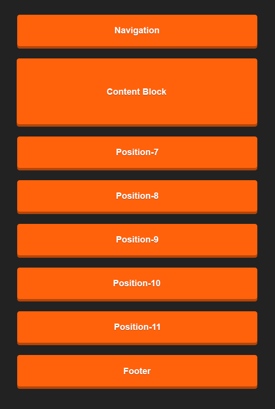 Layout in demo

4. Tablet Landscape
 Layout in demo

5. Tablet Portrait
 Layout in demo
