Hi,
my project is nearly finished. I have one little issue with the responsive Theme for Mobile Portrait. I tested this on an iPhone 5 in Mobile Portrait and then the page stays empty in the main section. That is featured products are not displayed.
I works fine on Mobile Landscape.
You can reproduce this if you open this page with a resolution 320×356.
http://playground.oneinsixbillion.de/index.php/
Or also cool to test is this
http://www.responsinator.com/?url=ht…nsixbillion.de
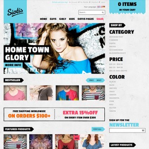
It must be some misconfiguration in my Magento, because when I open the Demo on JM Siotis with this resolution it is displayed like explained in the JM Siotis -- Userguide. That is I can see the feature products.
Any help is appreciated.
Thanks
Daniel
1 answer
Hi Daniel,
you can open the file skin/frontend/default/jm_siotis/css/layout-mobile-portrait.css there look for this css rule
HTML Code:
.ja-mass, .jm-products-slider-listing, .top-banner, .block-social {
  display: none;
}
change it to
HTML Code:
.ja-mass, .jm-products-slider-listing, .top-banner, .block-social {
  display: block;
}
I hope this change helps !


