UB Trex Pro for Magento 2 – Fashion Theme
Theme Introduction
UB Trex Pro is a brand new multi-purpose Magento 2 theme we developed from the ground up. It comes with 2 homepages, 6 pre-made product layouts, advanced custom product tabs, up-sells and cross-sells integration. It is packed with UB Theme Helper -- a powerful theme customisation tool, plus 3 complimentary Magento extensions including Mega Menu, Content Slider, Quick View. Not only that, it enables multiple category view options, infinite scroll & much more!
This documentation describes the theme installation process and shows how to configure the theme and built-in extensions.
We recommend installing our theme in a testing environment before deploying it to your production environment. The theme was tested in clean Magento 2 installations without 3rd party extensions and we can’t guarantee compatibility with 3rd extensions.
I. Installation Prerequisites
UB Trex Pro is a native Magento 2.x theme, please make sure your system meets the Magento 2 System requirements.
II. Download Packages
The download package includes:
- Theme: UB Trex Pro (single theme including UB Theme Helper and all extensions built in the theme for manual installation)
- Quickstart: is a full Magento 2 CMS version with our template and extensions already integrated to match demo
- PSD source files: all graphic source files
III. Installation Instruction
There are two ways to install a UberTheme Magento 2 theme:
- Manual Installation: Applicable if your store is full of content that you don’t want to overwrite.
- QuickStart Installation: Applicable if you want to get a whole new fresh site as per our Demo.
Manual Installation
Let’s start installing UB Trex Pro manually following these steps:
- Step 1: Download and extract UB Trex Pro single theme
- Step 2: Enable UB Theme Helper and our built-in Magento 2 extensions
- Step 3: Import Sample Data
- Step 4: Activate the theme
Step 1. Download and extract UB Trex Pro theme
1.1. Download and extract UB Trex Pro theme
Download the ub_trex_pro_(version) zip file from your profile at Ubertheme, and extract it on your computer. Navigate inside the extracted folder, you should see the necessary folders listed below:
1.2. Copy and paste the folders to your web root
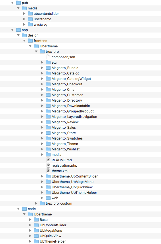
1.2.1. Copy and paste the folder app of the package you have unzipped to your Magento 2 root folder. Once done, you should see the path:
..app/design/frontend/Ubertheme/trex_pro/
The overwritten folders should have a directory tree like this:
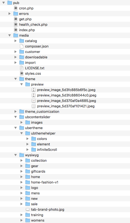
1.2.2. Copy and paste the pub/media folder of the package you have unzipped to your Magento 2 root folder. Make sure you *merge*, not ‘replace’ existing media folder contents. The overwritten folders should have a directory layout like this:
Step 2: Enable UB Theme Helper and our built in Magento 2 extensions
2.1. (Required) Install PHP Mobile Detect Resource APIs
You have to install the PHP Mobile Detect Resource APIs using Composer by requiring the mobiledetect/mobiledetectlib in your project. You can check out How to install PHP Mobile Detect Resource APIs here.
2.2. Install UB extensions & Deploy static files
Open your terminal and go to the Magento 2 directory. In this directory, run the following command:
- php -f bin/magento deploy:mode:set developer
- php -f bin/magento setup:upgrade
- php -f bin/magento setup:di:compile
- php -f bin/magento setup:static-content:deploy -f
- php -f bin/magento cache:clean
Once you finish the last command, navigate to your Magento Admin Panel | Ubertheme’s Extension, you should see the extension’s menu respectively as follows:
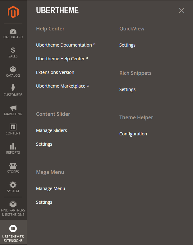
Click [Theme Helper] Configuration, the theme panel looks like this screenshot:
Step 3: Import Sample Data
Now that you’ve installed UB Trex Pro theme and all built-in extensions, let’s move on to the next step — Import Sample data.
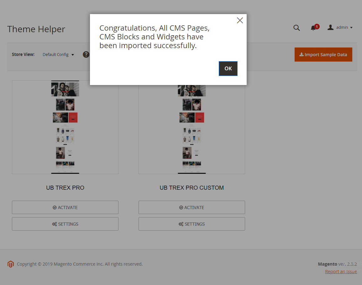
Sample data refers to all CMS pages, CMS blocks and widgets we created for UB Trex Pro.
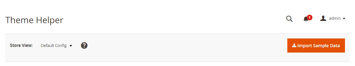
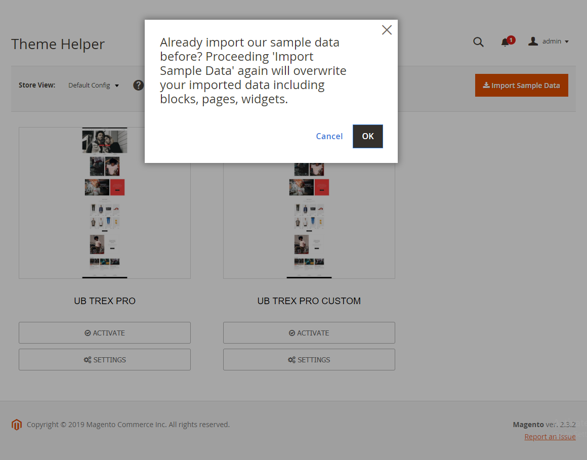
In your Magento 2 Admin Panel, navigate to Ubertheme’s Extension | (Theme Helper) Configuration, then simply click Import Sample Data button.
Step 4: Activate the theme
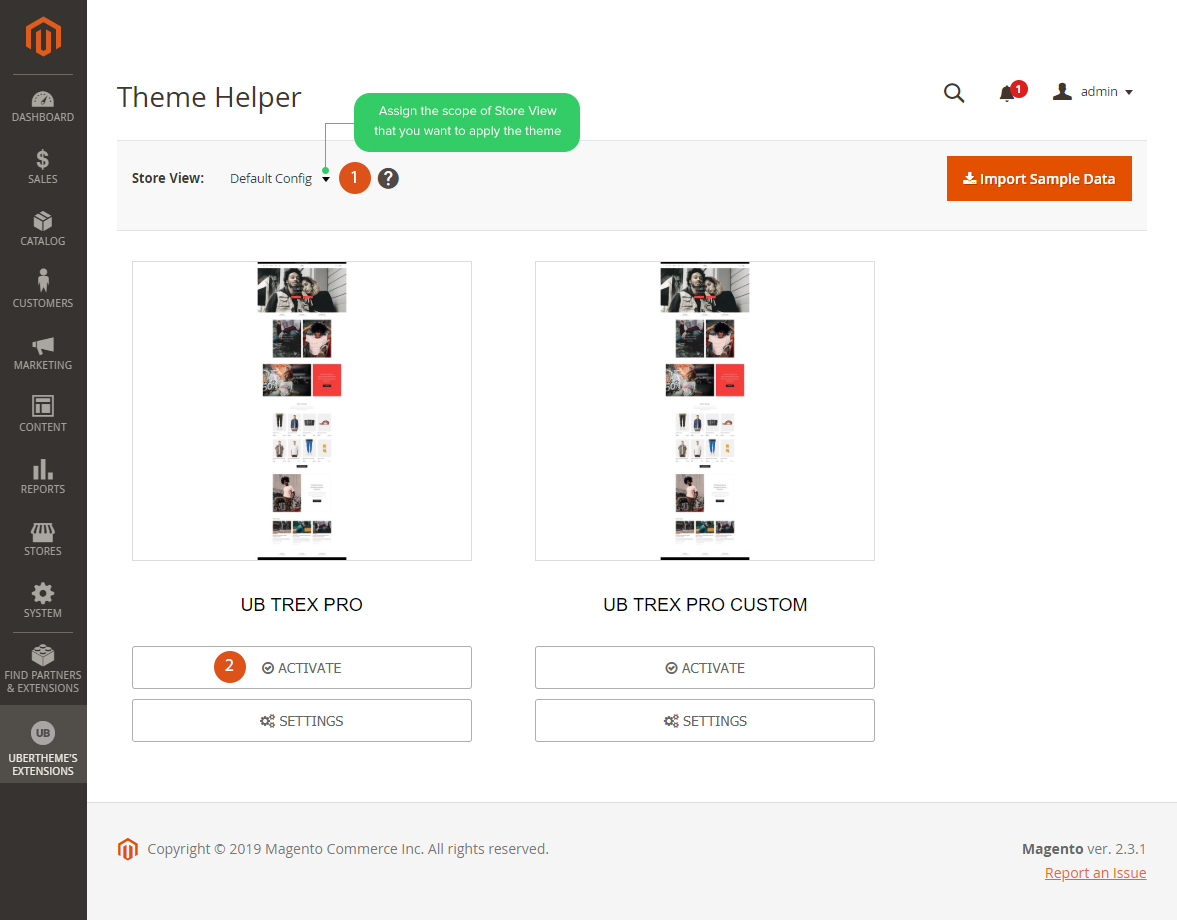
1. In your Magento 2 Admin Panel, navigate to Ubertheme’s Extension | (Theme Helper) Configuration. You will see a grid of themes available.
2. Specify scope of Store View you want to apply the theme (if you do not set scope of Store View, Default Config will be applied). Then click Activate button to apply specific theme you select.
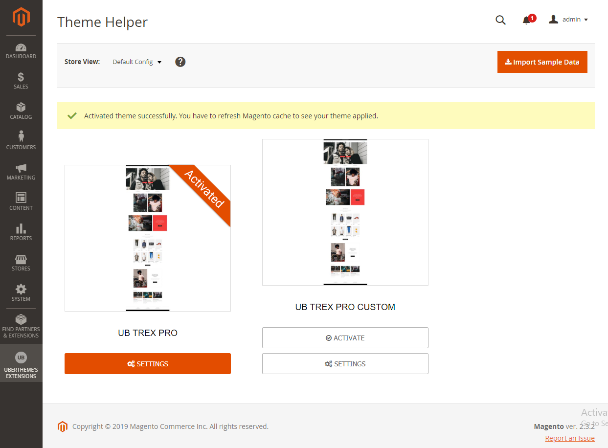
After you click ‘Activate’ button, you should see the screen below:
3. Once done, you run the following commands before you see the theme applied in the frontend.
- php -f bin/magento cache:clean
NOTE: If you make any custom changes via the ThemeHelper, you need to re-deploy static files to compile LESS to CSS.
Static view files deployment is affected by Magento modes (Default | Developer | Production). Please refer to Magento guide here to learn more about the static deployment command (php -f bin/magento setup:static-content:deploy -f)
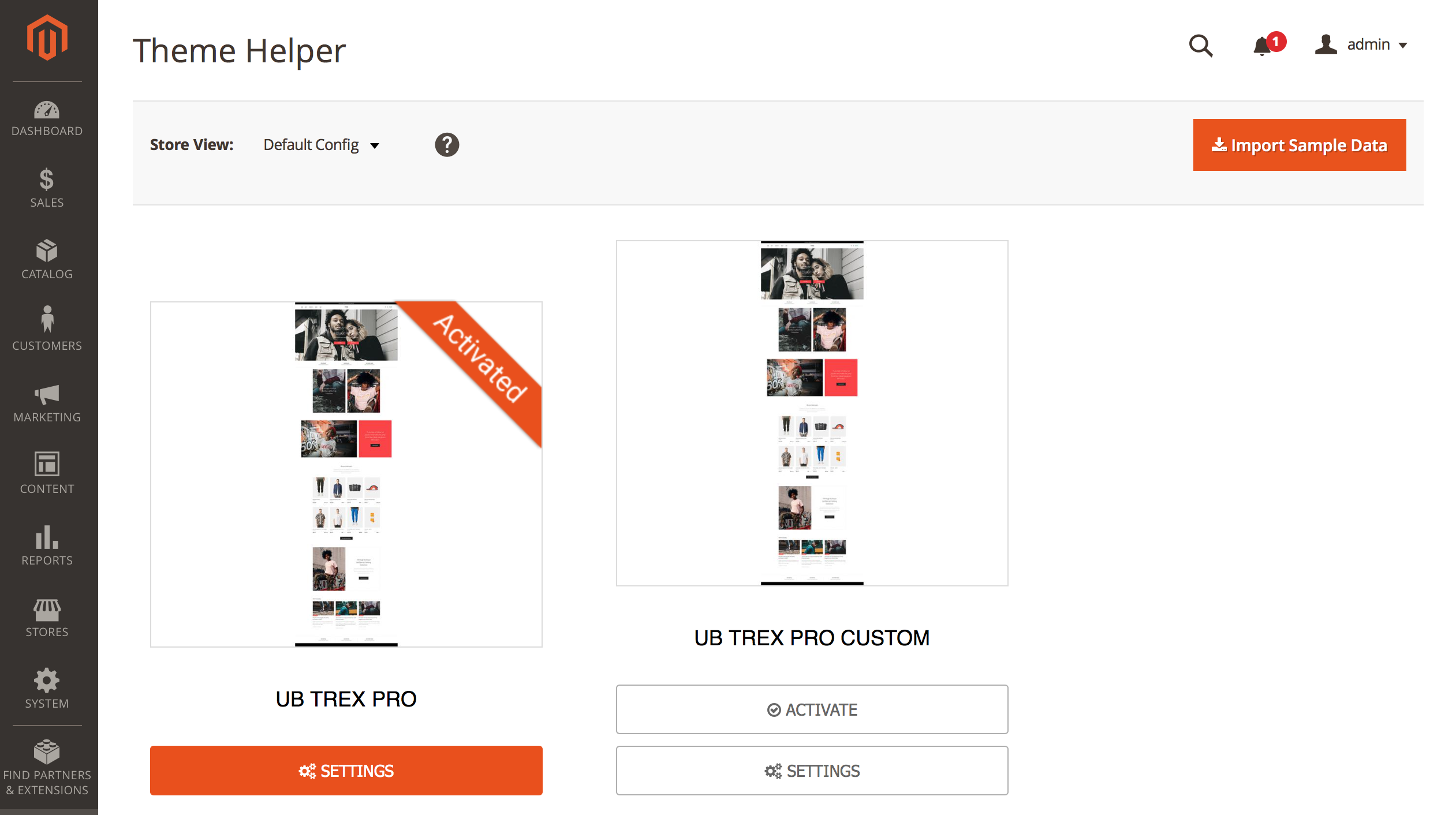
After you complete all commands above, your theme admin panel should look like this:
And the storefront like on the following screenshot:
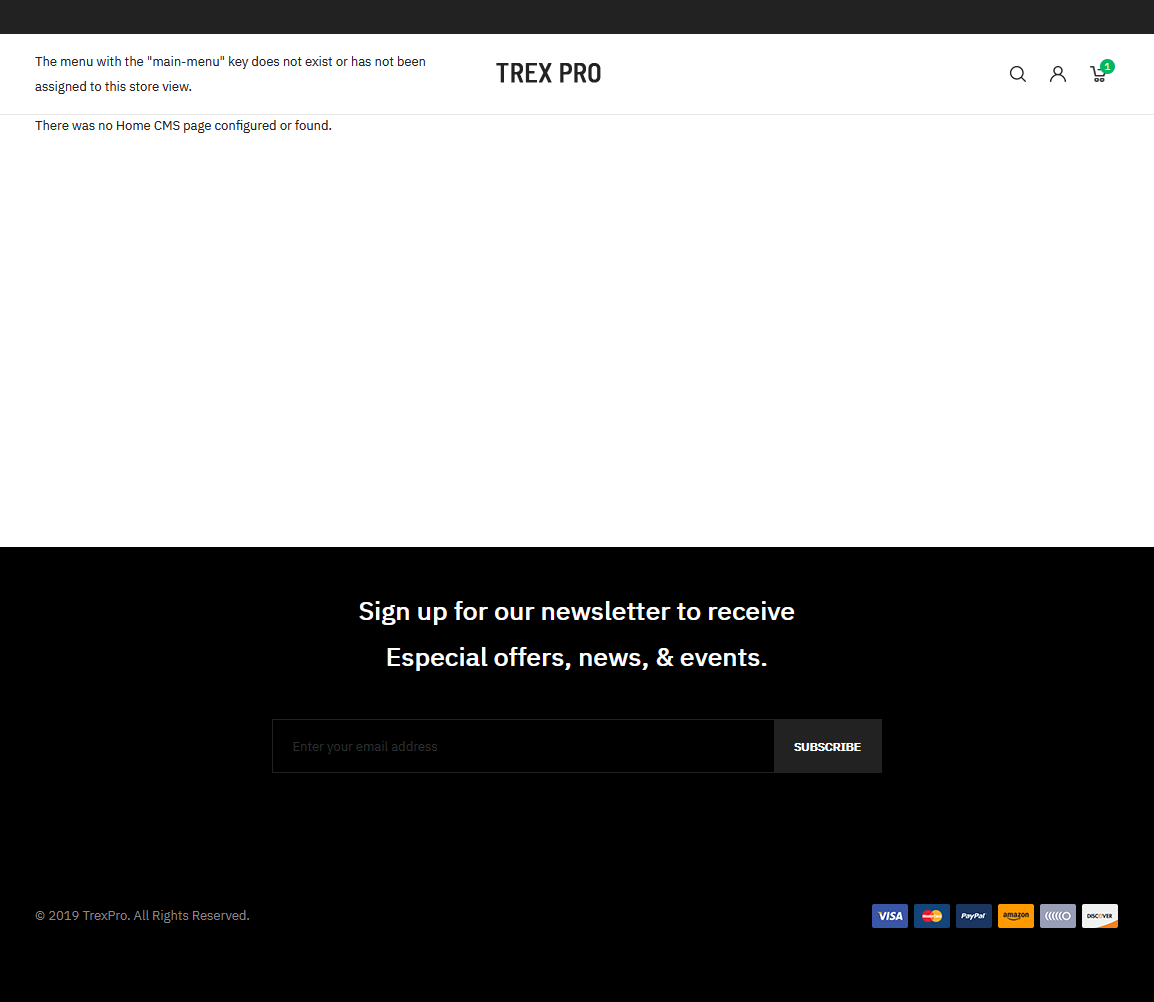
Note that this screenshot was captured when we installed UB Trex Pro theme manually on a fresh Magento 2.4.x instance without any sample data.
That’s all. Now you can scroll down to learn more how to configure the theme.
Quickstart Installation
Quickstart package is to minimize time and effort in installing the theme as per Demo site. The Quickstart package includes Magento 2, UB Trex Pro theme and our extensions built in the theme, and sample data. We recommend using Quickstart for your first installation or just in case you want to refresh your site to the very beginning. For step by step guide, please Click here.
IV. Page and Block positions
The layout of UB Trex Homepage can be illustrated as follows:
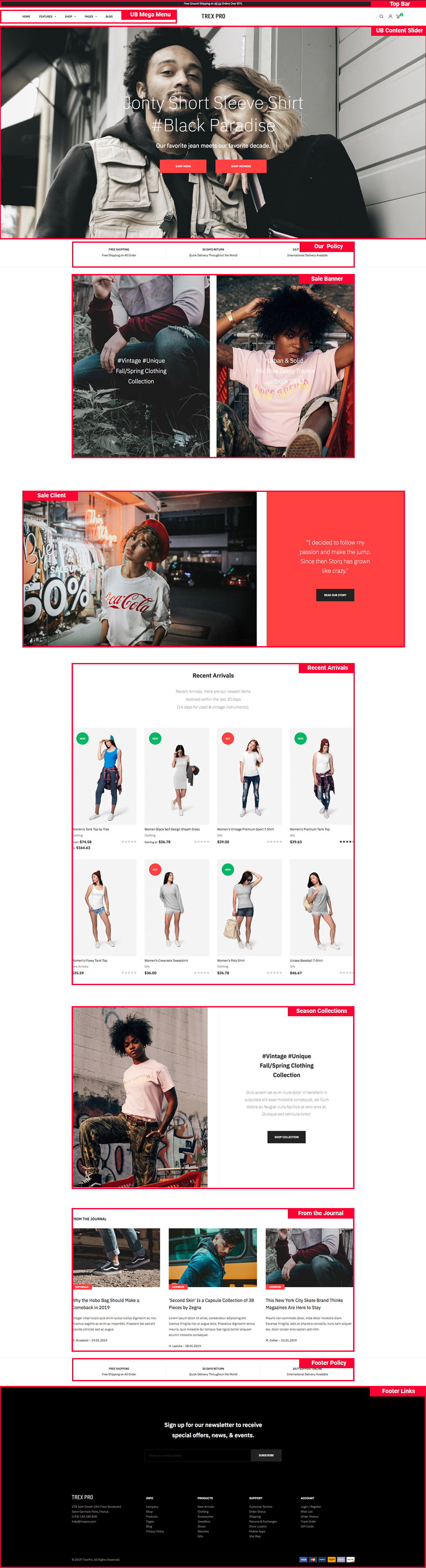
As seen in the screenshot, UB Trex storefront has the following static blocks:
- UB Top Menu (Extension: UB MegaMenu)
- Static Block: Top Bar
- Static Block: Slideshow (Extension: UB Content Slider)
- Static Block: Our Policy
- Static Block: Sale Banner
- Static Block: Sale Client
- Static Block: Recent Arrivals
- Static Block: Season Collections
- Static Block: From the Journal
- Static Block: Footer Policy
- Static Block: Footer links
- Static Block: Sidebar Product Tags (on Product Detail page)
- Static Block: Size Char Tab (on Product Detail page)
- Static Block: Brand Tab (on Product Detail page)
V. Page Configuration
Fashion Homepage Configuration
Supposed that you install the theme manually without importing our theme’s Sample Data, you can follow steps below to set up Homepage that matches our demo exactly.
Step 1: First, you need to add related CMS blocks/widgets to prepare the content for the Homepage as per our demo.
1. Add related CMS blocks, including:
- UB Top Menu (Extension: UB MegaMenu)
- Static Block: Top Bar
- Static Block: Slideshow (Extension: UB Content Slider)
- Static Block: Our Policy
- Static Block: Sale Banner
- Static Block: Sale Client
- Static Block: Recent Arrivals
- Static Block: Season Collections
- Static Block: From the Journal
- Static Block: Footer links
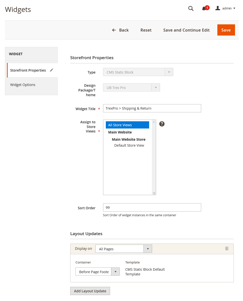
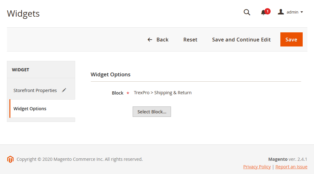
2. Then, in the Admin Panel, go to Content | (Elements) Widgets | Add Widget, and create a widget TrexPro > Shipping & Return with the configuration like this sample: Back-end setting > Back-end setting
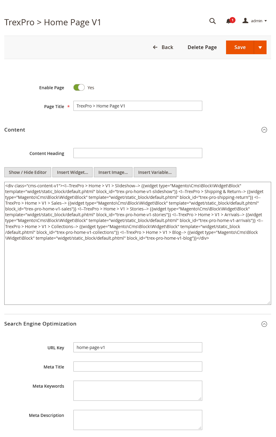
Step 2: Navigate to Content | (Elements) Pages | Add New Page with configuration as follows (You can disable the default Home page of your M2 instance for now):
- Content tab: Copy and paste the code below on the Content field (you can see the Back-end setting for reference):
<div class="cms-content-v1">
<!--TrexPro > Home > V1 > Slideshow--> {{widget type="Magento\Cms\Block\Widget\Block" template="widget/static_block/default.phtml" block_id="trex-pro-home-v1-slideshow"}}
<!--TrexPro > Shipping & Return--> {{widget type="Magento\Cms\Block\Widget\Block" template="widget/static_block/default.phtml" block_id="trex-pro-shipping-return"}}
<!--TrexPro > Home > V1 > Sales--> {{widget type="Magento\Cms\Block\Widget\Block" template="widget/static_block/default.phtml" block_id="trex-pro-home-v1-sales"}}
<!--TrexPro > Home > V1 > Stories--> {{widget type="Magento\Cms\Block\Widget\Block" template="widget/static_block/default.phtml" block_id="trex-pro-home-v1-stories"}}
<!--TrexPro > Home > V1 > Arrivals--> {{widget type="Magento\Cms\Block\Widget\Block" template="widget/static_block/default.phtml" block_id="trex-pro-home-v1-arrivals"}}
<!--TrexPro > Home > V1 > Collections--> {{widget type="Magento\Cms\Block\Widget\Block" template="widget/static_block/default.phtml" block_id="trex-pro-home-v1-collections"}}
<!--TrexPro > Home > V1 > Blog--> {{widget type="Magento\Cms\Block\Widget\Block" template="widget/static_block/default.phtml" block_id="trex-pro-home-v1-blog"}}</div>
- Page in Websites tab: set Store View to All Store Views
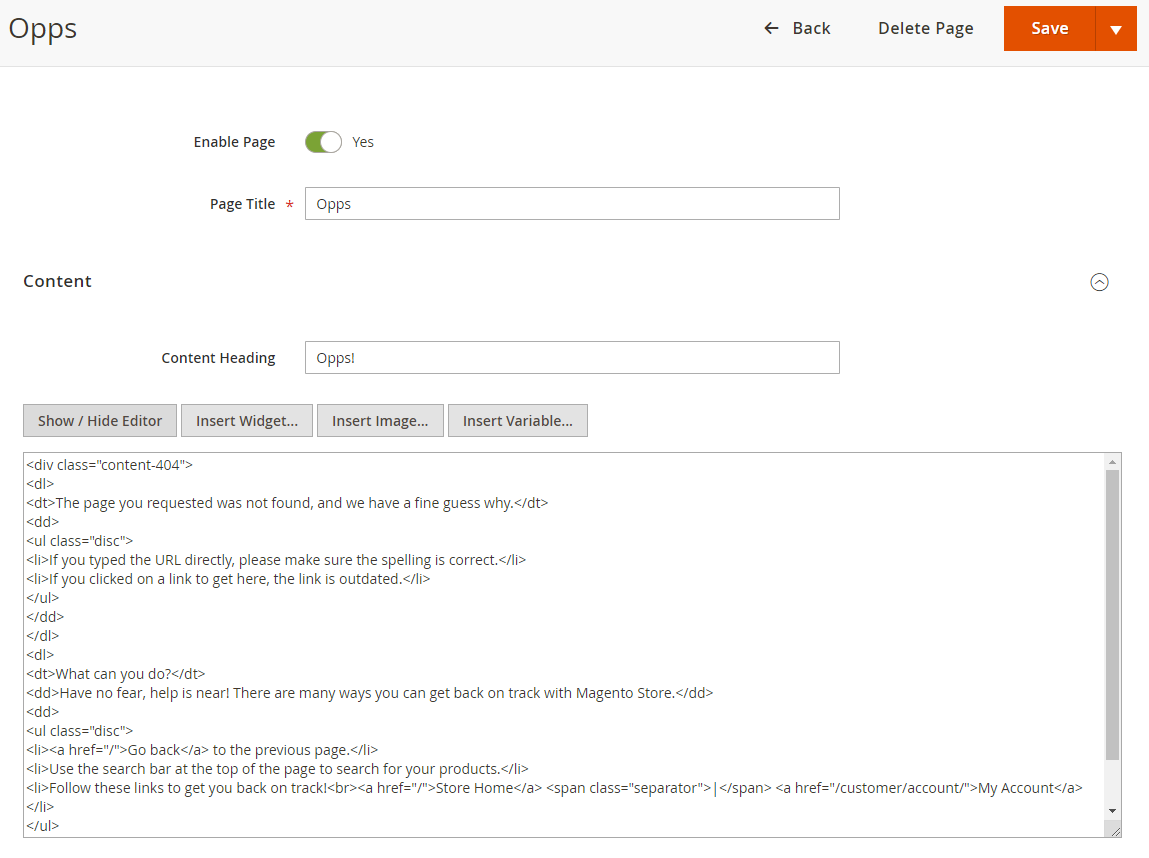
404 Not Found Configuration
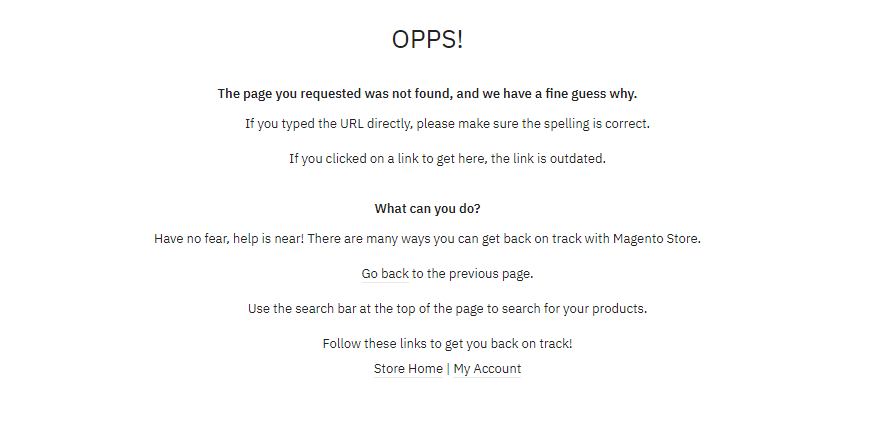
To configure this page, in the Admin Panel, navigate to Content | Elements | Pages, then select 404 Not Found page to update the settings as follows:
- Content tab: Copy and paste the code below on the Content field (see the Back-end setting for reference):
<div class="content-404">
<dl>
<dt>The page you requested was not found, and we have a fine guess why.</dt>
<dd>
<ul class="disc">
<li>If you typed the URL directly, please make sure the spelling is correct.</li>
<li>If you clicked on a link to get here, the link is outdated.</li>
</ul></dd></dl>
<dl>
<dt>What can you do?</dt>
<dd>Have no fear, help is near! There are many ways you can get back on track with Magento Store.</dd>
<dd>
<ul class="disc">
<li><a href="/">Go back</a> to the previous page.</li>
<li>Use the search bar at the top of the page to search for your products.</li>
<li>Follow these links to get you back on track!<br><a href="/">Store Home</a> <span class="separator">|</span> <a href="/customer/account/">My Account</a></li>
</ul></dd></dl>
</div>
- Page in Websites tab: see the Back-end setting.
Front-end Appearance:
About Us Configuration
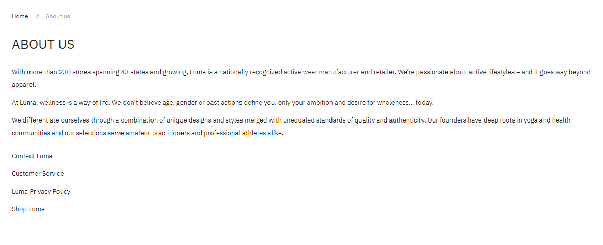
To configure this page, in the Admin Panel, navigate to Content | Elements | Pages, then select About Us page to update the settings as follows:
- Content tab: Copy and paste the code below on the Content field (see the Back-end setting for reference):
<div class="about-info cms-content">
<p class="cms-content-important">With more than 230 stores spanning 43 states and growing, Luma is a nationally recognized active wear manufacturer and retailer. We’re passionate about active lifestyles – and it goes way beyond apparel.</p>
<p>At Luma, wellness is a way of life. We don’t believe age, gender or past actions define you, only your ambition and desire for wholeness... today.</p>
<p>We differentiate ourselves through a combination of unique designs and styles merged with unequaled standards of quality and authenticity. Our founders have deep roots in yoga and health communities and our selections serve amateur practitioners and professional athletes alike.</p>
<ul style="list-style: none; margin-top: 20px; padding: 0;">
<li><a href="{{store url="contact"}}">Contact Luma</a></li>
<li><a href="{{store url="customer-service"}}">Customer Service</a></li>
<li><a href="{{store url="privacy-policy"}}">Luma Privacy Policy</a></li>
<li><a href="{{store url=""}}">Shop Luma</a></li>
</ul>
</div>
- Page in Websites tab: see the Back-end setting.
Front-end Appearance:
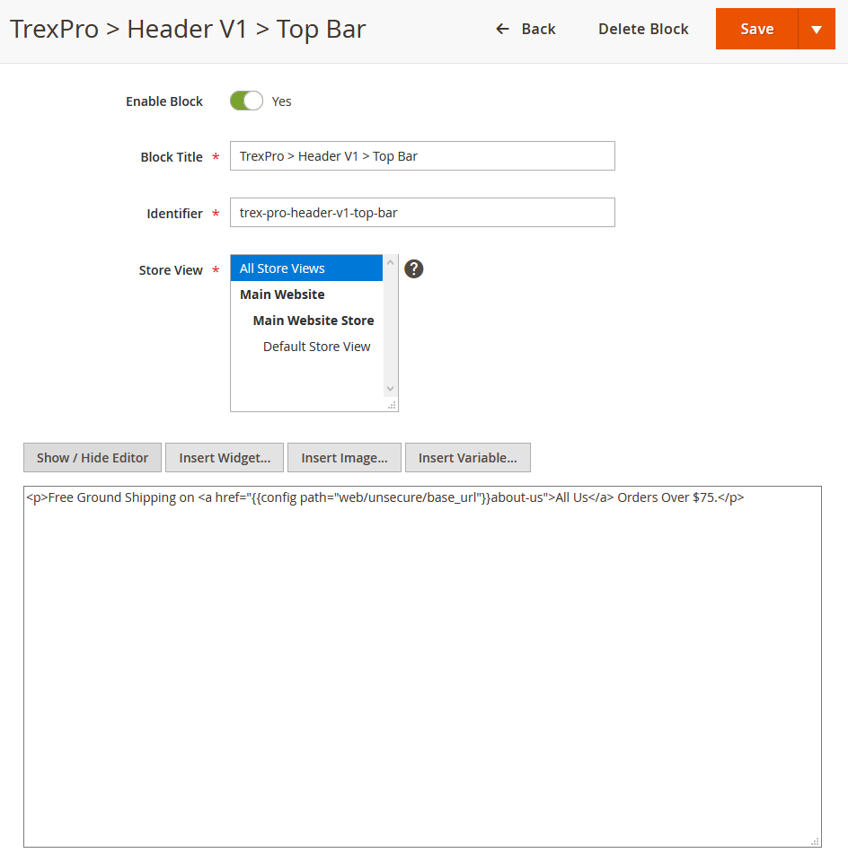
1. Top Bar
In your admin dashboard, click Content | (Elements) Blocks | Add New Block, then create Top Bar block with the configuration like this sample: Back-end setting
In the Content field, click Show/Hide Editor button, then copy and paste the following code:
Free Ground Shipping on <a href="{{config path="web/unsecure/base_url"}}about-us">All Us</a> Orders Over $75.
Front-end Appearance:

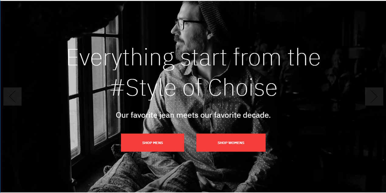
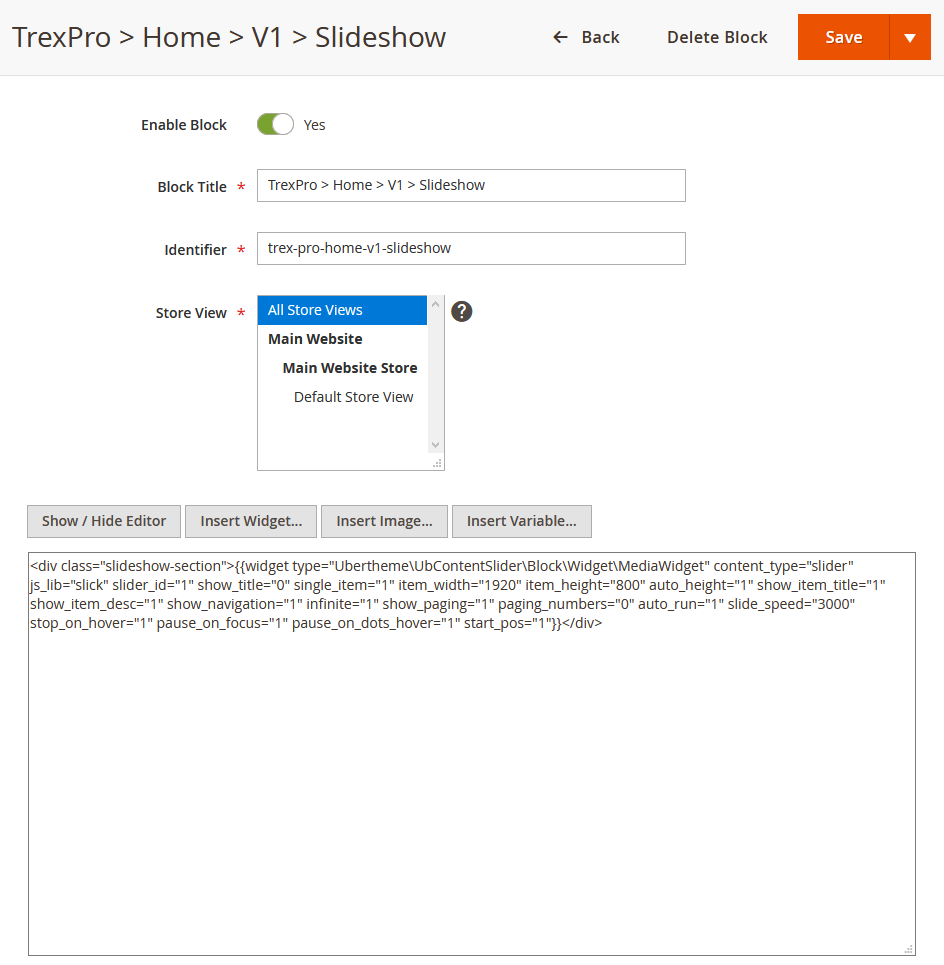
2. Slideshow
You can display the slideshow at the top of the homepage as follows:
2.1. In your admin dashboard, click Content | (Elements) Blocks | Add New Block, then create a Slideshow block with the configuration like this sample: Back-end setting
In the Content field, click Show/Hide Editor button, then copy and paste the following code:
<div class="slideshow-section">{{widget type="Ubertheme\UbContentSlider\Block\Widget\MediaWidget" content_type="slider" js_lib="slick" slider_key="home-fashion-version-v1" show_title="0" single_item="1" item_width="1920" item_height="800" auto_height="1" show_item_title="1" show_item_desc="1" show_navigation="1" infinite="1" show_paging="1" paging_numbers="0" auto_run="1" slide_speed="3000" stop_on_hover="1" pause_on_focus="1" pause_on_dots_hover="1" start_pos="1"}}</div>
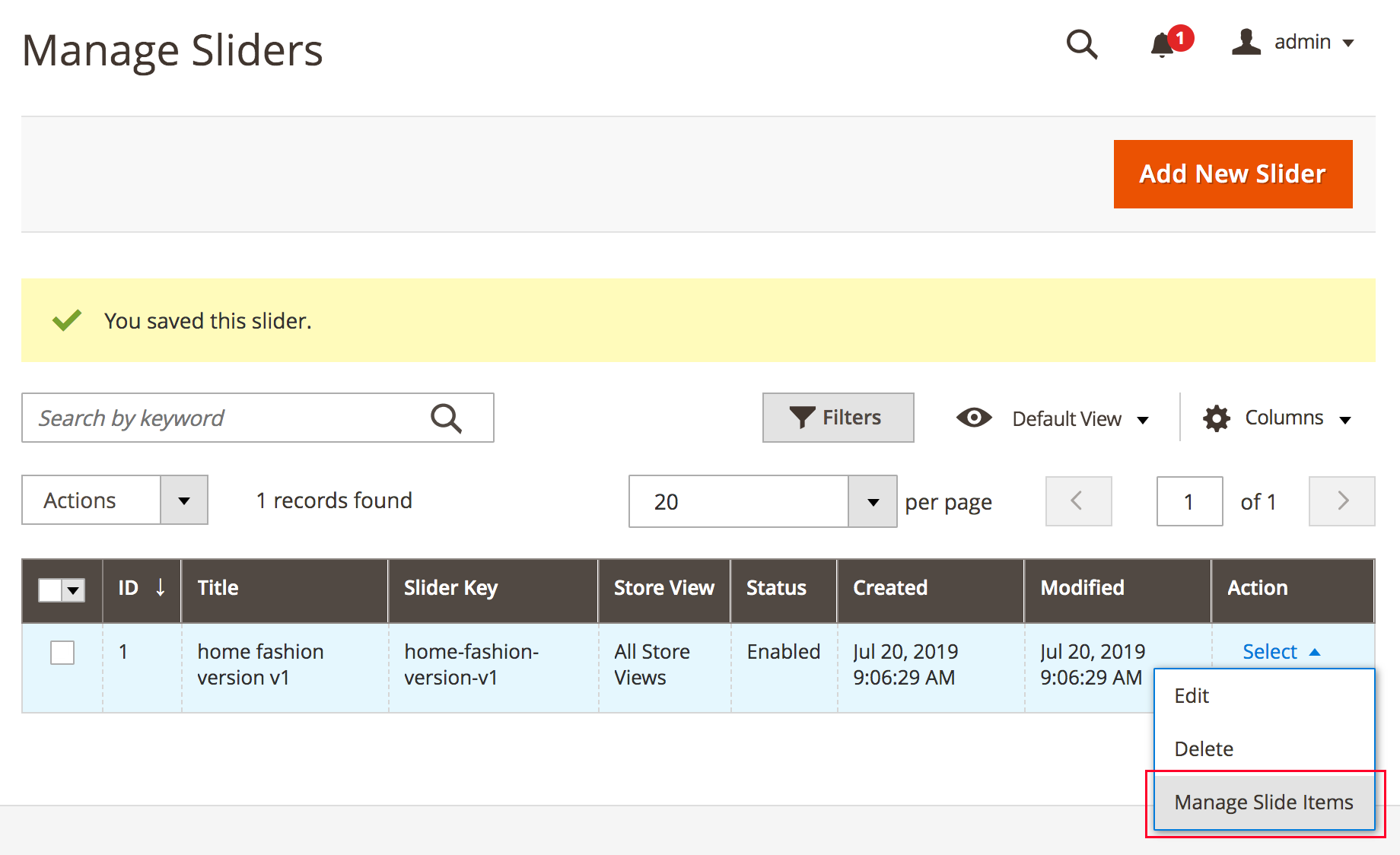
2.2. Then, go to Ubertheme’s Extensions | (Content Slider) Manage Sliders | click “Add New Slider” button and fill in required configuration as per this screenshot.
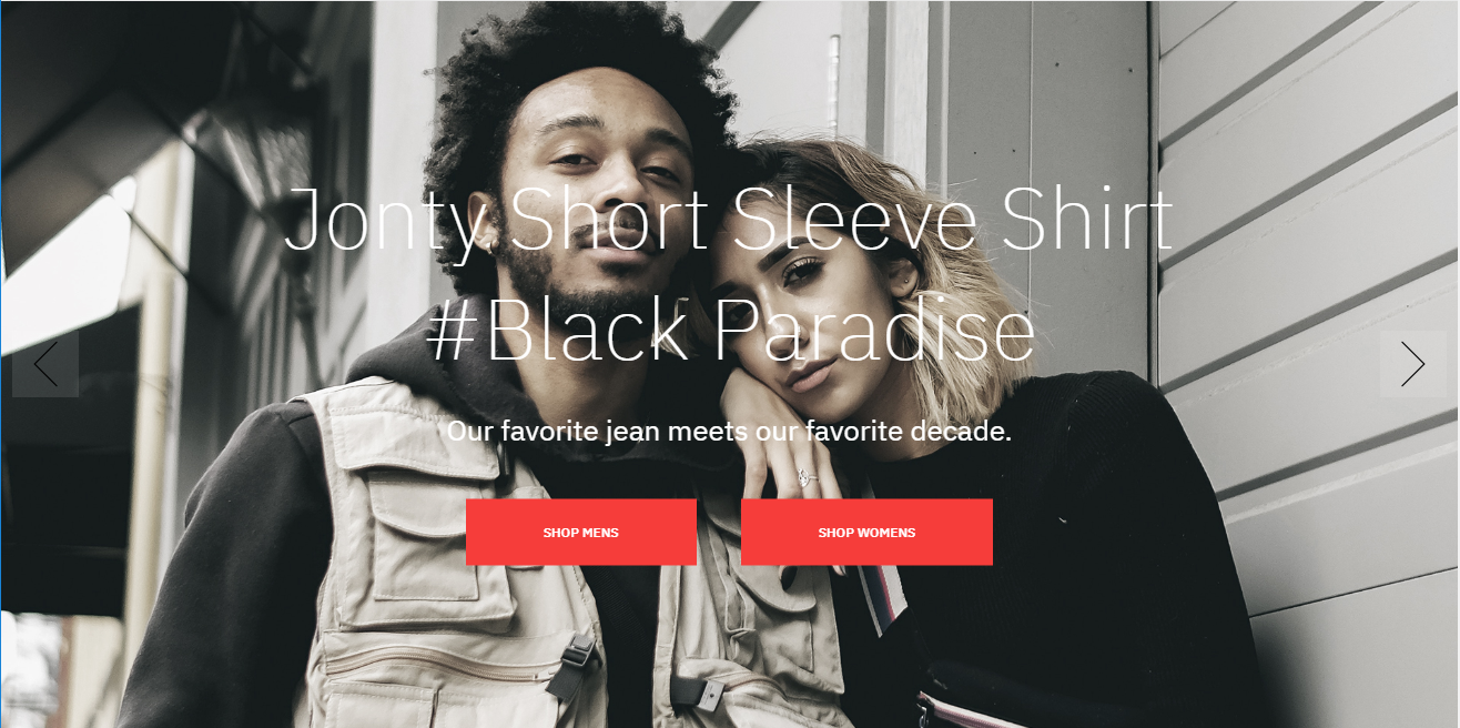
After that, you click ‘Manage Slide Item’ to create slide items like this:
You can add multiple slides filled with your featured images and captions. You can use this HTML as a sample block content (In the Description field, then copy and paste the following code):
<div class="slide-content-details"><h2 class="title">Jonty Short Sleeve Shirt<br/>#Black Paradise</h2>
<div class="desc">Our favorite jean meets our favorite decade.</div>
<div class="actions"><a href="#" class="action primary" title="Shop Mens" ><span>Shop Mens</span></a><a href="#" class="action primary" title="Shop Womens" ><span>Shop Womens</span></a></div>
</div>
Front-end Appearance:
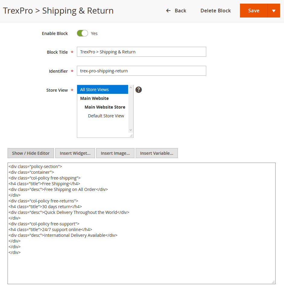
3. Our Policy
You can create the Our Policy block with configuration as follows:
Back-end setting
In the Content field, click Show/Hide Editor button, then copy and paste the following code:
<div class="policy-section">
<div class="container">
<div class="col-policy free-shipping">
<h4 class="title">Free Shipping</h4>
<div class="desc">Free Shipping on All Order</div>
</div>
<div class="col-policy free-returns">
<h4 class="title">30 days return</h4>
<div class="desc">Quick Delivery Throughout the World</div>
</div>
<div class="col-policy free-support">
<h4 class="title">24/7 support online</h4>
<div class="desc">International Delivery Available</div>
</div>
</div>
</div>
Front-end Appearance:

4. Sale Banner
You can create the Sale Banner block with configuration as follows:
Back-end setting
In the Content field, click Show/Hide Editor button, then copy and paste the following code:
<div class="sale-section">
<div class="container">
<div class="banner-col first"><img loading="lazy" alt="Unique" src="{{media url="wysiwyg/trex-pro/home-v1/vintage-banner.jpg"}}" srcset="{{media url="wysiwyg/trex-pro/home-v1/300/vintage-banner.jpg"}} 480w, {{media url="wysiwyg/trex-pro/home-v1/600/vintage-banner.jpg"}} 768w" sizes="50vw" />
<h3><a title="Vintage" href="#">#Vintage</a> <a title="Unique" href="#">#Unique</a><br>Fall/Spring Clothing<br>Collection</h3>
</div>
<div class="banner-col last"><img loading="lazy" alt="Urban Mid Rise" src="{{media url="wysiwyg/trex-pro/home-v1/urban-solid-banner.jpg"}}" srcset="{{media url="wysiwyg/trex-pro/home-v1/300/urban-solid-banner.jpg"}} 480w, {{media url="wysiwyg/trex-pro/home-v1/600/urban-solid-banner.jpg"}} 768w" sizes="50vw" />
<h3>Urban & Solid<br>Mid Rise Zespy Trackie<br>Loobook SS’18</h3>
</div>
</div>
</div>
Front-end Appearance:

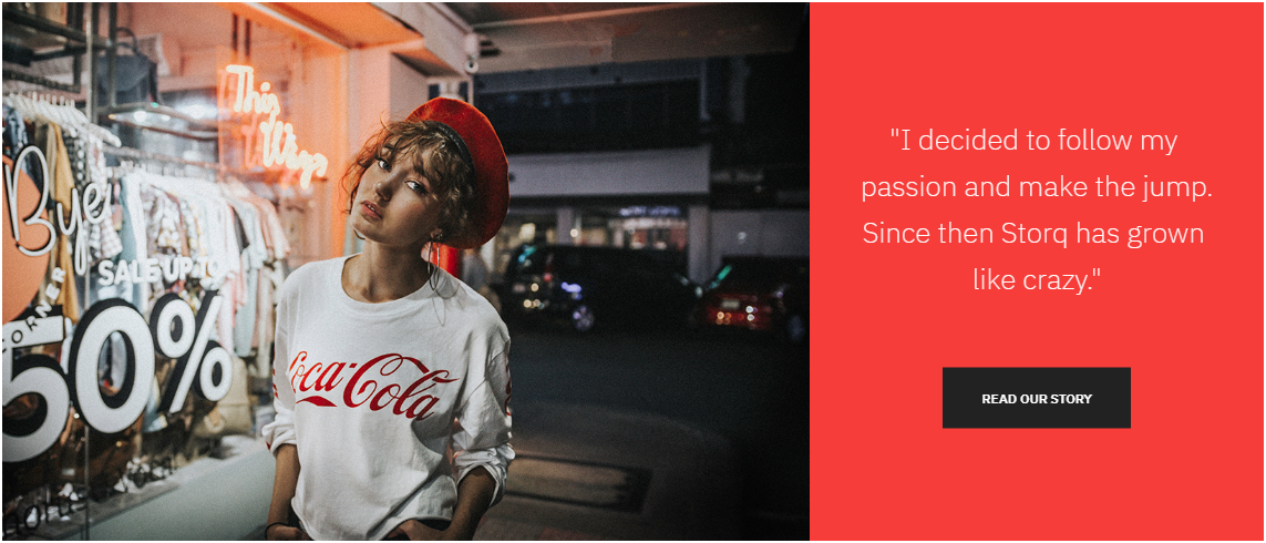
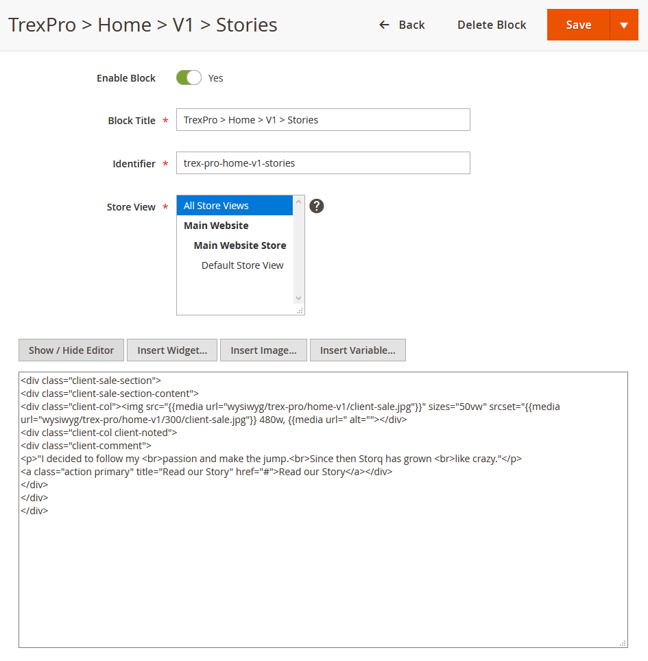
5. Sale Client
You can create Sale Client block with the configuration as follows:
Back-end setting
In the Content field, click Show/Hide Editor button, then copy and paste the following code:
<div class="client-sale-section">
<div class="client-sale-section-content">
<div class="client-col"><img loading="lazy" alt=" src="{{media url="wysiwyg/trex-pro/home-v1/client-sale.jpg"}}" srcset="{{media url="wysiwyg/trex-pro/home-v1/300/client-sale.jpg"}} 480w, {{media url="wysiwyg/trex-pro/home-v1/600/client-sale.jpg"}} 768w, {{media url="wysiwyg/trex-pro/home-v1/1200/client-sale.jpg"}} 1200w" sizes="50vw" /></div>
<div class="client-col client-noted">
<div class="client-comment">
<p>"I decided to follow my <br>passion and make the jump.<br>Since then Storq has grown <br>like crazy."</p>
<a class="action primary" title="Read our Story" href="#">Read our Story</a>
</div>
</div>
</div>
</div>
Front-end Appearance:
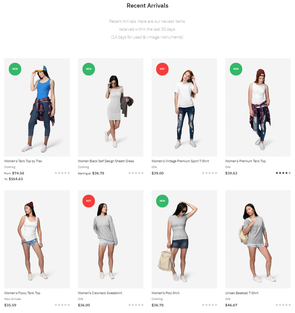
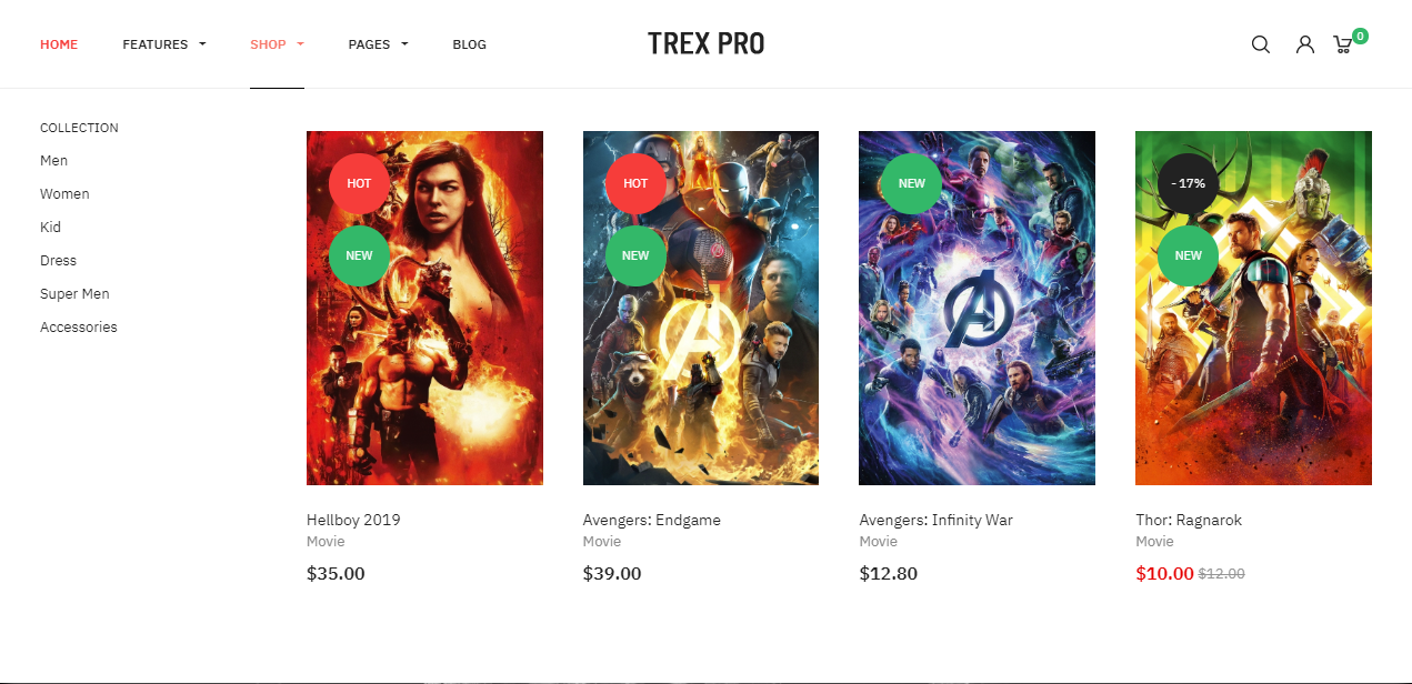
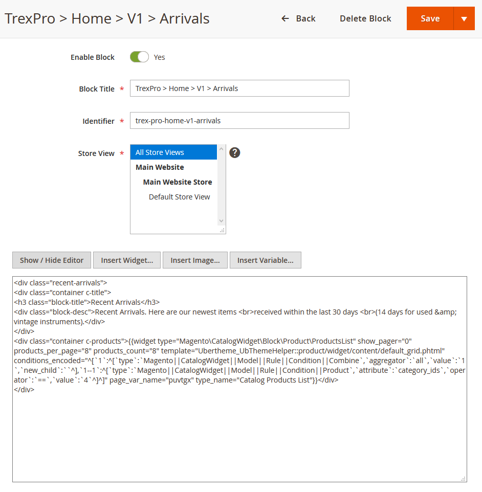
6. Recent Arrivals
You create the Recent Arrivals block with the configuration as follows:
Back-end setting
In the Content field, click Show/Hide Editor button, then copy and paste the following code:
<div class="recent-arrivals">
<div class="container c-title">
<h3 class="block-title">Recent Arrivals</h3>
<div class="block-desc">Recent Arrivals. Here are our newest items <br>received within the last 30 days <br>(14 days for used & vintage instruments).</div>
</div>
<div class="container c-products">{{widget type="Magento\CatalogWidget\Block\Product\ProductsList" show_pager="0" products_per_page="8" products_count="8" template="Ubertheme_UbThemeHelper::product/widget/content/default_grid.phtml" conditions_encoded="^[`1`:^[`type`:`Magento||CatalogWidget||Model||Rule||Condition||Combine`,`aggregator`:`all`,`value`:`1`,`new_child`:``^],`1--1`:^[`type`:`Magento||CatalogWidget||Model||Rule||Condition||Product`,`attribute`:`category_ids`,`operator`:`==`,`value`:`4`^]^]" page_var_name="puvtgx" type_name="Catalog Products List"}}</div>
</div>
Front-end Appearance:
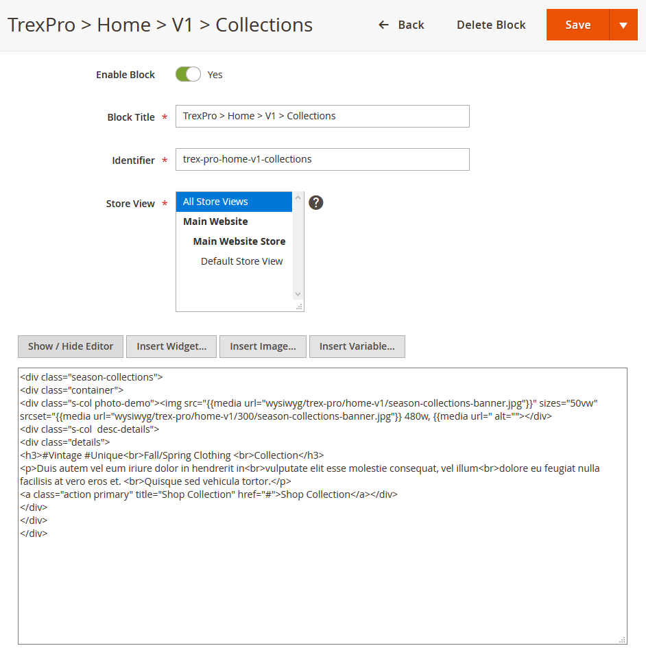
7. Season Collections
You create the Season Collections block with the configuration as follows:
Back-end setting
In the Content field, click Show/Hide Editor button, then copy and paste the following code:
<div class="season-collections">
<div class="container">
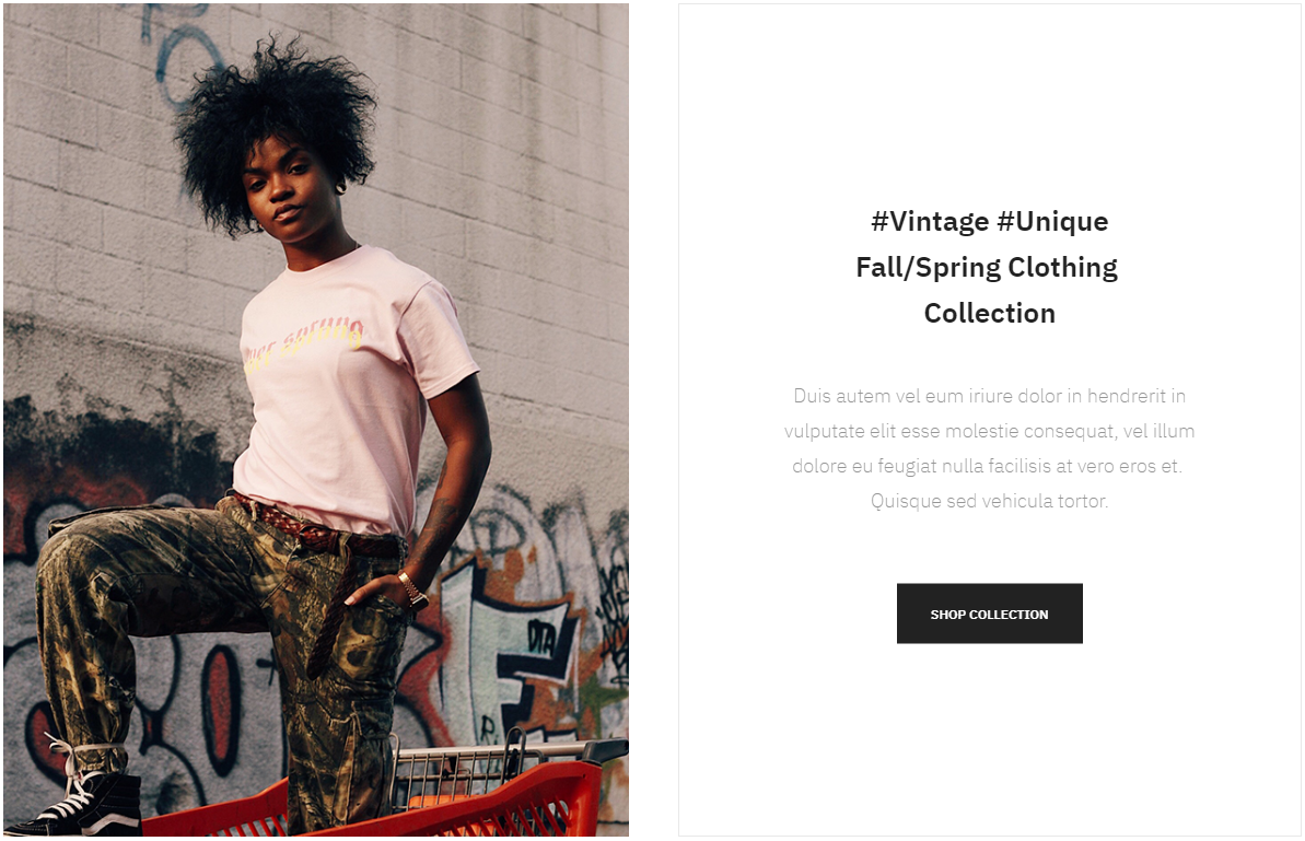
<div class="s-col photo-demo"><img loading="lazy" sizes="50vw" srcset="{{media url="wysiwyg/trex-pro/home-v1/300/season-collections-banner.jpg"}} 480w, {{media url="wysiwyg/trex-pro/home-v1/600/season-collections-banner.jpg"}} 768w" , {{media url="wysiwyg/trex-pro/home-v1/1200/season-collections-banner.jpg"}} 1200w" alt=" src="{{media url="wysiwyg/trex-pro/home-v1/season-collections-banner.jpg"}}"></div>
<div class="s-col desc-details">
<div class="details">
<h3>#Vintage #Unique<br>Fall/Spring Clothing <br>Collection</h3>
<p>Duis autem vel eum iriure dolor in hendrerit in<br>vulputate elit esse molestie consequat, vel illum<br>dolore eu feugiat nulla facilisis at vero eros et. <br>Quisque sed vehicula tortor.</p>
<a class="action primary" title="Shop Collection" href="#">Shop Collection</a>
</div>
</div>
</div>
</div>
Front-end Appearance:
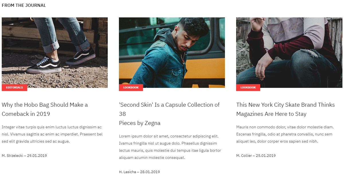
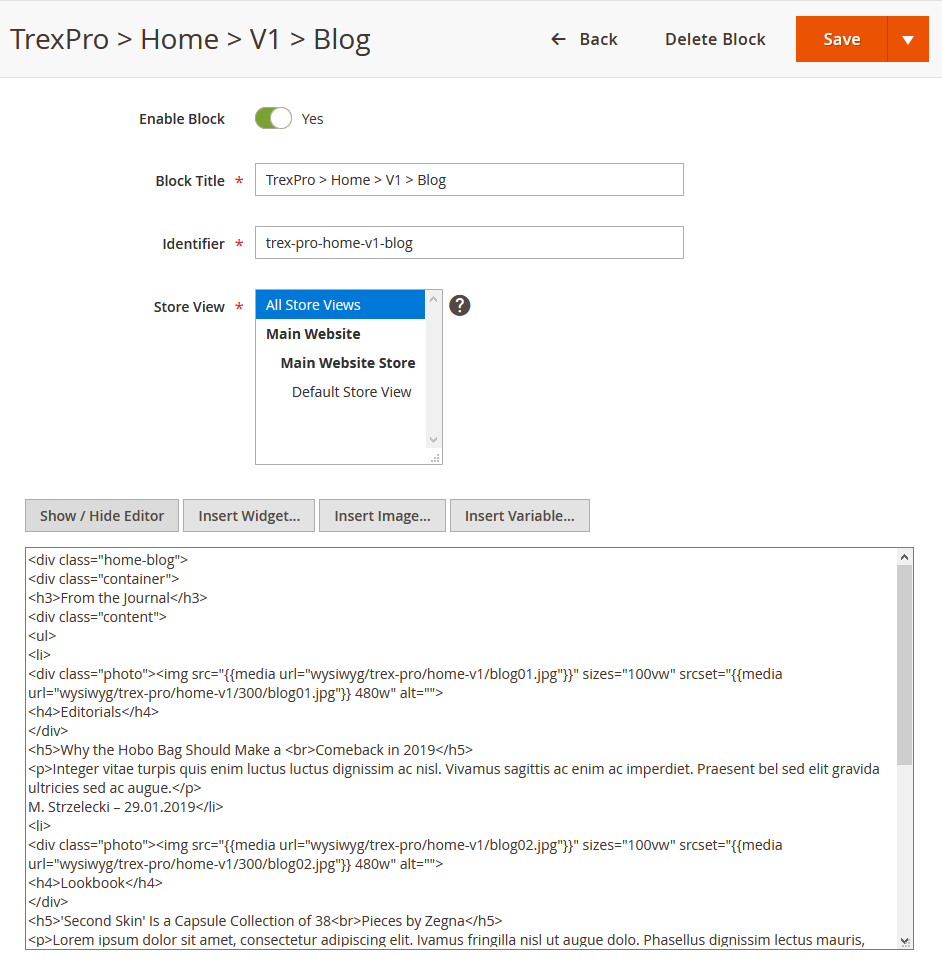
8. From the Journal
You create the From the Journal block with the configuration as follows:
Back-end setting
In the Content field, click Show/Hide Editor button, then copy and paste the following code:
<div class="home-blog">
<div class="container">
<h3>From the Journal</h3>
<div class="content">
<ul>
<li>
<div class="photo"><img loading="lazy" sizes="100vw" srcset="{{media url="wysiwyg/trex-pro/home-v1/300/blog01.jpg"}} 480w" alt=" src="{{media url="wysiwyg/trex-pro/home-v1/blog01.jpg"}}">
<h4>Editorials</h4>
</div>
<h5>Why the Hobo Bag Should Make a <br>Comeback in 2019</h5>
<p>Integer vitae turpis quis enim luctus luctus dignissim ac nisl. Vivamus sagittis ac enim ac imperdiet. Praesent bel sed elit gravida ultricies sed ac augue.</p>
M. Strzelecki – 29.01.2019
</li>
<li>
<div class="photo"><img loading="lazy" sizes="100vw" srcset="{{media url="wysiwyg/trex-pro/home-v1/300/blog02.jpg"}} 480w" alt=" src="{{media url="wysiwyg/trex-pro/home-v1/blog02.jpg"}}">
<h4>Lookbook</h4>
</div>
<h5>'Second Skin' Is a Capsule Collection of 38<br>Pieces by Zegna</h5>
<p>Lorem ipsum dolor sit amet, consectetur adipiscing elit. Ivamus fringilla nisl ut augue dolo. Phasellus dignissim lectus mauris, quis molestie dui tempus itae ligula bortor aliquam acumin molestie consequat.</p>
H. Lasicha – 28.01.2019
</li>
<li>
<div class="photo"><img loading="lazy" sizes="100vw" srcset="{{media url="wysiwyg/trex-pro/home-v1/300/blog03.jpg"}} 480w" alt=" src="{{media url="wysiwyg/trex-pro/home-v1/blog03.jpg"}}">
<h4>Lookbook</h4>
</div>
<h5>This New York City Skate Brand Thinks <br>Magazines Are Here to Stay</h5>
<p>Mauris non commodo dolor, vitae dolor molestie diam. Escenas fringilla, odio at pharetra convallis, nunc sem aliquet leo, dolor corper eros sapien sed nibh.</p>
M. Collier – 25.01.2019
</li>
</ul>
</div>
</div>
</div>
Front-end Appearance:
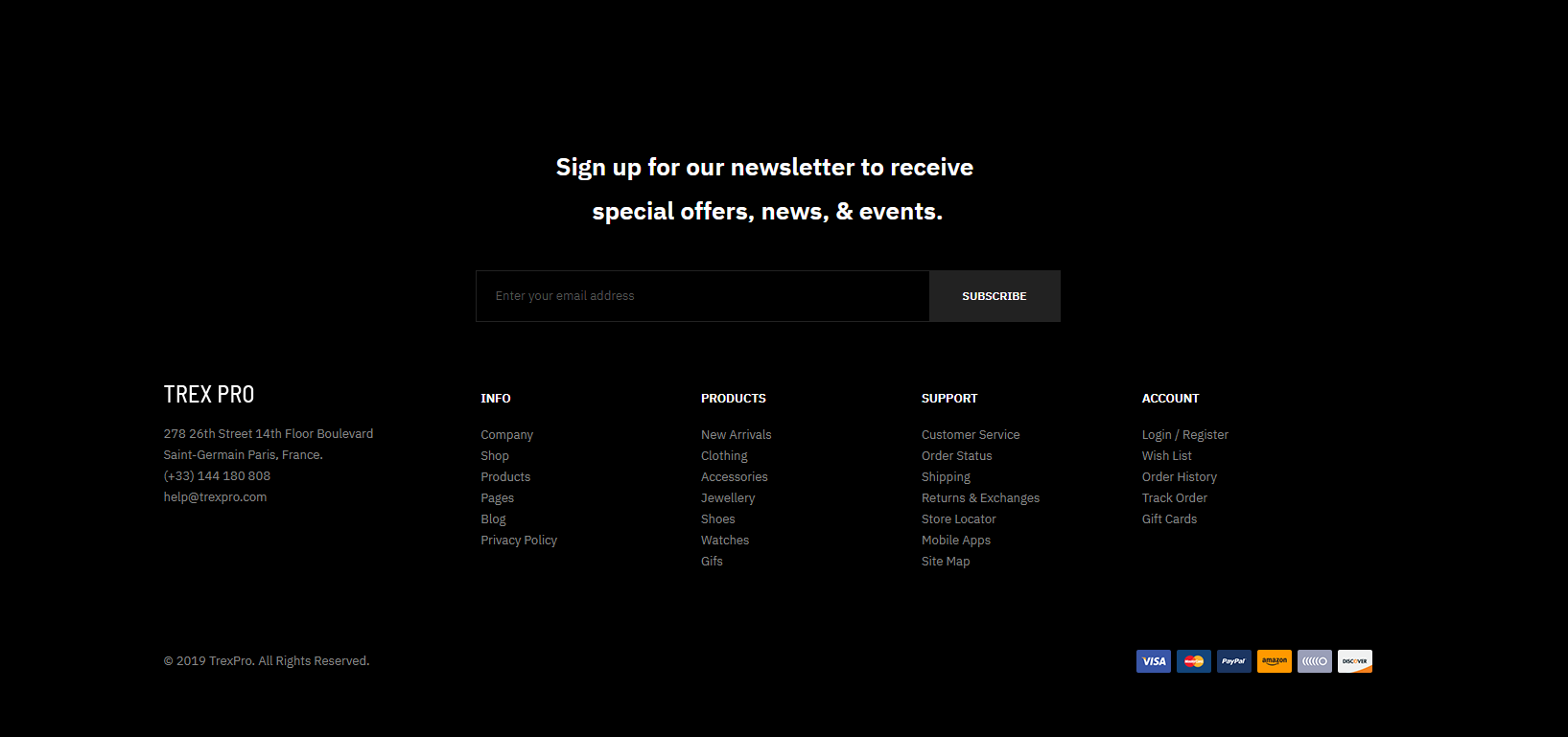
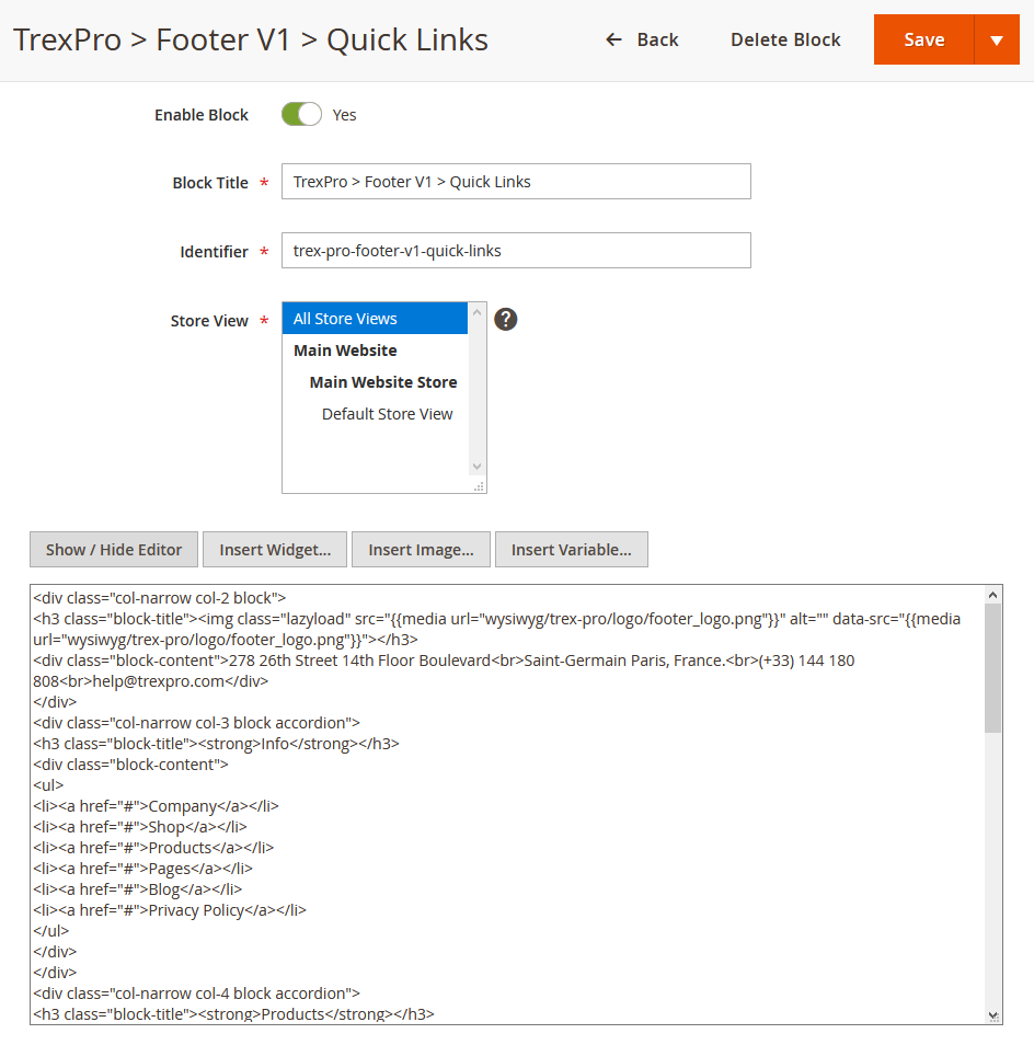
9. Footer links
You create the Footer links block with the configuration as follows:
Back-end setting
In the Content field, click Show/Hide Editor button, then copy and paste the following code:
<div class="col-narrow col-2 block">
<h3 class="block-title"><img class="lazyload" src="{{media url="wysiwyg/trex-pro/logo/footer_logo.png"}}" alt=" data-src="{{media url="wysiwyg/trex-pro/logo/footer_logo.png"}}"></h3>
<div class="block-content">278 26th Street 14th Floor Boulevard<br>Saint-Germain Paris, France.<br>(+33) 144 180 808<br>[email protected]</div>
</div>
<div class="col-narrow col-3 block accordion">
<h3 class="block-title"><strong>Info</strong></h3>
<div class="block-content">
<ul>
<li><a href="#">Company</a></li>
<li><a href="#">Shop</a></li>
<li><a href="#">Products</a></li>
<li><a href="#">Pages</a></li>
<li><a href="#">Blog</a></li>
<li><a href="#">Privacy Policy</a></li>
</ul>
</div>
</div>
<div class="col-narrow col-4 block accordion">
<h3 class="block-title"><strong>Products</strong></h3>
<div class="block-content">
<ul>
<li><a href="#">New Arrivals</a></li>
<li><a href="#">Clothing</a></li>
<li><a href="#">Accessories</a></li>
<li><a href="#">Jewellery</a></li>
<li><a href="#">Shoes</a></li>
<li><a href="#">Watches</a></li>
<li><a href="#">Gifs</a></li>
</ul>
</div>
</div>
<div class="col-narrow col-5 block accordion">
<h3 class="block-title"><strong>Support</strong></h3>
<div class="block-content">
<ul>
<li><a href="#">Customer Service</a></li>
<li><a href="#">Order Status</a></li>
<li><a href="#">Shipping</a></li>
<li><a href="#">Returns & Exchanges</a></li>
<li><a href="#">Store Locator</a></li>
<li><a href="#">Mobile Apps</a></li>
<li><a href="#">Site Map</a></li>
</ul>
</div>
</div>
<div class="col-narrow col-6 block accordion">
<h3 class="block-title"><strong>Account</strong></h3>
<div class="block-content">
<ul>
<li><a href="#">Login / Register</a></li>
<li><a href="#">Wish List</a></li>
<li><a href="#">Order History</a></li>
<li><a href="#">Track Order</a></li>
<li><a href="#">Gift Cards</a></li>
</ul>
</div>
</div>
Front-end Appearance:
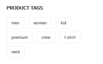
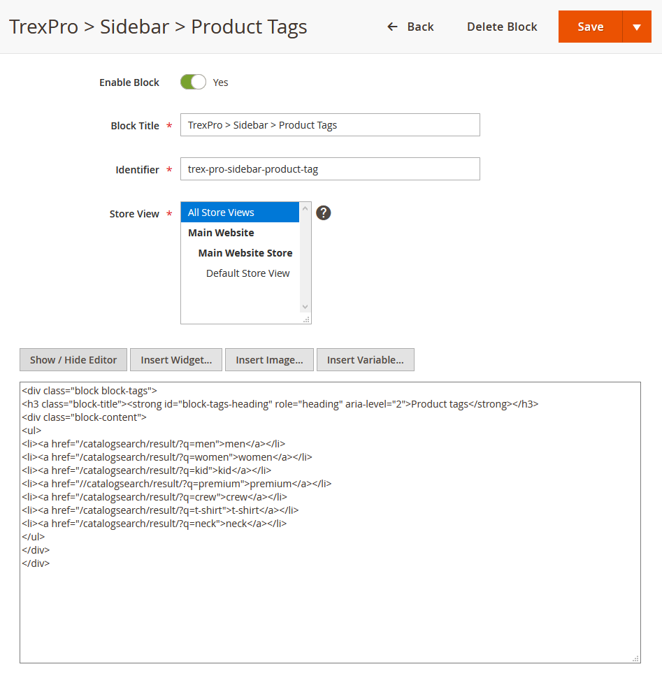
10. Sidebar Product Tags
1. You create the Sidebar Product Tags block on the Category page with the configuration as follows:
Back-end setting
In the Content field, click Show/Hide Editor button, then copy and paste the following code:
<div class="block block-tags">
<h3 class="block-title"><strong id="block-tags-heading" role="heading" aria-level="2">Product tags</strong></h3>
<div class="block-content">
<ul>
<li><a href="/catalogsearch/result/?q=men">men</a></li>
<li><a href="/catalogsearch/result/?q=women">women</a></li>
<li><a href="/catalogsearch/result/?q=kid">kid</a></li>
<li><a href="//catalogsearch/result/?q=premium">premium</a></li>
<li><a href="/catalogsearch/result/?q=crew">crew</a></li>
<li><a href="/catalogsearch/result/?q=t-shirt">t-shirt</a></li>
<li><a href="/catalogsearch/result/?q=neck">neck</a></li>
</ul>
</div>
</div>
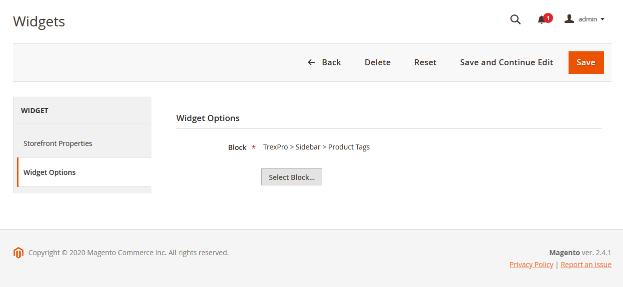
2. Then, click Content | (Elements) Widgets | Add Widget, and create Sidebar Product Tags Widget with the configuration like this sample: Back-end setting > Back-end setting
Front-end Appearance:
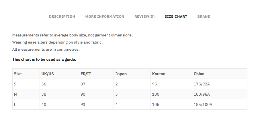
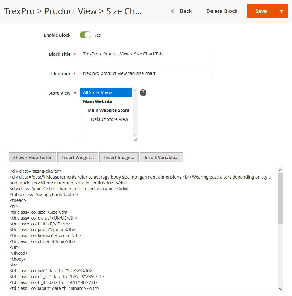
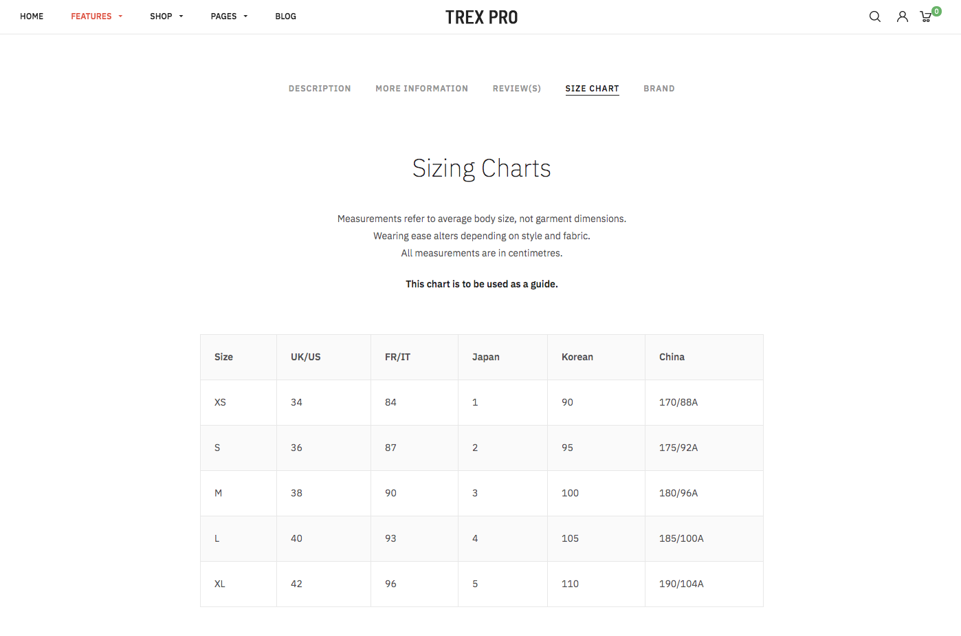
11. Size Chart Tab
You create the Size Chart Tab block on a product page with the configuration as follows:
Back-end setting
In the Content field, click Show/Hide Editor button, then copy and paste the following code:
<div class="sizing-charts">
<div class="desc">Measurements refer to average body size, not garment dimensions.<br>Wearing ease alters depending on style and fabric.<br>All measurements are in centimetres.</div>
<div class="guide">This chart is to be used as a guide.</div>
<table class="sizing-charts-table">
<thead>
<tr>
<th class="col size">Size</th>
<th class="col uk_us">UK/US</th>
<th class="col fr_it">FR/IT</th>
<th class="col japan">Japan</th>
<th class="col korean">Korean</th>
<th class="col china">China</th>
</tr>
</thead>
<tbody>
<tr>
<td class="col size" data-th="Size">S</td>
<td class="col uk_us" data-th="UK/US">36</td>
<td class="col fr_it" data-th="FR/IT">87</td>
<td class="col japan" data-th="Japan">2</td>
<td class="col korean" data-th="Korean">95</td>
<td class="col china" data-th="China">175/92A</td>
</tr>
<tr>
<td class="col size" data-th="Size">M</td>
<td class="col uk_us" data-th="UK/US">38</td>
<td class="col fr_it" data-th="FR/IT">90</td>
<td class="col japan" data-th="Japan">3</td>
<td class="col korean" data-th="Korean">100</td>
<td class="col china" data-th="China">180/96A</td>
</tr>
<tr>
<td class="col size" data-th="Size">L</td>
<td class="col uk_us" data-th="UK/US">40</td>
<td class="col fr_it" data-th="FR/IT">93</td>
<td class="col japan" data-th="Japan">4</td>
<td class="col korean" data-th="Korean">105</td>
<td class="col china" data-th="China">185/100A</td>
</tr>
</tbody>
</table>
</div>
Front-end Appearance:
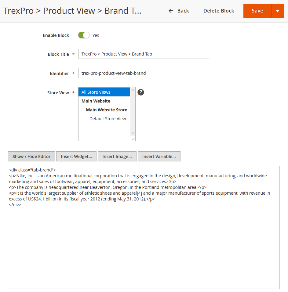
12. Brand Tab
You create the Brand Tab block on a product page with the configuration as follows:
Back-end setting
In the Content field, click Show/Hide Editor button, then copy and paste the following code:
<div class="tab-brand">
<p>Nike, Inc. is an American multinational corporation that is engaged in the design, development, manufacturing, and worldwide marketing and sales of footwear, apparel, equipment, accessories, and services. </p>
<p>The company is headquartered near Beaverton, Oregon, in the Portland metropolitan area.</p>
<p>It is the world's largest supplier of athletic shoes and apparel[4] and a major manufacturer of sports equipment, with revenue in excess of US$24.1 billion in its fiscal year 2012 (ending May 31, 2012). </p>
</div>
Front-end Appearance:

VII. Extension Configuration
The premium UB Trex Pro theme is packed with four featured extensions (UB Mega Menu, UB Content Slider, UB Quick View or UB Rich Snippets). Below you can find a list of userguides available for each extension:
1. UB Content Slider extension
The UB Content Slider module gives you the ability to add and manage rich slideshow on your homepage with ease. Each slide is a static block which can contain any custom images or HTML. You can add multiple slides filled with your featured images and captions.
First, you need to create a static block which calls the content slides on the homepage (Content | Bocks | Add New Block). Then, you create slide items under UB Content Slider’s admin panel (Ubertheme’s Extensions | [Content Slider] Manage Sliders). See this section for details:
VI. Static Block Configuration -- 6. Slideshow.
In addition, we recommend you check out the UB Content Slider’s documentation below to understand how the module works and learn about a wide variety of configuration options available:
2. UB Mega Menu extension
This section refers to the configuration of the mega menu built in the UB Trex Pro theme: Ubertheme’s Extensions | [Mega Menu] Manage Menu
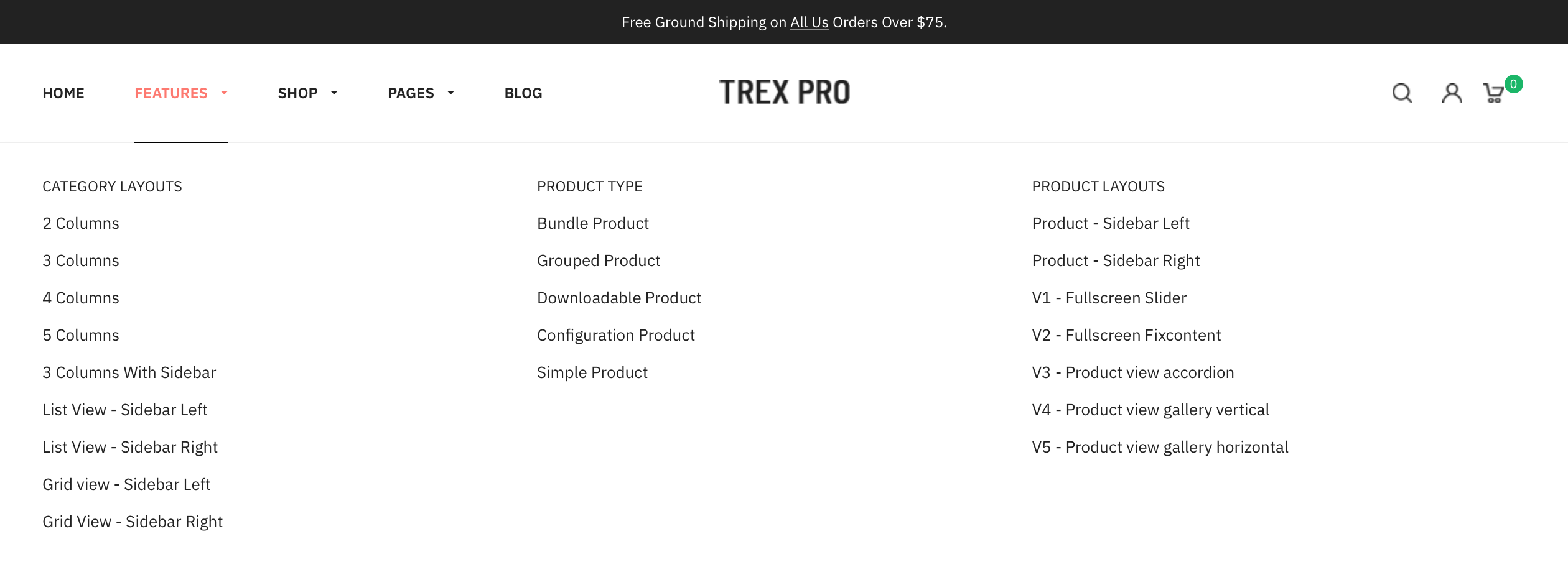
As can be seen on the UB Trex Pro demo, the main menu comes with some samples of menu layouts:
- Features menu item: 3 columns
- Shop menu item: 2 columns
- Pages menu item: 1 columns
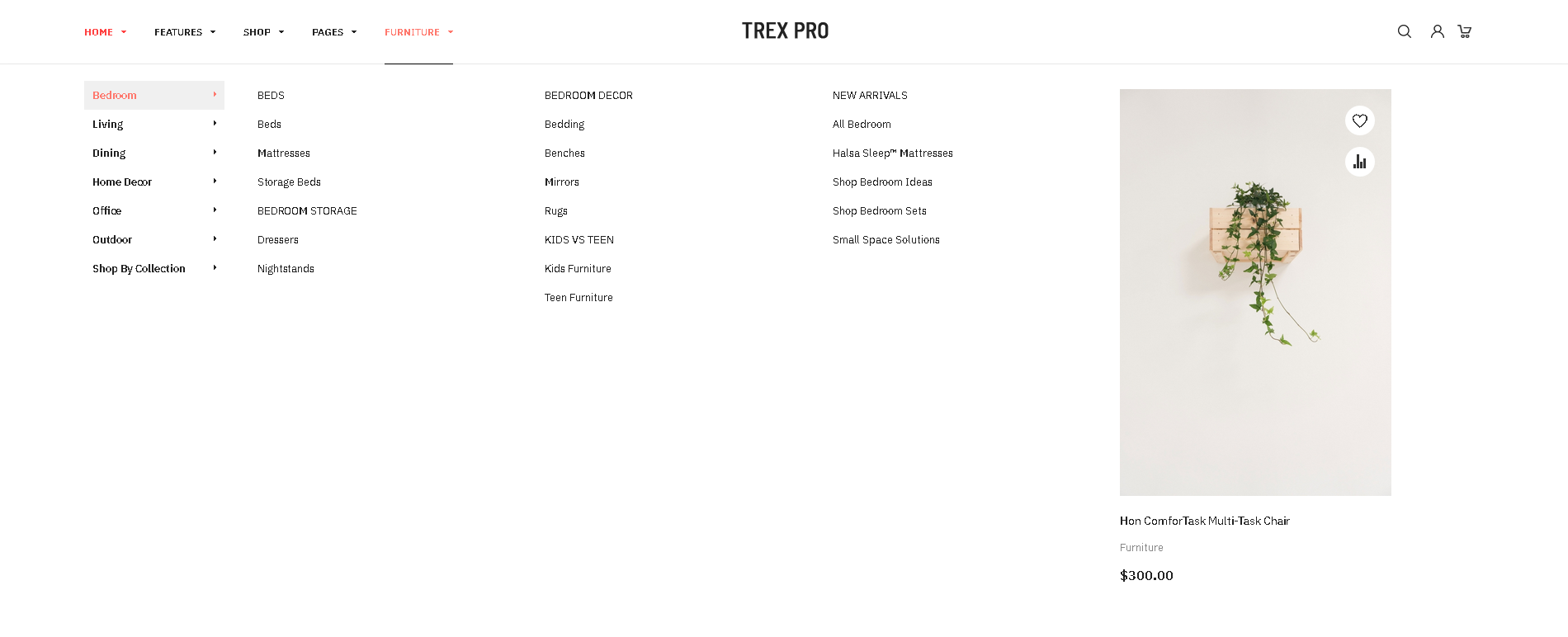
- Furniture menu item: Stacked category dropdown
Below is an example of the Shop menu item:
You can create all those drop-down mega menu items as follows:
Step 1 -- Create the Top Menu group
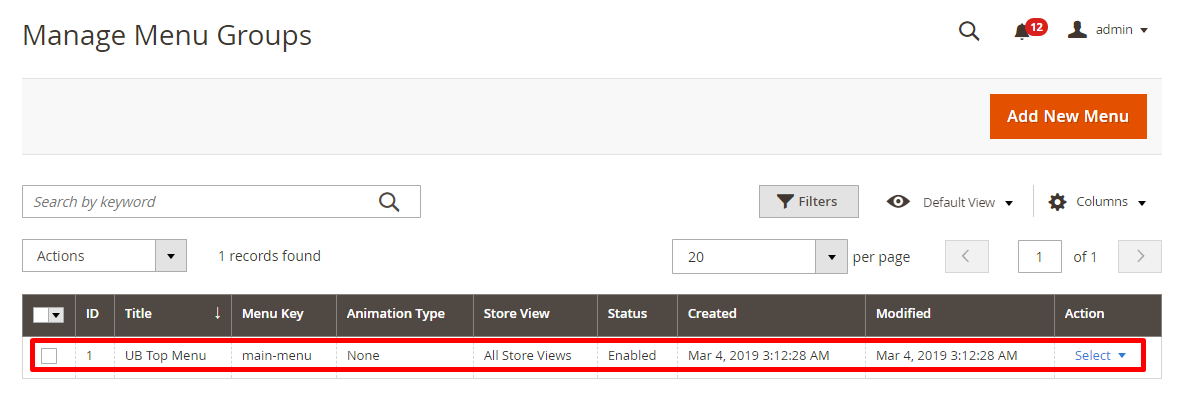
In your Magento 2 backend, navigate to Ubertheme’s Extensions | Mega Menu | Manage Menu, then click Add New Menu. In the popup, you can configure as in this screenshot
(Make sure you insert the menu identifier: main-menu).
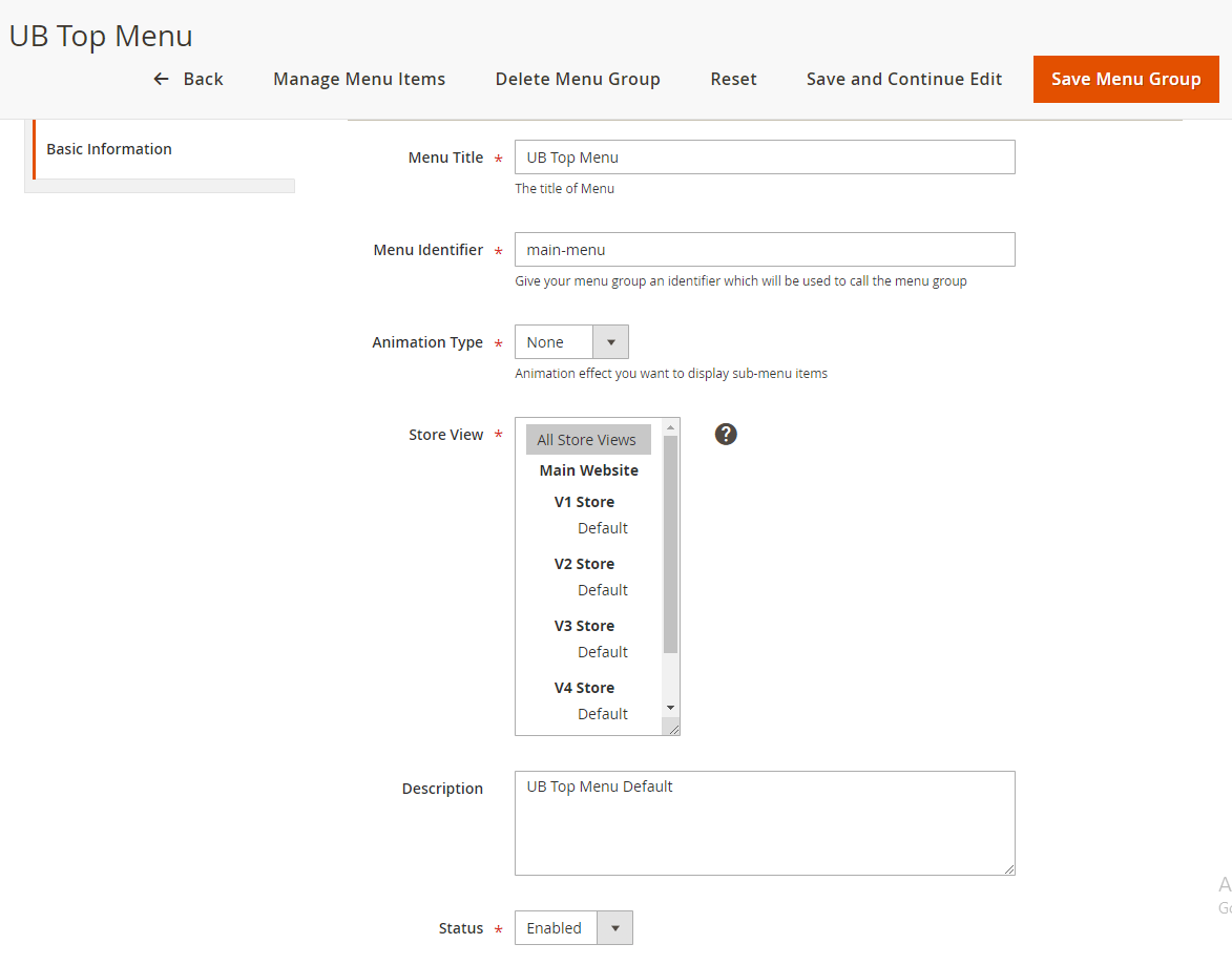
Once done, you should see the new menu group visible as shown in the following screenshort:
Step 2 -- Create menu item in the Top Menu
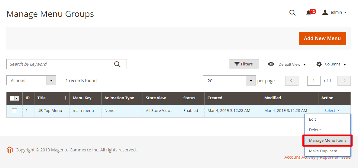
Supposed that you have some sample products in place already, now we start creating menu items for the mega menu. In the same Menu Group panel, go to Select | Manage Menu items:
Step 2.1 -- Create ‘Features’ and its sub-menu items:

Click Add New Menu Item button to create each of menu item, and follow configuration below:
- Features menu: Configuration steps -- menu setting 1 > menu setting 2
(NOTE: In the menu setting 1 of the Features menu, we set the Menu Link as a custom link ‘/v1/fashion.html’ for demo purpose only. You can set the menu link type as ‘Category Page’, ‘CMS Page’, or ‘Custom link’ at your choice.) - Category Layouts menu: Configuration steps -- menu setting 1 > menu setting 2
- 2 Columns menu: Configuration steps -- menu setting 1 > menu setting 2
(NOTE: In the menu setting 1 of the 2 Columns menu, we set the Menu Link as a custom link ‘/v3/fashion.html’ for demo purpose only. You can set the menu link type as ‘Category Page’, ‘CMS Page’, or ‘Custom link’ at your choice.)
You simply follow the same configurations for other sub-menu items of the Features menu.
Once done, after you flush Magento 2 cache, you should see the frontend appearance of the Features menu:
Step 2.2 -- Create ‘Shop’ and its sub-menu items

Click Add New Menu Item button to create each of menu item, and follow configuration below:
- Shop menu: Configuration steps -- menu setting 1 > menu setting 2
NOTE: In the menu setting 1 of the Shop menu, we set the Menu Link as a custom link ‘/v1/fashion.html’ for demo purpose only. You can set the menu link type as ‘Category Page’, ‘CMS Page’, or ‘Custom link’ at your choice. - Collections menu: Configuration steps -- menu setting 1 > menu setting 2
- Men menu: Configuration steps -- menu setting 1 > menu setting 2
NOTE: In the menu setting 1 of the Men menu, we set the Menu Link as a custom link ‘/v1/fashion/men.html’ for demo purpose only. You can set the menu link type as ‘Category Page’, ‘CMS Page’, or ‘Custom link’ at your choice.You simply follow the same configurations for other sub-menu items of the Collections menu. - Products menu: Configuration steps -- menu setting 1 > menu setting 2
NOTE: In the Description field of menu setting 2, you need to insert a Catalog Product List widget which will load specific products from a category at your choice.
For your convenience, in the Description field, click Show/Hide Editor button, you can copy and paste the following sample code into the Description field (make sure you replace the category_ids‘s value with your existing category id):<div>{{widget type="Magento\CatalogWidget\Block\Product\ProductsList" show_pager="0" products_count="2" template="product/widget/content/grid.phtml" conditions_encoded="^[`1`:^[`type`:`Magento||CatalogWidget||Model||Rule||Condition||Combine`,`aggregator`:`all`,`value`:`1`,`new_child`:``^],`1--1`:^[`type`:`Magento||CatalogWidget||Model||Rule||Condition||Product`,`attribute`:`category_ids`,`operator`:`==`,`value`:`26`^]^]"}}</div>
Once done, flush Magento 2 cache, then you should see the frontend appearance of the Shop menu:
Step 2.3 -- Create ‘Furniture’ and its sub-menu items:
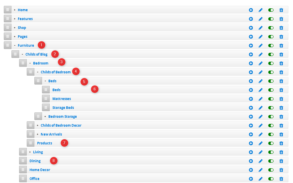
Click Add New Menu Item button to create each of menu item, and follow configuration below:
- Furniture menu: Configuration steps -- menu setting 1 > menu setting 2
(NOTE: In the menu setting 1 of the Features menu, we set the Menu Link as a custom link ‘{base_url}contact/’ for demo purpose only. You can set the menu link type as ‘Category Page’, ‘CMS Page’, or ‘Custom link’ at your choice. Make sure you insert the Extra Classstyle-tabsunder Mega Settings tab.) - Childs Of Blog menu: Configuration steps -- menu setting 1 > menu setting 2
- Bedroom menu: Configuration steps -- menu setting 1 > menu setting 2 (Make sure you insert the Extra Class
tab-headunder Mega Settings tab). - Childs Of Bedroom menu: Configuration steps -- menu setting 1 > menu setting 2
- Beds menu: Configuration steps -- menu setting 1 > menu setting 2
- Beds menu item: Configuration steps -- menu setting 1 > menu setting 2
- Products menu item: Configuration steps -- menu setting 1 > menu setting 2
NOTE: In the Description field of menu setting 2, you need to insert a Catalog Product List widget which will load specific products from a category at your choice.
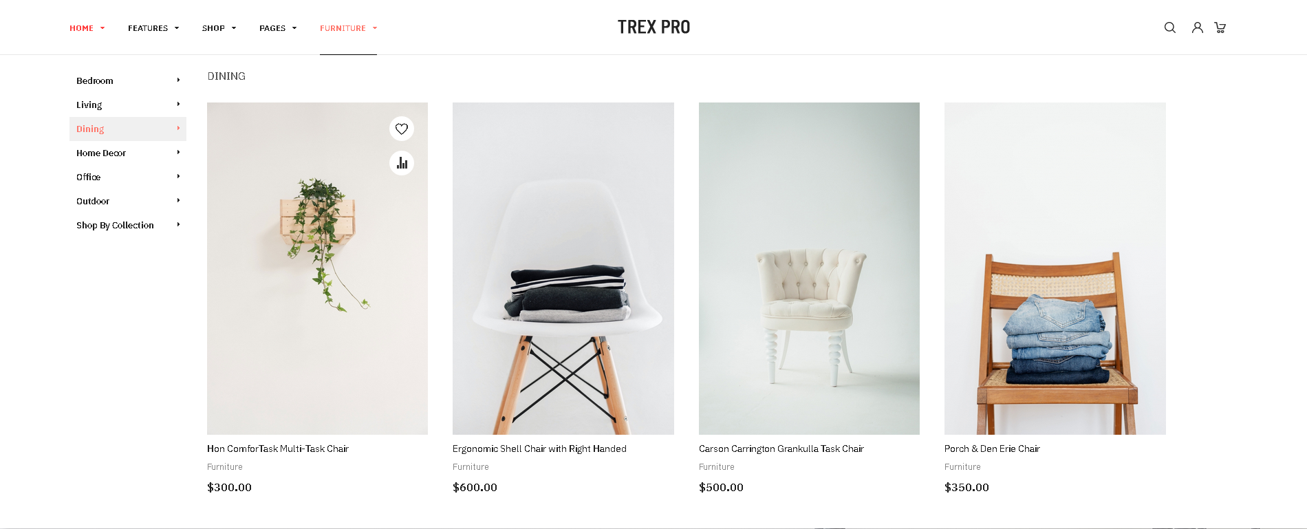
For your convenience, in the Description field, click Show/Hide Editor button, you can copy and paste the following sample code into the Description field (make sure you replace the category_ids‘s value with your existing category id):<div class="collections-single">{{widget type="Magento\CatalogWidget\Block\Product\ProductsList" title="Collections" show_pager="0" products_count="1" template="Magento_CatalogWidget::product/widget/content/grid.phtml" conditions_encoded="^[`1`:^[`type`:`Magento||CatalogWidget||Model||Rule||Condition||Combine`,`aggregator`:`all`,`value`:`1`,`new_child`:``^],`1--1`:^[`type`:`Magento||CatalogWidget||Model||Rule||Condition||Product`,`attribute`:`category_ids`,`operator`:`==`,`value`:`9`^]^]"}}</div> - Dining menu: Configuration steps -- menu setting 1 > menu setting 2
NOTE: Make sure you insert the Extra Classtab-headunder Mega Settings tab.
In the Description field of menu setting 2, you need to insert a Catalog Product List widget which will load specific products from a category at your choice.
For your convenience, in the Description field, click Show/Hide Editor button, you can copy and paste the following sample code into the Description field (make sure you replace the category_ids‘s value with your existing category id):<div class="collections">{{widget type="Magento\CatalogWidget\Block\Product\ProductsList" title="Dining" show_pager="0" products_count="4" template="Magento_CatalogWidget::product/widget/content/grid.phtml" conditions_encoded="^[`1`:^[`type`:`Magento||CatalogWidget||Model||Rule||Condition||Combine`,`aggregator`:`all`,`value`:`1`,`new_child`:``^],`1--1`:^[`type`:`Magento||CatalogWidget||Model||Rule||Condition||Product`,`attribute`:`category_ids`,`operator`:`==`,`value`:`9`^]^]"}}</div>
You simply follow the same configurations for other sub-menu items of the Furniture menu.
Once done, after you clean Magento 2 cache, you should see the frontend appearance of the Furniture menu:
In addition, we recommend you check out the UB Mega Menu’s documentation below to understand how the module works and learn about a wide variety of configuration options available:
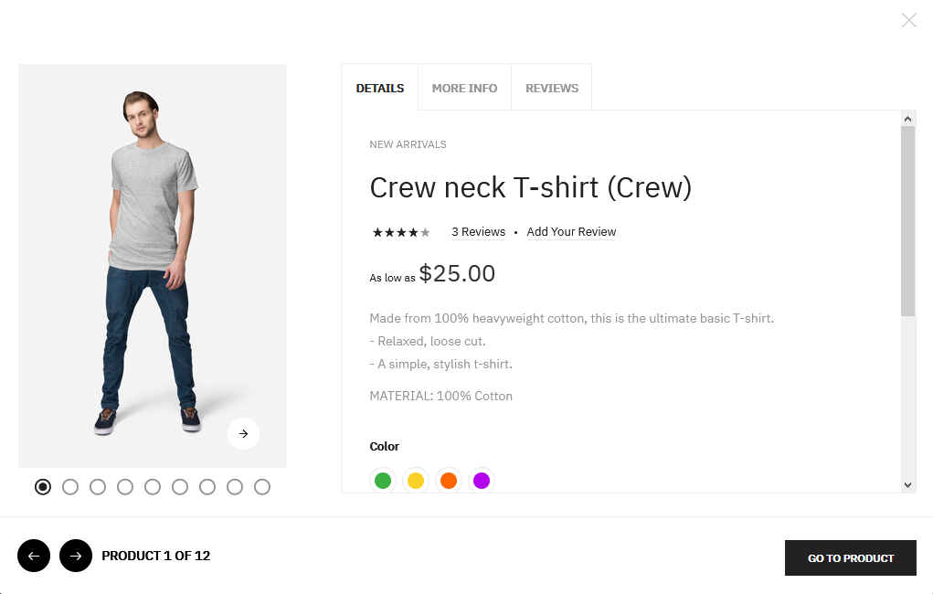
3. UB Quick View extension
UB Quick View module is packed with UB Trex Pro theme by default. The module allows shoppers to access the product details at ease through a pop-up windows right from homepage, category page or search result pages.
In your Magento 2 Admin Panel, navigate to Ubertheme’s Extensions | Quick View | Settings, you should see the default Backend settings like this screenshot.
NOTE:
If you use the Quickstart package of UB Trex Pro, you should see the Append Quick View Buttons to field is set as .actions-secondary.
If you install UB Trex Pro theme manually, you should see the Append Quick View Buttons to field is set as .product-item-info.
Front-end Appearance:
For more detail about installation and configurations of the UB Quick View, check out this guide:
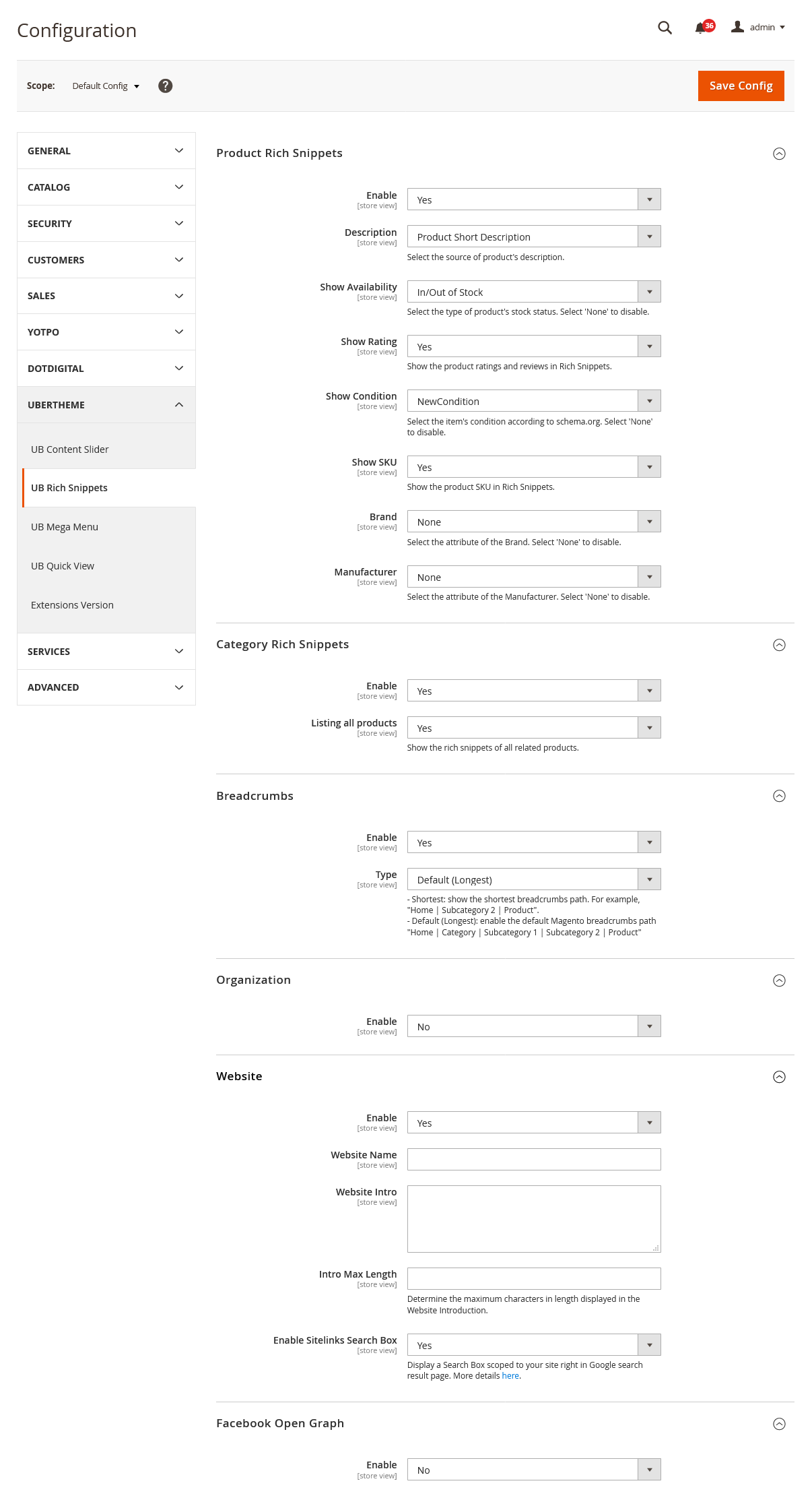
4. UB Rich Snippets
In your Magento 2 Admin Panel, navigate to Ubertheme’s Extensions | Rich Snippets | Settings and configure the default settings as shown in the Back-end setting.
For more detail about installation and configurations of the UB Rich Snippets, check out this guide:
VIII. UB Theme Helper Configuration
This section refers to the configuration of UB Trex Pro theme admin panel: Ubertheme’s Extensions | [Theme Helper] Configuration. You will learn about:
- Scope of the theme
- Parent theme and child themes
- How to activate the theme
- Configuration options of the theme
- How to create a child theme
1. Getting Started
UB Theme Helper theme panel gives you control over site-wide theme elements, such as your typography, colors, category page, product page etc.,
By default, the UB Theme Helper theme panel comes with the following themes:
- UB Trex Pro (the parent theme)
- UB Trex Pro Child Theme (a sample child theme that inherits and extends UB Trex Pro parent theme)
- 5 sample child themes for demo purpose -- V1, V2, V3, V4, V5, V6 (packed with UB Trex Pro Quickstart package only)
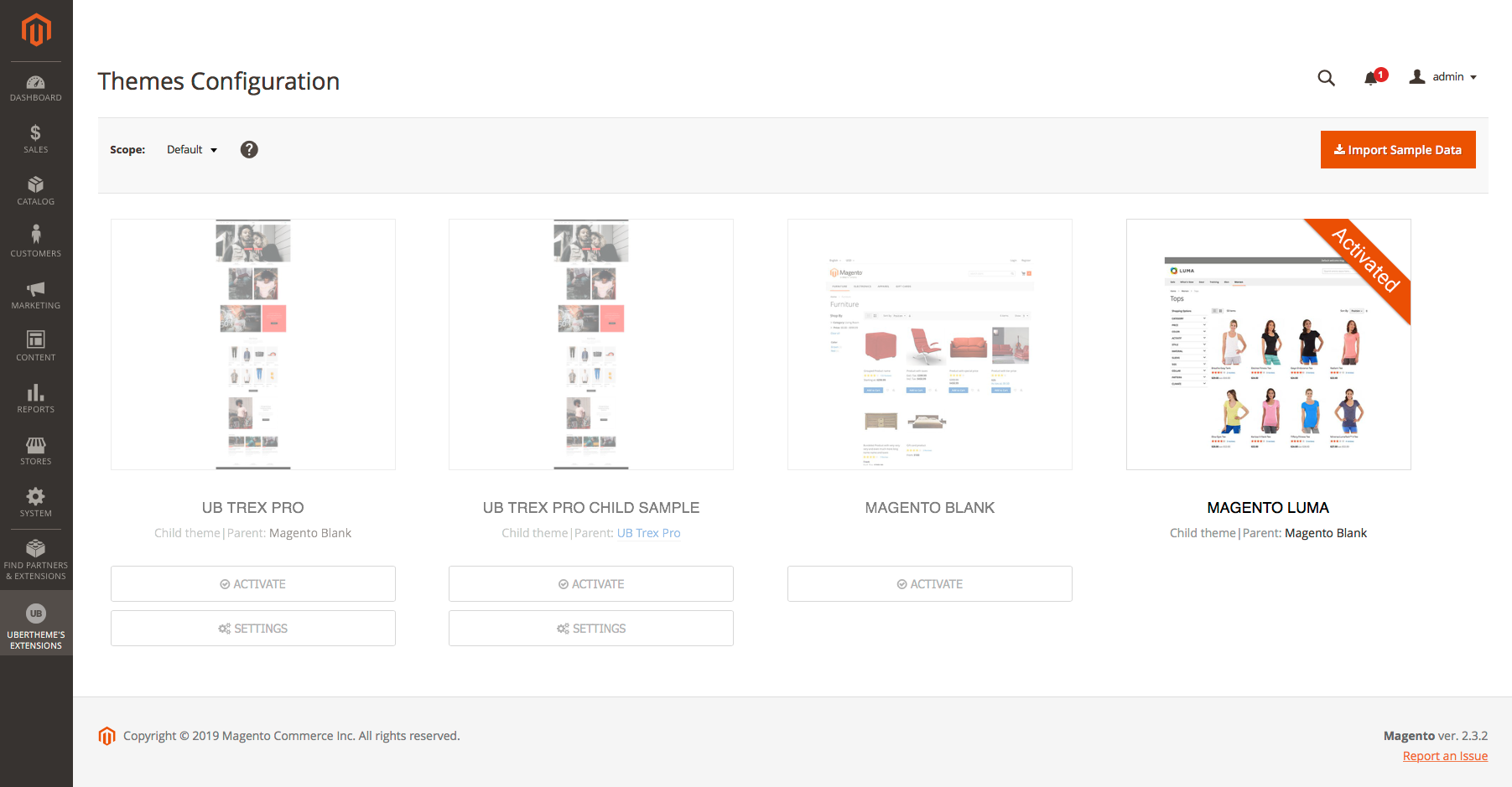
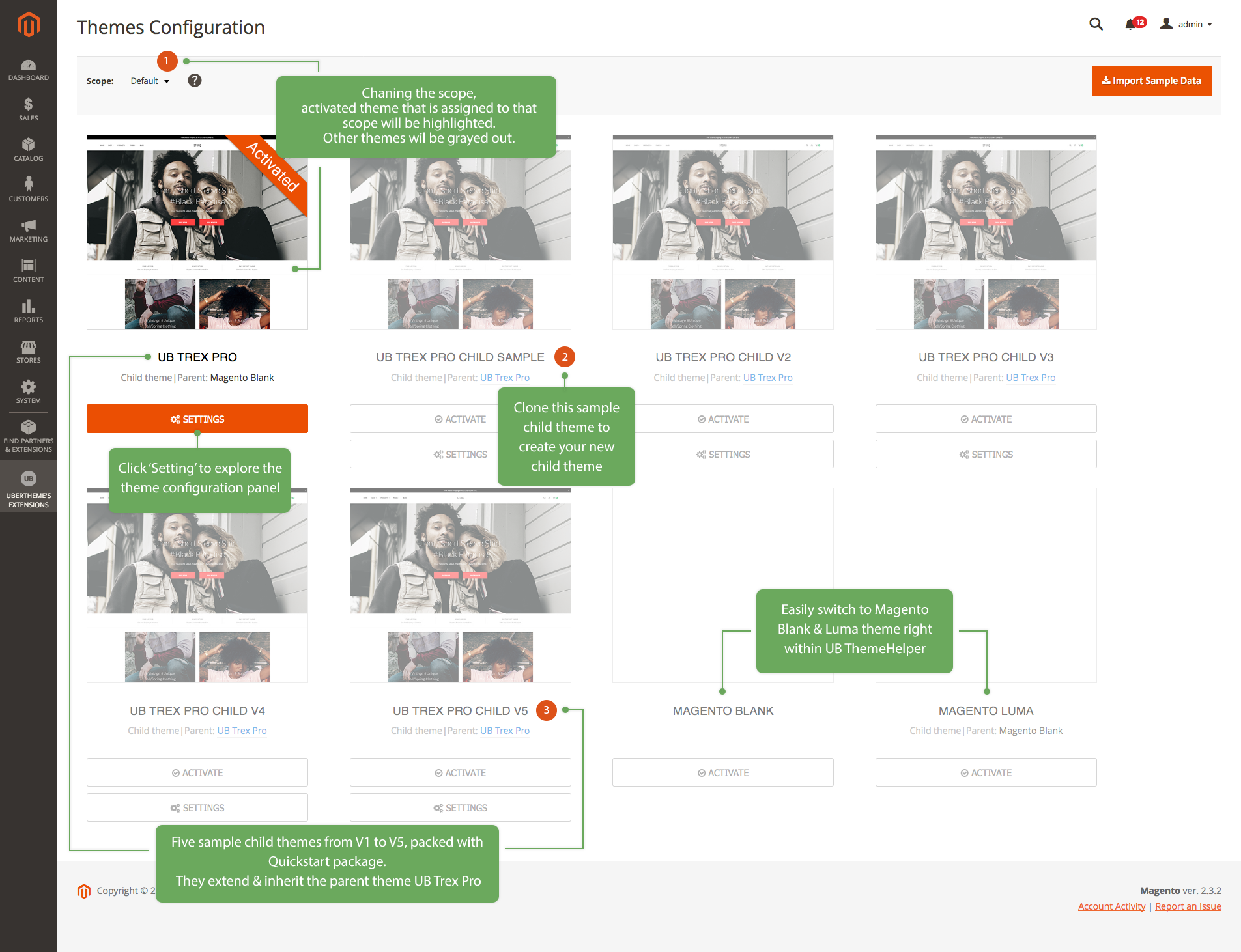
Go to Ubertheme’s Extensions | [Theme Helper] Configuration, you should see a grid of available themes as follows (suppposed that you install UB Trex Pro quickstart package):
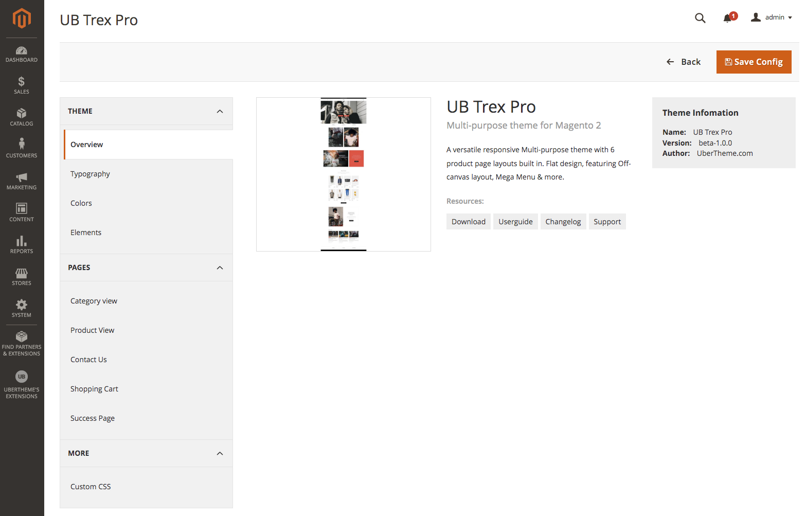
To explore the configuration panel of a theme, simply click the ‘Setting’ button right below the activated theme’s thumbnail. Here is an example configuration panel of the UB Trex Pro (the parent theme):
Magento 2 has the ‘scope’ of configuration which refers to a hierarchy of websites, stores, and store views. You can assign UB Trex Pro theme and it’s child themes to one of specific scopes below:
- Default (Global)
- Website
- Store View
Each theme can be assigned to any specific scope you select. It’s possible to assign the same theme to different scopes at your choice. Please refer to the section 1.2. Activate the theme below to learn how to activate and assign a theme to a specific scope.
1.2. Parent theme and child themes
UB Trex Pro theme can be enabled for the entire store, but you can also create multiple child themes from existing parent theme UB Trex Pro and set different child themes for different parts of the store (eg. for selected categories or CMS pages).
- A parent theme is a complete theme which includes all the features for the theme to work.
- A child theme allows you to change aspects of your site’s appearance. You can overwrite any part of the parent theme to make your modifications. All the functions from the parent theme will be inherited, unless it is overridden in the child theme.
The parent theme UB Trex Pro and its sample child themes are illustrated in this screenshot.
The description ‘Child theme | Parent theme UB Trex Pro’ appears in small text below each theme’s title. It indicates that this is a child theme, and it’s parent theme is UB Trex Pro.
The child theme inherirtance:
The child theme of UB Trex Pro is based on the fallback scheme. The child theme is used first. If a configuration option is not found in the current child theme, the parent theme’s configuration will be used.
Both parent theme and child themes come with 2 sets of configuration:
- Default Configuration: initial default configurations of the parent / child theme
- Custom Configuration: changes made to the default configurations of the parent / child theme. Custom configuration is always used first. If no custom configuration is found, default configuration will be used.
Child theme configurations:
To enter the configuration panel of a child theme, go to Ubertheme’s Extensions | [Theme Helper] Configuration, select the scope (that you assign the child theme) from the Store View chooser in the upper-left corner. Then, you should see the activated Child theme. Click the ‘Setting’ button of that child theme, you should see the configuration panel like this:
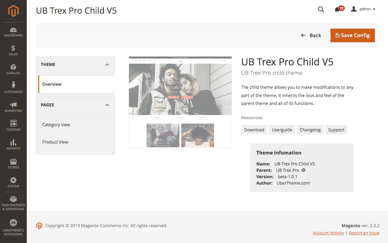
The screenshot above is a sample configuration panel of the UB Trex Pro Child Theme V5 packed with UB Trex Pro Quicktart package. The child theme admin panel only displays the configuration options that you make changes to the parent theme.
Please refer to the section Manual Installation | Step 4: Activate the theme for details. In general, you need to follow steps below to activate a theme:
Step 1: Navigate to UB Trex Pro theme admin panel: Ubertheme’s Extensions | [Theme Helper] Configuration. You will see a grid of themes available.
Step 2: From the Scope chooser in the upper-left corner of our Theme Helper configuration page, select a scope you want to assign the theme to.
Step 3: Then, navigate to the theme you want and click the ‘Activate’ button. And that’s it.
You can create different child themes that extend the UB Trex Pro parent theme, following steps below:
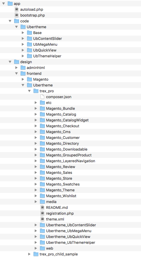
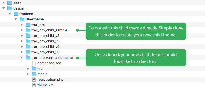
Step 1. Under the same directory [magento_root]/app/design/frontend/ubertheme/, clone the trex_pro_child_sample folder and rename it as you want. Your new child theme structure is illustrated as follows:
Step 2: Edit the three mains files below that manage the child theme’s behavior:
- registration.php: replace the frontend/Ubertheme/trex_pro_child_sample with your own child theme name
- theme.xml: update the title element
- composer.json: update the name/value pairs “name”: “ubertheme/trex_pro_child_sample” with your own child theme’s name.
Step 3: On the terminal, go to the Magento 2 directory and run the command: php -f bin/magento setup:upgrade.
After these steps, access Ubertheme’s Extensions | [Theme Helper] Configuration, your new child theme should be available in the theme grid.
1.4. Switch to Magento 2 Blank / Luma theme
For your convenience, we integrate both Magento 2 Blank theme and Luma theme into our UB Trex Pro theme panel. There might be a chance that you want to switch to Blank theme or Luma theme for testing purpose.
Go to Ubertheme’s Extensions | [Theme Helper] Configuration, select the Scope you want, and click ‘Activate’ button under the Blank or Luma theme, depending on which theme you want to switch to.
2. Theme Configuration
2.1 Typography Setting
Note: After making changes to your active theme’s Typography settings, you need to run the static view files deployment to apply the changes.You should back up your site first. Once done, access your server via SSH and navigate to your Magento 2 folder, then run the following commands one by one:
(Make sure you are using developer or default mode)
- rm -rf var/cache/ var/page_cache/ var/view_preprocessed/ pub/static/frontend/Ubertheme/
- php bin/magento setup:static-content:deploy -t Ubertheme/trex_pro -language en_US -f (if you’re using other language, make sure you replace with specific language code you’re using)
- php bin/magento cache:flush
- Then clear your browser cache
2.1.1 Base font size
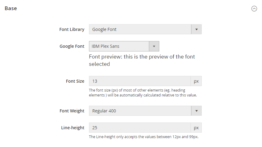
Base Font Size: The font size of most of regular text elements. Default value: 13px.
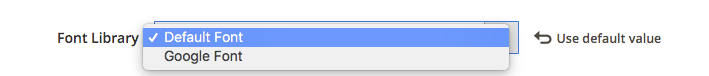
a. Google Font
By default, UB Trex Pro uses the Google font family — a robust directory of open source designer web fonts, simply browse the font of your choice.
General font weight: set the font weight you need (Eg: Thin, Extra Light, Light, Regular, Medium, Semi bold, Bold, Black).
Make sure you specify correct font weight for the selected font. A specific font might not available in all weights.
b. Default Font
Default font supports general font families including:
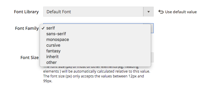
- Serif
- Sans-serif
- Cursive
- Fantasy
- Monospace
Beside those 5 font families, UB ThemeHelper also support two other values:
- Inherit: If ‘Inherit’ selected, default font family will be used.
- Other: If ‘Other’ selected, default ‘Bulter’ font will be used
2.1.2 Heading
General
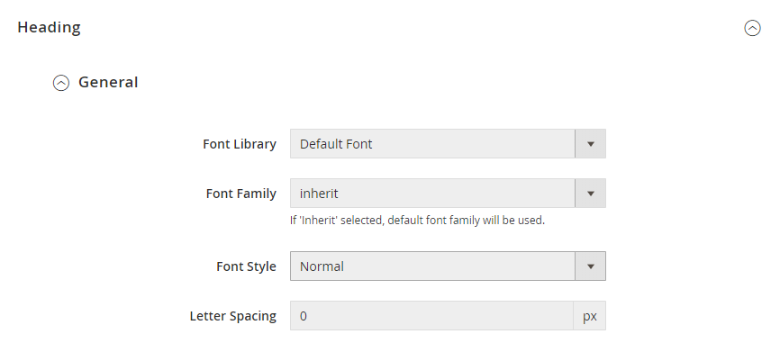
The Heading section determines the font library for heading text elements. Heading Element refers to all H1, H2, H3, H4, H5, H6.
You can choose one of the two options: Default font or Google font.
If Font Library is set with ‘Default Font’, the Heading supports 5 common font families: Serif, Sans-serif, Monospace, Cursive and Fantasy. Besides, UB ThemeHelper also supports two other values:
- Inherit: If ‘Inherit’ selected, default font family defined in the Theme | Typography | Base section will be used.
- Other: If ‘Other’ selected, default Bulter font will be used
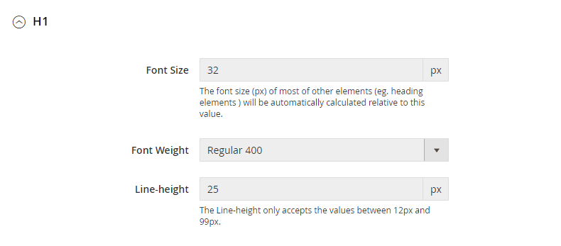
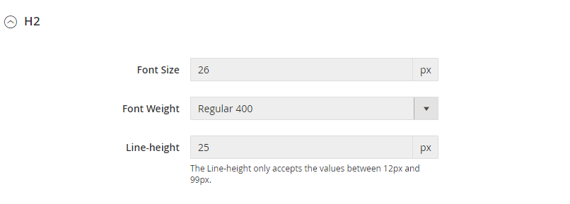
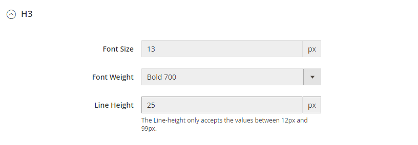
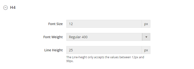
H1, H2, H3, H4, H5, H6
For each heading element, you can configure Font Size, Font Weight and Line-Height.
Heading font weight: Simply set the font weight you need (Eg: thin, extra light, light, regular, medium, semi bold, bold, black). Make sure you specified correct font weight for the selected font. A specific font might not available in all weights.
H1 Configuration
H2 Configuration
H3 Configuration
H4 Configuration
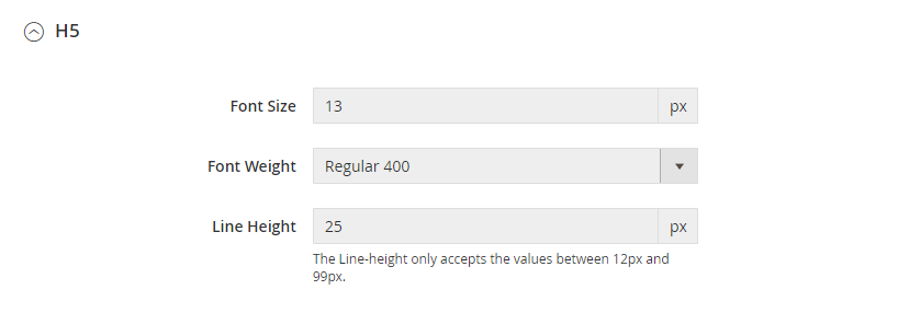
H5 Configuration
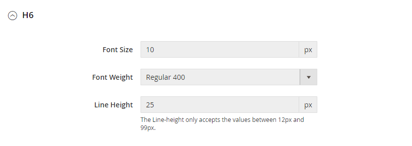
H6 Configuration
2.2 Color Settings
2.2.1 Base Color
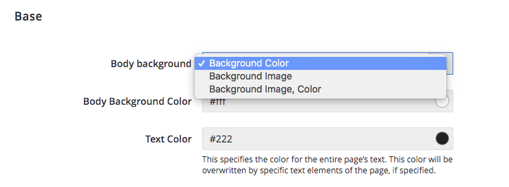
UB Trex Pro supports three types: Background color; Background image; or Background image, color.
Depending on which type you select, you might need to change the following settings:
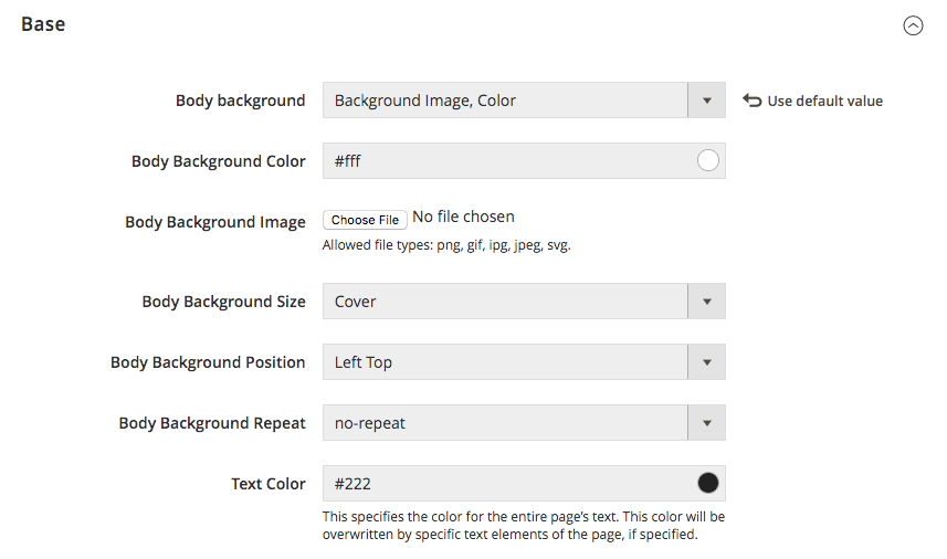
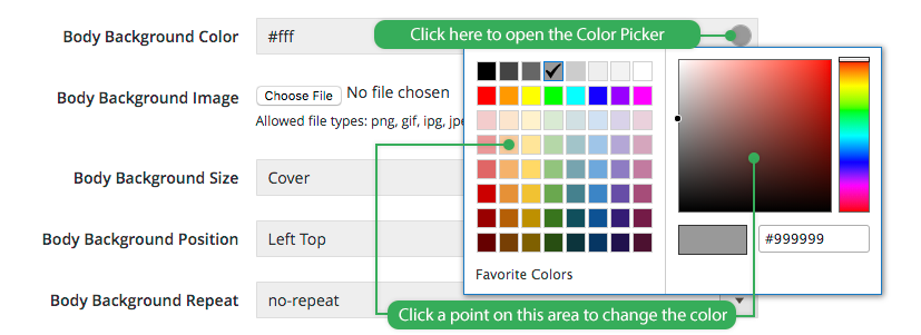
- Body Background Color: Refers to the color scheme of the body section. We recommend you leave this setting unchanged, unless you want to make custom graphic UI. Default color: #fff. Simply open the Color Picker and change the color like in this screenshot:
- Body Background Color: Set the body background color that you want, if you sepcify the body background type as ‘Background Color’ or ‘Background Image, Color’
- Body Background Image: Upload an image which will be displayed as a background of the entire page.
- Body Background Size: Set the Background size as Auto, Cover, Contain, Other
If ‘Other’ selected, define the position following one of two types: Length values (eg. 100px 5px); Percentages (e.g. 100% 5%); like in this screenshot: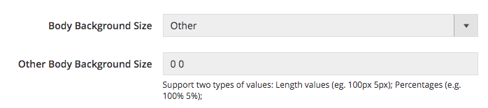
- Body Background Position: Defines the position of the background image. Set it as Left Top, Left Bottom, Right Top, Right Center, Right Bottom, Center Top, Center Center, Center Bottom, Other.
If ‘Other’ selected, define the position following one of two types: Length values (eg. 100px 5px); Percentages (e.g. 100% 5%); like in this screenshot: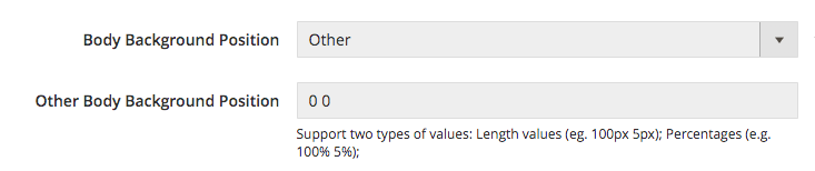
- Body Background Repeat: Defines how the background image is repeated. You can set it as repeat, no-repeat, repeat-x, repeat-y, initial
- Text Color: This specifies the color for the entire page’s text. This color will be overriden by specific text elements of the page, if specified
2.2.2 Links Color
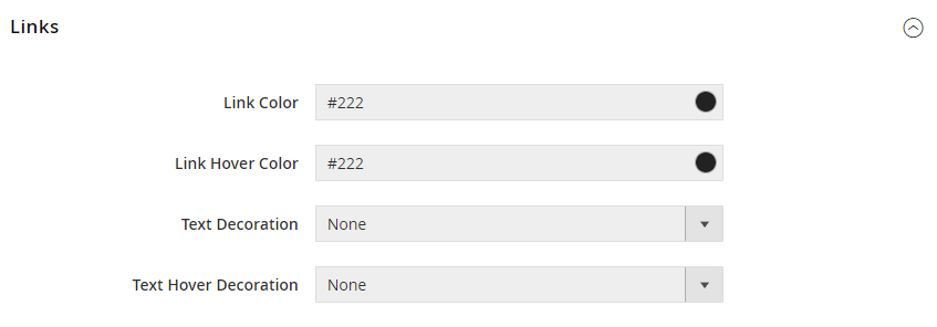
In this tab, you can configure basic color for the entire page’s links. These colors will be inherited by all sections of the page.
- Link Color: Set the link color.
- Link Hover Color: Set the link color on mouse hover.
- Text Decoration: Set to None, Underline, Overline or Line Through.
- Text Hover Decoration: Set to None, Underline, Overline or Line Through.
Note: After making changes, you need to run static view files deployment to see your changes applied. See this note for details.
2.2.3 Brand Color
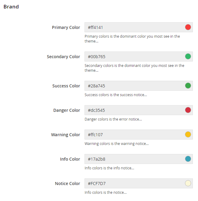
In this tab, you can configure the basic color for the Brand color:
- Primary Color: Refers to the dominent brand color for links, buttons, etc.
- Secondary Color: Secondary color constitutes additional color for alternative styling.
- Other notice elements: Set the color for highlighting the Success, Danger, Warning, Info notices.
2.3. Element Settings
Note:
- If you just enable/disable each of Element’s settings, simply clean Magento cache to see your changes applied.
- If you customize Element’s configuration, you have to re-deploy the static content and clean Magento cache to display changes you have made.
2.3.1 Header
In this section, you can configure key blocks in the header section of the store: Logo, Top Bar, Menu, other global elements like Header Background color etc.
2.3.1.1 General
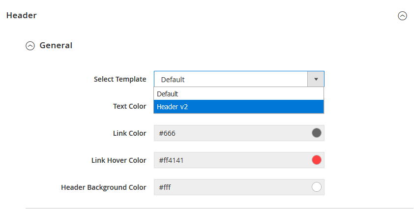
At present, UB Trex Pro supports 2 header options:
- Default: Center aligned logo header
- Header V2: Left aligned logo header
You simply switch among the header templates under the Select Template field.
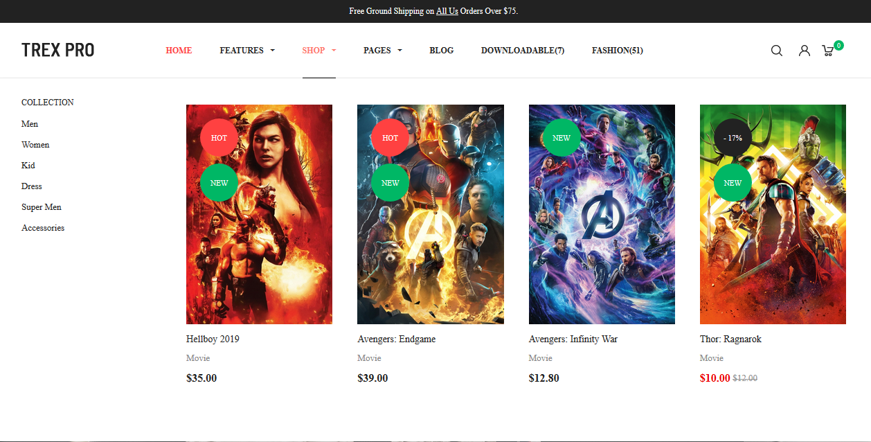
Front-end Appearance for Header V2:
2.3.1.2 Logo
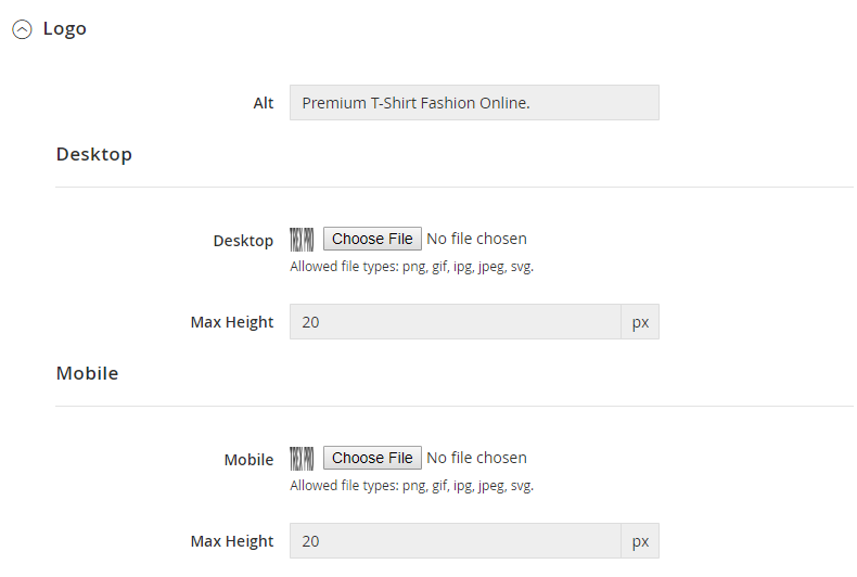
You can upload different logos for Desktop and mobile view.
Your logos will be stored under the directory [magento_root]/pub/media/ubertheme/uberthemehelper/element/header/logo/src_desktop (and src_mobile).
Then, you set the maximum height of the logo accordingly. Please note the max height should be aligned with the height of the Header section.
Once done, after flush Magento cache, you should see your new logos applied.
2.3.1.3 Top bar
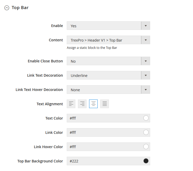
When you enable the Top Bar, Content or Enable Close Button, simply flush Magento cache to see your changes immediately.
However, for the other configurations listed below, you have to re-deploy the static content and clean Magento cache to display changes you have made.
- Link Text Decoration
- Link Text Hover Decoration
- Text Alignment
- Link Text Hover Decoration
- Text Color
- Link Color
- Link Hover Color
- Top Bar Background Color
2.3.1.4 Menu
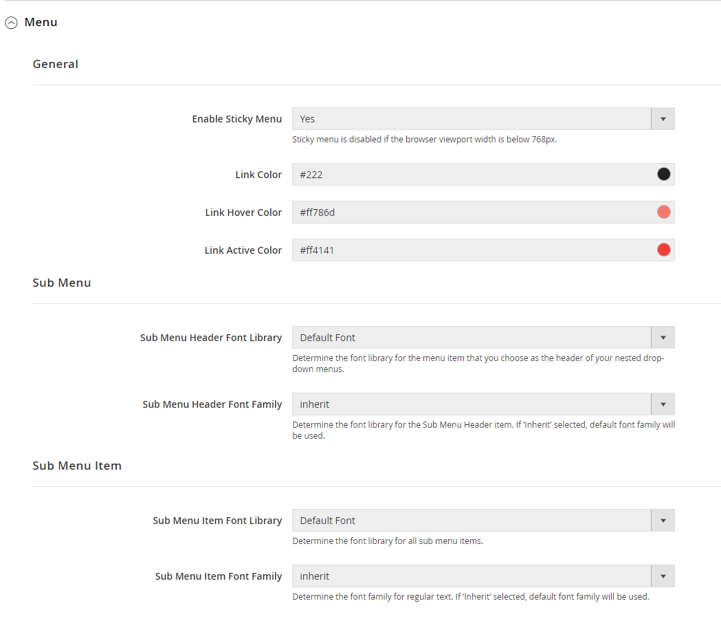
When you enable Sticky Menu, simply flush Magento cache to apply your changes. Please note sticky menu is disabled if the browser viewport width is below 768px.
For the other configurations in this section, you need to re-deploy the static content and clean Magento cache after making changes.
- Sub Menu: refers to the font library of the menu item that you choose as the header of your nested drop-down menus. If you set the Sub Menu Header Font Family as ‘inherit’, default font family defined in Theme | Typography | Base will be used.
- Sub Menu Item: refers to the font library of all sub menu items. If ‘inherit’ selected, default font family is loaded similar to the Sub Menu.
2.3.1.5 Other
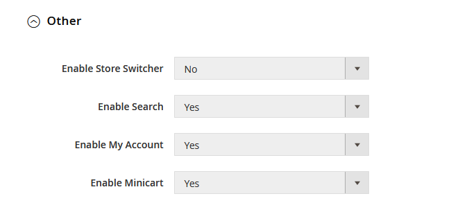
You just need to flush cache after making changes in this section.
2.3.2 Main
2.3.2.1 Default Button
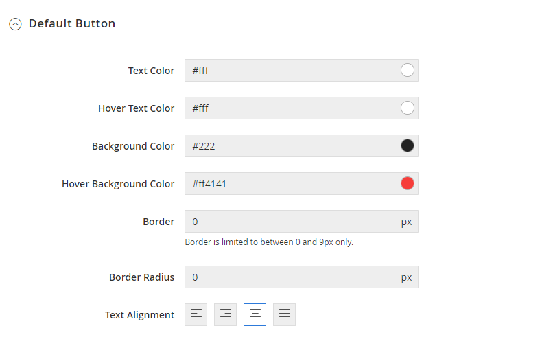
Default button refers to the style for button on the entire pages, unless classified elsewhere. For example, default buttons are used on UB Trex Pro homepage’s blocks like Sale Client, Season Collections; and other sub-page’s buttons like “Log In”, ‘Submit Review’ etc.,
You can configure the button your way:
- Text Color
- Hover Text Color
- Background Color
- Hover Background Color
- Border
- Border Radius (to define the button with rounded corners)
- Text Alignment
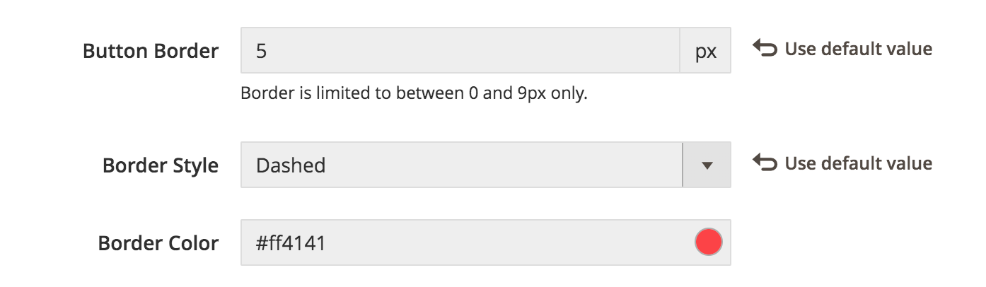
Please note the border is limited to between 0 and 9px only. If you set the border as 1px or above, two additional configuration options will be added:
- Border Style
- Border Color
NOTE: You need to re-deploy the static content and clean Magento cache after making changes in this section.
2.3.2.2 Primary Button
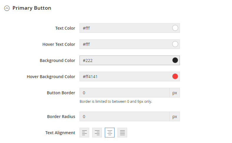
Primary Button refers to the key, or the most important action on a page (e.g. main CTA on a page). UB Trex Pro uses the primary buttons like ‘Add to Bag’, ‘Proceed to Checkout’ etc.,
The configuration options for the Primary Button is similar to the Default Button.
2.3.2.3 Sidebar Manager
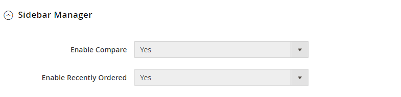
You can enable Compare Products block and Recently Ordered block which usually appears in either the left or right sidebar of a catalog page. The Recently Ordered block is visible when you log in your account.
2.3.2.4 Back To Top Manager

The ‘Scroll to top’ button is visible when you start to scroll the page. It will take you to the top of the page when clicked on.
2.3.2.5 Product Label
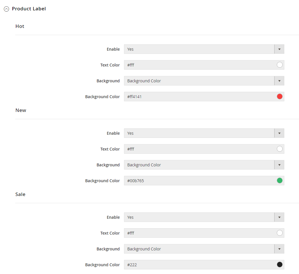
UB Trex Pro supports 3 pre-designed product labels: Hot, New, Sale.
For each of the product label, you can set the Background as: Background Color; Background Image; or Background Image and Color.
Depending on which background type you set, the configuration options vary as follows:
Background Color:
- Enable
- Text Color
- Background (set as Background Color)
- Background Color
Background Image:
- Enable
- Text Color
- Background (set as Background Image)
- Background Image: here you can upload an image which will be displayed as a product label.
- Background Position: defines the position of the background image. By default, it’s aligned to the top left of the product label canva.If you set the Background Position as ‘other’, you need to define your custom position along the vertical and horizontal axis. You can configure using one of the two types of values: Length values (eg. 100px 5px); Percentages (e.g. 100% 5%); like in this screenshot:
- Background Size: specifies the size of the background image with ‘auto’, ‘cover’, ‘contain’, or ‘other’.
- Auto: the background image is displayed in its original size.
- Cover: resize the background image to cover the entire container.
- Contain: resize the background image to make sure the image is fully visible.
- Other: specify the size of the background image with percent, or pixel. E.g. Length values (eg. 100px 5px); or Percentages (e.g. 100% 5%);
- Background Repeat: define how the background image is repeated.
Background Image, Color:
If the Background Image, Color is enabled, you will see all configuration options similar to the Background Image type, plus one new field ‘Background Color’.
When you specify both Background Color and a background image (with smaller size), then you see both elements within the product label container.
2.3.2.6 Infinite Scrolling
If enabled, the Infinite Scrolling pulls content automatically into view when you approach the bottom of the page.
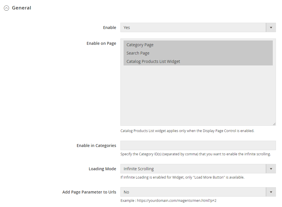
- Enable on Page: you can enable Infinite Scrolling on Category Page, Search Page and Catalog Products List Widget. Please note Catalog Products List widget applies only when the Display Page Control is enabled.
- Enable in Categories: Specify the Category ID(s) (separated by comma) that you want to enable the infinite scrolling.
- Loading Mode: you can specify one of the following options:
- Infinite Scroll
- Infinite Scroll with page limit: if enabled, you need to specify the ‘Scrolling Page Limit’ value. When this page number is reached, a button to load more products will be shown instead of continuing loading products automatically with the scroll.
- Load More button
- Add Page Parameter to URLs: if enabled, your page url will include a query string with variable for the page ID like this: https://yourdomain.com/men.html?p=2
If you want to specify the Infinite Scrolling with your own custom text, simply open the Style section and modify as you want.
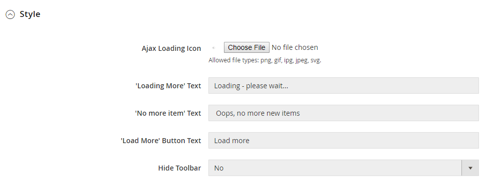
If Hide Toolbar is enabled, the set of controls (grid/list view switcher, sorting products, specifying the number of products shown per page) on the top of the category page will be disabled.
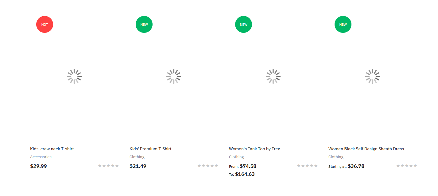
2.3.2.7 LazyLoad
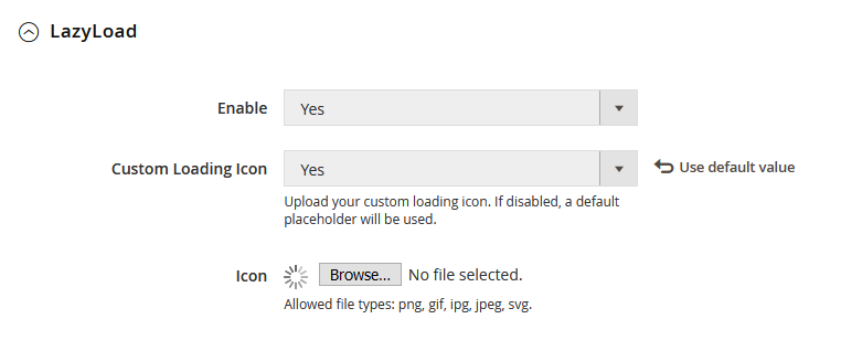
If lazyload is enabled, you can upload your custom loading icon. Otherwise, a default placeholder will be used.
When you enable LazyLoad, simply flush Magento cache to apply your changes.
Front-end Appearance:
2.3.3 Footer
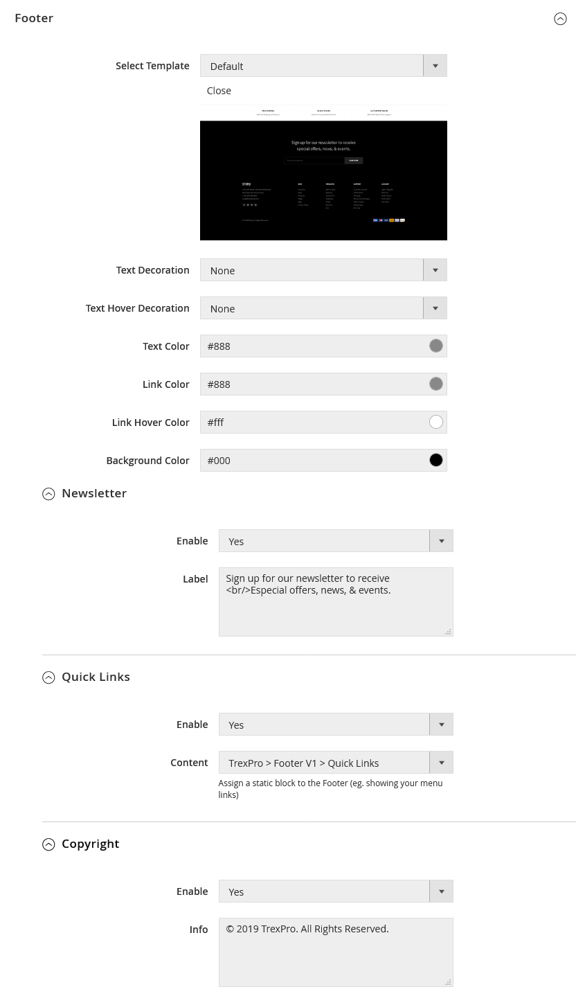
The first release of UB Trex Pro theme packs with one Default template for the Footer section. When we can add more templates, you simply switch between the template under the Select Template field.
3. Pages Configuration
3.1. Category view
In this section, you can configure the options related to the category view. Please note after changing any settings in this section, you have to flush Magento cache to see your changes applied.
3.1.1. General
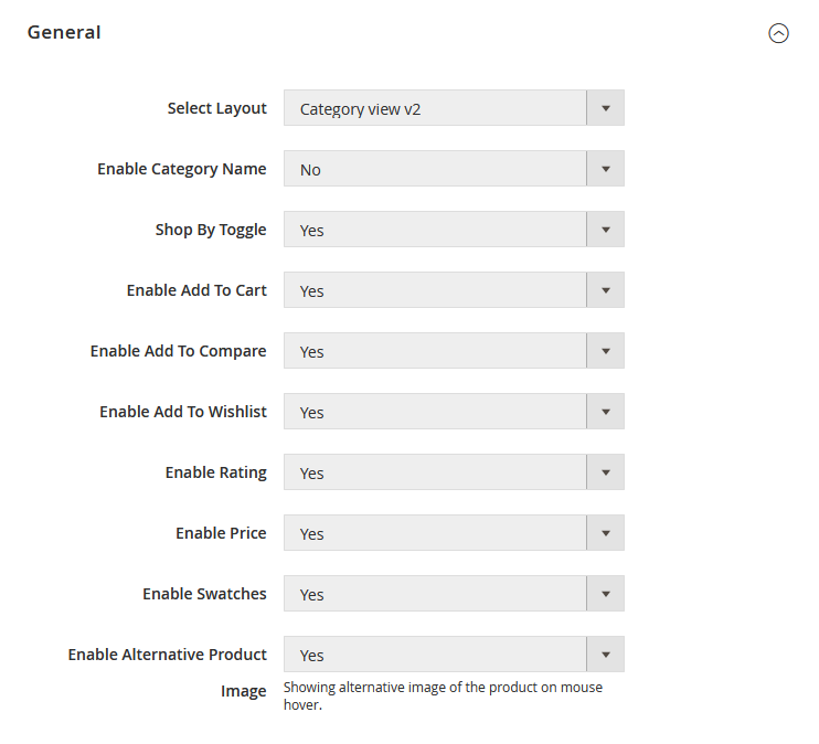
Select Layout: you can enable the following layout options for your entire category pages:
- Category view V1: 1-column with no sidebar (By default, it comes with 4 items per row)
- Category view V2: 2-column with left sidebar (By default, it comes with 3 items per row)
- Category view V3: 2-column with right sidebar (By default, it comes with 3 items per row)
To change the number of products per row, you can configure by navigating to UB Theme Helper panel | Pages | Category view | Grid Configuration.
NOTE: When navigating to your Magento admin | open a specific Category | Design tab, you will see the Theme & Layout fields that load default Magento layouts (eg. 1 column, 2 columns with left/right sidebar, 3 columns). These layouts are inherited from Magento Blank theme and differ from pre-designed Category view V1, V2, V3 of UB Trex Pro theme.
3.1.2. Grid Configuration
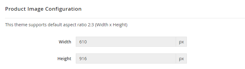
3.1.2.1 Product Image Configuration
Set your own image width and height values. The theme supports default aspect ratio 2:3 (Width 610px x Height 916px).
Please note the UB Trex Pro theme always keep the image aspect ratio 2:3. When editing the image, be careful to preserve the aspect ratio of the images, so the height and width resize proportionally.
As a general rule, if you enter the height bigger than the width of the images, the width will be caculated automatically based on the height to preserve the aspect ratio 2:3.
And vice versa, if the height is smaller than the width of the images, the height will be caculated automatically based on the width.
3.1.2.2 Items per Row (Desktop)
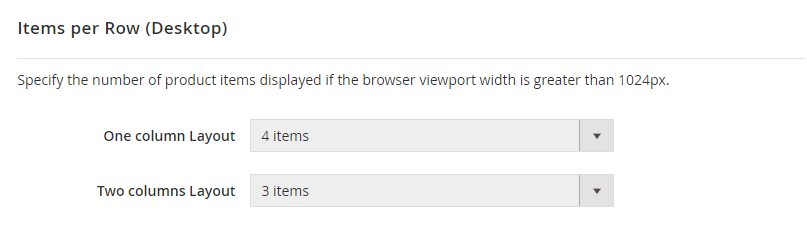
Specify the number of product items displayed if the browser viewport width is greater than 1024px.
Depending on which layout that your categories applies (1-column layout or 2-column layout), the number of product per row will be loaded accordingly.
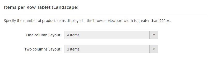
3.1.2.3 Items per Row Tablet (Landscape)
Specify the number of product items displayed if the browser viewport width is greater than 992px.
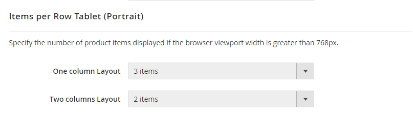
3.1.2.4 Items per Row Tablet (Portrait)
Specify the number of product items displayed if the browser viewport width is greater than 768px.
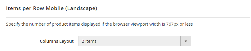
3.1.2.5 Items per Row Mobile (Landscape)
Specify the number of product items displayed if the browser viewport width is 768px or less.
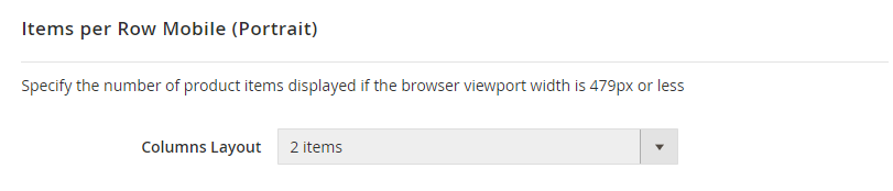
3.1.2.6 Items per Row Mobile (portrait)
Specify the number of product items displayed if the browser viewport width is 479px or less.
3.1.3. List Configuration
Set your own image width and height values. The UB Trex Pro theme supports default aspect ratio 2:3 (Width 290px x Height 435px).
When editing the image, make sure you preserve the aspect ratio of the images, so the height and width resize proportionally.
As a general rule, if you enter the height bigger than the width of the images, the width will be caculated automatically based on the height to preserve the aspect ratio 2:3.
And vice versa, if the height is smaller than the width of the images, the height will be caculated automatically based on the width.
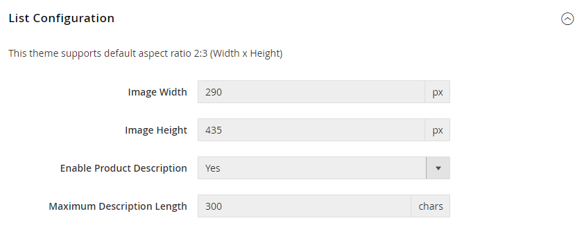
If Product Description is enabled, you need to specify the Maximum Description Length (Default value is 300 characters).
3.2. Product view
3.2.1 General Settings
In this section, you can configure the layout for product view and other elements of a specific product page (eg. enabling Rating, Price, Wishlist, Email to Friend, SKU et.c,).
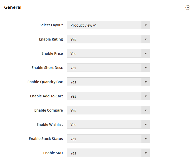
By default, UB Trex Pro theme uses the Product View V1 like this screenshot above.
Important:
UB Trex Pro supports 5 different product views: V1, V2, V3, V4, V5. Each product view (V1, V2, V3, V4, V5) has a different set of Gallery’s configurations.
Scroll down to the section 3.2.2 Gallery Settings (Product View V1) below for details about the configuration of the specific Product View V1.
If you want to switch from default Product View V1 to anther Product View (V2, V3, V4, V5), see details here.
3.2.2 Gallery Settings (Product View V1)
Sample Product View V1 Appearance: Demo Link
Gallery Configurations for Product View V1:
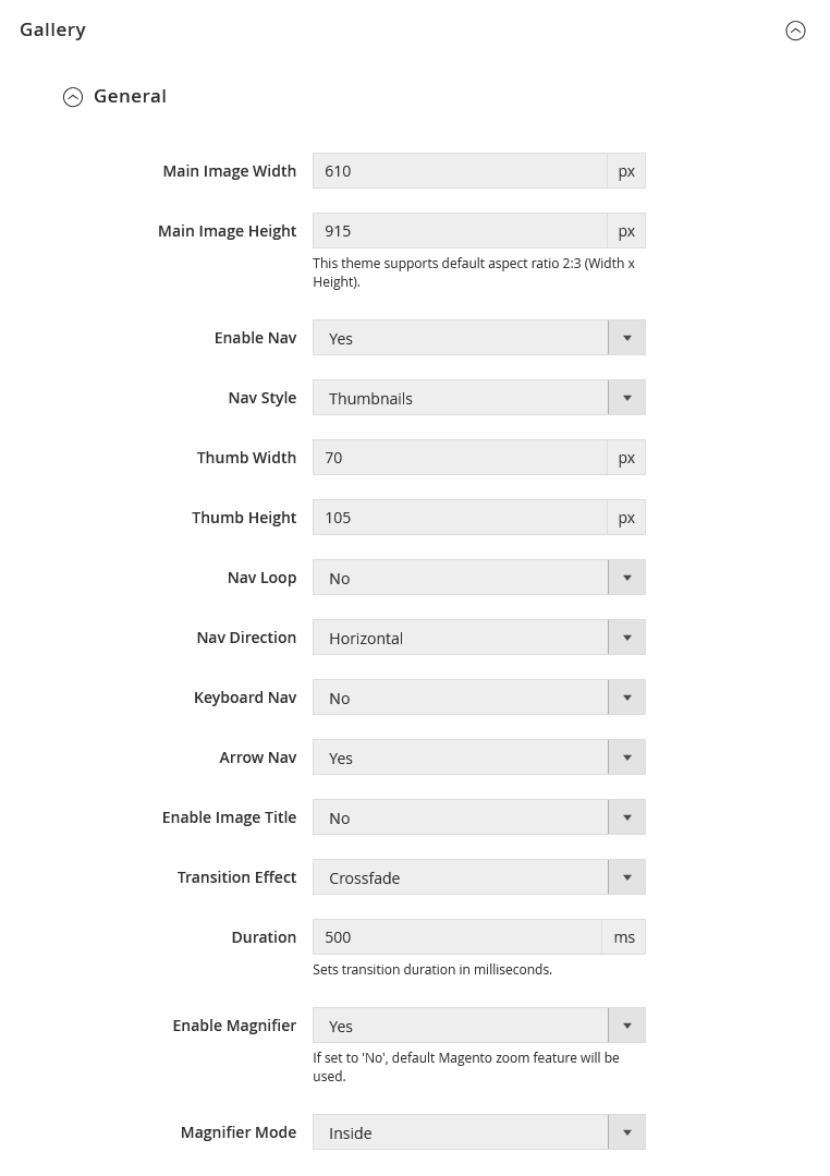
- Main Image Width: Default value is 610px.
- Main Image Height: Default value is 915px.Please note the UB Trex Pro theme always keep the image aspect ratio 2:3. When editing the image, be careful to preserve the aspect ratio of the images, so the height and width resize proportionally.As a general rule, if you enter the height bigger than the width of the images, the width will be caculated automatically based on the height to preserve the aspect ratio 2:3.And vice versa, if the height is smaller than the width of the images, the height will be caculated automatically based on the width.
- Enable Nav: Enable gallery navigation. For Producct View V1, default value is Yes.
- Nav Style: Set gallery navigation style (Thumbnails | Dots | None).
- Thumb Width: Set the width of the main product image’s thumbnail. Default value is 70px.
- Thumb Height: Set the height of the main product image’s thumbnail. Default value is 105px.
- Nav Loop: Enable the navigation loop. Default is No.
- Nav Direction: In Product View V1, set Navigation Direction as ‘Horizontal’.
- Keyboard Nav: Enable the keyboard arrow navigation. Default is No.
- Arrow Nav: Enable arrows on the side preview. Default is Yes.
- Enable Image Title: Display alt text as image title. Default is No.
- Transition Effect: You can set transition effect for slides changing with three types (Slide | Crossfade | Dissolve).
- Duration: Set transition duration in milliseconds. Default is 500.
- Enable Magnifier: Enable product zoom. Default is Yes.
- Magnifier Mode: Set with ‘Inside’ or ‘Outside’.
Fullscreen Configurations for Product View V1:
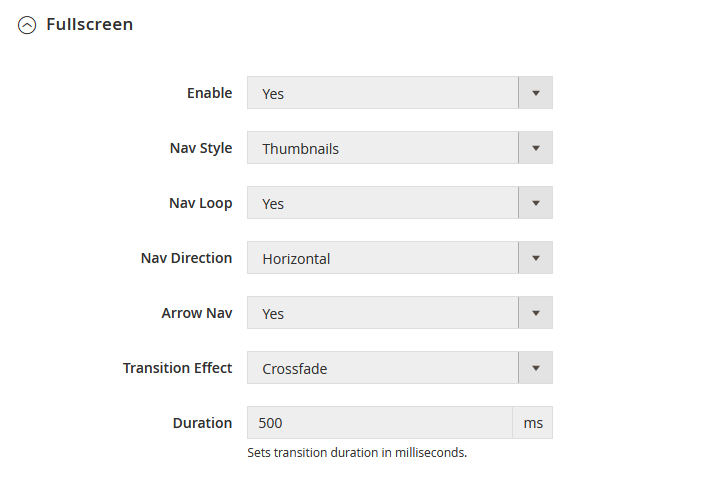
- Enable: Enable fullscreen image zoom. Default is Yes.
- Nav Style: Set gallery navigation style (Thumbnails | Dots | None).
- Nav Loop: Enable the navigation loop. Default is Yes.
- Nav Direction: In Product View V1, set Navigation Direction as ‘Horizontal’.
- Arrow Nav: Enable arrows on the side preview. Default is Yes.
- Transition Effect: You can set transition effect for slides changing with three types (Slide | Crossfad | Dissolve).
- Duration: Set transition duration in milliseconds. Default is 500.
3.2.3. Switch from default Product View V1 to another Product View (V2, V3, V4, or V5)
There’s a high chance that you want to set your product pages with another Product View layout instead of the default Product View V1.
Depending on whether you install UB Trex Pro theme manually or use Quickstart package, follow these steps to switch to a new Product View:
a. For Quickstart package:
Once you install UB Trex Pro using the Quickstart package, all 5 Product Views (V1, V2, V3, V4, V5) are already built in the theme.
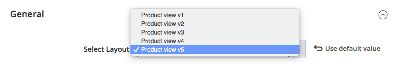
Below are steps to switch from default Product View V1 to another specific Product View (eg. Product View V5):
Step 1: Navigate to Store | [Settings] All Stores | Open the Default Store of Default Website.
Step 2: In the Default Store configuration panel, set Default Store view to specific Store View you want (eg. V5 Store View) like the screenshot below:
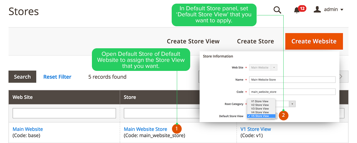
Step 3: Once done, clean Magento cache to see the new Produdct View applied in your storefront.
Now that you’ve assigned the Product View V5 (as per the sample above), in order to configure the newly assigned product view, go to Ubertheme’s Extensions | [Theme Helper] Configuration, select the scope ‘V5 Storeview’ from the Store View chooser in the upper-left corner. Then, you should see the UB Trex Pro Child theme V5 activated. Click the ‘Setting’ button under the theme’s thumbnail to enter configuration panel.
b. For Manual Installation package:
If you install UB Trex Pro theme manually (see Manual Installation), you need to configure Product View as follows:
Step 1: Go to Ubertheme’s Extensions | [Theme Helper] Configuration
Step 2: Select the scope that you assign UB Trex Pro theme from the Store View chooser in the upper-left corner.
Step 3: Click ‘Setting’ button under the activated UB Trex Pro theme.
Step 4: Go to [Pages] Product View | General | then set Select Layout with the specific Product View you want (For example: Product V2)
Step 5: Under the same Product View section, move to the Gallery and configure related options (Make sure you enter correct configurations of the Product View you assign. See each set of Gallery’s configurations -- V2, V3, V4, V5 -- below).
Each product view (V1, V2, V3, V4, V5) has a different set of Gallery’s configurations. Depending on which product view you assign, follow the configurations below:
Gallery Settings (Product View V2):
Sample Product View V2 Appearance: Demo Link
Gallery Configurations for Product View V2:
- Main Image Width: Default value is 960.
- Main Image Height: Default value is 1440. UB Trex Pro theme always keep the image aspect ratio 2:3. Please refer to Gallery Settings (Product View V1) for more details.
- Nav Direction: Set to Vertical.
- NOTE: Other configurations of Product View V2 are inherited from the parent theme’s Product View V1.
Gallery Settings (Product View V3):
Sample Product View V3 Appearance: Demo Link
Gallery Configurations for Product View V3:
- Enable Nav: Set to No.
- Arrow Nav: Set to No.
- Enable Magnifier: Set to No.
- Fullscreen mode: Set to No
- Tab Style: Accordion
- NOTE: Other configurations of Product View V3 are inherited from the parent theme’s Product View V1.
Gallery Settings (Product View V4):
Sample Product View V4 Appearance: Demo Link
Gallery Configurations for Product View V4:
- Main Image Width: Default value is 960.
- Main Image Height: Default value is 1440. UB Trex Pro theme always keep the image aspect ratio 2:3. Please refer to Gallery Settings (Product View V1) for more details.
- Nav Style: Set to None.
- Arrow Nav: Set to No.
- Enable Magnifier: Set to No.
- And disable the Fullscreen mode
- NOTE: Other configurations of Product View V4 are inherited from the parent theme’s Product View V1.
Gallery Settings (Product View V5):
Sample Product View V5 Appearance: Demo Link
Gallery Configurations for Product View V5:
- Main Image Width: Default value is 960.
- Main Image Height: Default value is 1440. UB Trex Pro theme always keep the image aspect ratio 2:3. Please refer to Gallery Settings (Product View V1) for more details.
- Nav Style: Set to Dots.
- Arrow Nav: Set to No.
- Enable Magnifier: Set to No.
- And disable the Fullscreen mode
- NOTE: Other configurations of Product View V5 are inherited from the parent theme’s Product View V1.
3.2.4. Related Products
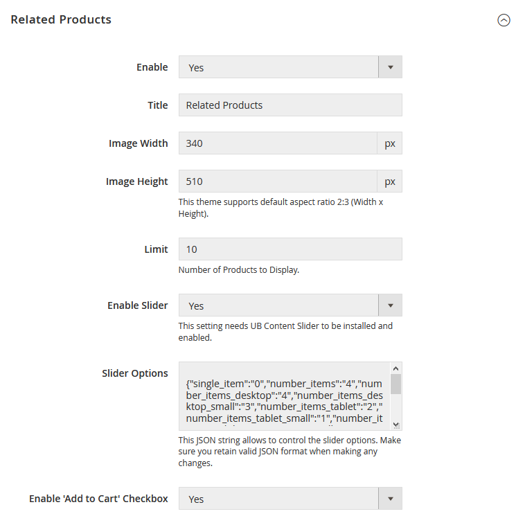
- Enable: Set to ‘No’ to hide Related products on product page.
- Title: The title of Related product block on product page.
- Image Width/Height: Set the Width/Height of the Related Products’ thumbnail in pixels. Default is Width 340px x Height 510px.Please note the UB Trex Pro theme always keep the image aspect ratio 2:3. When editing the image, be careful to preserve the aspect ratio of the images, so the height and width resize proportionally.As a general rule, if you enter the height bigger than the width of the images, the width will be caculated automatically based on the height to preserve the aspect ratio 2:3.And vice versa, if the height is smaller than the width of the images, the height will be caculated automatically based on the width.
- Limit: Set a default limit on the number of Related products displayed on product page.
- Enable Slider: Enable product sliders to all existing related products on product page.
- Slider Options: This JSON string allows to control the slider options. You can learn more about the parameters here
- Enable ‘Add to Cart’ Checkoutbox: Add to Cart checkbox displayed in Related products block on product page.
Front-end Appearance:
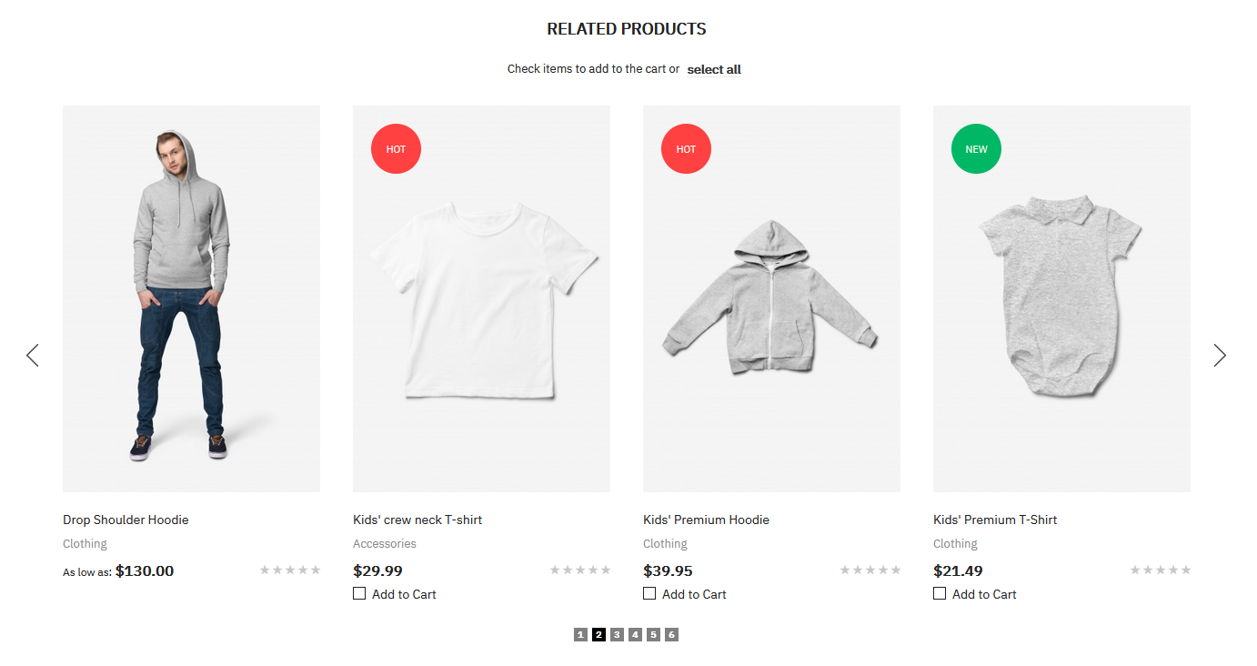
Related products are means to be purchased in addition to the item the shopper is viewing. It appears at the bottom of the Product View page.To set up Related products, you need to open the product in Edit mode. Then expand the Related Products, Up-Sells, and Cross-sells section to manage the Related products you want to display on the Product View page.
3.2.5. Up-sell Products
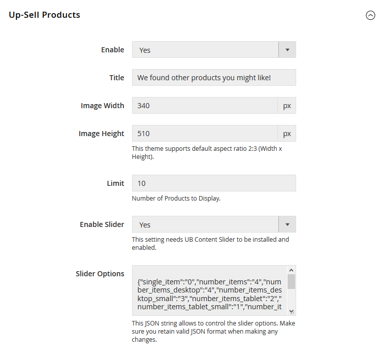
- Enable: Set to ‘No’ to hide Upsell products on product page.
- Title: The title of Upsell product block on product page.
- Image Width/Height: Set the Width/Height of the Upsell Products’ thumbnail in pixels. Default is Width 340px x Height 510px.UB Trex Pro theme always keep the image aspect ratio 2:3. Please refer to the Related Products to learn more about this aspect ratio.
- Limit: Set a default limit on the number of Upsell products displayed on product page.
- Enable Slider: Enable product sliders to all existing Upsell products on product page.
- Slider Options: This JSON string allows to control the slider options. You can learn more about the parameters here.
Front-end Appearance:
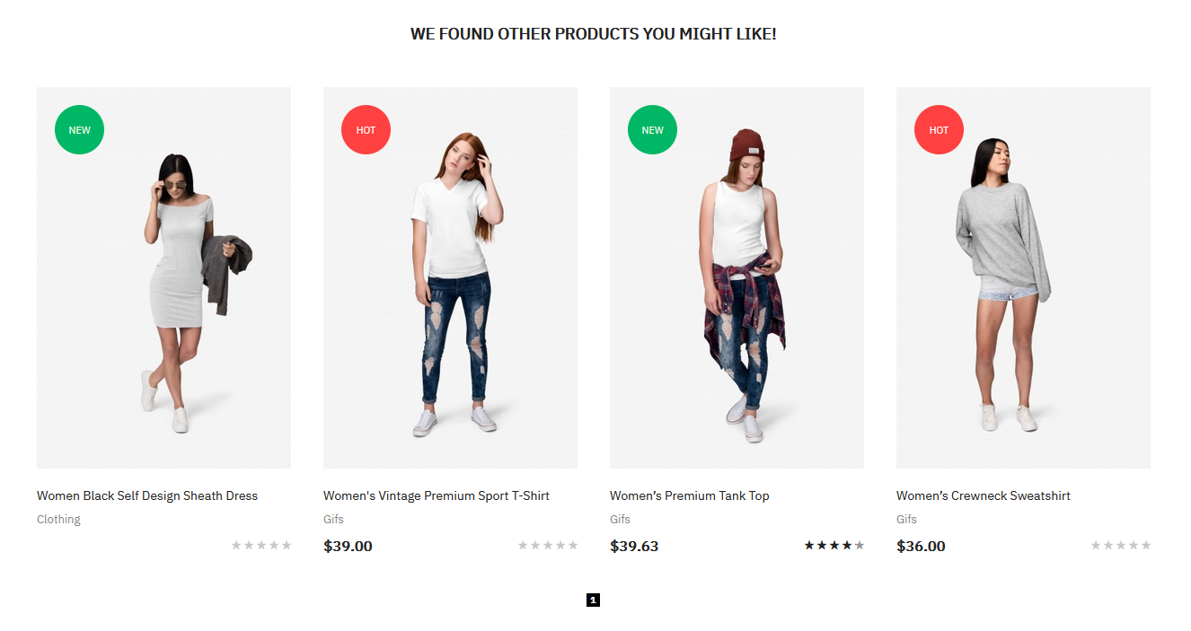
Up-sell products refer to items that are similar, but have a better profit margin than the item the customer is considering.To set up Upsell products, you need to open the product in Edit mode. Then expand the Related Products, Up-Sells, and Cross-sells section to manage the Upsell products you want to display on the Product View page.
3.2.6. Custom Tabs
In this section, you can create multiple custom tabs based on content of CMS blocks, product attributes or HTML content; assign those tabs to any individual products; and drag & drop to re-order each tab.
Front-end Appearance:
Configuration:
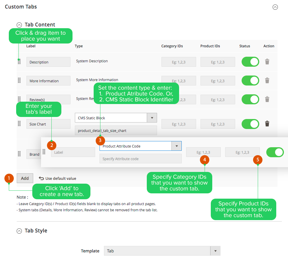
Below are steps to create a new tab:
- First, click ‘Add’ button to create a new custom tab
- Depending on the type of content (Product Attribute | CMS Static Blocks) displayed in tab, you need to enter Product Attribute Code or CMS Static Block Identifier.
- Then, enter the Category IDs or Product IDs that you want to assign the tab to. Leave Category IDs, Product IDs fields blank if you want to display tabs on all product pages.
- Open the ‘Tab Style’, assign the tab’s template (Tab | Accordion | List). In UB Trex Pro, all product views are set with ‘Tab’ as default template, except for the Product View V3 that uses the ‘Accordion’ type.
After making changes, you clean Magento cache to see your changes applied.
3.3. Contact Us
Front-end Appearance:
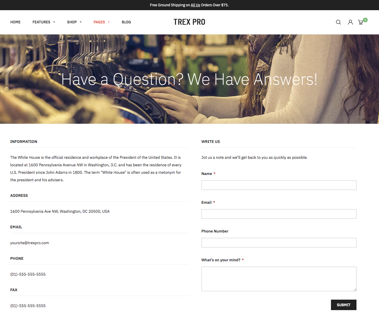
At present, UB Trex Pro comes with one default Contact Us layout. You can easily manage the masthead image as follows (instead of creating a separate Masthead block as in the old UB Trex Pro version).
Your masthead image will be stored under the directory [magento_root]/pub/media/ubertheme/ubthemehelper/contact_view/general/src_masthead_background
Go to Ubertheme’s Extensions | [Theme Helper] Configuration | [UB Trex Pro] Settings | [Pages] Contact Us | then fill in your specific contact info:
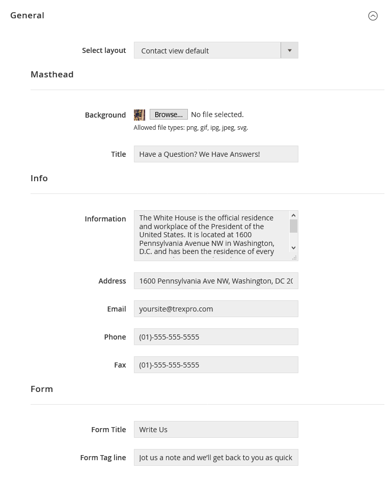
Once done, please clean Magento cache to apply your changes.
3.4. Shopping Cart
This section allows you to set up cross-sells block on the Shopping Cart page.
Front-end Appearance:
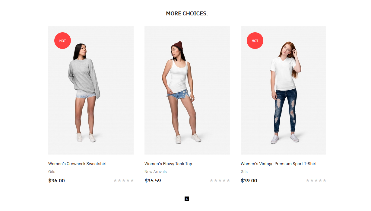
Go to Ubertheme’s Extensions | [Pages] Shopping Cart | you should see the configuration like this:
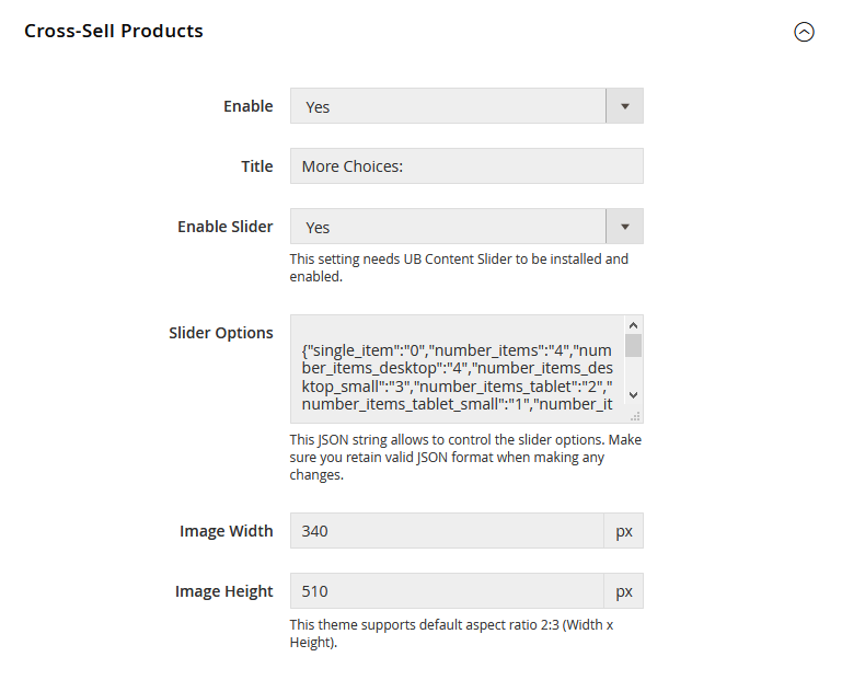
- Enable: Set to ‘No’ to hide Cross-sell products on shopping cart page.
- Title: The title of Cross-sell product block on the shopping cart page.
- Enable Slider: Enable product sliders to all existing Cross-sell products on shopping cart page.
- Slider Options: This JSON string allows to control the slider options. You can learn more about the parameters here.
- Image Width/Height: Set the Width/Height of the Cross-sell Products’ thumbnail in pixels. Default is Width 340px x Height 510px.UB Trex Pro theme always keep the image aspect ratio 2:3. Please refer to the Related Products to learn more about this aspect ratio.
Once done, please clean Magento cache to apply your changes.
3.5. Success page
This section allows you to create custom message on the thank you page when user finishes a Magento order.
Front-end Appearance:
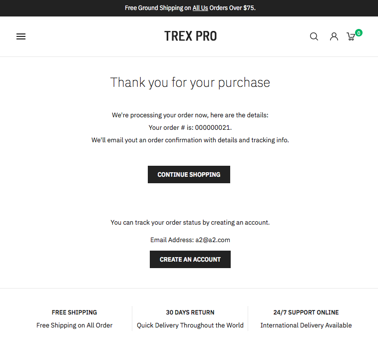
Go to Ubertheme’s Extensions | [Pages] Success Page | you should see the configuration like this:
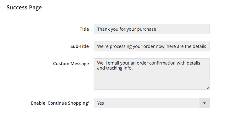
After making changes in this section, please clean Magento cache to apply your changes.
4. Custom CSS
UB Trex Pro supports 3 options to make custom changes your way.
Option 1:
Go to Ubertheme’s Extensions | [More] Custom CSS | you should see the option like this:
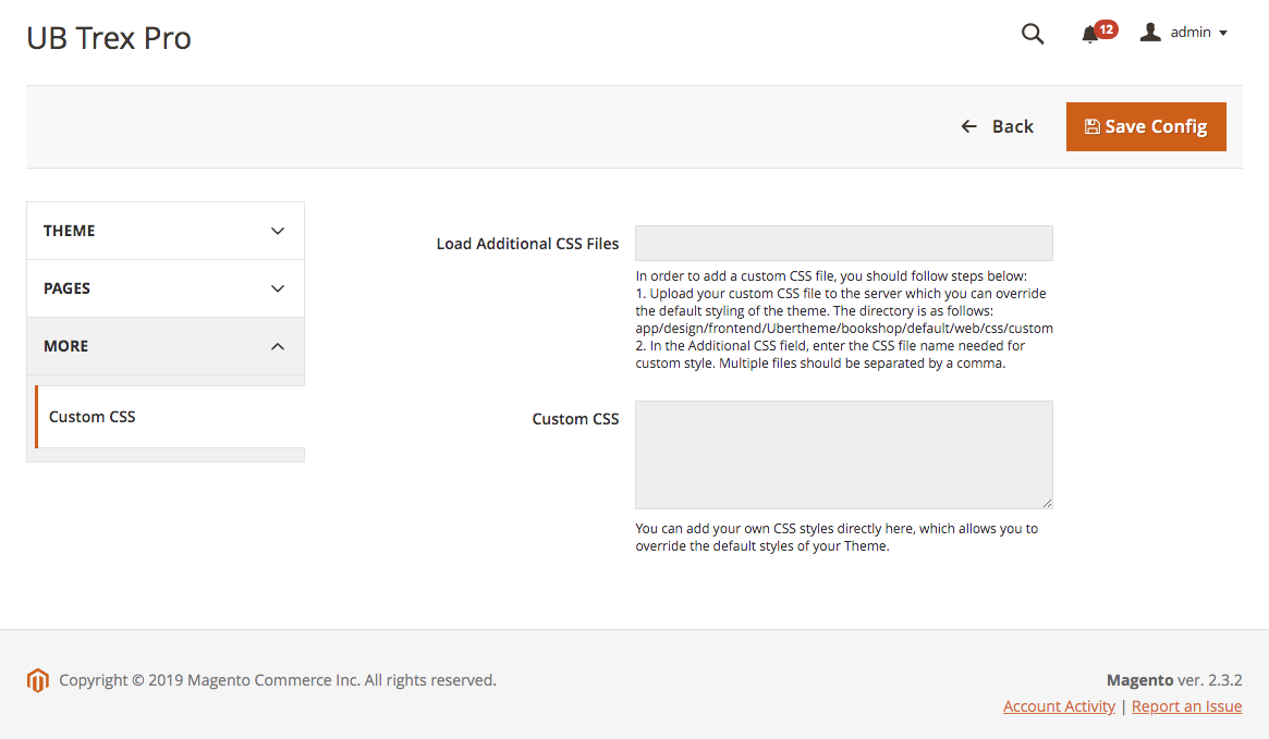
In order to add custom CSS, you should follow one of the following options:
- Upload your custom CSS file to the server which you can override the default styling of the theme. In the Additional CSS field, enter the CSS file name needed for custom style. Multiple files should be separated by a comma. Or,
- Add your custom CSS directly to the Custom CSS field.
You can add your own CSS styles directly here, which allows you to override the default styles of your Theme.
Note: To apply the changes you made, make sure you run deployment command, as per this note.
Option 2:
Edit the custom file at: [magento_root]/app/design/frontend/Ubertheme/trex_pro/web/css/_custom_styles.less (an empty file packed with the core theme UB Trex Pro) in which you can add both custom CSS and LESS.
To apply the changes you made, make sure you run deployment command, as per this note.
Option 3:
Create a child theme that extends the parent theme UB Trex Pro where you can make changes to your store. Please refer to Parent and Child themes section for more details about this option.