Designing a carousel (sometimes called ‘slider’, ‘slideshow’) that works can be a real pain and it’s true that sliders do suck if they aren’t used or designed well. You might have heard of the drawbacks around sliders such as:
- Only a small percentage of people actually click on a slider, which almost always the first slide;
- Sliders don’t always work well on mobile devices;
- People tend to ignore your slider because it triggers banner blindness. Visitors will skip the messages in your slider as they consider it advertisement or promotions;
So, is the carousel really bad? If carousels aren’t that effective, why do people use them?
Actually, carousels introduce a level of complexity to an interface, however, the carousels are everywhere on the web and have been an essential web design tool for e-commerce sites.
So, let’s take a closer look at some real use cases to see the possibilities that carousels offer and learn how to make carousels work better.
3 examples of carousels in eCommerce sites and key takeaways
Example 1 -- Made.com with Homepage carousel
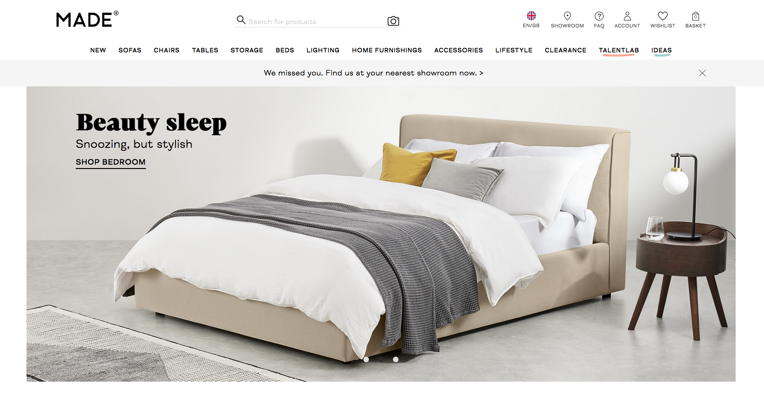
The Homepage of Made.com uses a big carousel in the hero section.
As the above screenshot shows, a big carousel appears at the top of the homepage and occupies the hero section. This carousel enables auto-rotation, set of arrows upon hover, and dot navigation. And only one piece of content is actually visible at one time.
Takeaway: Actually, carousels (sliders) are better suited to retail and image-heavy websites. The history of design has included many carousel-like design patterns, including slideshows, galleries, timelines, and presentations. So your homepage carousel can work well and be helpful to users if done right.
A carousel that works:
- It isn’t ad-like: carousels can only be as good as their content. If the content in the carousel looks like an ad, most users tend to ignore it due to banner blindness.
- It would be best if the carousel doesn’t auto-advance, so users retain control over it.
- If auto-rotation is enabled, make sure:
- Slides don’t rotate too quickly, so users can read the information.
- Auto-rotation should be paused on hover.
- And you should not use auto-rotation on mobile since users can accidentally tap on a wrong slide when the carousel auto-rotates. It’s also important to note that auto-rotation carousels could also be annoying, but if they contain visual content like the case of Made.com, there’s little need to worry. It’s beautifully designed and looked gorgeous and doesn’t contain lots of fine detail that take time to “read”.
- Keep users in control: Users can interact with a carousel using the visible and easily recognizable next/previous controls
- If you’re using your carousel in the hero section, don’t duplicate H1 tags. Treating the slides’ headlines like H1 is not recommended.
- The navigation controls should appear inside the banner slideshow, not below it or separated by a fold.
Example 2 -- Menswearhouse.com with vertical Product Sliders
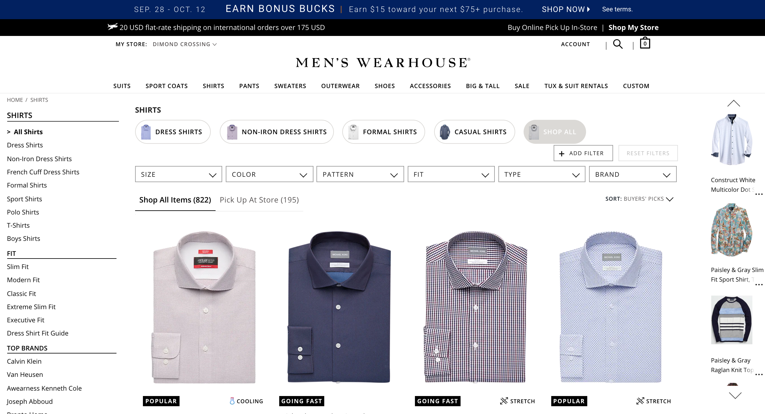
The Category page of Menswearhouse.com shows a vertical product slider.
Menswearhouse makes use of sliders to display best seller products vertically on its category page. It provides a great example of the e-commerce use-case mentioned earlier.
Takeaway: Product image galleries (either horizontal or vertical carousels) are ideal because users know what the next slide holds and why they should view it. It prompts you to click on the arrow so you can see the next product image and description in full.
With this, you can display various product types like Best Selling, Hot Products, New Products, Latest Products, or Random Products, etc. This is a handy way to show the variety of products on sale.
Product Sliders are helpful when:
- It saves people time and clicks
- It helps to have up-sell / cross-sell lined up side by side.
- If your catalog has so many items, products will expand beyond the screen’s edge, a product carousel could be a perfect solutio.
Example 3 -- Californiaclosets.com with Product Sliders with thumbnails
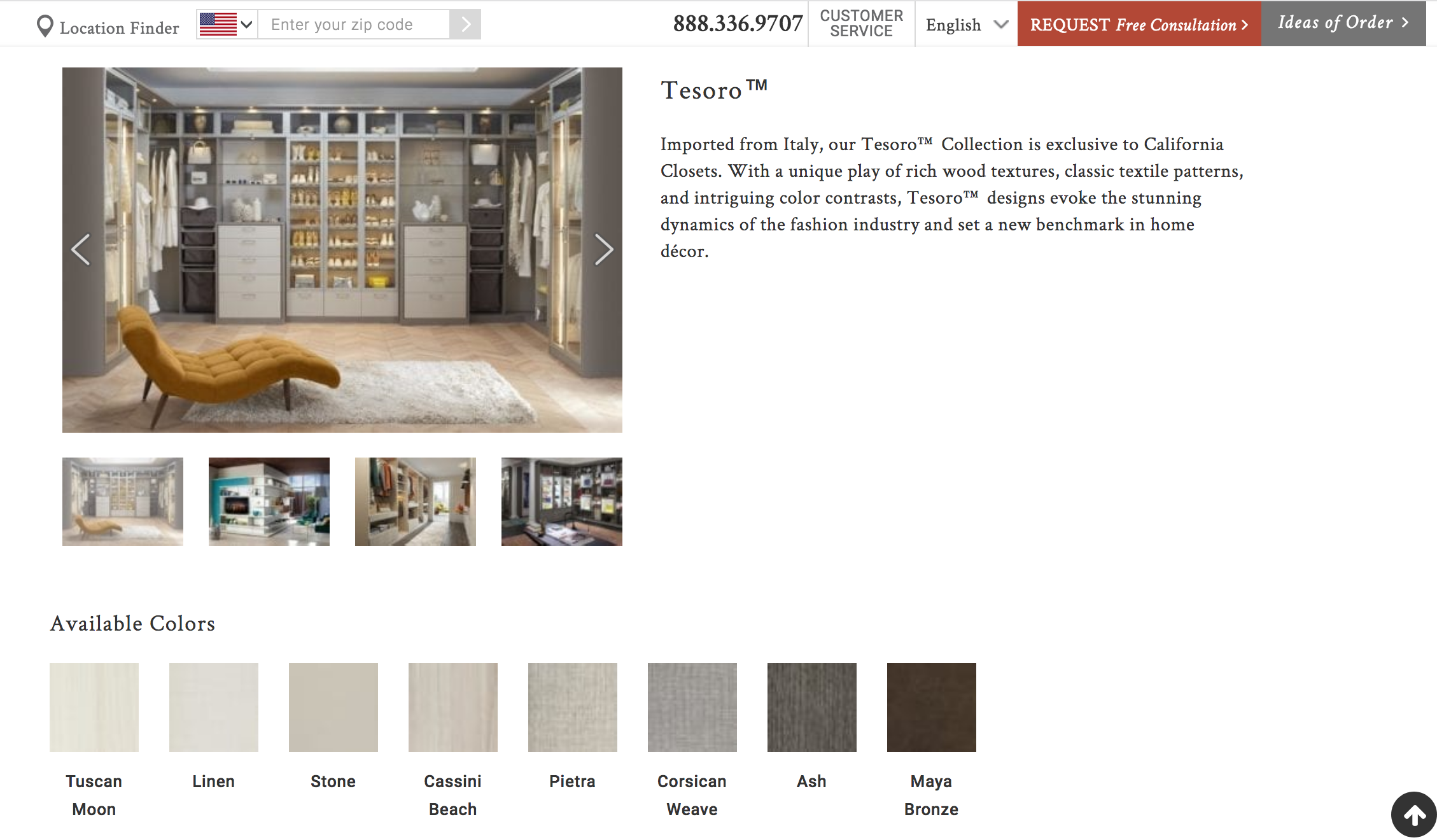
Californiaclosets.com uses multiple product sliders as part of their catalog pages.
Californiaclosets creates attractive product slider carousels and demonstrates countless items in a smooth and expert manner. It uses thumbnail navigation as part of gallery images which is much more encouraging and grants more control of switching between images to users.
The product carousels in this example appear to be part of the catalog rather than an ad-like content, so they are information-rich and attention-grabbing.
Takeaway: Several things that make the product slider effective:
- The clearer the text and images, the more likely users are to engage and browse the product collections.
- Make navigation obvious: a little dot navigation is an ineffective way of communicating a carousel to a user. Using a set of arrows, scrollbars, gestural hints could make all the difference in deciding the carousel’s effectiveness.
- Ensure the next/previous controls have enough contrast so they are clearly distinguishable from the background.
- Make sure your carousel’s touch-friendly on mobile. Since dot navigation is a particularly poor cue on mobile devices and poses difficulty interacting with them due to their small hit areas, it’s recommended to support swipe gestures for mobile devices.
Should not use auto-rotation on mobile.
Conclusion
Carousels aren’t necessarily bad, and you can certainly justify the extra effort for something that will pay off and push them a step further.
Instead of immediately rejecting the carousel as advised by some teams, consider digging into the specific use case of your clients’ site. There are no strict guidelines for designing a carousel for an e-commerce site so you have to study what others are doing and try to make something that’ll fit with your project.