So you have the perfect set of products and you’re pretty confident that the market will love you. You’ve made sure that every detail is in order—your advertising campaigns, your marketing strategies, your product’s quality. But wait! Are you sure you’ve got all your bases covered?
You see, you may have the perfect product line, but if you do not have the perfect strategy for presenting your products to the market, that won’t do you any good.
Do you see what we’re getting at here? Yes, we’re talking about your online product catalogue. If you’re aiming for more than just a ‘break even’ for your sales, then at this point you should already have seen to it that your e-commerce site is not only functional; it should be appealing as well.
Product catalogues may sound like something from the last century, but the truth is, it’s a crucial aspect that you should be most concerned about.
Just think: How many printed catalogues have you browsed through over the years, only to find yourself dumping them in the trash or stashing them in a corner without even purchasing anything from them? While your site’s visitors can’t possibly dump your catalogues in the bin, there is always that distinct possibility that they will simply ignore the products on your category page. That’s pretty much like stashing your catalogue into a forgotten cranny in their minds.
So how do you keep that from happening? How do you make sure that your category page works to encourage your market to buy your products? This anatomy of a perfect category page will help you to do just that.
This detailed how-to guide will lead you through the various aspects that you should consider when creating your category page. First, we will look at how you could establish your product categories and then move on to how you could enhance navigation through your page. Finally, we will consider the various features that your page can have.
Navigation
Before you could plan out how your visitors could navigate through your category page, you first need to come up with categories. Don’t rush through this step as how you categorize the items on your page can do much to affect your sales.
Here are some things that you should remember regarding your main categories and subcategories:
Determine your main categories
When structuring your category page, it is important that you determine which category should appear more prominently. Keep in mind that your main categories should not be specific. Take only the broadest and most important ones as they will be the primary headings of your page.
Be strategic with your categories and sub-categories
You could also choose to devote a whole block of your page’s prime navigation space for a product that you wish to feature. Doing so could do much to boost your product sales.
Limit the number of your main categories
Try imagining a page with too many tabs on its menu. Would such a page appeal to you? Obviously not. So limit the number of your main categories. Don’t go beyond seven. But there’s more to the reason than just the visual aspect of it.
First, limiting the number of your main categories is also a strategy you could employ if you wish to optimize your page for search engines. The fewer main categories your page has, the higher the likelihood for each category to become an authority from an SEO (Search Engine Optimization) perspective.
Second, putting a limit on the number of main categories on your page ensures that you do not overwhelm your potential customer with too much information. In fact, experts say that the short-term memory of the human brain cannot handle more than seven items at once. So since the whole point of your category page is to make a powerful impression on your target market’s mind—and thus influence them to purchase your products—it would not be strategic to go beyond seven primary headings. Don’t worry! You can opt to classify other items under those primary headings.
Be strategic with your sub-categories
Since there is no limit to the number of sub-categories you could put under your main or root categories, be strategic! Why not put a certain subcategory under multiple root categories? Let’s say, for example, that you have Accessories, Men’s Fashion, and Women’s Fashion as your root categories. You could then categorize necklaces not only under Accessories but also under Men’s Fashion and Women’s Fashion. The more categories you could place the same set of products under, the higher the chances of a conversion.
Your category names should be straight to the point
When it comes to naming your categories, you have to make sure that they’re understandable by your target audience. By the description ‘understandable,’ we mean that your audience should be able to grasp what kind of products you are selling just by skimming through your categories. If they still need to click on your category for them to understand what you are really trying to offer, then you need to work on improving your category names.
But there’s another reason why you need to name your categories strategically. This is because your category names will affect your SEO. When it comes to picking out a name for your categories, there just isn’t any room for word play. Be as functional with your category names as possible. And focus only on using those that are often searched by your target market. So how do you go about doing that? Utilize a scientific approach. Google Adwords, for example, can help you identify frequently searched keywords you could use for your category names.
Sort your categories according to importance
Why should the order of your categories matter? Mainly because this will affect the browsing activity of your site’s visitors. So order your categories logically—with the least valuable categories placed at the bottom. This will make navigating through your category page easier and will encourage your visitors to browse through your products.
Tips for you: Navigation by category should be considered site wide. You should check if your main (mega) menu and layered navigation can be automatically synced when you make changes to your categories / sub-categories.
Page Visuals
So now that you’re done with your category layout, let’s head on to the other elements of your category page that you should look into.
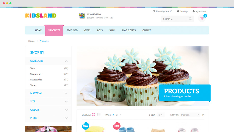
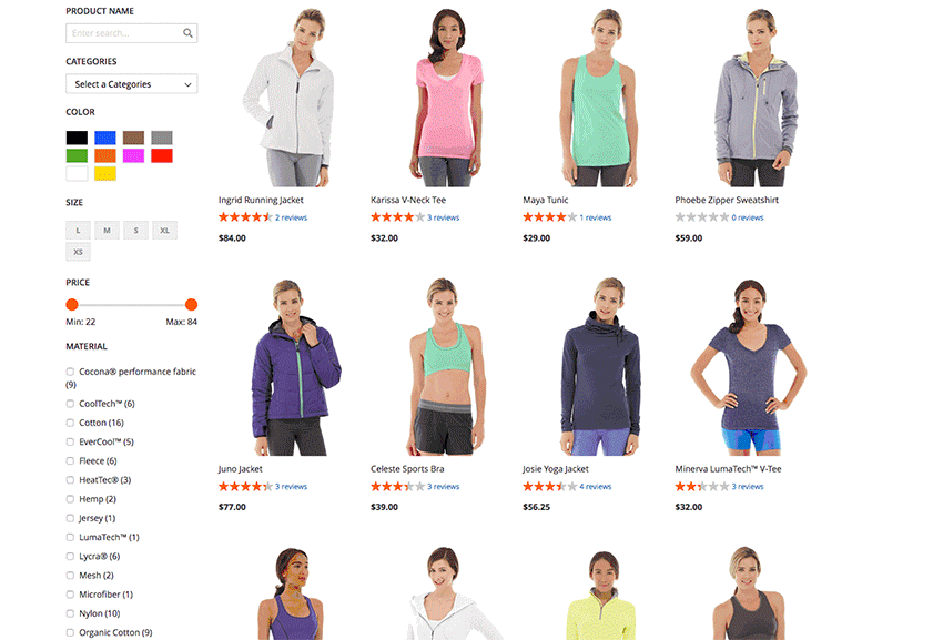
Sample category page in UB Kidsland for Magento 2
Let’s discuss page visuals.
Make sure that your visual cues are consistent
Let’s say that your SEO techniques worked and it got people to your category page without going through your homepage. Would they be able to distinguish the page they have entered? This is where visual cues play their role.
Whatever your page’s visual cues may be—full-width banners or featured photos of items that are in trend, you should make sure that the images your site’s visitors would see on that page coincide with the headers that appear there.
If your visitor ends up feeling lost as to what type of page he or she has landed on, then there’s something wrong with your visuals.
Do not overcrowd your page with your products
Yes, you want to showcase what you have to offer to the market, but that doesn’t mean that it’s okay to overcrowd your page.
So what is the best way to layout your products without annoying your potential clients? Rows of three are the most common layouts for ecommerce sites.
Of course, the number of items you choose to have on each row would depend on you, but experts recommend that you keep the number of items per row minimal. That will allow your site’s visitors to easily retain information on your various products.
Also, the less crowded your page is, the more appealing it becomes to your prospective customer.
Tools for you: Browse well-crafted and beautiful pre-built themes is a cost-effective way to design your Magento store.
Filtering
Have you ever tried searching for an item online and being given a list of items that are irrelevant to what you’re actually searching for? At one point in time, you must have had, and you know firsthand that the experience just wasn’t good.
How could you avoid making your customers feel that way about your online category page? The trick is effective filtering. But did you know that research shows that only 16% of the major ecommerce sites actually offer effective filtering techniques?
Here’s how they got their filtering methods right:
Choose a prime location for your page’s navigation
Initially, navigation was left-hand. This was done to avoid confusing the customers where to browse through the site’s offers and to prevent them from simply closing the site without buying anything. If you notice, shoppers only use sites that they find easy to use.
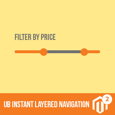
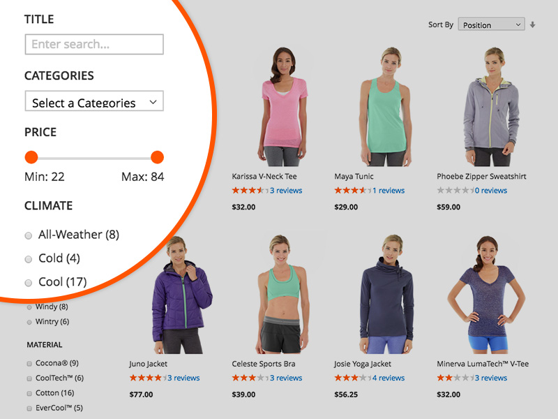
Sample Left-side Filter in UB Instant Layered Navigation
After several years of studying consumer behaviour online, marketing experts have noted that customers tend to go through the items on the upper center. So adapt your navigation system to visitors such as the one quoted.
Horizontal navigation systems, for instance, addresses the issues of users as stated above. It has both the sorting and filtering capabilities. With horizontal navigation, users can keep their attention on the page’s center. Such a system also allows you to post larger photos of your product, especially if you have only a few filters on your navigation bar.
However if you opt to use the left-hand navigation still, then it would be much better that you use checkboxes when filtering your search. This is because users have the tendency to simply focus on the center of the page instead of on the sorting options available on the side. Using a notable filter such as checkboxes will make it easier for your users to filter their search.
Ensure that your filtering options make your user’s search more relevant
Keep in mind that your filtering options is supposed to make browsing through your products a whole lot easier. It’s supposed to help your users find the product they want as quickly as they could before they decide to just head over to your competitor’s category page.
So if, for example, you need multiple filters for your set of products, then make sure that your navigation system will let them layer the options available so they’ll only be shown the products that are relevant to their search. That way, your visitors will be most likely to buy a product off your category page.
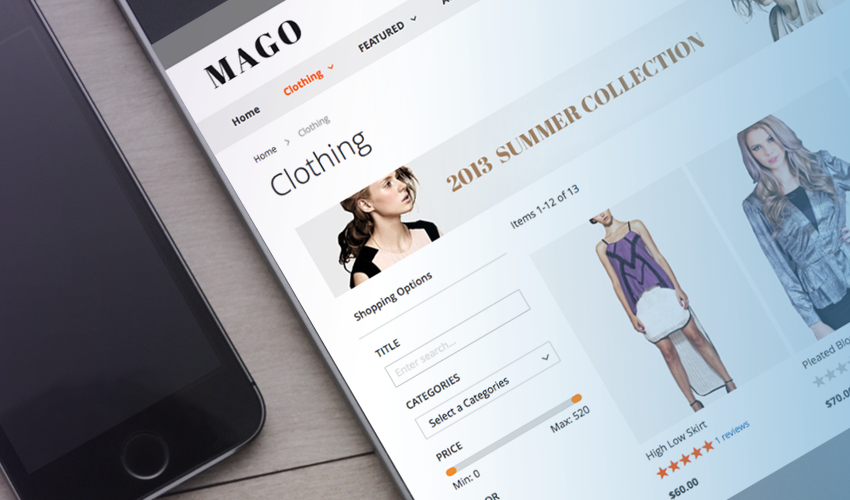
Tailor your page filters according to your market’s preference
Market research is very important when considering how to layout your category page. This is especially true when it comes to choosing your filters. When you know the preferences of your target market, you are better able to anticipate the kind of items that they would want to see on your page; you know which filters to use. So make it your business to know your market well.
A right layered navigation module allows to tailor your page filters with ease
Modify your filters according to season and trend
Temporary filters are best for seasonal products. For example, if you are promoting a holiday special, then why not add in a filter that would feature such products? That would save your potential customers time.
Tools for you: UB Instant Layered Navigation is a new way to extend Magento 2 layered navigation that offers the best user experience. It provides a richer UX for your store with multiple-categories filter, attribute filter, visual price slider and so on.
Sorting
Sorting is closely tied in with your category page’s filters and can even be combined to achieve better results. Note that sorting is crucial particularly for pages that feature left-hand navigation. While your categories and filters allow your site’s visitors to immediately see products that are relevant to their search, the order in which they see their products also matters.
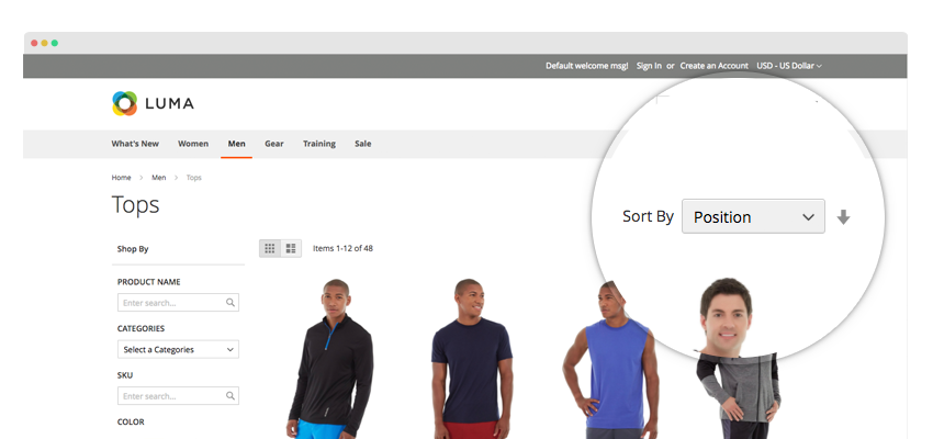
Sorting is crucial particularly for pages that feature left-hand navigation
There are several ways for you to sort your products. You could, for instance, sort them based on factors such as ratings, popularity, and price. But a better way to sort your products would be by customizing search results according to the individual’s purchasing or search history.
For example, you could highlight a brand that an individual has purchased on his or her last visit. Or you could make sure that the brand he or she has searched for the last time would be among the top results in every category. Not only would that be better for your customer but it would also be better for you.
Personalization
You may have a strategic layout for your category page, proper product sorting, and a fully functional set of search filters, but that wouldn’t be of much help if your site’s visitors don’t know what products to look for.
This is where you could personalize your category page for them. You can do that through automated product recommendations.
For example, feature products that have the highest ratings or Best Seller recommendations. Just keep in mind that the best products to feature are those that are in season and are highly sellable.
Product Information
The last but definitely not the least aspect of your category page that you should look into is the amount of information you should put for each product. This is where you need to be very careful. While it’s not beneficial to present too much information about a certain product, neither is it okay to present too little information about what you are offering.
So how do you strike the balance between too much and too little information? The trick is by deciding which information is key to describing what you are really offering. That way, you are able to present each of your products in a way that would easily highlight their main features in the most appealing way.
Bottom Line
The key to the perfect category page is market research and balance. Remember to keep your text and your visuals consistent and never overcrowd your page with either of them. When you keep these things in mind, then you could be sure that you will have the perfect category page.