What exactly creates a self-sustaining and competitive Magento site? Excellent product reviews? Good pricing? While these factors do make a good contribution on the success of ecommerce sites, there is much more than the product itself that enhances your ecommerce website’s conversion rate. The secret lies in your design elements. Remember that your website’s visuals appeal more to your shoppers than anything else. Now, before you head off spending a hefty amount for your website interface, take a look at these design elements you can do on your own, with a basic knowledge of your Magento platform, of course. Here are some pointers from ecommerce web designers for you to check out:
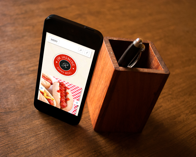
Menu
Let’s begin with the most dominant feature. Your menu design determines either good conversions or painful immediate bounces. What really is the key? Your category structure. But what exactly is a category structure? It is your site’s logical content arrangement. Now let’s further on this. Here’s a step by step approach for everyone’s convenience:
1. Analyze your product catalog.
Begin with acquiring a thorough knowledge of your product catalogue – which one is most saleable, which product is constantly in demand regardless of the season, which requires a more promotion, and other factors depending on your line of business. In short, you should know what you’re selling like the back of your hand.
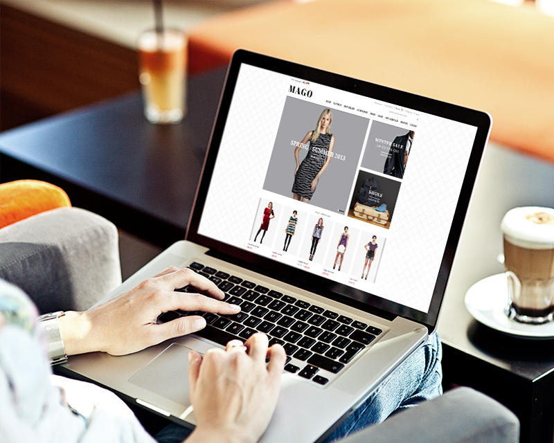
UB Mago -- A simple product catalog for Magento 2 store
2. Map it out.
With your menu in mind, map it according to how you want it organized. You may want to learn more about effective wireframing strategies for this step. If you’re new to this approach, don’t let this scare you. Believe me, it’s not rocket science. Consider your menu as a table of contents of information ordered according to its degree of significance in your ecommerce site. True, this is one big complicated task. But once you start off with your broad categories, be confident that the real task is less intimidating than all the mouthfuls you are reading from this article.
3. Provide subcategories.
There is a good reason why your mapping has to come first before your subcategories. Mapping your broad categories before anything else puts you in a better position to narrow it down as the need arises. Now that you’re done with broad categories, work your way down to subcategories. Never be tempted to go the easy way by overwhelming your visitors with a gazillion of links. That is the highway to beating your bounce rate record in history. Rule of the thumb? BALANCE. Remember, the key to successful ecommerce sites is making life a lot easier for your shoppers, not for you.
Note:
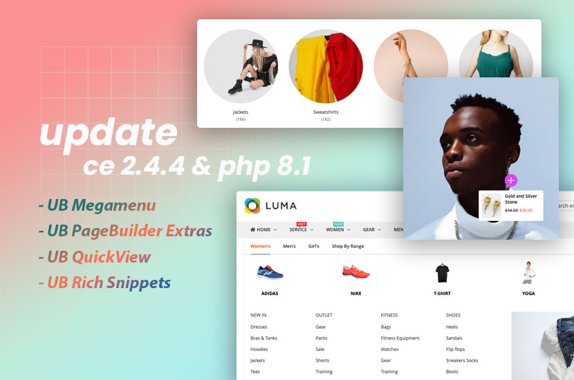
If your site requires a more sophisticated structure, you are better off being served by a mega menu. Since mega menu allows you to display your categories in a tabular form, it keeps your Magento site from getting cluttered which then affects your usability in a negative way. A Magento 2 extension for mega menu can get you started.
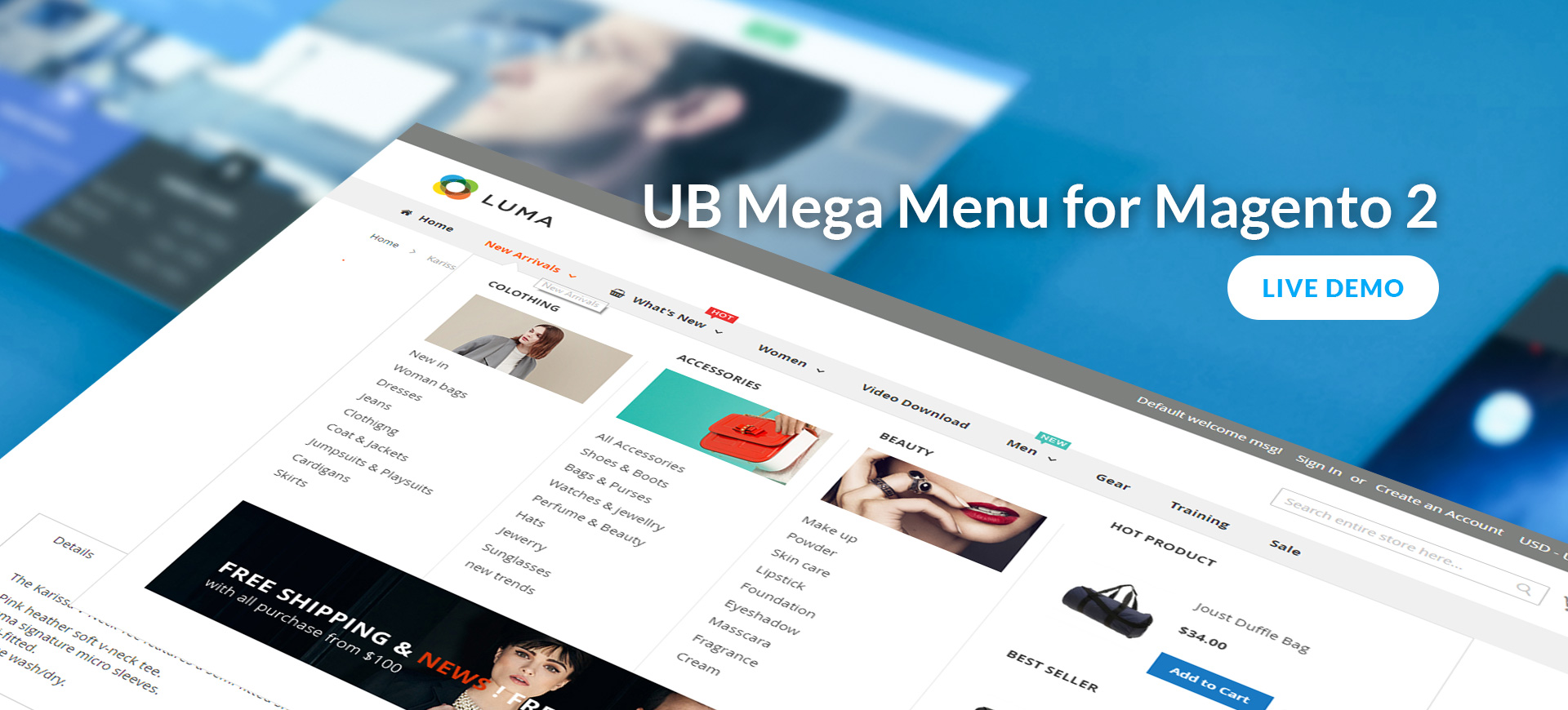
UB Mega Menu -- Handy drag and drop Mega Menu for Magento 2
4. Once you’re done, REVIEW, MONITOR, ADJUST
Your menu design, much like everything in your website, is not a “one time big time” approach. After implementing your design structure, it is important that you take time to review your visual design by visiting it as a guest to get a better understanding of your shoppers’ perspective. Once it passes the review, periodically monitor your menu design’s efficiency by using heat mapping tools like google analytic, Crazy Egg, or any other mapping tool. Adjust as needed. Again, remember, this is a cycle. After adjustments have been made, review. Then monitor your shoppers’ responses. After which, make needed adjustments. Review, monitor, adjust. Until when, you say? For as long as you intend to keep your ecommerce website up and running.
Other pointers:
- Follow the conventional design approach. Unique is good. But not this time. Shoppers adapt to what they do all the time. Do not risk functionality for style.
- Search bar should be placed next to the menu. This is where your shoppers expect to find it. Making them hunt around for it will result to a bounce. Again, this is another conventional layout you cannot risk defying.
- Menu size matters. Overly large sizes make your website look unprofessional. Make it way too small and it will confuse your shoppers.
- To make actionable links visually stand out, use link colors that contrast with the background.
Product filter
Want to increase your conversion rate to 26%? Apply product filters. But what exactly is a product filter? Also known as faceted search, it allows your shoppers to narrow down their search based on multiple attributes such as color, size, reviews, prices, and others. It’s pretty much like the salesman we ask in Costco when we look for the cheapest queen sized pink sheet covers your friend Joey just bought from them 2 days ago. A dedicated Magento 2 extension called UB Instant Layered Navigation gets this job for you.
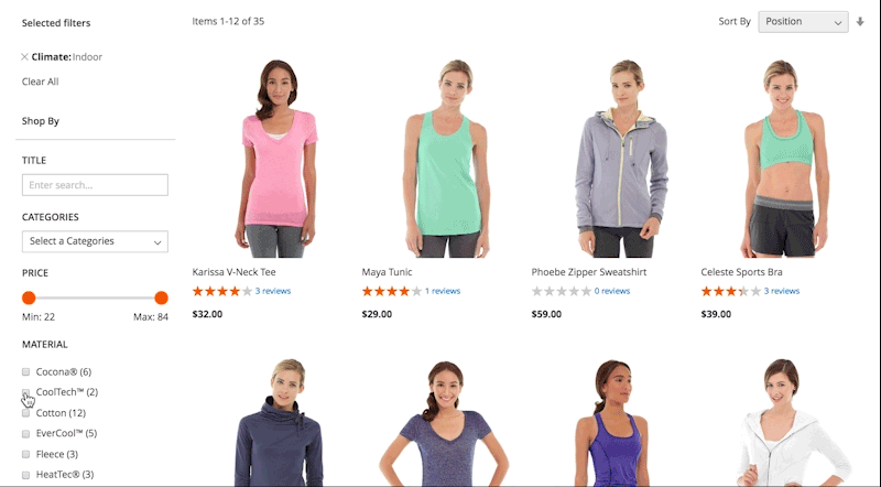
UB Instant Layered Navigation for Magento 2 -- With built-in Shop By Brand
Before your get all too excited to add filtering to your products however, here are some things you need to think about when applying product filters:
1. Promote filters according to importance
The importance of knowing your products very well cannot be overstated. It not only enhances your approach on menu design. It further helps you which product filter you should promote to the top of your list. It helps you personalize the filter for every product category rather than giving a generic approach to all of them. For instance, it is less likely that shoppers for kitchenware would search for the cheapest frying pans. They may begin their search according to the kind of material used like Teflon, or stainless pans. When you have a good knowledge of what your shoppers’ standards for quality, you can better sort your filters accordingly.
2. Use category specific filters
It can be tempting to use proprietary terms like the clothing line. But it’s not always a good idea to filter your products based on product names. Unless you’re eBay, Amazon, Alibaba or other huge and securely established ecommerce company, filter your products according to common attributes like size, color, and fabric type.
Another filter you can utilize is the thematic filter. Pretty much like common attributes, thematic filters assign its attributes according to social relevance such as the season, holiday, or style.
3. Usability is the most important
Again, confusing your shoppers is a huge NO-NO. Make sure this functionality work perfectly in both desktop and mobile channels. Give your shoppers a smooth user experience (UX) by allowing them to navigate to and fro the broad product lists to every filter option.
Also, avoid too many filters. While it is good to maximize your shoppers’ search playground, include only the necessary product attributes. Keep in mind that this feature aims to aid them in navigation, not confuse them. Hence, balance is the name of the game. How to find the perfect balance on the amount of your attributes? When in doubt about including a certain attribute, don’t do it.
Other pointers:
- Periodically review your product filters to make sure of the up-to-date relevance to adapt to your shoppers’ changing shopping attitude.
- Some eCommerce platform do not automatically support product filters. If your current plan does not support this feature, consider an upgrade.
Promotions placements
Here are the 4 Ps of ecommerce merchandising: Product, Pricing, Position and Placement. As a business man, you definitely got the 2 two Ps properly analyzed. But your business study doesn’t only end in what to sell and how much you should be selling them for. Without proper promotional placements in your page, the value you offer is bound to be just as good as nothing. True, anyone can design a graphical banner for a promotion. But learning the difference between promotional placements and promotional placements that yield good results takes a lot more than experimenting on your Magento dashboard tools.

UB Mega Mall for Magento 2 -- features promotion blocks almost everywhere
1. Promotional banner
Promotional banners are the graphical display of your product advertisement. And since it appeals to your shoppers’ visual senses, a good eye flow must be taken into consideration. For a start, remember that standard reading is from left to right. You definitely should not mess up with that. Hence, when placing your elements, work in line with this principle. Do not make your headlines difficult to read. Also, photo selection is of extreme importance. Do not overwhelm your visitors with a plethora of photos of all the products you offer. A right photo that direct your visitors sight to all other elements in your advertisement is a lot more effective than a cluttering your banner with the all the visuals.
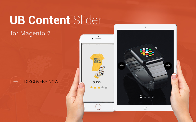
UB Content Slider -- Personalize each single promotional slider with ease
2. Call to action
These are the buttons (usually in your banners) that your customers click to respond to your invitation to either visit your page, sign-up for registrations, or other engagements you would like them to do. Call to actions should be noticeable. They should be clear and void of any confusions. Begin with clear words such as “Shop Now!” or “Sign-up.” Also, since this works best when done in conjunction to good eye flow, effective call to action buttons are usually located at the bottom-right side of your banner. While it does not have a hard and fast rule on placements, make sure your call to action stand out according to your chosen eye flow for the promotion.
Other pointers:
- For added appeal to price conscious shoppers, place your “on sale” category in the top level of your navigation.
- Homepage is a great place for discount promotions. Try playing effective promotional banners here. Be creative. Do not limit yourself to photos and text banners. Try animations. For multiple discount promotions, slideshows can be an effective way to get all your offers in one banner.
- When discussing bullet points in your banner, avoid centered texts as this makes up for a bad alignment. Try left or right alignment instead. The only time centered alignment works best is for your header – and even that depends on your graphic layout and message as you do not your text overshadow your photo’s appeal. Rule of the thumb: when in doubt, left align text.
Conversion elements
Ecommerce has evolved create within its span of 20-year existence. Part of the evolution is the birth of conversions elements. There are the creative strategies used to promote greater conversions as much as possible. These conversion elements are specifically designed to be used in conjunction with other features, usually in the checkout process to maximize your sales. As an ecommerce website owner, keeping up with the trend of conversion elements is a vital step increase your sales.
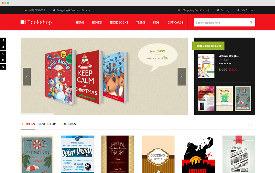
Hot books, Best seller… motivate your shoppers add more products to cart
1. Up-sell
Up-selling is promoting a similar product of higher value than the ones your customers is currently checking. Let’s say your customer is checking on an $800 notebook. Promoting a $1000 notebook with higher specs on the same page increases your chances of earning $200 more.
Due to the efficiency of this conversion strategy, majority of ecommerce companies have configured up-selling for as many products as they have. It is also not difficult to apply. Learn more about Magento 2 up-selling strategies and take your shoppers’ attention to products they might otherwise overlook.
2. Cross-sell
This goes hand in hand with the former to boost up average order value. Cross-selling differs from up-sell in the kind of promotion it offers. Rather than getting your shopper to buy a different item with a much greater value, cross-selling offers complimentary products to their order. Hence, cross-selling is almost always presented upon check out. The goal is to get your shoppers purchase more items than they originally intended.
If we go back to our $800 notebook example, cross selling is presented by offering a totally different product that complements with their notebook, perhaps a Bluetooth speaker, headphones, or external memory drive. Since this approach feeds on your shopper’s impulse buying attitude, products that you cross sell must be at a lower price than your shopper’s original purchase at no more than 30%.
3. Related products
Another approach to increasing average order value that also serves as a sleek design element is by presenting a checkbox of related products that your shoppers can quickly add to their carts. Unlike upsell and cross-sell, related products are neither upgrades nor add-ons to your shoppers’ original purchase. To explain, as your shopper checks on that same $800 notebook, a checkbox of other electronic gadgets such as a tablet, DSLR camera, or a smartphone may presented on the same screen, that can easily be added to the cart with just a simple click.
To ensure the efficiency of adding related products, use Google Analytics to analyze your customer’s shopping activity. This helps to know which products have the closest relationship with each other.
Other pointers:
- Some ecommerce platforms have limited conversion element services. Magento 2 offers a wide range of design options to for a sleek up-sell, cross-sell, and related product presentation.
- Periodically check with google analytics and your platform reviews. What works well for the moment may no longer be as effective a week after.
Trust Proof Badges
The vital role of trust in your ecommerce website
Never underestimate the vital role of trust in your ecommerce website. First, it is how you tell your shoppers that you are not some random ecommerce fraud. Despite the rise of online consumers, a survey of 900 people from 5 mixed demographics (United States, United Kingdom, Germany, India and China) conducted by The Harvard Business Review shows that 97% of the participants expressed concern that businesses might be misusing their personal information such as their home address and credit card information. Hence, unless you are E-bay, Amazon or any globally renowned ecommerce bigshot, it’s not going to be an easy wheezy thing to get your first-time shoppers to disclose private information. Incorporating an SSL badge on your footer helps engender that customer reliance on your brand.
Other pointers:
- Having multiple trust proofs doesn’t hurt. So aside from your SSL badge, PCI compliance also goes a long way to help your shoppers gain confidence in your website’s security.
- Social proof is also another way to foster your shoppers trust. These are demonstration that people who patronize your brand were satisfied. Be it testimonials, social shares, or reviews, it encourages future customers to feel more comfortable making transactions with your ecommerce store.
- Adding trust proof badges is as easy as copy-pasting an HTML code to your website footer. So really, you do not have an excuse not to come up with one.
Most ecommerce companies on a startup struggle with getting a firm grasp on their design concept. This doesn’t have to be your case. By working around with these 5 pointers, you set your foot on a good start. This guideline only covers the basics of all the things you can do with your Magento store’s design elements. As you track your progress and implement needed adjustments accordingly, discover endless possibilities to increasing your ecommerce sales. Or maybe you have done so already. Hit the comment section below and share with us what you’ve got!