As the first Magento theme release for the year 2014, iTech is a dedicated responsive Magento theme built for digital and electronic stores. The theme will create an excellent online shopping experience for your store with trendiness and great UI application in the front end along with stable responsive settings, theme customizing tools and much more.
The theme supports responsive layout with off-canvas menu for mobile devices, Mega Menu, cool accordion effect and theme customization tool.
 iTech -- responsive Magento theme for your eCommerce sites about digital, games or entertainment
Play around the Live Demo of our responsive Magento theme iTech, you can find that even the smallest details are about to give your customers the most comfortable experience within your own site.
Let’s zoom in cool features included in this Magento theme iTech, shall we?
1. Trendy design and brilliant user interface design
Flat design

Responsive Magento theme iTech with a flat design
Flat design is a trend in web design and people will keep talking about it through out this year. We, ourselves, love the idea of being flat. Responsive Magento theme iTech comes up with a purely flat and typographical design. Not to mention lots of white space, the bright gamut and a sleek layout with a rational frequency of promotional block, iTech delivers a trendy and techie feel in your eCommerce store.
Interactive menu bar
 Menu bar in Magento theme iTech
In Magento theme iTech, we support an auto-hide menu panel in which the menu bar will be hidden when the page is being scrolled down, and only shown up when the page is being scrolled up. This witty little touch helps you to save space for more content and also gives viewers a new interaction experience.
Vertical Mega Menu
 Vertical Mega Menu in iTech
Mega Menu in responsive theme iTech supports a new setting for menu icons: now you can add flat icons into the menu to present the content instead of plain text as before. Besides, you can still impress your viewers right from the vertically sliding menu with professional organized categories, sidebar and featured images or videos.
Accordion effect
 Accordion effect for Product pages in iTech
Being focused and simplified as possible, we use the accordion effect in iTech to display product details. Shoppers can read selective content get away from being distracted from a mass amount of content.
 Suggesting boxes in iTech
Another plus to stack the space, the Related Product box displays as slider so that you can give more products suggestions to your viewers. Also in the Special box in Homepage, the product list is presented under tabs. Your customers can head over the exact tab that they want. You can define each tab with a little icon as well.
Product labels
 Items tags in iTech
Also in term of product displaying, you can add labels for any specific items with Hot / Sale / New or whichever tags that you prefer.
Product Quickview
 Pop-up item details in iTech
In responsive Magento theme iTech, your shoppers can have a quick and sweatless access to item details thanks to Quickview function supported in the theme. A click on an item in the Category page, a pop-up window will appear with the detailed information. There will be no need for any reloading product pages.
2. Features for a Magento theme with Responsive layout and Off-canvas menu
Responsive layout
 Responsive layout for different devices in iTech
Responsive layout is the one of the most important factor for a Magento site to be mobilized for Mobile Commerce. As a responsive Magento theme, iTech is perfectly adaptable and can rock your content on any mobile and tablet device. The theme changes automatically to fit in the actual collapsed screens that your viewers are using.
Off-canvas menu
 Off-canvas navigation for different devices in iTech
Magento theme iTech supports Off-canvas menu for better navigation experience on mobiles and tablets. Your mobile customers can surf through your store and will never afraid to be lost ever again.
3. Practical theme customization tools
 Theme color settings for iTech
We offer 7 default theme colors for you to choose or switch around. Check this out:
 Personalizing color theme for iTech
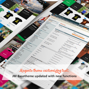
Or course, if you want to have more colors and more control in theme design, you have a powerful tool packed in your back-end already: BaseTheme. With this Mangeto extension, you have in hand unlimited color choices to personalize your whole theme: from background color to details in header, footer or text.
5. Some more plus points
 Languages and currencies alternatives for iTech
If you want to think global and reach out for oversea customers, remember that responsive Magento theme iTech is ready to turn your site into various languages and currencies.
Also, iTech supports Shop By so that your shoppers can search for items at ease according to the product attribute. Accordion effect is supported to make the results clear and organized.
 Shop By filter function for iTech
Wrapping up
Totally flat, friendly interface, smart in functions, these words may wrap up the review about iTech. Let this responsive Magento theme re-craft your site with the techie feel!