How do you make a person stay in your Magento site without their eyes squinting or brows meeting, looking as though he is about to analyze the most complex, deep and meaningful painting? With so many pieces of unsorted, and most often unsolicited, advice on how to improve site navigation, choosing the best can be as easy as walking on a field full of active landmines. That’s right, it is never easy. However, with the right points, proper prioritization, and appropriate placing this can be achieved. Indeed, navigation can either make or break your site depending on significant design and development.
Consolidate and differentiate
One important point to remember is to consolidate your categories as much as possible. First off, you need to decide which comes in the main navigation, otherwise it will look like a clutter and you don’t want that because that’s how you lose your customers in just around 10 seconds. Decide what is most important, whether it’s a product, a landing page or a certain category. If a particular type of product sells most, then you will want to place that in the site where it is most obvious, navigable and easy to search and find. Be mindful of products that do not gain so much traffic or may need sales boost and put them together in one category instead of listing down all products, along with the category of high-selling ones. This will help avoid confusion and promote a minimalist view that allows the customer to focus. Keep in mind, always present the main navigation page in an orderly and systematic manner.
Showcase the category of high-selling products in the main navigation -- Bookshop for Magento
Use proper labels—it makes a whole lot of difference! Sometimes, less is more. Hence, exercise proper judgment when creating titles for categories and subcategories for your contents. Once the categories are decided and organized, you may subdivide them based on attributes. Be careful not to interchange either of these to ensure systematic flow and streamlined design.
Displaying the links in differentiated categories will help the customer to navigate the site with swiftness and ease in understanding. With proper distinction, customers will be able to navigate based on functionality, thus eliminating visual confusion and possible loss of focus, which may mean of loss of sale. Display links based on types, and remember the following points:
- Product Categories are specific to the type of product in the title.
- Browsing Categories can be more general, referring to a broad range of products. For example, “New Arrivals,” “Clearance” and “Shop by Brand” can encompass a variety of products that may also appear within another Product Category.
- Utility Pages are informational, non-product related links to pages such as Contact Us, About Us, Shipping Info or Privacy Policy.
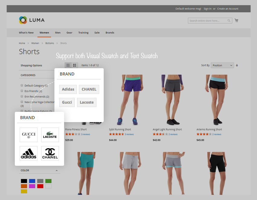
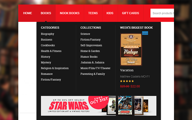
The combination of Shop by Brand & Layered Navigation for Magento 2
Limit contents and navigation options
The universal rule applies: the simpler, the better. Having too many navigational options may easily intimidate customers. Having minute details can be helpful, but perhaps not always at a first glance. Place yourself as the customer and contemplate what you need most when reaching at a certain navigation point. The homepage should summarize what you sell, as well as show benefits and important, eye-catching specials. The category page allows you to see subsections and products with their attributes so advance filtering navigation will be most helpful. Once the customer chooses a certain item, the navigation will lead to the product page which allows detailed information and other associated options, upsell and cross sell features. Having too many navigational options can clutter the customer experience, especially in the checkout page wherein they should be focused. Again, less can be essentially more.
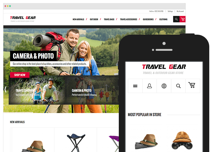
TravelGear theme Mega Menu -- Professional navigating tools for Magento
Take advantage of sticky navigations and shrinking menus
Online shopping can be intimidating for some customers, especially with so many categories and products to choose from. Proper navigation display can encourage customers to focus on their shopping experience and not on the navigation itself. The sticky navigation gives the customer more confidence as they explore since the menu or bar itself remains in place in either bottom or top screen throughout the scroll. If the sticky navigation has too much content or is too long, a simple “Return to Top” navigation option can be placed permanently for added convenient.
To make the navigation or popout menus more prominent, utilizing the best strategies such as shadows, color contrast, and fades can really make it pop out thus differentiating them from the rest of the content. Shadows over the content is least intrusive and layering it over can work magic. A contrasting color cannot escape notice and it helps in differentiating to avoid confusion. Fades demand attention to the popout as it blurs out all other content leaving the user no choice but to address the popout.
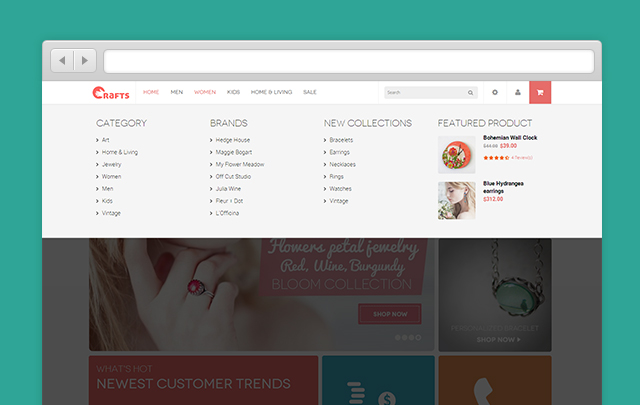
Mega Menu at highest level of accessibility -- Crafts theme for Magento 2
Avoid confusions – functionality icons must be:
- Obvious. Being unique is excellent, right? No. Not really. At least, not always. Universality affords comfort and confidence to customers when navigating the site. Avoid confusion by using the accepted standard formats: a magnifying glass for search, a hamburger icon for hidden menus, etc. You can always set yourself apart in other areas.
- Strategically located. The search bar is another useful tool that must be placed where it is most visible. Strategically placing the search bar in the upper-left corner or center of a top navigation menus is not only the best but is also the most common and widely familiar to many customers.
Use animated slide outs
If there are too many categories, subsections and products in the sticky navigation, it might cloud up the whole page which may cause clutter and jeopardize visual aesthetics. The shrinking or hidden menus can be convenient and useful to avoid taking up the whole space of the page, especially for those with limited screen space. To achieve noticeability and effectiveness, clever animations can be utilized. Opening the site with the navigation menu prominent, then automatically shrinking it to one side or corner, with a flashy animation to show users where it will be if they need it. This should increase usability and help conserve screen space without limiting user options.
One of the primary purposes of animations is to smooth over clashing or discarded transitions. It is significant for slideouts, drop-downs, and all other appearances of menus, to use an appropriate animation of 200 – 300 ms. This is slow enough not to seem abrupt, but fast enough that the user still feels direct control of the interface.
Allow backtracking – Show recent history feature
Double-checking can be sometimes forgotten or often neglected in some situations but online customers do it all the time. Web browsing doesn’t just move in one direction which is why Recent History feature makes it highly important as it lets users backtrack at will, whether they made a mistake going forward, or need to reexamine previously viewed content. Not only does it allow them to go back or review, it also helps them differentiate items for comparative shopping. Switching between two or more products raises the chances that the customer will be satisfied with their purchase and gives them more control which they will truly value.
Conclusion
Each site is unique and has unique navigation needs that work best. These recommendations may work on one site and not on the other. For certainty though, these recommendations will go a long way to help improve site navigation. Keep in mind the customers who visit your site. Think of their comfort, convenience and constant need for accurate and easy information readily available on their screen. Consider key points to categorize and differentiate your products, as well as promote them in a user-friendly interface even for the not so tech-savvy ones.
Tool for you: UB Mega Menu for Magento 2 -- Dynamic menu solution for you to stack content into categories along with images, clips, banners.